
Howdy!
My name is Gabriel Chlebowski and I am a junior zoology and environmental science major from Toledo, Ohio. Some of my interests include animal behavior, geography, music, sports, and kayaking. GIS has always been super fascinating to me since I have always loved maps growing up, so I am very curious about this course to see if my knowledge of the discipline can be expanded upon 🙂
One of my favorite sections of Chapter 1 was explaining the human condition that it is easier for people to discern information through visual displays like maps as opposed to more textual approaches of displaying information like in tables. They point to a pretty straightforward but also slightly comical example of showing tuberculosis rates in a table format with percentages next to state zip codes. As strange as it sounds, without mapping software or a skilled cartographer, such data would be left in that format, which is very indigestible in my opinion. In addition, I did not know that not only do people “reason” using images, but such is processed differently in the brain that text. I think that the way that data can be processed via images is very special and really gives GIS great purpose in the realm of data analysis. This was especially true in the example of John Snow’s Cholera maps, a story in which I found extremely fascinating. The data by itself was not ample enough to draw any conclusions in where the source of the sickness arose, yet the use of mapping allowed Snow’s intuitions to lead him to the holes in the data, allowing for follow-up questions to reveal that the public wells were at fault. These types of stories are one of the many reasons why I find this type of data analysis so interesting. Maps can offer extreme amounts of information about a place or event that is much more in-depth and layered (pun) than a table with a contextual description. It takes extreme care and large amounts of precision to work the data into the visual in the correct fashion as to be the most presentable and apt as possible for the intended audience. Briefly mentioned in the chapter, the use of specific colors when discerning data is another way in which visualization can lead to more precise analysis, which is an area that extremely piques my interest.
The first of the two GIS applications I found was an older report on seagrass abundance monitoring in the realm of dugong population health. The map accompanied from it is very old (article published in 1993), but it is very informative on the locations of seagrass off of the coast of Australia. The subject area is of interest for me as I wrote a research paper on factors that negatively affect dugong population size, in which seagrass availability and quality were of the upmost importance. 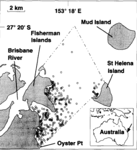
An efficient method for estimating seagrass biomass – ScienceDirect
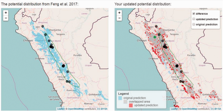
The second application is a type of online armadillo occurrence tracker called Armadillo Mapper (AM). This GIS tool automatically makes a range map of armadillos in the subparamo habitats of Peru based on user online input that shows on the map as potential occurrence. This is important to the knowledge of the hairy long-nosed armadillo (Dasypus pilosus), as their compiled map shows a larger range than the established one by the International Union for Conservation of Nature (green circle on both maps).
Sources:
Feng X, Castro MC, Linde E, Papeş M. Armadillo Mapper: A Case Study of an Online Application to Update Estimates of Species’ Potential Distributions. Tropical Conservation Science. 2017;10. doi:10.1177/1940082917724133
Long, B. G., Skewes, T. D., & Poiner, I. R. (1994). An efficient method for estimating seagrass biomass. Aquatic Botany, 47(3-4), 277–291. https://doi.org/10.1016/0304-3770(94)90058-2
dugongs and amarillos. or some unholy combination of both (dugarillo).