Chapter 1 (Law / Collins)
- It is important to note that the feature data in GIS contain attributes that correspond to the features attribute data.
- Feature attribute information is stored in a table in a GIS database. Each feature occupies a row in the table, and an attribute field occupies a column
- ArcGIS Pro is similar but also different from the basis of ArcMap in that it uses ArcGIS Online basemaps as the backdrop instead of the typical import of basemaps from another source. ArcMap can also use Arc Online for basemaps but this is something that is not extremely important
Exercise 1:

- This figure represents up to the 8th step in exercise one. At this point all that has really been done is opening an ArcGIS online map and seeing some of the features located in the layers tab that are associated with the map

- This figure represents the public schools in the area but with a different symbol. At this point in the exercise we have successfully changed and updated a symbol in the map
- The next figure shows the ToBreak attribute and what this attribute shows is the minutes it takes to walk to school from those areas.
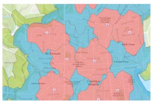
- This figure represents the different areas and how long it takes to walk to school from those areas. Using the steps in the book I was able to create this map to show the difference between 5, 10, and 15 minutes of walking to get to school. Red being 5, blue being 10, and green being a 15 minute walk to school.
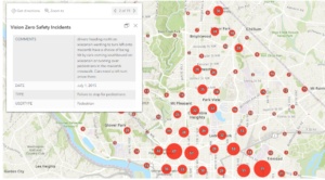
- This figure represents the Vision Zero Safety Incidents that were configured using the filter and clustering section of the editing tools for the map. As well as the map pop-up windows were configured to produce this figures pop up window you can see in the top left of the figure.
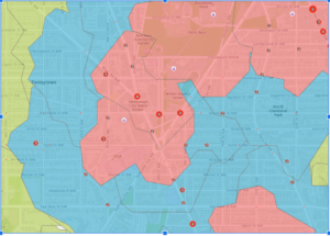
- This figure shows what the final version of the map looks like with all three layers showing. Cities can use a map like this to create stricter speeding fines and punishments for school zones where these incidents occur.
Chapter 2:
- This chapter begins with getting to know the basics of ArcGIS Pro. ArcGIS Pro offers 2D AND 3D visualization and analysis with an interactive, navigable interface.
- So far this chapter is showing that although ArcPro is similar to ArcMap, it varies in that it is more similar in some regards to Microsoft applications
- A folder connection was one of the first steps in exercises 2a and this was a very similar process to that of ArcMap
- This figure shows the air pollution by country layer in the first exercise in chapter 2. This map was produced from data that was imported into ArcPro and then manipulated to look the way it does.
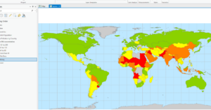
- The continents that PM concentrations are the highest are Africa and Asia.
- To restore the contents pane in ArcPRO just go to the view tab and click on contents
- The largest city according to the Cities attribute table is shanghai china
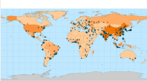
- This figure shows what the final map looks like after the first exercise in chapter 2. Some basic tools were used to manipulate the map and its data so that it looked this way as a final product.
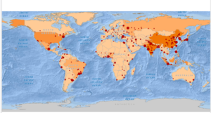
- This figure shows what the map looks like at the end of the 2nd exercise in chapter 2. In this exercise we changed feature symbols, configured feature labels, used the measure tool, added a cloud-hosted basemap, and packaged the project to share online.
- The height of the tallest building in the third exercise in this chapter is 339.76 feet
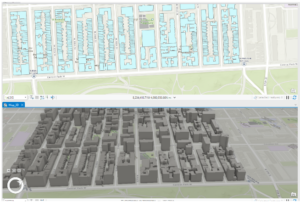
- This figure shows the final map image for the final exercise in chapter 2. In this exercise we learned how to convert a 2d map into a 3d map, and then extrude features based on the building height attribute to visualize buildings in a more realistic perspective. This exercise was fantastic if I say so myself and I was genuinely surprised going through this chapter. I think chapter 2 contained great information that is vital in getting to know ArcPro.
Chapter 3:
Questions :
- (add data to the project) The field name that indicates the state within which the county features are located is called STATE_NAME
- (add data to the project) There are 10575 residents in Wayne County Ohio between the ages of 22 and 29
- (Incorporate tabular data) Six years of data are represented in the table
- (incorporate tabular data) No I do not see a correlation between income and 2010 obesity rates. There are many counties with moderate-high income and high obesity rates. There are also counties with low income that have moderate to low obesity rates.
- (Calculate data statistics) 18.7% of households had an income of less than 15,000 per year.
- (connect spatial datasets) There are 4 food deserts in knox county
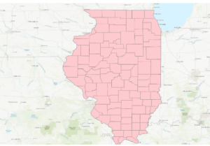
- This figure shows the map after the first exercise in chapter 3. This map was configured using select features by attribute and then exporting those features into a new dataset into the map.
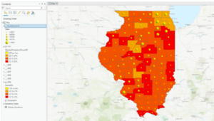
- This figure shows the final map product at the end of the second exercise in chapter 3. This exercise was all about joining the cdc data to the Illinois county feature class. This was done using a variety of methods and data manipulation techniques including joining data tables, incorporating layer symbology, and using the swipe tool to compare different years of the data on the map.
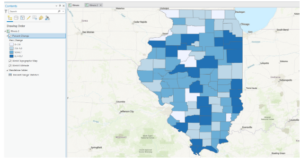
- This figure shows the final map product after the end of the 3rd exercise in chapter 3. This exercise was all about calculating the data statistics. We added a new attribute field and then populated the field with values. We then calculated the summary statistics for the state.
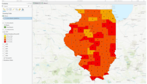
- This figure shows the final map product of the last exercise and the final map at the end of chapter 3. This exercise was all about spatially joining data. We spatially joined the 2010 layer with the IL_food_deserts layer and this is shown by the number of food deserts displayed on the map for each county.
Chapter 4:
Questions:
- (Configure snapping options) The selected line has 4 vertices
- (Modify Features) The Shape_area value decreased from the original water pressure zone

- This figure shows the final map product after the first exercise in chapter 4. This exercise was all about switching the city’s data collection to a geodatabase model. It was easier than expected to build a geodatabase for the city.
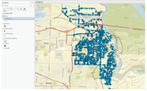
- This figure shows the final map product after the second exercise in chapter 4. This exercise was all about creating features and fixing the missing water lines in the map. This was done using a variety of techniques in the data tab of the ribbon. Snapping was the method that was used for the exercise.
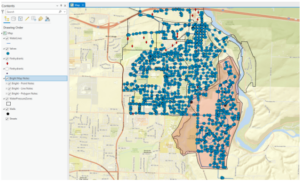
- This figure shows the final map product of the last exercise and the end of chapter 4. This exercise was all about modifying features which included splitting a polygon, merging polygons, modifying lines and points, and adding map notes.
Chapter 5:
Questions
- (manage a repeatable workflow using task): The conflict events recorded in the dataset are battle (no change of territory), battle (government regains territory), battle (non-state actor overtakes territory), headquarters or base established, non-violent transfer of territory, remote violence, riots/protests, violence against civilians, and strategic development
- (Author a task) 14,211 fatalities resulted from violent conflicts against South Sudanese civilians between 2010 and 2018
- (Run the model) There were 71 fatalities that resulted from conflicts classified as violence against civilians in Rwanda from 2010 – 2018
- (Convert a model to a geoprocessing tool) 41 riots/protests occurred in Rwanda between 2010 and 2018 and 12 fatalities resulted from this
- (Use a custom script tool) The geoprocessing tools combined in this script are Select Layer By Attribute and Summary Statistics
- (Use a custom script tool) 26,323 fatalities resulted from conflicts classified as violence against civilians in Nigeria from 2010 to 2018
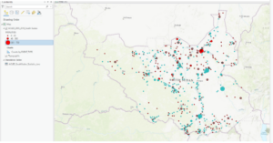
- This figure shows the final map product of the first exercise of chapter 5. This exercise was all about using the Tasks pane in ArcPro to establish a workflow for ourselves and so others can use the task we created in a similar way to create a similar map with the appropriate data.

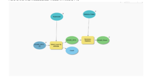
- This figure represents the final map product at the end of exercise 2 in chapter 5. This exercise was all about using ModelBuilder which is a design environment for creating spatial analysis workflow diagrams and in this exercise we used ModelBuilder to build the workflow to create this map.
- Here is the final modelbuilder model in ArcGIS Pro
- This figure shows the final map product of the last exercise in chapter 5. We can see that all three countries (South Sudan, Rwanda, and Nigeria) are highlighted as they were all worked on in different exercises throughout the chapter. This exercise was all about running geoprocessing tools in ArcGIS Pro using Python. This workflow was similar to the first two exercises but we used Python coding and a script tool to execute the processes.

Notes:
- These first five chapters of the book were very informative on how to use the tools and functions in ArcGIS Pro, and how to manipulate maps and data as well. Once we get to chapter 3 I think that’s when things start to get dicey. Although I can follow the instructions the book gives for each exercise in each chapter, I would still struggle somewhat if I were to do this off the top of my head (guess I need to review more).
good annotated progress thru these chapters. it’s a lot of stuff. i think it’s largely true that until you run through an actual application of much of this stuff it won’t stick in your head. thus the exam in this class. that’s just a few applications, but with GIS it’s all about doing to understand it. feel free to ask questions – I still have to look up most stuff I do in ArcGIS unless I’ve done it before. and I’ve been doing this stuff forever and a decade.