Nagel Week 5

The schedule says to skip Chapter 5 so I didn’t attempt the assignment/tutorial but I did still read it, albeit maybe not as in much detail as usual. Chapter 5 discusses the creation of a ‘self-managed’ or private Web GIS and the various reasons for doing so. Chapter 5 also discusses ArcGIS Enterprise, the version of the program made for private types of GIS programs. Also mentioned are ‘portal collaborations’, the differences between various tiles and features such as vector, raster, and feature tiles, and the different strategies for choosing any of the various layer types.

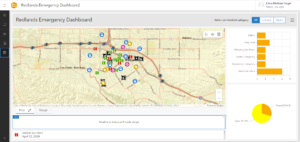
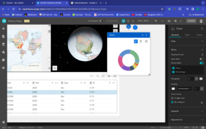
Chapter 6, as its title implies, discusses ‘spatiotemporal’ data, or data relating to space and time and details GIS systems which update data in real time. I’ve never heard the internet referred to as the ‘Internet of Things’ so that’s definitely interesting. Chapter 6 also discusses ‘stream layers’, how to use ArcGIS to look at real time data, and animate time-based data. As for the tutorial, looking at things such as real time traffic cams is interesting to see. It was nice to have everything going smoothly but I could only get as far in the chapter 6 tutorial to the end of 6.4 whereupon trying to tell the code to make a certain icon the color red, the arcade script code just decided it hates the color red or something and decided to stop working entirely, rendering the table completely useless. From what I could do though, I liked the idea of real time GIS.

To be honest, I’m not quite sure how I would go about making an application based on what was learned in chapter 6. Perhaps an app showing the real time flow data in streams and rivers?

Hagans Week 5

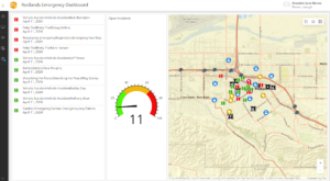
This chapter went very smoothly and I finally didn’t run into any problems using ArcGIS Online. The beginning of the chapter went through how to create a dashboard app, which is useful for displaying information that is constantly changing and the dashboard can keep it up to date, which is a very useful application. This section also introduced me to new elements on ArcGIS Online and how to put multiple elements on one page to display as much information as possible. The next section went over how to use Arcade to format certain things. This section involved adding a bit of code, but it was pretty easy and I got it to work. Next, the chapter went over how to add a time slider to show how things like population can change over time. I got more practice with symbolizing attributes and what sizes and colors to use to show up best on maps. I think it would be very interesting to use the time slider for a project idea, and this could really be used to show a wide variety of data. If there is data available, I think it could be cool to show a time slider of tree leaf fall in autumn. It would be interesting to see how leaf fall compares from state to state. 


Allo Week 5

Chapter 6:
I loved learning how to make the live-updating dashboard. I didn’t know that something like this was possible. It’s very cool that the data will be updated on the stop. I am curious to know the other applications for something like this. I wonder if there are any other uses besides incident updates. I also believe that this is one of the easier tutorials to follow. I didn’t encounter many issues and moved through them fairly quickly. The only part where I struggled was with Arcade. While I appreciated that this was also a chance to get to learn how to use it, it wasn’t as straightforward as the rest of the tutorial. For example, I kept receiving error messages within the code and couldn’t find a solution after troubleshooting. I had to skip over the Arcade portion completely due to all the error messages. The time-enabled feature layer was also something interesting to create. It’s another way to add more detail to what you are working on. Each tutorial shows me more possibilities.

Ideas:
After completing the tutorial I wanted to think more about other potential applications of the dashboards. I specifically was thinking about environmental applications. One that I thought of was a dashboard that tracks flooding or extreme weather. In regards to my other ideas I have had for the final project, I think I could use the dashboards to track foot traffic at certain grocery stores.

Benes, Week 5

Chapter 6:

  • This was a really interesting chapter. I thought that the tutorial went smoothly there were some areas that I couldn’t complete but for the most part I understood the concepts. I really liked being able to see different tools that can be used for data collection. Like in the beginning tutorials working with the dashboard and imputing data with various forms.

Gassert, week 4

Week 4


Ch. 3

This chapter was short and sweet. I feel a little more comfortable with this stuff than the things used in 291 (that’s just my opinion). The 3D maps took a little bit to load, but it worked. I was worried it wouldn’t since I haven’t got the 3D maps to work on the first try in the past section. The focus on this single topic was easy to follow and made it easier to focus.


Tutorial for Ch. 3

3D map worked, it just lags a little bit (blaming BishopNet, may try to do later tutorials at home on my own internet). I had a couple issues with the 2D and 3D changes for the maps, but I don’t think I missed anything major. I’ve come to understand that the software isn’t perfect, so I don’t let the discrepancies discourage me. The animations are very laggy which makes me worry about doing the tutorials like this on my laptop as it might make it crash.


Ch. 4

The phone application is a little weird, but I get why it’s a thing. I can see how it could be useful to certain groups of people to develop other applications based on it or how to see land maps conveniently. This could be an issue to use if the internet is bad or if you don’t have enough data on your device for everything to work properly. The use of AR is something I’m vaguely familiar with since some mobile games use it (Pokémon Go is a prime example of this, along with the fact it uses location maps to verify where you are and what roads, waterways, or landmarks are nearby). 


Tutorial for Ch.4

This tutorial was not as easy as the Ch.3 one. I switched to my IPad to try it, but that didn’t really fix it. Loading times were long for this one too, but it also may just be my device. I would be interested to know how more of the mobile applications work since it’s supposed to make this more accessible.


Delaware Data inventory:

I think I did this in 291? I remember going in and reading about what the different things are, not sure if that was the same thing. 


End of semester idea:

I want to try to do something relevant to chapters 3 and 4 since that seems a little easier and more accessible to me since I am a commuter. 

Quartson Week 4

The reading basically  talks about how to properly use the Experience Builder within ArcGIS. It’s a guide for users, introducing them to the tool’s and different functions of it. It covers different aspects like selecting templates, choosing themes, designing layouts. Additionally, it talks about features like dynamic content, charting, filtering, triggers, and actions, providing users with a thorough understanding of how to leverage these tools effectively. I liked chapter 3 and I feel like the chapter 3 tutorial was the best one yet. It’s just really long and that can be a bit annoying  I’m not gonna lie. But it went pretty smooth and I was able to do it. The map making is complex but I can tell that knowing this information could probably go a long way over time. Can literally make a map for anything you think of.


My idea for the application is that we could setup a map around Delaware or anywhere in the Columbus area and it could show different locations of car accidents and whenever there’s an area with several reoccurring accidents we could highlight those areas differently than the rest. This can keep roads and neighborhoods safer if we spread the information gained.


Nagel Week 4

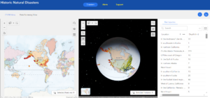
Chapter 3 introduces the ‘Experience Builder’, an ArcGIS component that allows for app to be configured with more functionality than what is typical, such as dynamic content, charting, and reporting. Chapter 3 also introduces the various terminology of the Experience Builder component. The chapter also explains the workflow for creating web apps with the Experience Builder, and how to understand widgets and their contents. Chapter 3 also explains how to configure widgets and use things such as filtering. Finally Chapter 3 discusses ‘triggers’ and ‘actions’, and how to utilize them. The Experience Builder is a multi-step process which starts by using a template or by starting from scratch. From using the Experience Builder maps can be made in 2D or 3D, and allow you to configure the various widgets, themes, layouts, and presets. The tutorial went smoother than the ones in chapter 1 and 2, but it was still a bit difficult and technical and took a while to complete. That being said, I love learning about natural disasters so this is right up my alley. Also at least this one worked and despite it being a bit difficult it did ultimately end being a little bit fun.

Chapter 4 introduces a mobile version of GIS software, the approaches to building mobile apps. collecting data, and the configuration of feature layers. I have never been a particular fan of mobile apps, something you can thank the constant spam of mobile app ads for. However, I see how mobile applications of GIS could be utilized to an advantage. A mobile system also potentially allows for more people to access the software and make data collection easier. The features listed are also compatible with numerous different operating systems, and with ArcGIS only being operable on Microsoft and Windows systems, collaboration and the sharing of data becomes easier. As for the tutorial, it had some of the same problems as tutorials 1 and 2, with serious mismatches between the book and website that made completion of 4.1 and 4.2 impossible as once again the option to add an expression was not there, or rather it was there but the options the book instructed me to select were not. The majority of 4.3 was doable until it asked to me to find a ‘change style’ button which could not be found. With 4.4 being a follow up to 4.3, this made it impossible to proceed with that as well. I was apprehensive with 4.5 as I’ve never been a fan of downloading apps onto my phone for academic reasons as it always signs me up to some email newsletter. In addition my app store account is linked to my fathers email which I don’t have the password for so I was unable to download the app to begin with. I had the same problem with 4.7 and 4.9 being unable to access the app store and with it being late in the evening I was unable to contact my father. 4.6 was also broken as I was unable to uncheck a ‘only search in your organization’ button and this part of the tutorial relied on data that would’ve been created with 4.3 and 4.4 but because those could not be completed, I was also stuck here. 4.8 had the same issue and 4.6 with no option to uncheck the ability to only search within the organization and multiple results turning up when I input what the book asks me to search. In short, while the reading portion of Chapter 4 was interesting, the tutorial was a nightmare to sit through and try to go back through things to see what I missed. Dr Krygier if you see this, I don’t know what you can do about this, but these books are somehow severely out of date already. At the very least parts of it were doable compared to tutorials 1 and 2 which effectively blocked me from the start.

Application Idea: Attempting to go off something I enjoy and using what information I was able to learn in Chapters 3 and 4, as an avid angler, it might be an interesting idea to create a 2D/3D map using a hydrology dataset which shows various fishing locations on bodies of water in a given location, such as within Delaware County. This application could not only give a better view of the area from both a 2D and 3D perspective, and then customized to show what species can be caught in x location and if said location has a history behind it. For example, a 2D/3D view of a spillway beneath a major dam, what species can be caught in the spillway, and the history of the dam itself.

Data Inventory: The instructions say to include it in the posting so not sure if this will transfer over correctly. If it does, fellow students, I apologize for the wall of text. Not sure how else I’m supposed to turn this in.

  • Delaware County E911 Data: Contains all certified addresses within the county. Supports emergency services and geocoding. Updated daily and published monthly.
  • Township: Shows different townships in Delaware county. Updated on a need-as basis and published monthly.
  • PLSS: Shows all Public Land Survey System polygons in military districts. Shows boundaries between PLSS systems. Updated on a need-as basis and published monthly.
  • Dedicated ROW: Consists of a map of roadways designated ‘right of way’ within Delaware County. Updated on an as needed basis and published monthly
  • Zip Code: Shows all ZIP codes in Delaware county based on a 2003 census. Updated on an as needed basis and published monthly
  • School District: Shows all school districts in Delaware county based on parcel records. Updated on an as needed basis and published monthly.
  • Street Centerline: Depicts the center of the pavement of public and private roads within Delaware County. The data is intended to support appraisal mapping, 911 emergency response, accident reporting, geocoding, disaster management, and roadway inventory. Layers are updated daily but 3D fields are updated annually
  • Recorded Document: Dataset consists of points that represent recorded documents in the Delaware County Records. Documents include vacations, subdivisions, centerline surveys, surveys, annexations, and other miscellaneous items. The dataset was created to facilitate the process of locating miscellaneous documents within Delaware County. The dataset is updated on a weekly basis and is published monthly.
  • MSAG: MSAG (Master Street Address Guide) is a featureset of the 28 different political jurisdictions that make up Delaware County. created to ease the process of locating the boundaries between cities and towns. The data is updated on an as-needed basis and is published monthly.
  • Survey: Shows points of land surveys with Delaware County. Most of the data was recorded before 2004 but is still being updated on a daily basis and is published monthly.
  • GPS: Identifies GPS points as established in 1991 and 1997. Published monthly and updated on an as needed basis.
  • Parcel: Shows all polygons that represent cadastral parcel lines within Delaware County. This data is maintained by the Delaware County Auditor’s Office. The data is maintained on a daily basis and is published monthly.
  • Tax District: This set of data consists of all tax districts within Delaware County. The data is defined by the Delaware County Auditor’s Office. The data is updated on an as needed basis and is published monthly.
  • Subdivision: Shows all subdivisions in Delaware County. The data is updated daily and published monthly.
  • Precinct: Shows all of the Voting Precincts within Delaware County. The data is maintained by the Delaware County Auditor’s Office. The data is updated on an as needed basis and is published as needed by the Delaware County Board of Elections.
  • Annexation: Data contains Delaware County’s annexations and conforming boundaries from 1853 to present year. The data is updated on an as-needed basis and is published monthly. 
  • Municipality: Shows all municipalities within Delaware County.
  • Building Outline 2021: The data here consists of building outlines for all structures in Delaware County, Ohio as of 2021. Updated on an as needed basis.
  • Address Point: Shows the data from the Location Based Response System (LBRS) and shows all addresses in Delaware County. The data is intended to support appraisal mapping, 911 Emergency Response, accident reporting, geocoding, and disaster management. The data is updated on a daily basis, and is published monthly.
  • Condo: Dataset consists of polygons representing condominiums in Delaware County that have been recorded by the Delaware County’s Recorder’s Office.
  • Farm Lot: The data here consists of all the farm lots in both the US Military and the Virginia Military Survey Districts of Delaware County. created to facilitate in identifying all of the farm lots and their boundaries in Delaware County. The data is maintained on an as needed basis.
  • Original Township: This data consists of the original boundaries of the townships in Delaware County, Ohio before tax district changes affected their shapes.
  • Hydrology: Shows all major waterways in Delaware County.
  • ROW: Consists of all lines designated as right of way.
  • Delaware County Contours: Shows the contours of the terrain in Delaware County.

Hagans Week 4

Application idea: I think it would be interesting to create an application using the School District data set from the Delaware Data Inventory and use it to highlight the school districts in Delaware County and some of their accomplishments, mascots, facts, history, etc. I didn’t go to school around here, but I think this would be an interesting app for locals who are interested in the high schools around Delaware. If I could find it (if it’s even available), I could also do this using schools from the county where I am from so that it would feel a little more personal and relevant. This could be turned into something unique using the Experience Builder feature!

Chapter 3: Chapter 3 is all about learning to use the Experience Builder, which as I understand it, is a feature in ArcGIS Online that allows people to make unique and interactive web experiences without having to worry about too much coding! I think this a really cool concept that makes app building much more accessible and allows for more information to be shared. The book explains that you can choose from a template and pick the theme of your web experience, and then you can use multiple tools to design it the way you want. 

Tutorial 3: This tutorial was an overview of how to use the ArcGIS Experience Builder to map an application about natural disasters. For the most part, it was pretty easy to follow and understand, but like other people, I ran into a few problems. It was interesting to see all the different widgets that are available to customize the web experience. I wasn’t able to link my Views Navigation to the 2D and 3D map, so there might be something buggy with this feature since other people appeared to have issues as well. I thought that the Dynamic Content feature in the Text widget was really cool to use. I had a little trouble with the SQL builder and I’m not quite sure I did it correctly. Tutorials 3.5 and on were a bit difficult because it built on stuff in 3.5 which I couldn’t quite get to work. However, I was able to do 3.1-3.4 easily, so I’m glad I got the basics of the Experience Builder so I can use it in the future because it is a really useful tool!

Chapter 4: This chapter is about Mobile GIS and some of the other ways you can utilize ArcGIS Online to reach a broader audience through phones, tablets, laptops, etc. Some of the terms they use in the introduction are a little out of my realm of knowledge, but I mostly understood that Mobile GIS is a very powerful and versatile tool. The ArcGIS Field Maps is a really interesting concept that could probably be used for some of the biology field labs that we offer here at OWU since it gives tasks and assignments based on locations. It is also interesting to see how VAR and AR can be incorporated into these applications for a very visual concept. 

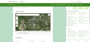
Tutorial 4: It’s a little hard to begin with all of the different GIS features because they all seem to have different names for the Panes and all of the tools are in new places each chapter. For example, in tutorial 4.1 I couldn’t find the Add Tab button in the location the book said it was. It’s a little frustrating when you can’t find something because then I had to skip most of the rest of 4.1 since it builds on the Add Tab direction, which wasn’t there. I wonder if sometimes they just update the names of the items on ArcGIS, but the book is a bit older. Sometimes I can work around the little differences, but since I’m not familiar with Survey123, I couldn’t find another feature to replace the Tab with. I also didn’t publish this Survey since it didn’t even have most of the things from the tutorial. I think this is an interesting concept, but I wish I was able to find the option to add the actual survey parameters. There were also a few things I couldn’t find in 4.3 like the Change Style button, but this was mostly doable. Some of the things I could find on a different tab than what the book specified. I wasn’t able to do the Expression builder in this chapter. I struggled with this in a previous chapter because the book has different directions than how the Expression builder is set up now, so I have no idea what I should be doing. The bad thing about this chapter is that every other tutorial requires you to try out the app you just built in the previous tutorial, but I haven’t been able to complete an entire app without some sort of issue, so I’m never able to try it out with the mobile app. The AR app was very cool! I was testing it out in my room, so I couldn’t completely see some of the POIs I put in, but it was still fun to test out.

Allo Week 4

Chapter 3:
The beginning of this tutorial was pretty straightforward. I encountered an issue with the Data Summary part because there was no URL to type in to insert an image. I tried to use a random natural disaster image from Google, but it didn’t work. I don’t know if I missed something but I didn’t see a key for either the 2D/3D maps so I wasn’t sure how to interpret them correctly. Despite that, I thought the process of adding the 2D/3D maps to the builder was fairly easy. I like the animations you can add to the maps because they really add to the storytelling aspect. The next configurations were a little more complicated but I figured out how to add all of the triggers. The rest of the tutorial went well with a few obstacles.

Chapter 4:
The survey part was very easy and I will be thinking about how to add that to my ideas for the final project. The other parts of tutorial 4 gave me more trouble and I couldn’t navigate them well. I am not sure if it was more parts missing in the PDF or if my software looked different than expected. Specifically, 4.3 and 4.4 were just not cooperating so I skipped over the majority of those parts. Because the other parts went wrong the mobile app was all off too. I decided to explore the app without strictly sticking to the tutorial to move through it. I am disappointed that I struggled with this tutorial, but I still feel I learned some valuable information about the features.

Delaware Data:
There is data on School districts, zip codes, condos, and PLSS, and more. I looked at the condo data and it had all the areas in Delaware County that have condominiums polygons. I clicked through a couple of them and it showed more data about each. I also created a new folder in my drive and added the data needed.

Idea:
I still like the idea I had from last week about the different grocery stores, local vs. chain. However, I can incorporate what I learned from Tutorial 3 into it. I can use the app builder from tutorial 3 and create more of a flowing story about the stores. I can also use the animation/trigger features to make it more engaging and visual. I don’t know how much the 2D/3D visuals will play a role, but I could add both to make it more visually appealing.

Shaw Week 4

Chapter 3:

  • This chapter was a lot easier to follow because it only focused on one topic.
  • The tutorial was a bit confusing because I could not find the 3D map that was required to use in the tutorial so mine did not turn out as it should have.
  • The 3D maps look very interesting and I am looking forward to learning more.


Tutorial

  • It does seem more difficult to do these tutorials on my personal computer than in the GIS lab. I assume it’s because my computer can not hold all the data I need. 
  • These tutorials are much longer than the ones in the last class so attention to detail is very important when doing these.
  • I also can not find the button to switch it to 2D and 3D.
  • I completed the tutorial but did have some difficulty due to missing some key pieces like the 3D map.


Chapter 4: 

  • Using Web GIS on your phone is very interesting, I am not sure how people can use it on their phones efficiently as there are so many parties to making these maps.
  • Having WebGIS being mobile does open up a lot of doors for people that need maybe a very specific location. Having your phone being able to access the data will help with GPS and location specific issues. 


Tutorial:

  • I had many challenges with this tutorial and after reading other peoples posts it seems like it was a common trend. 
  • The instructions were very confusing and I could not follow or find everything that was being asked.