Chapter 7
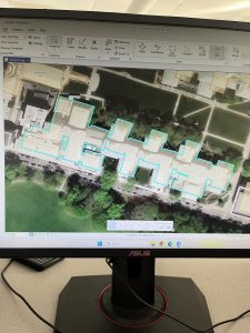
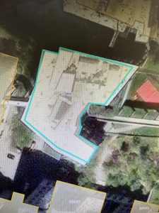
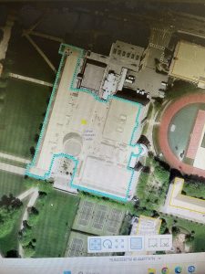
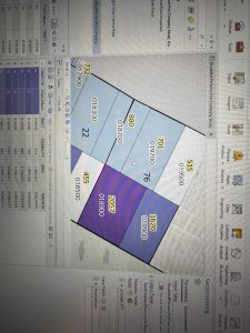
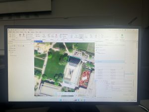
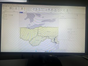
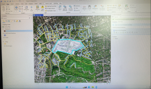
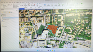
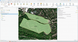
Chapter 7 was about digitizing, in which I learned how to edit, create, and delete polygon features, create and digitize point features, use cartography tools to smooth features, work with CAD drawings, and spatialy adjust features. I found it very interesting that 7-1 allowed us to edit polygon features on CMU’s campus buildings. I was able to rotate and move existing buildings into a layer, and add vertex points and split polygons to further edit them to match buildings on the world imagery basemap. I found this section to be very fun. I am still a little confused on vertex points and why they are important to use/what the purpose of them are. In 7-2 I was able to create and delete polygon features. I learned that campus planners need polygons of open parking lots for a permeable surface and transportation engineering study. This section was interesting as I was able to work with parking lots and bus stops.
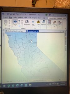
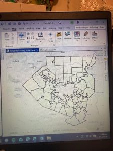
Section 7-3 was very straightfoward, where I learned about the smooth polygon tool, which is a useful tool to improve the aesthetic or cartorgraphic quality of polygons. I also learned that the features are digitized with just a few line segments and don’t match the true geography. Section 7-4 was the most difficult section, which was about transforming features. I learned about the importance of computer-aided design (CAD). CAD drawings and BIM models use Cartesian coordiantes (which I do not know what it is) and are not geographically referenced to geographic coordinate system, state plane, or Universal Transverse Mercator (UTM) coordinates (which I also do not know what this is). CAD drawings contain layers in one drawing and are color-coded according to the layer color assigned in the CAD drawinsgs. I did not know that you cannot edit CAD drawings directly, and in order to edit it, you have to export the drawing to a feature class after you georeference it to its approximate campus location- and this caused me to be stuck at first.
Chapter 8
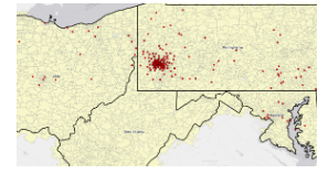
Chapter 8 was about geocoding, and I felt as if this was the hardest chapter we have done yet. I have not heard of geocoding prior to this, but I learned that geocoding is a GIS process that matches location fields in tabular data to corresponding fields in existing feature classes, such as TIGER/Line Streets, to map the tabular data. I also learned that a problem with geocoding is that soruce data suppliers and data entry workers can write or type anything they want for an address, including misspellings, abbreviations, omissions, and place-names instead of addresses. I would like to read more and research more about what fuzzy matches and fuzzy methods are- I have heard about this in research articles before and was not too sure what that means. I learned that an algorithim computes a Soundex key, which is a code assigned to names that sound alike, and identifies candidate matches of source and reference street adresses to account for spelling errors.
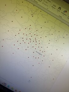
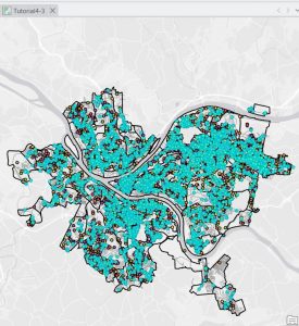
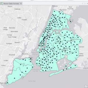
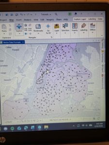
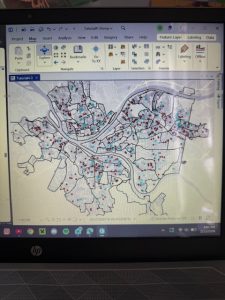
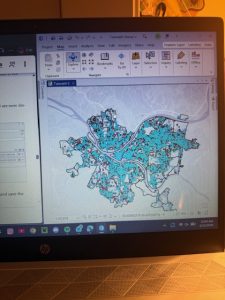
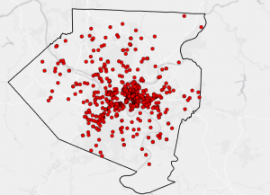
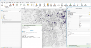
In 8-1 I geocoded survy data collected by a Pittsburgh arts organization that holds an event each year attended by persons across the country. I found the process of building a zip code locator to be difficult. I’m not too sure what I was doing wrong, but I had a lot of trouble on step 3, as I could not find the locators tab in the catalogs pane. I was alos able to geocode data by zip code. I know the book stated to not select ArcGIS World Geocoding Service or Esri World Geocoder for Address Locater, however I am very interested in these two software systems and what they entail. 8-2 was interesting as I was able to geocode street addresses. It was very interesting to geocode attendee data by street address and select minimum candidate and matching scores, as this has broader implications to public health initatives and outbreak response.
Chapter 9
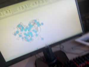
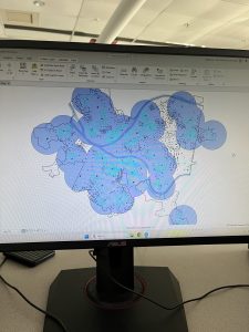
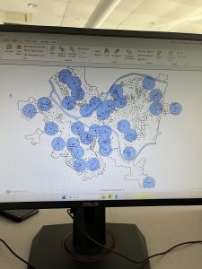
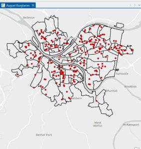
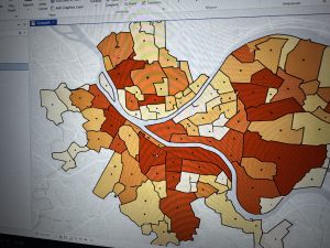
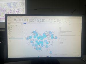
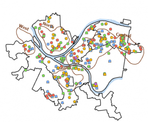
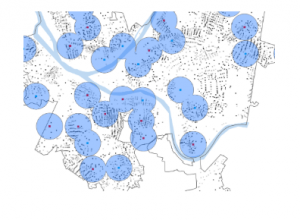
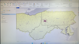
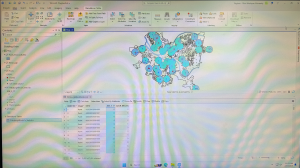
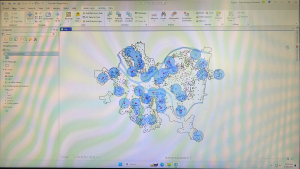
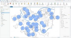
This chapter was about spatial analysis. I have heard this term being used in the first book we use, and in public health courses, but I have not known what the term means. I learned how to use buffers for proximity analysis. A buffer is a polygon surrounding map features of a feature class. I was able to run the pairwise buffer tool through buffering Pittsburgh’s 32 public pools to estimate the number of youths ages 5 to 17 that live close, within a half mile, of the nearest pool. I found 8-1 to be very straight-forward and easy to navigate. I also did do the “your turn” on page 216, which I also was found very easy to change the radius to increase buffer areas. Tutorial 9-2 was about using multiple-ring buffers. I learned that a multiple-ring buffer for a point looks like a bull’s-eye target, with a central circle and rings extending out.
Furthermore, 9-2 annlowed me to use spatial overaly to get statistics by buffer area. This calculates the percetnage of youths with excellent and good access with the limited number of pools open. I found this was very interesting as the information was already readily available, and it is cool to see the differences between various buffer areas. In tutorial 9-3, I was able to create multiplering service areas for calibrating a gravity model. It was interesting to use service areas to estimate a gravity model of geography that assumes the further apart two features are, the less attraction between them. I did enjoy making a scatterplot through ArcGIS Pro, as I can see myself utilizing this tool in the future.
 funny.