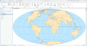
Chapter 1: Introducing GIS Analysis
Some of the main things I picked up from this chapter were what GIS analysis actually means (not just making maps, but using geographic data to look for patterns and relationships), and how geographic features are represented as points, lines, and areas for real-world things. This chapter also discusses discrete vs. continuous data: how businesses or roads exist in specific places, whereas things like temperature or elevation change gradually across space. The author also goes into vector and raster data models, which are basically two different ways GIS stores information (points/lines/polygons vs. grid cells), and why map projections and coordinate systems matter since you’re taking a round Earth and forcing it onto a flat map, and if layers don’t match, things won’t line up in a right way.
It was interesting to learn how all of this actually matters once you start doing GIS analysis instead of just reading definitions. This chapter makes it clear that GIS is about asking geographic questions and using spatial data to try to answer them, and even simple mapping counts as analysis because you are already organizing data and looking for patterns in them. I also didn’t really think about how much the results depend on your choices, like how you frame your question, what data you decide to use, and how you process it. The chapter kind of shows that GIS is not neutral, and small decisions can change what story the map ends up telling.
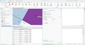
Another part that stood out to me was how data is stored and connected behind the scenes. The section on vector vs. raster explains why one might be better than the other, depending on what you are mapping and how raster cell size affects both detail and processing time. The part about projections and coordinate systems is also important, since if layers don’t match, your relationships and measurements can be off. The attributes show how maps are tied to tables, with things like categories, ranks, counts, and ratios (like density or percentages), and how you can use queries, calculations (like people per household), and summaries to actually get meaning out of the data.
One thing I realized is how easy it seems to accidentally get misleading results without even realizing it. Like when you combine layers from different sources, I wonder how often people mess up coordinate systems or projections and don’t notice, and how much that actually changes the conclusions they end up drawing from GIS analysis.
Chapter 2: Mapping Where Things Are
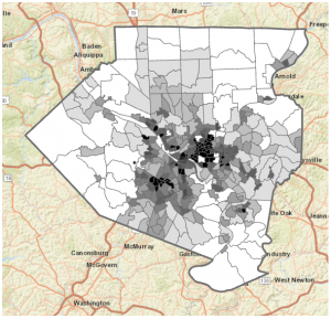
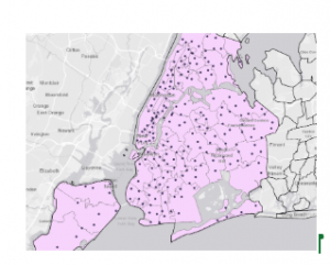
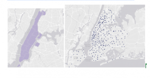
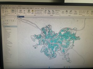
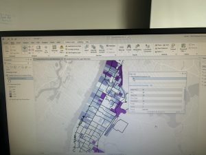
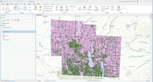
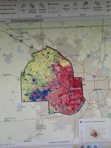
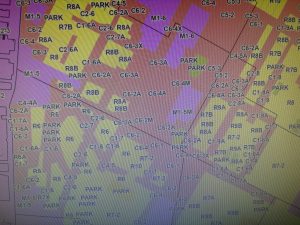
Some of the key concepts I learned from this chapter were how the way you classify and group categories on a map can completely change the patterns you end up noticing. If you use too many detailed categories, patterns can get lost, but if you group things too broadly, trends become clearer while some important details disappear. This chapter also shows how much symbols matter in mapping, especially how color, shape, and size affect what stands out to you first. Colors are usually easier to tell apart than shapes, and even small things like line width can show hierarchy, like making freeways stand out more than smaller roads. I also learned that basemaps and reference features are supposed to support what you are mapping, not compete with it, which is why simpler, lighter basemaps usually work better. Another idea that stuck with me was that patterns on maps can look clustered, uniform, or random, and that what you notice can change depending on the scale you are viewing the map at.
Something that stood out to me in this chapter was how much the design of a map shapes the story it ends up telling. The examples showing how the same zoning data can look totally different just by grouping categories differently make it obvious that maps are not neutral. If “rural residential” is grouped with agriculture, the map feels more rural, but if it’s grouped with residential areas, the same place suddenly looks more urban. How symbols guide your attention was another important thing. When there are too many colors or the basemap is too busy, it actually becomes harder to see patterns, while simpler symbols and lighter backgrounds make clusters along streets or intersections way easier to notice. The part about analyzing geographic patterns helped me try to describe what I see on maps, like paying attention to whether things look clustered, evenly spaced, or random, and then thinking about possible reasons for those patterns.}
It is interesting how easy it would be to influence how people interpret a map without even trying to. Just grouping categories differently or choosing certain colors can make an area look more urban, more rural, safer, or more crowded than it actually is, even though the data itself hasn’t changed. It makes one realize that making maps comes with a lot of responsibility, because small design choices can really change the story people get.
Chapter 3: Mapping the Most and Least
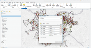
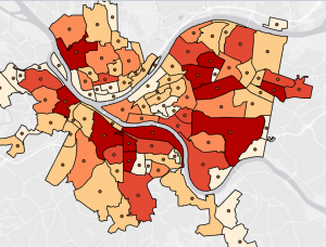
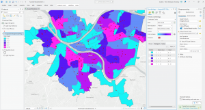
Some of the main ideas I learned from this chapter were different ways of showing quantities on maps, especially using ratios, ranks, and classified values instead of raw numbers so comparisons between places are more fair and actually mean something. The chapter also went into common classification schemes like natural breaks, quantile, equal interval, and standard deviation, which are just different ways of grouping data based on how the values are spread out. Another important idea was outliers, which are really high or really low values that can throw off how patterns look on a map. It also talks about different visualization methods like graduated symbols, graduated colors, charts, contours, and 3D views, and how each one shows patterns differently depending on what kind of data you are mapping. Another important thing was that the number of classes you choose, and how you set the class ranges, can change what patterns stand out even when the data itself hasn’t changed.
I also learned that your map can tell a different story with the same data based on how you pick between natural breaks, quantiles, equal intervals, or standard deviation. They all highlight different things. Natural breaks make more sense when values are clustered unevenly since they separate natural groupings, while quantiles are more about relative position, like showing who is in the top or bottom group even if the actual values are still close. Equal intervals could be easy to understand, especially for things like temperature or percentages, but they can hide variation when a lot of values fall into the same class. Standard deviation is more about how far values are from the average, which is helpful for seeing what is above or below “normal,” but it can also hide the actual values and be heavily affected by extreme cases.
Again, just how I learned from other chapters, it can be very easy to mislead people with a map without even meaning to, just because of small design choices.

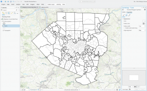
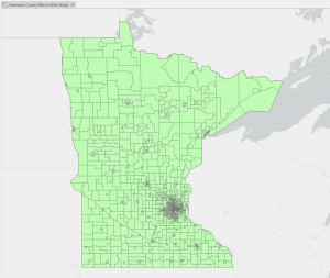
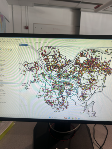
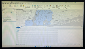
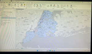
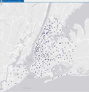 Chapter 6 was the easiest for me, I had no trouble getting through any of the tutorials and was able to understand the instructions well enough to complete the tutorials in a timely manner.