Chapter 4:
An accidental benefit of this chapter was becoming more familiar with my file explorer. I had to restart Tutorial 4-1 because I was struggling a bit to create filepaths, but I got the hang of it after a bit. This chapter also helped me get a lot better at working with attribute tables. It’s becoming more intuitive, and I’m beginning to sense patterns and use keyboard shortcuts. 🙂
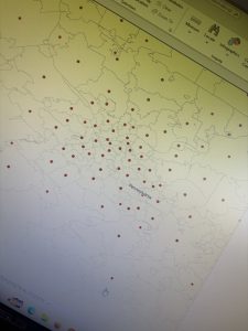
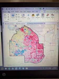
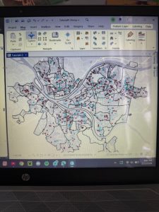
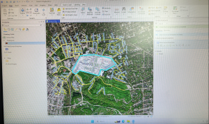
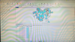
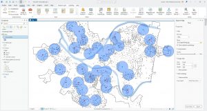
In Tutorial 4-5, I was intrigued by what the tutorial meant when it said we wanted to calculate central points instead of centroids. After doing a quick internet search, I realized that it is important for tracts of irregular shape. In some cases, the technical “centroid” of an irregular shape might fall outside of the boundaries of the shape. Therefore, opting to choose a “central point” that looks good visually is accurate enough for this map. I followed through with the central points method that the tutorial suggested, but out of curiosity I tested what would happen if I left these dots as centroids.
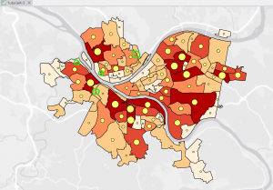
Figure 4.1: Graduated Symbols Map of Burglaries by Neighborhoods–as displayed by centroid points. Notice the dots circled in green are located on tract lines or in a completely different tract from the one they are representing. This is why we select the “Inside” option to display general, more visually intuitive central points.
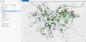
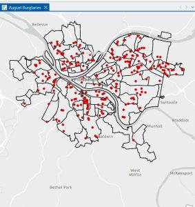
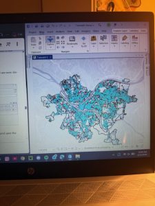
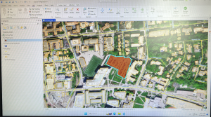
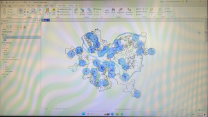
Figure 4.2: Pittsburgh Serious Crimes Summer 2015. I changed the symbol shape for each type of crime, which makes the map a bit more visually intuitive.
Personally, I think the map in Figure 4.2 still looks a little clunky. For the purpose of the tutorial and for noticing general trends it’s fine, but if I were to use this map to discuss trends, I might create sub-symbols (especially for Larceny-Theft crimes) or summarize the data with graduated colors or even numerical values.
Chapter 5:
I enjoyed the beginning of this chapter. As the tutorial walked me through how to import files to the geodatabase, navigate my file explorer, and convert files into various formats, I did ok.
The first few tutorials dealing with map and coordinate system projections were kinda boring. I understand why maintaining a consistent map projection is important, but to be honest, I felt like it was a lot of repetitive work to change projection status for every layer. On the county/regional level it’s not really necessary, but I did realize just how crucial this extra check is when looking at a national or global map.
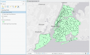
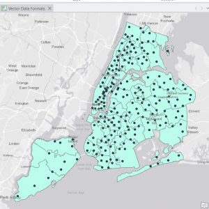
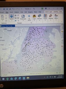
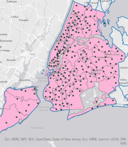
Figure 5.1: New York School Districts (light gray outline) and Libraries (green dots).
As the chapter went on, I began to have some trouble completing the tutorials. I guess all of the file downloading and transferring was not super intuitive to me. There were several times when I realized that I had completed a previous step incorrectly and had to retrace my steps. In particular, I had a bit of trouble figuring out the Add Join feature during Tutorial 5-5. I don’t think my join worked completely, because I could not transfer the tracts data correctly, so my choropleth maps were a little off. However, from looking at the maps in the tutorial, it appears that men bike to work around Minneapolis from a larger radius than women.
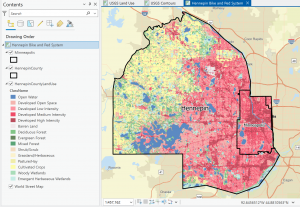
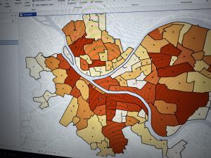
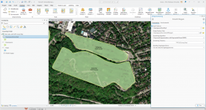
Figure 5.2: Hennepin County Land Use. I notice that the (south)eastern portion of the county is mostly developed land (because of the proximity to the city of Minneapolis) while the western portion of the county is more cropland and water.
I hope to further develop the skills that I began to learn in this chapter. I think being able to import my own data from websites like those used in the tutorials will be crucial to any personal work I might do with GIS.
Chapter 6:
Thankfully, this chapter *did* help me improve the skills that were troubling me last chapter. This section focused on geoprocessing, and I spent a lot of time working with merging, clipping, and uniting to analyze spatial data patterns. I’m getting a lot better at working with filepaths, and I’m anticipating patterns when it comes to determining input fields and other criteria while running tools. All of the processes I learned in this chapter seem super useful!
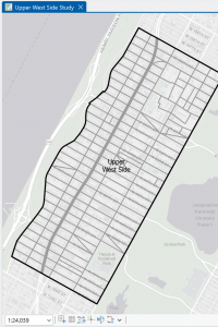
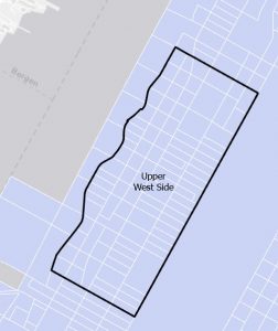
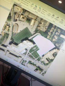
Figure 6.1: Manhattan Streets clipped to fit within the Upper West Side tract. The Clip tool seems super helpful with geoprocessing techniques when different layers don’t automatically coincide with each other.
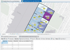
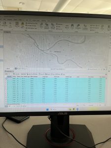
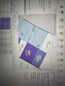
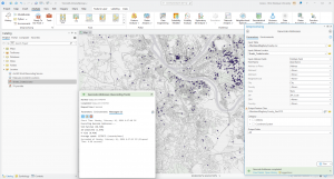
Figure 6.2: Upper West Side Manhattan Fire Company Service Areas (black outline) overlaid on Tracts (graduated colors). Yellow-highlighted numbers indicate the amount of disabled people in each tract, but because the tracts do not align with the fire company service polygons, more processing has to be done to determine the amount of disabled people in each tract.
As mentioned in the tutorial, the neighborhood tracts and areas each fire company serves do not line up perfectly. That means that some tracts will be split in terms of service, so just from looking at the map we cannot determine exactly how many disabled people are served by each fire company. However, by running Summary Statistics, I was able to determine this. The results are shown in the attribute table in Figure 6.2.

 funny.