Chapter 1
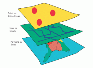
Chapter 1 helped me to better understand what GIS really is and what it’s supposed to do. I thought that GIS was pretty technical and computer-based, but I realized through reading Chapter 1 that GIS analysis really begins with thinking through a question. GIS is a system to store, manage, analyze, and display spatial data, but the value of GIS depends on how well the analyst frames the problem. The author, Mitchell, points to important concepts that include geographic features, attributes, and layers, and shows how they all contribute to answering a question. What I found interesting was that it’s not accidental or arbitrary to do a GIS analysis; you make a decision about what you want to find out and then use appropriate data to do it. I think I now see it as a process of reasoning rather than a technical process. I also appreciated that I could see how maps were used to make important decisions, including public policy, and that it really makes you think about your decisions, even small ones, that you make while working with your data. Reading this chapter really made me think about how important it is to be clear about what you want to do before you start to do it. It also made me realize the level of responsibility that comes with conducting GIS analysis, as the choices you make at the beginning can affect how other people will interpret a place or a pattern. It also made me ask questions such as: How do analysts ensure that they frame their questions correctly? How do they deal with incomplete data? How does uncertainty play a role when maps are being used to make decisions?
Chapter 2
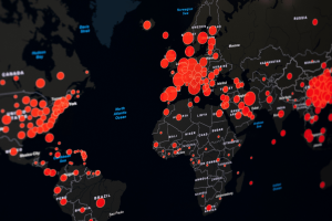
In Chapter 2, Mitchell discusses how before analyzing why something is happening, one should first understand where it is happening. He goes on to say that mapping locations is the first step in GIS analysis and helps one understand basic spatial patterns such as clustering, dispersion, and gaps. This may sound like a very basic concept, but as I read through this chapter and the rest of the book, I understand why this concept is important. Sometimes it can be difficult to understand patterns when using a table or list, but with a map, it can instantly become clear. Another important point that Mitchell makes is how scale affects a map. What may look significant at one scale may not look significant at another scale, and this shows how easy it is to come to a false conclusion when one does not think about scale. Another important point that was discussed in this chapter was how mapping involves making decisions about what to map and how to map it. This shows how mapping can sometimes be more interpretive than I initially thought. I found this to be interesting because sometimes when one looks at a map, it seems to be a very factual piece of work, but with this reading, I can see how it involves interpretation just as any other type of analysis does. This chapter has made me think about how mapping can sometimes mislead people unintentionally if one does not make these decisions carefully enough. Some questions that I had while reading this chapter were: What is the right way to go about choosing a scale when mapping? What is the right way to go about choosing a classification method to avoid misleading patterns?
Chapter 3
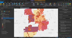
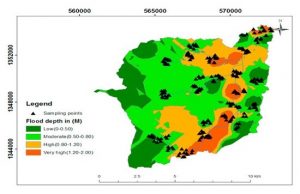
Chapter 3 introduces the reader to the importance of mapping quantities in providing more depth in the analysis, rather than just the location of the data. Mitchell introduces the reader to the difference between mapping totals and mapping ratios or density. It was clear that the importance of normalization cannot be overstated, especially when dealing with data that is not normalized. A larger area is likely to have higher totals despite the density being low. Another important aspect of mapping quantities that the author introduces is the different ways in which data is classified. I found the chapter interesting in that the author shows the reader that the choice of classification is likely to affect the general look of the map. Another important aspect that the author introduces is the issue of dealing with outliers. In some cases, the outlier is likely to distort the map if not handled with care. This reminded me that the importance of understanding the data cannot be overstated before mapping the data. The author also introduces the reader to the importance of density mapping in highlighting the data. In my view, this chapter reminded me that mapping quantities is a powerful tool that requires careful consideration in order to avoid misinterpretation. After going through this chapter, I had some questions in my mind. When is the use of totals more important compared to the use of ratios? How does one deal with the issue of outliers in classification? How does density mapping affect the interpretation of the data?