Author: zmpois
Pois Week 5
Same issue as before. Its not allowing me to insert my map photos properly, its either not there or incredibly blurry, so I have just included a pdf of the document I was working on for this content.
Pois Week 4
Its not allowing me to insert my map photos properly, its either not there or incredibly blurry, so I have just included a pdf of the document I was working on for this content.
Pois Week 3
Chapter 4:
In Chapter 4, the author focuses predominantly on mapping density and how to interpret the maps. There are two methods of displaying density. You can show the density for each area graphically using a dot density map, or you can calculate a density value for each area and shade each based on this value. You can also display a density surface using either graduated colors or contours.
The cell size determines how coarse or fine the patterns will appear. The smaller the cell size, the smoother the surface.
Calculating cell size: Convert density units to cell units, then divide by the number of cells, and then take the square root to get the cell size (one side)
Natural breaks: Class ranges are based on groupings of data values.
Quantile: Each class has the same number of cells in it.
Equal interval: The difference between the high and low values is the same for each class
Standard deviation: The classes are defined by a number of standard deviations from the mean of all values in the layer.
Chapter 5:
Discrete features: Unique, identifiable features. You can list or count them or summarize a numeric attribute associated with them. They are either locations, such as student addresses, crimes, or eagle nests; linear features, such as streams, pipelines, or roads; or discrete areas, such as parcels.
Continuous features: Represent seamless geographic phenomena and include things like spatially continuous categories or classes, such as vegetation type or elevation range.
Three ways of finding what is inside:
Drawing areas and features -You create a map showing the boundary of the area and the features. You can then see which features are inside and outside the area.
Selecting features inside the area – You specify the area and the layer containing the features, and the GIS selects a subset of the features inside the area.
Overlaying the areas and features: The GIS combines the area and the features to create a new layer with the attributes of both or compares the two layers to calculate summary statistics for each area on the fly.
Chapter 6
Using GIS, you can find out what’s occurring within a set distance of a feature. To find what’s nearby, you can either measure a straight-line distance, measure distance or cost over a network, or measure cost over a surface. This will help you decide which method to use.
After identifying which features are near, there are three methods for gathering your information:
List – An example of a list is the parcel-ID and address of each lot within 300 feet of a road repair project.
Count – The count can be a total or a count by category.
Summary statistic – a total amount, such as the number of acres of land within a stream buffer, or an amount by category, such as the number of acres of each land cover type (forest, meadow, and so on) within a stream buffer
Three ways of finding what is nearby:
Straight line distance – specify the source feature and the distance, and the GIS finds the area or the surrounding features within the distance. Use straight-line distance if you’re defining an area of influence or want a quick estimate of travel range.
Distance or cost over a network – specify the source locations and a distance or travel cost along each linear feature. Use cost or distance over a network if you’re measuring travel over a fixed infrastructure to or from a source.
Cost over a surface – specify the location of the source features and a travel cost. Use cost over a surface if you’re measuring overland travel.
Pois Week 2
Chapter 1: GIS itself is the process of looking at geographical patterns in your data and at the relationship between the features within said data.
Start by framing your question: This can typically start off as a question, and being as specific as possible about the question you are asking will help with deciding the best method to approach it with. Understanding your data can also aid in making things more clear and narrowing down what method you should use. Finish by looking at your results and deciding if the data is relevant/useful, or if you should use a different approach.
There are multiple kinds of features in GIS: For discrete locations and lines, the actual location can be pinpointed, and the feature is either present or not. Continuous phenomena like precipitation can be found or measured anywhere. Summarized data represent the counts or density of individual features within area boundaries.
Vector and Raster: With the vector model, each feature is a row in a table, and feature shapes are defined by x, and y locations in space. With the raster model, features are represented as a matrix of cells in continuous space.
Types of attribute styles: Categories, ranks, counts, amounts, ratios
The only thing I worry about from this chapter is coming up with my own question. There are so many different topics with so many different subtopics, and the possibilities are so open that it’s almost overwhelming.
Chapter 2: Prepping your data involves ensuring that the features you are mapping have geographic coordinates assigned and have a category attribute with a value for each feature. If you are bringing data from another program or entering it by hand, the features will need to have location information like a street address or latitude-longitude, and GIS will assign the coordinates.
To make your own map, you’ll tell GIS which features you want to display and what symbols to use to draw them. Mapping a single type involves drawing all features with the same symbol, while mapping by category involves using a different symbol for each category. If you use the method with multiple categories, you shouldn’t use more than seven categories, otherwise, you will have to group categories.
Along with symbols, text labels can also be used to help distinguish categories (e.g. OW = Open water)
Chapter 3: This chapter continues to discuss different methods of displaying data, as well as how they should be understood. It seems like the best method for display varies between the project and what its purpose is.
Natural breaks: Data is not evenly distributed
Quartile: Data is evenly distributed
Proportion: part of the whole
Rank: high, medium, low
Density: concentration of data/feature
I found all three chapters helpful in terms of explaining the basics of GIS. There are pictures to illustrate every point that is made, which is super helpful for me, as I have always needed some kind of visual or example to understand any concept.
Pois Week 1
1. Hi! My name is Zoie Pois; I am a senior double majoring in Zoology and Environmental Science with a Psychology minor. I am from Louisville, Kentucky, and attended a middle school similar to a Montessori school that focused heavily on nature and art, so I have been protective of nature for as long as I can remember. I enjoy being out in nature, doing crafts/art, listening to music, and hanging out with my close friends. I am unsure what I want to do after graduation, but I hope that it will revolve around nature and animals in some capacity, which are two things I am very passionate about. The picture of me for my introduction is refusing to act right, so we’ll see if it decides to show up when I post.

2. I have previously worked a tiny bit with GIS, but I am coming into this class with minimal knowledge about it. It was fascinating to read about the uses of GIS in areas that I did know it could even be used in. I had assumed that it could only be used predominantly for geographical and solar purposes. Now I know that it can be used in things that range from infectious diseases to Starbucks. I appreciated the author’s distinction between mapping and spatial analysis by explaining that spatial analysis generates more information or knowledge than can be gathered from maps or data alone, In contrast, mapping is unable to create more data/knowledge than what is already given. It was also interesting to read about Dr. John Snow and the cholera outbreak and how it is linked to a trend in science towards using visual displays to understand patterns. I am personally a person who relies pretty heavily on visuals to understand concepts fully, so I am glad that this trend continued to gain more popularity. After reading, I wondered what else GIS can be used for and how there is a vast amount of information that I was previously unaware of.
3. I am doing an internship with Watson Acres Flower Farm this semester, so I wanted to look at GIS information in relation to pollinators and maybe even pollen itself. One study I found talked about the interaction of lovebugs (Plecia nearctica) and honey bees. Some studies have suggested that honey bees will not visit flowers that have lovebugs on them, and since the distribution of lovebug populations has the potential to change due to the warming climate, the usual pollination pattern of species like honey bees could be disrupted. Using GIS, the authors tracked what areas would remain suitable for lovebugs and how those areas are likely to increase in the future.
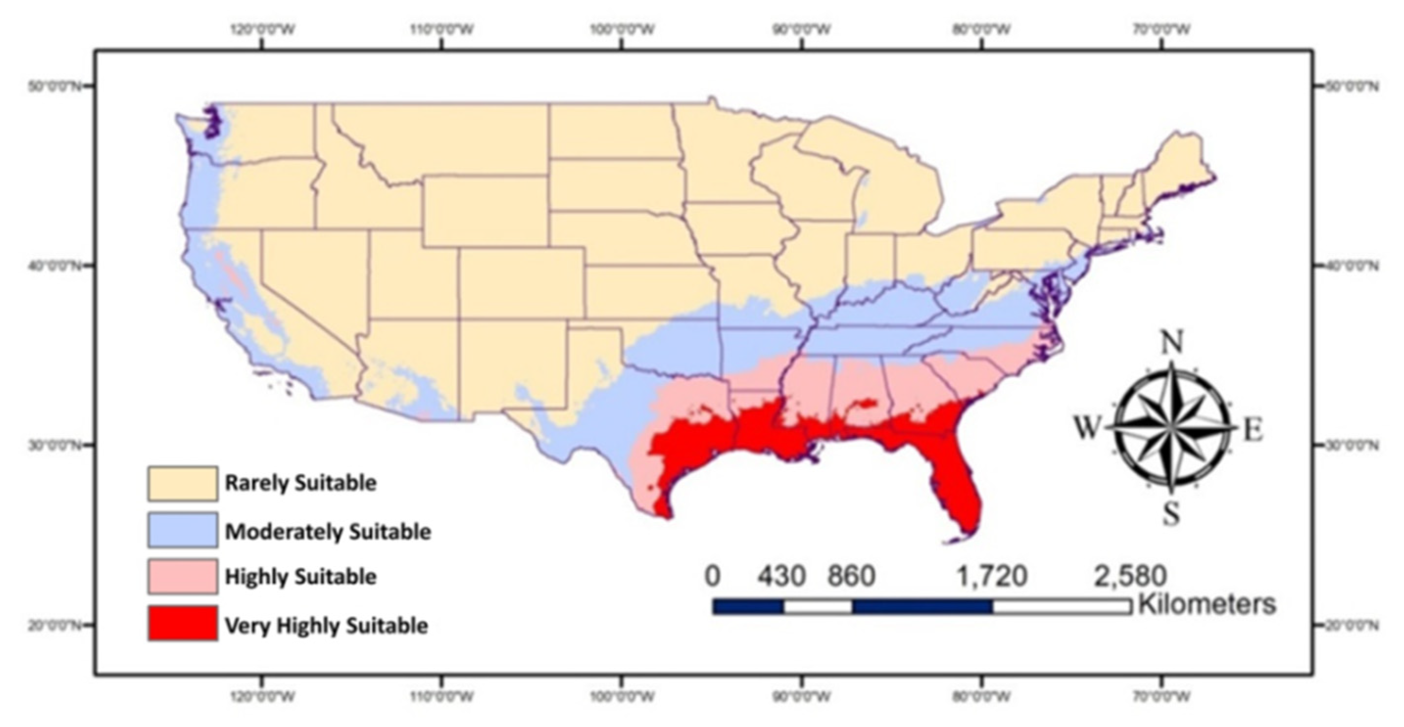
Map showing historic/current habitat suitable for Plecia nearctica in the USA.
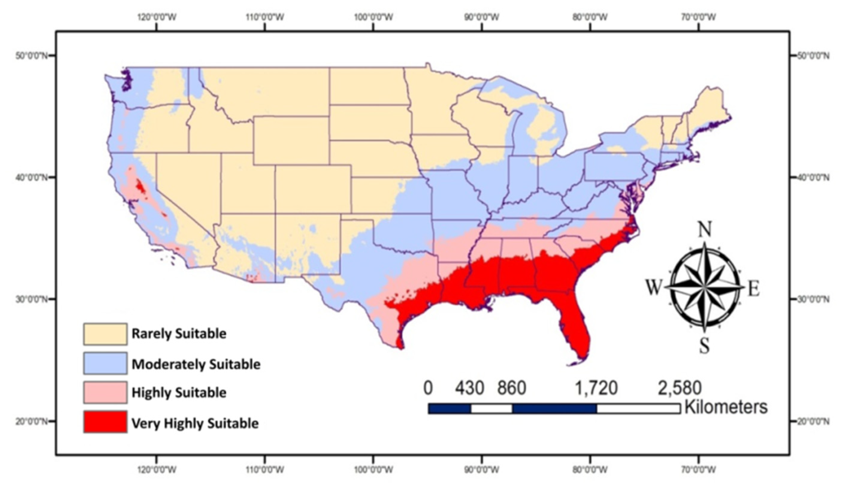
Map showing future habitat suitable for Plecia nearctica in the USA during 2050.
I also looked into a study that took an infrastructural method of pollinators to strategize urban planning for pollinators by pinpointing hotspots and pinch points. The higher the HSI value (darker areas), the more suitable the 100 m cell is predicted to be for this species group.

Abou-Shaara, H. F., Amiri, E., & Parys, K. A. (2022). Tracking the effects of climate change on the distribution of Plecia nearctica (Diptera, Bibionidae) in the USA using MaxEnt and GIS. Diversity, 14(8), 690.
Bellamy, C. C., van der Jagt, A. P., Barbour, S., Smith, M., & Moseley, D. (2017). A spatial framework for targeting urban planning for pollinators and people with local stakeholders: a route to healthy, blossoming communities?. Environmental Research, 158, 255-268.