Crane Week 5

I would like to start this blog post by damning every tool within the GIS application. Throughout the entirety of part 2 anything with and output and a run button did not work because the tutorials are ‘read only.’

Starting about half way through chapter 5 just about every tutorial is about a specific tool, which eventually broke by he end. Most of them were straightforward enough to make plenty of sense even if the result I got was an error, but a few of the outputs that couldn’t be created in the read only folders and couldn’t be saved anywhere else did break whole tutorials later on.

Chapter 6 was a whole hullabaloo of issues considering that everything was some sort of exporting or changing of the base files that GIS didn’t want to happen. I think I have the general idea of what many of the tool do though.

In chapter 7 I encountered a different issue that I have probably looked for a solution for more than working on learning how to use the tools. For some reason no matter what I do after I select anything from the Tools section of the Edit tab I could not select any polygons to work on. Eventually I figured out that if I just opened the tool then went back to selecting normally I could select polygons to use with the tool, but then it just gave me more accessibility errors and I had to throw in the towel.

I don’t have much to say or share about chapter 8 because I couldn’t get past any of the steps and just had to pretend like they were happening to get through it.

Crane Week 4

Finally using the ArcGIS application simply could not be exaggerated as a breath of fresh air. Apart from a couple of instructions that didn’t work exactly as instructed, the process of getting through there first three chapters was a really fun and far more understandable than some of the reading from previous weeks. The first and biggest thing that surprised me when I first started using the app is how similar it is to other data organizing and creation software like Microsoft Word or Google Sheets.

Everything at first was obviously very confusing and overwhelming to look at, but as I progressed through the tutorial finding all of the different buttons and options quickly started to become natural to me. One of my favorite functions of the app in how easy it is to organize multiple pages of information in a very small space. The right tool bar area makes it super easy to organize all your different windows and conveniently stores them in a row on the bottom of your screen for easy selection between them. This made the few moments here and there where I was jumping from window to window trying to find the button I hadn’t heard of before a lot less stressful that it could have been by a long shot.

Some of the negatives that I’ve gathered from this so far have been the amount of options that there are. I can see it being very easy to completely confuse one tool for another or to find myself looking in the wrong properties tab for an option that’s really similar to another and in a similar looking window. However, I am excited to learn more as I think the more I use and understand the app that I will be able to accurately and efficiently differentiate between all of the different options you have at your disposal. One part that really did kinda confuse me and make me feel off track was some of the online stuff in the third chapter, it wasn’t super hard, just annoying having to navigate both the internet and ArcGIS. I hope the other half of this course feels more simple.

Crane Week 3

Chapter 4

The first thing that really grabbed my interest when reading this chapter is how the mapping of density looks visually. That might sound kinda dumb cause that is the whole point of GIS, but I believe that the gradient looking mapping of density plays exceptionally well, at least to my, towards our sense of what the data represents. I find it quite easy to interpret the difference between the darkly shaded areas of density compared to the lighter shaded areas that surround it, representing less density. To contrast this though, I’m not the biggest fan of how the use of dots to represent density appear on maps. In the section about dots it shows a map before and after using them for density and to be honest the one that JUST represented each individual business was far easier to read. Funnily, the dot system (not for density) seems to be very helpful to be but beside and used with a density surface map, showing the finder details of whatever data you’re projecting.  Within all of this and the idea of density I feel like I’m reading a lot about computer calculations and stuff which is confusing, just really wondering how much of this stuff I only kind of understand needs to be known well. I know I’ve absolutely said this before a few times in my last journal, but there is definitely a disconnect between me and the specific knowledge that I need to be gaining in order to complete this course when we go to the Application. I will note though that I’ve just heard that part week 5 is hard and I’m probably overthinking the severity of this little issue.

Chapter 5

(What I’m writing here was wrote before I finished the chapter, but isn’t this kind of just everything overexplained. Like if there was nothing inside your map it just wouldn’t be there.) I hate to go back to the old classic immediately, but this chapter feels like it’s not really conveying any new information to me without using GIS along with it to see what its talking about. Like it still feels weirdly obvious that you should be able to locate and see specific data in a specific area, I just still don’t exactly know how to do that myself. It feels like someone is trying to teach me how to shoot a basketball, but he wont show me how to do it and just tells me all the ways to do it right. Yes, that is helpful, but at least for me it would be a lot better to actually see and work on the shot.

Chapter 6

From what I understand this is just chapter 5 but about what surrounds specific things on the map instead of what specific things surround this are of the map. At this point in the reading I’m struggling very hard to figure out how to write more about any of this. I’m very much so at a point where there has been so many things that only kind of make sense to me piled up that its all kind of not making sense. However its weird because it’s also almost impossible to not understand it because a lot of what I am reading feels like its just saying the same basic idea of “you can see how far this is away from that” over and over again in slightly different ways. Like I know that I’ve read literally hundreds of pages about this, but the more I read the less it feels like I’m reading anything. I’m sorry if I may be being kinda picky about the reading or whatever, but I seriously don’t know how to write about any of this anymore. I’m at a point where it feels like there isn’t any more starter information to soak up through this book and that I am only getting more confused by the repetition of almost identical ideas. I know that especially for these last two chapters I really didn’t write much, but I cant figure out how to keep writing it. Big props to Andy Mitchel for being able to write all that!

Crane Week 2

Chapter 1

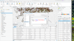
This first chapter gave me a very similar vibe to that of the first reading we were assigned. It very much had an intro style intended to introduce new GIS’ers such as ourselves to key ideas, such as understanding the basics of data tables and different identifiers on a GIS map.  To be honest, as much as I’m “understanding” the concepts that this chapter discusses, I’m definitely feeling some weird gap between hearing and seeing. By this I am meaning that without seeing more active examples its a bit harder to interpret the exact usage of any given features or attributes. However, despite my confusion I am seeing how when diving into the GIS application these concepts may come easier since I’ve already seen them. One notable thing that started to make me think this way is the difference between raster models and vector models. I think I sorta understand the general idea of what separates the two, but without using it and having to deal with the actual software I feel like I’m missing some pieces of the puzzle. Another good example would be continuous and discrete features, once again giving me a good general idea, but leaving a few foggy spots in my head. I think what I really took from this chapter is the mindset for acquiring the data needed to be able to make a map in the first place. It really sent it home for me that without data this whole application and process can be kinda useless.

Chapter 2

This chapter really drove home the idea of GIS being a tool for optimal human visualization. Pretty much everything talked about in this chapter at some point mentioned the way in which what is being map is going to be interpreted by another human being. When it comes to roads on a map it is important to have some sort of distinction between the different types of roads in a way that is easily perceivable among the other layers you’ve implemented. This specific example does not always apply though, the information that you want your map to have on it heavily depends on the audience that you intend to see and use the map. With the road example it would be very convenient for an urban planner to have all the roads on a map categorized in order to properly plan around them, but if your map is made to help tourists navigate some sort of park the addition of road categorization may take away from the information they need to not get eaten in the woods. It is important to be able to find the correct amount of information to feed into your map depending on what your are trying to convey and the space that you physically have to apply categories and coordinates to. If you do not have enough information layered on your map it could become very easy for the user  to be unable to locate the information they need. It is also equally easy to include too many categories to your map making it far too hard for anyone to reasonably navigate and use it. It is imperative to apply the correct data, and correct amount of the correct data to your map to make it legible.

Chapter 3

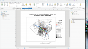
I’m immediately having issues figuring out how to properly write 300’ish words for this chapter, its about putting numbers on a map. However, I see the importance and value that goes along with knowing more about the process and ways that numbers can be visually interpreted through a map. One of the biggest factors relating to displaying numbers in your map is the generalization of those numbers. It is possible to be very specific with your data or generalistic and still properly convey the information. Within this idea of trying not to overcomplicate or undersell the information that your are mapping we can use similar ideas to that of the past chapters and integrate more systems of categorization. Using what are referred to as classes it can be easy to solve the problems surrounding the possible comprehension of your work. Further, there are even more labels for identification within the class system that can be used to organize, such as Natural Breaks or Equal Interval. At this point I can say that my mind is confidently jumbled with all of this information. Once again I think I’m understanding the descriptions and ideas being displayed to me, but without using the program yet I’m still kind of unsure how to properly implement all of these tools. The chapter moves on to talk about Graduated Symbols and Colors and I cant entirely tell if they are supposed to be within the class system or not, same for the charts. From this whole book I’m seeing the importance of organization and keeping things legible, but its hard to separate all of the different tools and situations I’ve been learning about without trying to use them. A lot of these ideas are blending together in my brain as all of them are just different ways of categorizing and organizing information to make it an interpretable as possible for the intended viewer. For example I understand the difference between Charts and Classes, but I doubt I could figure out how to use them in GIS. I may be thinking about this a but too deep for the time being though, I assume the class will dive deeper into the actual application of these ideas in the future, but I still feel some sense of confusion for sure.

Crane Week 1

My name is Zachary Kyan Crane, going by Kyan, and I am currently an Environmental Studies major. I am from a small town on the West Virginia side of the Ohio River named New Martinsville (about 45 minutes to an hour South of Wheeling). I’m a big fan of skateboarding/snowboarding (bad at both though), biking, and just about anything you can waste your time doing on a tv/pc.

If I was asked to create a new slogan for GIS it would go along the lines of “Seeing is Believing.”  In my opinion from what I gained from the chapter, GIS is a tool used to streamline and organize geographical data through visual imagery. It is clear that the way that any data is visually represented for the human brain to comprehend is imperative for any kind of planning or organization. I can totally see myself struggling to understand data points on a representing graph more than a comprehensive map. Within this humanization is the incredibly important need to organize a large amount of different points of data into one maneuverable format. I’m actually pretty excited to see all the different layers that a map can have and all the different variables that can be brought into one space. However, there is a need to recognize that this is not the end all of mapping and that GIS is more of an organization tool than a computing tool. I understand that for anyone using GIS it is still important to be able to actually understand the data being visualized so that I can be added upon, changed, or used for a project of some sort. One thing about all this that I felt seemed somewhat given were all of the different uses of GIS. It makes a lot of sense to me that many different projects and jobs use this technology to plan and understand the land that they are working on. It is incredibly important to understand the setting of whatever is about to happen.

One of the first things that came to mind for something that uses or is similar to GIS is a video game called Cities: Skylines. Its just a game where you build a city, but there is a complex info panel that shows you everything from mineral deposits to the happiness of your citizens. The 20+ overlays that can be accessed are all needed to sufficiently run your city.

https://www.esri.com/about/newsroom/arcnews/arcgis-urban-transforms-city-planning/

This is what this kind of thing looks like for real life applications in urban planning. Another good application that can relate back to urban planning is how to engineer the structures that have been assigned somewhere to be built.

https://www.esri.com/en-us/industries/aec/business-areas/design-engineering