Buco, Week 3

Chapter 4

Key concepts and definitions:

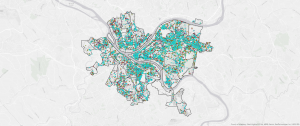
Map Density: Shows you where the highest focus of a feature is.

Dot map: Is one of the ways you can graphically map density.

Comments/Notes:

Map density is very important because you can not only see concentrations of the features, but you can also see those features within a uniform aerial unit like hectares or square miles. An example of how you can use map density is that a crime analyst might use it to see burglaries that occur over a year, per square mile, to compare different parts of that city.

When making a map, you should think about the features you are mapping and the information you need from this map; this will help you decide what method you should use.

You can also map density graphically, using something called a dot map, or calculate a density value for each area.

To be able to calculate a density value for each area, you divide the total number of features, or the total value of features, by the area of the polygon. Then each area is shaded based on its density value.

The areas you choose to map may affect the patterns. For example, the density displayed when mapped by census tract may appear quite different from the density shown when mapped by county.

When making a dot map, you often display the dots based on smaller areas but draw the boundaries of larger areas. That way, the boundaries would not obscure the dots.

When looking at the results, the patterns on your map partially rely on how you made the density surface.


Questions:

When did people first discover map density for GIS?

Chapter 5

Key concepts and definitions:

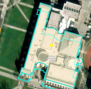
Single area: Finding what is inside a single area lets you monitor activity or summarize information about the area. Some examples of single areas are a service area around a central facility, such as a library district, or a fire response area.

Discrete features: They are unique, identifiable features. You can list them or count them or summarize a numeric attribute that relates with them.

Continuous features: They represent a seamless geographic phenomenon. With this you can find out how much of a category and how much is in that category or class occurs in each of the areas. Some examples of continuous features are the amount of each vegetation type in each of the watersheds.

Frequency: It is the number of features with a given value, or within a range of values, inside the area, displayed as a table.

Comments/Notes:

It is important to map what is inside because it is important to monitor what is happening inside, to be able to compare several areas based on what is inside each one. To find what is inside, you can draw an area boundary on top of the features, use an area boundary to select the features inside and list or summarize them, or you can combine the area boundary and features to create summary data.

If you need a list or count of features, you will want to include those that are mostly within the boundary.

Questions:

Are there limitations to how deep/far this map can go, and if so, what are they?


Chapter 6

Key concepts and definitions:

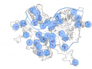
Distance: Is one of the ways of defining and measuring how close something is.

A summary statistic, such as an average, minimum, maximum, or standard deviation. An example is the mean square footage of buildings within three minutes of each fire station.

Straight line distance: This is when you specify the source feature and the distance, and the GIS finds the area or surrounding features within a certain distance.


Comments/Notes:

When you are using GIS, you are able to find out what is happening within a certain distance from a feature. To find out what is around you, you can measure straight-line distance, measure distance or cost over a network, or measure cost over a surface. Deciding on how to measure how nearby a feature is and what information you need from an analysis will help you make a decision on which method to use.


A summary statistic can be many things, some of which are: A total amount, such as the number of acres of land within a stream buffer. An amount by category, such as the number of acres of each land type. Examples are forests, meadows, etc.

To create a buffer, you need to specify the source feature and the buffer distance.

A geometric network is made up of edges, junctions, and turns.

There are two ways to make a boundary: you can manually draw a line around the selected segments, or you can have the GIS make the boundary.

Questions:

How long or wide can the buffer distance be?

Buco, Week2

Chapter 1 

Comments/Notes

Since the time Esri Press first published the book in 1999, GIS has become more popular. There have been major advances in GIS software, like incorporating intuitive interfaces as well as more advanced mapping and analytical tools. Some of the most common geographic analysis tasks people do while doing their jobs are mapping where things are. One common task involves mapping the locations of the most and least common objects. Mapping the density. Finding what’s inside and nearby. Mapping changes.  GIS analysis is a process for looking at the geographic patterns in the data you collect and at the relationships between features. To do this, you start by framing the question, and an example of this is, “How many people moved to Delaware, Ohio, in the past 5 years?” Some factors that influence the data are how it will be used and who will use it. When working with GIS, the type of data and features you are working with will help determine what method you will use. When collecting data, there are almost always two or three ways that you can collect the data. Some of the types of features that you can see on GIS are discrete features, continuous phenomena, and features summarized by area. Discrete features are when the actual location can be pinpointed. At any given spot, whether you can see the feature or not. Continuous phenomena like precipitation or temperature can be found or measured anywhere. Features summarized by area represent the counts of individual features within a certain area’s boundaries. There are two ways that the GIS can be represented: vector and raster. Vector is when each feature is in a row or table, and feature shapes are defined by x,y locations in space. Raster is when features are represented as closed polygons. There are types of attribute values: categories, ranks, counts, amounts, and ratios. 

Questions:

How did spatial data scientists discover that GIS can be used for much more than building geodatabases and making maps?


Chapter 2

Comments/Notes:

People use maps to see where and what an individual’s feature is located. When looking at the map, you can see the distribution of features on the map. Rather than at individual features, you can see different patterns that can help you better understand the area you are mapping. Mapping is important because mapping where certain things are can allow you to see where you need to take action or different areas that meet your criteria. Also, by looking at the different location features, you can begin to explore causes for the patterns you are seeing. Before you create the map, you need to make sure the features you are mapping have geographical coordinates assigned and optionally have a category attribute with a value for each feature. When assigning location, you need to make sure each feature has a location in the geographic location. When assigning category values, you need to make sure that each feature has a code that can identify its type. Many categories are hierarchical, with major types divided into subtypes. The GIS stores the location of each feature as a pair of geographic coordinates or a certain set of coordinate pairs that define its shape, like a line or area. When you make a map, the GIS uses the coordinates you input to draw the features using symbols you specify. Most of the time, mapping a subset is more commonly done for individual locations. When you are mapping an area that is large relative to the size of the features, using more than categories can make patterns harder to see. But when smaller areas are mapped, individual features are easier to see, so more categories will also be easier to see. 

Questions:

When you are making maps or looking at a map, can you overlay two maps of similar areas to compare them both if made by two different people?


Chapter 3 

Comments/Notes:

When mapping, people map the most and least because it is to find places that meet their criteria and take action, or it is to see the relationships between the different places. To be able to map the most and the least, you need to map features based on a quantity associated with each other. Mapping features based on the quantities adds an additional level of information that is beyond simply mapping the locations of features. When mapping, you need to know the type of features you are mapping as well as the purpose of your map, which will help you decide how best to present the quantities to see the patterns on your map. When mapping discrete features, they can be individual locations, linear features, or areas. Locations and linear features are most likely to be represented with graduated symbols, while areas are often shaded to represent quantities. Continuous phenomena can be defined as areas or surfaces of continuous values. Areas are often displayed using graduated colors, while surfaces are displayed using graduated colors, contours, or a 3D perspective view. Data summaries by area are usually displayed by shading each area based on its value or using charts to show the amount of each category in each of the areas. Once you have decided on how to classify the data values of your map, you will want to create a map that presents the information you have found to the map readers as easily or clearly as possible. Since GIS makes it easy to create maps and the database often has so much information, the temptation is to show more information than you actually need on your map. 

Questions:

N/A

Buco, week 1


Hello, I am Sophie Buco, and I am a 2nd-year student, and I am majoring in zoology and environmental science. I also did the reading and quiz.

This first reading discusses how we use GIS in our everyday life even if we do not know it. Also the history about GIS, how it went from analog to computers. Some of the history includes how the GIS required massive physical and human resources to run. It also discusses how spatial analysis is different from mapping because it generates more knowledge and information. Mapping, though, shows geological data in visual forms. Even though the GIS was helpful when it first came out, it still was only recognized by a few people even with the analysis capabilities. This technology was generally referred to as “computerized cartography.” Because of this, GIS made a very unfortunate showing. The use of the GIS was not only in computers; it was used in coding for the census in the United States in 1890. These are only a few things about the GIS system that were talked about in this reading.

One interesting use I found for the GIS application is the behavior of sharks and how they interact with the environment around them. The reason I find this interesting is that I like to learn about how different shark species interact with the living organisms around them. Like how some sharks let certain fish stay with them to eat certain organisms off of them. The reason why GIS is so important to this is that it allows scientists to track the sharks. That allows them to learn about migration habits, feeding habits, environmental correlations, vulnerability and conservation, and so much more. (“Gemini”). Another source also says that sharks are important because they allow humans to learn about the climate and health of our oceans (Nicolas).

“Gemini.” Gemini, 2024, gemini.google.com/app/27e80cc53ef0061b. Accessed 22 Aug. 2025.

Nicolas, Alexander. “Sharks Are Key to the Health of Our Oceans and Climate | Stories | WWF.” World Wildlife Fund, www.worldwildlife.org/stories/sharks-are-key-to-the-health-of-our-oceans-and-climate.