Baer Week 4

Chapter 1

This chapter went really well. I felt really cool making it. Everything was straightforward and I had no issues. It’s surprising to me how much really goes into these maps.

Chapter 2

Similar to chapter 1, I had no issues. The mapping was really fun and cool. The slider tool was really fun to play around with too. Some of the features that the book refers to are either labeled differently or in a different place, but I eventually found it.

Chapter 3

This is where I ran into some issues. ArcPro would not let me do online sharing, so i was unable to complete some of what was need for 3.1 –>3.4. However, making the layout was really interesting as wells as the bar graph.

Baer Week 3

Chapter 4

This chapter was all about mapping density. Mapping density can show different levels of concentration for specific features. This allows you to easily identify patterns in the data. You can use it for things like census maps and robberies per square mile. You can use GIS to map the density of certain points or lines. Both of these usually appear with some sort of density surface. You can map the amount of occurrences of a feature in a defined area or the values of said feature. You can create density maps based on features in two main ways; summarized by defined area or by creating a density surface. The first one is by defined area. This is a more graphical way of mapping density. You can use a dot map. These typically represent the density of individual locations. On a dot map, the closer the dots, the higher density for that feature in that specific location. To calculate a density value for each area, you divide the total number of features, or total value of the features, by the area of the polygon. The second method is by density surface. This is usually created in the GIS as a raster layer. Each area is assigned a density value based on the number of features with a radius of the area. This mode does take more effort but it provides a lot more detail than the former. Maps of this kind can show locations of features and continuous phenomena. To me personally. I think I like the sending area better. To me it just creates a better and easier to understand map. The cell size of either of these maps will determine the way the patterns. This is the one bad thing about these maps, if your cell size is wrong then you might see different patterns. It kind of reminds me of gerrymandering in a way. To find the cell size, convert the density units to cell units, divide by the cells and then take the square root to get the cell size on one side. This chapter was interesting to me. Thereā€™s a lot more that goes into density maps than I would have thought. Although when Iā€™m actually working in the program this year Iā€™ll probably need a textbook by me because itā€™s a lot of information to digest.

Chapter 5Ā 

This chapter was focused on mapping what was inside areas. This allows people to analyze data and decide what to do. One example that the book gives is a defense attorney can see if a crime was close to a school. In order to properly do this you need to know if you are looking at one or multiple areas, and what is in each. The chapter goes on to describe discrete and continuous phenomena and how you should map them. This was pretty similar to chapter 1. Itā€™s sort of strange to me that some of this needs to be said, however, I wouldnā€™t think about it. Itā€™s kind of crazy how many implications there are for GIS. I mean the book talks about all sortsĀ  of applications for it. So it makes sense that you would want to map inside the areas rather than just a feature area itself. You can also overlay multiple of these into different layers which would allow you to isolate certain points in certain areas. Continuous features usually are mapped as the bottom layer, with the defining area put on top of the phenomena. Itā€™s somewhat hard to read but I think itā€™s a better alternative to the other way around. When selecting what points to put inside itā€™s best to think about the audience of the map. If you put in data thatā€™s already being summarized by area, all you can do is put your border down on top of it. Whatā€™s really cool is that the GIS will actually help put together numerical data for you. This kind of makes me think about the idea of it being a quantitative tool. In my opinion, I think all maps should be accompanied by charts and graphs, this way it might help explain the map a little better.

Chapter 6

This chapter was all about finding what was around your feature. This way you know what kind of environment and people could be affected by the feature. This one actually sounds pretty cool. I do a lot of road trips and traveling, so this would be a cool thing to have so I could see what is around my hotel. In order to do this you would have to determine how far you want to measure. If you are looking for walkable places, youā€™re not going to measure what is 40 miles away from your hotel. The measure also doesnā€™t have to be a distance, it could also be the cost of traveling to a certain place. Or it could be the amount of gas needed to get to that place. Sometimes you have to worry about the curvature of the Earth. I never would really think that that is something I would have to worry about when making maps. There are 3 ways to find what’s nearby. The first way is using a straight-line distance. This will yield a radius around your feature in the shape of a circle. This is the one that I usually think about. The other is distance or cost over a network. With this one you specify the source locations and a distance or cost along a linear feature. You could map it using roads. The third way is cost over a surface. You specify the location of the source features and the travel costs. Then the GIS will make a layer showing that travel cost from each feature. Similar to the other types of maps you have to know who your audience is. Local people are not going to care too much about the nearest travel center. The GIS could also measure the difference between two features. If you are calculating distance for more than one sourceĀ  you can specify a max distance. This way you donā€™t get data points that you donā€™t care about. The cost of travel can also be represented as a continuous phenomena, which was really cool to me. This chapter was really cool to me. Similar to the last chapter they were talking about how useful the GIS can be, and itā€™s crazy how much it can honestly do.

Baer Week 2

Chapter 1

GIS is defined as a ā€œprocess for looking at geographic patterns in your data and at relationships between featuresā€ (Mitchell). All GIS analysis has to start but knowing what information it is you need to gather, so you have to start with a question. Once you have gathered the necessary information you need there are multiple ways to display it such as a map, charts, or a table with values. On the maps there are various geographic features. They are; discrete, continuous phenomena, and summarized by area. Discrete features are features that can be pinpointed. I think personally a better word is definite features, since the feature is either there or it isnā€™t. Continuous phenomena are features that are identified everywhere such as temperature and precipitation. They are features that have no defined borders, and often start out as sample points for certain areas. Then the GIS will assign values for the in between area (interpolation. This is honestly so cool to me. The idea that it will create a blended feature just sounds like a futuristic thing. Finally summarized by area are features that represent the density or counts of features in boundaries like business profits or population density. In all honesty this one looks the least cool (Hey you asked for comments). Features can be represented in GIS by using two models. The first model is a vector which has each feature in a table and the shapes are defined by ā€œx,yā€ locations (like a coordinate plane). Vector areas are represented by polygons on the map. The second model is raster. Raster is a matrix of cells in a continuous space. The cell size thatā€™s used for the raster will affect the results of the map. A small cell size will have more cells which leads to more detail, similar to that of a screen. When making GIS layers they should be on the same map projection and coordinate system. This way you avoid issues in distortion between layers. Each feature has one or more attributes that identify what it is or how big it is. The first attribute is ranks, which put features in order from high to low. Ranks are relative, so you only know the order, but you wouldnā€™t know how much higher or lower the values are from each other. The next two are counts and amounts. Counts show you the actual number of features on a map and amounts are any measurable quantity associated with any feature. And the final attribute is ratios, which show how two quantities are related.Ā 

Chapter 2

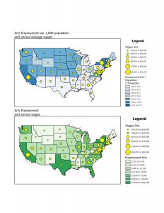
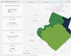
Maps can be used for a lot of different reasons, whether itā€™s where a feature is or what the feature is. They can also be used to look at the distribution of features. By looking at this you can see patterns that form and they can help you better understand the area you are trying to study or map. Mapping where things are can better show you where you need to focus or where all of your criteria are met. One example that came to my mind was their watershed GIS that was able to articulate which watershed needed to be prioritized. One really important thing to do with GIS is to tailor the map to who you are marketing to. If I was showing a map to the sheriff’s office, Iā€™m not going to include a layer for commercial sales. To me, this seems kind of obvious but at the same time, I wouldnā€™t have thought about this. The amount of detail also should be tailored, specifically to the format at which you are presenting the data. If you are presenting on a screen during a meeting, small details might not be the best. But, if you are working on a poster that will hang up in a hallway for an extended period of time, you can add many more details. Each feature in GIS needs geographic coordinates. They can be determined by street names or addresses. Also they can be identified by using longitude and latitude. GIS also requires you to have a code for each feature (i.e. robberies). I didnā€™t really understand why at first, but then it explains that a numbering system could allow your data to be broken down into subsets. The book says you should not use any more than seven categories for a map. However, in my opinion I think five is a better number because itā€™s less crowded. The book does come with a solution to complicated data sets. The solution is to have separate maps, one with the generalized data and the other with the subset data. I honestly really like this idea because it would allow one map to be simple, then IF you need more specific data you can look in the subset map. GIS can help you recognize patterns such as population density, characteristics, and relative location. However, you have to be careful because being too zoomed in could reveal different patterns than if you were to zoom out. This really reminds me of observer bias. But honestly it made a lot of sense. I really liked this chapter, I found it very interesting.

Chapter 3

When people map the most and least places for their subject. They are able to see the relationship between the areas. This allows more information to be processed. Not to mention, if you only map out the most frequent places for your feature, youā€™re not collecting any real data because you are not collecting any control. Thereā€™s nothing to compare it to. Thatā€™s like looking at a map of the U.S and the only feature is ā€œThe United States,ā€ what would be the point? In the section ā€œWhat type of feature are you mapping?ā€ they resay what they say in chapter 1. They talk about the 3 types of features (discrete features, continuous phenomena, or data summarized by area.). They also reinstate that you have to remember who your audience is. This way you are not representing data that doesn’t pertain to the group who is receiving the map. Quantities are also an extremely important part of mapping most and least. They can be; counts, amounts, rations, or ranks. The chapter goes over counts and amounts again, however it does add some advice. Mapping counts and amounts are used in each of the three types of mappings. It can also be helpful to present quantities differently. Sometimes it is better to present exact locations rather than by generalized areas such as area codes. This also goes into proportions, which can show how much of that area represents the whole. This reminds me a lot of things like political maps, when they show who has voted per county. Creating classes for certain features is also a helpful tool. This allows you to see different features more easily. Using different symbols is the best way to do this in my opinion. Sometimes it is best for the classes to be percentages, this is because it would show you the dense areas vs. the not so dense. But sometimes there are outliers in the data that can skew these percentages. With these you should use a number for the classes, which would allow you to add needed breaks.


Baer Week 1


Hello everyone! My name is Samuel Baer. I am a sophomore majoring in both Environmental Science and Geography. I am a part of the honors program, the symphonic wind ensemble, and Cru. Iā€™m from Mt. Gilead, Ohio which is about 30 minutes from here. I am a commuter so it feels like Iā€™m always driving.

To me this chapter was really interesting. One of the first things that really stood out to me was the fact that GIS has been around since the early sixties. To me it just doesnā€™t feel like something that would have been made that long ago. I find it interesting that Canada was one of the first nations to develop it, but I donā€™t find it surprising due to the amount of unpopulated area in Canada. I find the idea of GIS starting in the quantitative revolution is interesting, and it makes sense to me, even though it contains a visual component. Itā€™s really fascinating how philosophical a mapping program really can be. Whether itā€™s talking about whether itā€™s more quantitative or not. Also The idea of GIScience is really interesting to me. Specifically studying how to interpret GIS. I had heard of GIS before the course but I didnā€™t realize how big of a topic it was. I think studying GIS would be more interesting to me rather than GIScience just because the idea of practice is more appealing to me. This chapter made me really excited for the course because the author is very passionate and thorough.

First Search: GIS in Subway Systems

GIS can be applied to public transportation systems such as subways, bus routes, trains etc. Mainly it is used for the navigation between stops. GIS can also be used to track patterns in traffic and even track it live. With GIS, city planners are able to plan and analyze data with more precision. The maps can be automated to plan routes and determine schedules. It also can allow planners to pick more efficient stations and maintenance facilities. https://www.iunera.com/kraken/public-transport/geographic-information-system-gis-public-transit/#:~:text=A%20GIS%20gives%20the%20transit,Useful%20in%20map%20production

Second Search: GIS uses with Watersheds
https://www.hazenandsawyer.com/projects/using-gis-to-visualize-watershed-priorities-in-real-time
Hazen has applied GIS in Gwinnett County, Georgia. By adding layers of land use, septic parcels, and sanitation, they created an interactive map that allows them to determine where their priorities should be. They are able to slide the data, and the map will change to show where the priorities lie.