Address Point: This represents the unique addresses of every place in Delaware County, and is based on the State of Ohio Location Based Response System. It is used to help optimize emergency response.
Annexation: This represents the annexations in Delaware County from 1853 to present day. It is updated monthly.
Building Outline 2021: This is the older building outline data for Delaware County. It was last updated in 2023.
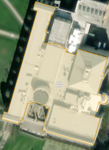
Building Outline 2023: This represents all the building outlines in Delaware County, and was last updated in 2024.
Condo: This data set represents all condominium style housing in Delaware County. It is based on data from the Delaware County Recorder Office.
Dedicated ROW: This represents the right of way data in Delaware County. It is line data created based on the Delaware parcel records.
Delaware County Contours: This represents the two foot contours in Delaware County and it is from 2018.
Delaware County E911 Data: This represents data from the location based response system for Delaware County. It is primarily used to help 911 operators be more efficient, and is updated daily.
Farm Lot: This represents the farm areas in Delaware County. It uses US Military data the get the data.
GPS: This dataset represents all the GPS monuments in Delaware County, from 1991-1997. It was last updated in 2021.
Hydrology: This dataset shows the major water ways in Delaware County, including lake and rivers. It is put together using LiDAR data and is updated monthly.
MSAG: This data set contains all street addresses and how they fit into jurisdictions, such as townships. It is updated as needed.
Map Sheet: The map sheet is a dataset that contains all the map sheets of Delaware County.
Municipality: This dataset shows all the municipalities in Delaware County.
Original Township: This dataset shows the original township borders in Delaware County. These are no longer in effect, and as such are not updated.
PLSS: This dataset shows the public land survey system. It is created using military data, and is updated as needed.
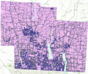
Parcel: This dataset contains all parcel data in Delaware County. It is created by the Delaware County Auditor’s GIS Office, and is updated daily and published monthly.
Precinct: This dataset represents the voting precincts in Delaware County. It is updated based on the Delaware County Board of Elections.
Recorded Document: This dataset represents all recorded documents in Delaware County. Its main purpose is to assist in finding documents.
School District: The school district represents all the school districts in Delaware County, and is made based on the Delaware County Auditor’s parcel records.
Street Centerline: This data set represents all roads and streets in Delaware County. It is updated daily and is used for things such as accident reporting and disaster management.
Subdivision: This dataset represents the subdivisions and condos in Delaware County. It is made based on the Delaware County Recorder’s Office and updates monthly.
Survey: This dataset represents the land survey results of Delaware County. It is overseen by the Map Department, updated daily, and published monthly.
Tax District: This dataset represents the tax districts found in Delaware County. It is created by the Real Estate Office and is updated as needed.
Township: This dataset represents the current townships in Delaware County. It is updated as needed and published monthly.
Zip Code: The zip code data is pretty self-explanatory. It is a collection of all the zip codes located in Delaware County, and is based on census data.