Thompson – week 4

Chapter 1 – This chapter really focused on just the basics of ArcGIS and learning how to use it. It helped me learn how to navigate basic maps and work with different types of data and tables. This chapter was really helpful in learning how you can incorporate symbols and labels into your maps as well and how you can work with things like 2D and 3D maps. It was overall just a super basic introduction to the technology and mapping.

Chapter 2 – This chapter was more focused on map design and details. So this incorporated those symbols and labels a lot more that we learned about in chapter 1. It also went into more detail on the maps and their features. This chapter also dealt more with the 3D mapping and showed how we can move the map around to look at it in different ways. This chapter also helped in learning how to create dot density diagrams within a map and other custom scales for visibility ranges.

Chapter 3 – This chapter was probably the most in detail with learning how to build maps and charts. This chapter had you start out with the maps that we worked on previously and you had to label them and everything and then you actually share the maps online and build a dashboard that you will do mapping work with. It goes into detail with labeling your dashboard with everything and you include the map, pie chart, table, and bar chart. All of which have the information you need for that specific map and dashboard in general. And you can see all the work on your content on ArcGIS.

Thompson – week 3

Chapter 4: 

There were 5 key points for chapter 4 – why map density, deciding what to map, two ways of mapping density, mapping density for defined areas, and creating a density surface. 

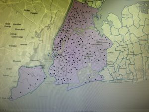
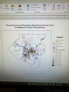
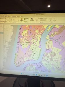
The reason that we map density is because it shows where the highest concentration of features is. It looks at patterns rather than locations and it’s helpful for mapping areas of different sizes. To map those areas, you have to shape them based on density value or surface. You have to look over what data you have and decide if you want to then map features or feature values. 

There are 2 specific ways of mapping density. Those are by defined area or by density surface. You would use mapping by area when you have the data already summarized by area. You would use mapping by density surface when you have individual locations. This chapter specifically goes into those two kinds of mapping in a lot more detail including how they are used, the calculations needed and what the results could look like. 

Mapping density for defined areas – you can make this in two ways. One is by showing density for each area graphically using a dot density map and the other is calculating a density value for each area and then shading based on that. An example of the calculation for that would look like this: pop_density = total pop/(area / 27878400). It also dives into how you would create that dot density map. 

Creating a density surface – these are created by GIS as raster layers. It helps show where point or line features are. There are a few things that go into calculating density surface, which include cell size, search radius, calculation method, and radius. The chapter goes over each of those parameters and what they do. To display a density surface you can use things such as graduated colors and contours. 


Chapter 5: 

The main topics of chapter 5 were why map what’s inside, defining your analysis, three ways of finding what’s inside, drawing areas and features, selecting features inside an area, and overlaying areas and features. 

As for why we map inside, it is to help monitor what’s occurring inside it, or to compare several areas. This is important to know whether or not to take action. In order to do this you have to draw a boundary on top of your features to define the analysis. You can find what’s inside of single areas, or several areas. The chapter then goes into more detail on those two. And another important thing to figure out is whether or not they are discrete or continuous features. 

When looking at the information you need from your analysis, you’re going to want to find out if you need a list, count, or summary. You then need to see if the features are completely or partially inside. 

There are 3 different ways of finding out what’s inside – drawing areas and features, selecting the features inside the area, and overlaying the areas and features. All of which this chapter goes into more detail about. It also goes over different guidelines that will help you choose the best method and how to make those maps. Look at locations and lines, discrete areas, and continuous features. 

When using your results there are a few things to look at – counts, frequency, and a summary of numeric attributes. This chapter also goes into a lot of detail on overlaying areas with features including what GIS does, how you would use them and what results you could get out of that. It looks at continuous categories or classes as well which includes a couple different methods: the vector method and the raster method and what the difference is between the two, as well as which one you should use. 


Chapter 6: 

The main topics for chapter 6 included why map what’s nearby, defining your analysis, three ways of finding what’s nearby, using straight-line distance, measuring distance or cost over a network, and calculating cost over a geographic surface. 

In terms of mapping what’s nearby, this is important because GIS can help find what’s occurring within a set distance. You also need to define your analysis and determine whether or not it’s by distance or by travel to or from a feature. 

Knowing what information you need is super helpful in creating the best method for your analysis. You can get a list, count or summary and each has their own benefits. Inclusive rings and distinct bands are useful in this as well. 

There are 3 different ways of finding what’s nearby – straight-line distance, distance or cost over a network, or cost over a surface and the chapter goes into detail for each of those regarding what they are used for and the pros and cons of each. 

Important information for straight-line distance: creating a buffer, getting the correct information which also involves finding features for multiple sources and several distance ranges and making a map. 

Important information for features within a distance: getting all the information and again, selecting features near several sources and distance ranges and making a map. 

Important information for feature to feature: specifying a maximum distance, getting the information, and making the map. Color coding is used a lot when making maps.. You can use it by distance or source and you can also use things such as spider diagrams and graduated point symbols.

The chapter goes into how to create distance surfaces which is something that has been touched on a few times within these past few chapters. You have to create distance ranges and then decide if they are discrete or continuous. Specifying maximum distance and multiple source features are also important. 

When measuring a distance or cost over a network, you want to specify a network layer and use GIS to help you. To assign street segments to centers you can use distance or cost and for setting travel parameters you need to specify turns and stops. It’s important that if you have more than one center, it is specified by GIS. Once GIS has identified the segments, you can find out what’s covered in those segments, including using boundaries and summing as you go. 

Lastly, for calculating cost over a geographic surface, it’s important to specify the cost by creating a cost layer. You can modify the cost distance and use barriers to get all the information needed. 

Thompson – week 2

Chapter 1:

This first chapter really goes over what GIS analysis is and the key points associated with it. GIS is really helpful when it comes to getting and creating data and mapping. Although it doesn’t just involve mapping, that is a big factor. First and foremost, GIS is a process that helps you look at geographic patterns in data and the relationships between certain features. This can involve both simple and complex methods.

There is a bit of a process in terms of analyses. Those include framing your question, understanding your data, choosing a method, processing all of your data, and finally looking back at all of the results to see how this may be of value to you. In the process of understanding geographic features, the chapter goes over the different types of features – discrete and continuous. There are also two ways of representing this which involves vector and raster models. Summarized data is also important to note in this chapter.

It’s important that every bit of data that you are collecting should be in the same map projection and coordinate system. Map projections are going to translate your locations onto a globe, while coordinate systems go into specifics to locate features within a two-dimensional space. Both of these work together to help enhance your data for the GIS analysis.

There are 5 different attribute values for geographic features – categories, ranks, counts, amounts, and ratios. Categories are similar things grouped together. Ranks are the features put into order, going high-low. Counts and amounts kind of go hand in hand with each other and they are going to help you find the total numbers. Lastly, ratios are going to show the relationships between two different quantities.

One last thing that was important in this chapter was the 3 different operations for features and values in tables which were selecting, calculating, and summarizing. Again, this chapter in general just kind of goes over what GIS is and the features that are connected with it/how you can use it.

Chapter 2: 

Chapter 2 goes over a lot about how you can use GIS for mapping and why mapping is useful. Mapping can be used for all sorts of things for different job areas such as police using it to map crime, a store using it to map out where they put their newest location, or even wildlife biologists using it to keep track of certain animal studies.

When creating a map using GIS, there are lots of steps that are important and you need to make sure they are done correctly so that your map comes out the way you want it to. The very first thing that you need to do is figure out what you want/need to map and what information you are going to need from the analysis. As said before, it can really help you find all sorts of different features and locations and that just depends on the type of information you are wanting to get out of it. The map should also cater to the proper audience. The amount of information and categories on your map is going to depend on who you are trying to target. Make sure you have all of your geographic information prepared before diving into the mapping itself. Some maps are going to be smaller with less categories which is fine and some are going to be larger. You want to make sure that it’s not too big or too small so find a good medium that will still be good for your specific research. This chapter also dives into assigning your geographic coordinates as well as category values. For the categories this means that each feature needs to have some sort of category and pattern. You can map either a single type or by category, and again, this just depends on what you are using it for. For a single type you would use the same symbol for all your features whereas for categories you would want to use different symbols for each category. Chapter 2 dives into more detail about both of those as well, but I won’t write out all of the details of both of those. A good rule of thumb when mapping categories is that you don’t want to display more than 7 different categories. This is because it becomes too confusing on one single map. If you do have more than 7, that’s when you would want to start grouping them together and the possibilities for different groups are endless.. It’s up to you what sections you put them in! When choosing your symbols for the map you can do colors, shapes, or both. Colors are easier to identify than shapes, especially on a smaller scale. You should be able to clearly see the different patterns and information on the maps if they are done correctly. This chapter overall went into a lot of detail on how you can start mapping and what it can be useful for.

Chapter 3:

In the third chapter, you learn a lot about the things you need to map and understand the quantities and patterns associated with creating maps. First off, mapping the most and least helps you find places that meet criteria, or to see the different relationships between places. It is important to note that you should map patterns of features with similar values. There are 3 different quantities you can map – discrete features, continuous phenomena, or data summarized by area (it dives into each of those in detail as well). Quantities can be counts or amounts, ratios or ranks. Knowing which one you are using is important. After deciding your quantities it talks about classes – you can assign each individual value a symbol or put them into classes. Individual mapping is a bit more detailed and accurate because you can look at each feature separately, but classes are better for when you have a bigger selection of features. When using classes, there are 4 common schemes: natural breaks, quantile, equal interval, and standard deviation. To figure out which is best, just look at your data distribution!

The chapter goes into a ton of detail about the 4 schemes including what they are and how to use them. In order to determine which scheme to use, it’s good to create a chart or spreadsheet of some sort to evaluate your data. If you have any outliers (which could happen) – there are a few different ways you can deal with it. One of which is grouping them together into their own class. After you decide everything with the schemes, it’s important to (with the help of GIS) decide on how many classes and make it easier to read them once they’re finished so you can easily interpret them.

Making maps is another big section. GIS gives you these options when creating maps – graduated symbols, graduated colors, charts, contours, and 3D perspective views. It goes into detail for all of those and when choosing your map it’s important to know those features and data values. You can look for all sorts of different patterns within your maps and each of the different options from above have different features/quantities that set them apart from the others. Overall this chapter I think went into the most detail regarding each section and it really helps the reader understand why we map things and all the little details that go into making them.

Thompson – week 1

Hi! My name is Sky. I’m from right here in Delaware and I’m a junior majoring in Environmental Studies.

Yes, I know my submission is late.. I was having major technical difficulties :/


After going over both the quiz and reading, it made me realize how much about GIS I really didn’t know. I’m coming into this class not knowing much at all about GIS systems and what they are capable of. One thing I thought was really interesting was how widespread GIS is. It isn’t something that is specific to one major or one group of people, GIS is open to really anyone (like how it can be used for police officers, students, and even starbucks shops). The reading goes over mostly history (dating back all the way to the 1960s) and the understanding/role of GIS systems. The reading was intended to demonstrate how GIS can fit into normal day tasks for a wide range of people. It’s really intriguing that coincidentally, the start of GIS actually didn’t involve computers. This is weird to think about because our world pretty much revolves around technology. The two different “faces” of GIS I think is something important to think about and that GIScience is basically the underlying theory of GISystems. GIS has more to it than just data and maps so I’m excited to get to learn more about it and what I could use it for. 

One of the GIS applications that I found and thought was really interesting was the use of GIS to track animal movements in marine environments. The reading goes over a bit about how GIS tracking isn’t used within water ecosystems as much as terrestrial areas. They kind of combined general GIS software with analysis tools that are specific to animal movement. There are a bunch of different functions that the paper goes over as well to show what types of animal movements and other things you can get out of using the software. The reason that studying animal movement is so important is because it can help with a lot of different research including fishing management, migration, and habitat management. The figure goes over location of the halibut being studied between different areas like pacific locations, rocky locations, and just randomly selected areas. I liked reading over this study and think that any of them having to do with tracking animals and their habitats is fun and interesting. 


Source: Hooge, P. N., Eichenlaub, W. M., & Solomon, E. K. (2001). Using GIS to analyze animal movements in the marine environment(pp. 37–51). http://www.bio.davidson.edu/people/midorcas/GISclass/GISprojects/hartman/Anim_Mov_UseMe.pdf