Final Project Data Summary:
- Zip Code
- Contains all zip codes within Delaware County, Ohio. The layer was created in 2005 after re-evaluation of the zip codes in 2003 by dissolving all Delaware County parcels by their property addresses. This dataset is published monthly and is updated on an as-needed basis through coordination with the USPS.
- School District
- This data set consists of all School Districts within Delaware County. Originally created via the Delaware County Auditor’s parcel records, it is updated as-needed and is published monthly.
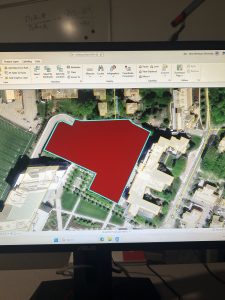
- Building Outline 2023
- This dataset has an outline of all buildings and structures in Delaware County in 2023. Delaware County.
- PLSS
- This dataset consists of all the Public Land Survey System (PLSS) polygons in both the US Military and the Virginia Military Survey Districts of Delaware County. It was created to facilitate the identification of all of the PLSS and their boundaries. It is updated as-needed and is published monthly.
- Township
- This data set consists of 19 different townships that make up Delaware County, OH. It is updated as-needed and is published monthly.
- 2024 Aerial Imagery
- 2024 3in Aerial Imagery. Flown in Spring of 2024. Collection of maps and datasets. Published September 25, 2024.
- 2021 Imagery (SID file)
- Collection of images. Published March 11, 2022.
- Recorded Document
- Dataset consists of points that represent recorded documents in the Delaware County Recorder’s Plat books, cabinet/slides and instrument records which are not represented by active subdivision plats. This dataset is updated on a weekly basis and is published monthly.
- Dedicated ROW
- This dataset consists of all lines that are designated right-of-way within Delaware County. Created through the daily updates of Delaware County’s Parcel data. This dataset is updated on a daily basis and is published monthly.
- Delaware County E911 Data
- The State of Ohio Location Based Response System (LBRS) Address_Points data set is a spatially accurate representation of all certified addresses within Delaware County. Data is maintained by Delaware County Auditor’s GIS Office. The Address_Points layer is intended to support appraisal mapping, 911 Emergency Response, accident reporting, geocoding, and disaster management. The dataset is updated on a daily basis, and is published monthly.
- Building Outline 2021
- This dataset consists of building outlines for all structures in Delaware County, Ohio. The layer was updated in 2021. The dataset is updated on an as-needed basis.
- Original Township
- This dataset consists of the original boundaries of the townships in Delaware County, Ohio before tax district changes affected their shapes.
- Precincts
- This dataset consists of Voting Precincts within Delaware County, Ohio. This dataset is maintained by the Delaware County Auditor’s GIS Office under the direction of the Delaware County Board of Elections. This dataset is updated on an as needed basis and is published as needed by the Delaware County Board of Elections.
- Delaware County Contours
- 2018 Two Foot Contours for Delaware County Ohio in File Geodatabase format. Data was published April 9, 2020.
- Building Outlines – DXF
- Data consists of an image of specific building outlines in Delaware County using CAD drawings. Created on March 26, 2020, Last updated on May 15, 2023.
- Address Points – DXF
- The State of Ohio Location Based Response System (LBRS) Address Points data provides for a spatially accurate placement of addresses within a given parcel in Delaware County. The data was created through a partnership between the State of Ohio and Delaware County. The data is maintained by the Delaware County Auditor’s GIS Office. The Address Points indicate the location of the building centroid as best as possible.
- Street Centerlines – DXF
- The State of Ohio Location Based Response System (LBRS) Street_Centerlines depict center of pavement of public and private roads within Delaware County. Address Range data was developed from data collected by field observation of existing address locations and by adding addresses using building permit information.
- Parcel
- This dataset consists of polygons that represent all cadastral parcel lines within Delaware County, Ohio. The cadastral geometries are maintained by the Delaware County Auditor’s GIS Office. This dataset is maintained on a daily basis, and is published monthly.
- Street Centerline
- The State of Ohio Location Based Response System (LBRS) Street_Centerlines depict center of pavement of public and private roads within Delaware County. Address Range data was developed from data collected by field observation of existing address locations and by adding addresses using building permit information. This layer is updated on a daily basis for all fields but the 3-D fields which are updated on an annual basis, and is published monthly.
- Condo
- This data set consists of all condominium polygons within Delaware County, Ohio that have been recorded with the Delaware County Recorders Office.
- Subdivision
- This data set consists of all subdivisions and condos recorded in the Delaware County Recorder’s office. This dataset is updated on a daily basis and is published monthly.
- Tax District
- This data set consists of all tax districts within Delaware County, Ohio. The data is defined by the Delaware County Auditor’s Real Estate Office. Data is dissolved on the Tax District code. The data is updated on an as-needed basis and is published monthly.
- Address Point
- The State of Ohio Location Based Response System (LBRS) Address_Points data set is a spatially accurate representation of all certified addresses within Delaware County Ohio. The dataset is updated on a daily basis, and is published monthly.
- Map Sheet
- This dataset consists of all map sheets within Delaware County, Ohio
- Farm Lot
- This data set consists of all the farmlots in both the US Military and the Virginia Military Survey Districts of Delaware County. This dataset is maintained on an as-needed basis where new surveys have been recorded.
- Annexation
- This data set contains Delaware County’s annexations and conforming boundaries from 1853 to present. This dataset is updated on an as-needed basis once an annexation has been recorded with the Delaware County Recorders office. It is published monthly.
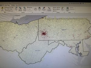
- Survey
- Survey points is a shapefile of a point coverage that represents surveys of land within Delaware County, Ohio. These surveys are found in documents in the Recorder’s office and the Map Department. This dataset is updated on a daily basis and is published monthly.
- 2022 Leaf-On Imagery (SID file)
- 2022 Imagery 12in Resolution. Information was published September 14, 2022.
- Hydrology
- This dataset consists of all major waterways within Delaware County, Ohio. This data was enhanced in 2018 with LIDAR based data. This dataset is updated on an as-needed basis and is published monthly.
- GPS
- This dataset identifes all GPS monuments that were established in 1991 and 1997. This dataset updated on an as-needed basis, and is published monthly.
- This dataset identifes all GPS monuments that were established in 1991 and 1997. This dataset updated on an as-needed basis, and is published monthly.