Gist – Week 7

Final Project Data- 

Tax District: Consists of all the tax districts within Delaware County. The data is updated as needed and published monthly. It is defined by the Delaware County Auditor’s Real Estate Office and is dissolved on the Tax District Code.

Parcel: Dataset consists of polygons that represent all cadastral parcel lines within Delaware County. This is maintained by the County Auditor’s GIS Office. Different attributes regarding the parcel records are maintained on the CAMA system on a daily basis and published monthly.

Address Point: This dataset is a spatially accurate representation of addresses within Delaware County. It contains Address_Points that indicate the location of the building centroid. This provides data to help appraisal mapping, 911 Emergency Response, accident reporting. geocoding, and disaster management. It can alter the set of coordinates to determine the closest valid addresses specifically for 911 Emergency Response teams.

Recorded Document: This consists of points that represent recorded documents in the Delaware County Recorder’s Plat Books, Cabinet/Slides and Instrument Records that are not represented by subdivision plats. This dataset was created to locate different documents within Delaware.

Zip Code: This data set contains all zip codes within Delaware County. The zip codes were carefully made and cleaned up in 2003 to later have the layer created in 2005. The layer created both right_zip and left_zip attributes for the county’s road centerline. This is updates as needed through the United States Postal Service.

School District: This dataset contains all the school districts within Delaware County. The data was created by the Delaware County Auditor’s parcel records of the school districts and is updated as needed.

Map Sheet: This dataset contains all the map sheets in Delaware County. It is a feature service and tags Land Data and Boundaries. There was not much more information on this specific file.

PLSS: This data contains PLSS (Public Land Survey System) polygons in the US Military and the Virginia Military Survey Districts of Delaware County. It helps identify all the PLSS and their boundaries.

MSAG: This dataset contains the Master Street Address Guide (MSAG) polygon with 28 different political jurisdictions. These include townships, cities, and the villages in Delaware County. This dataset was made to facilitate and locate each of these places and is updated on an as-needed basis.

Municipality: This dataset was made to consist of all the municipalities within Delaware County.

Farm Lot: This dataset consists of all the farm lots in both the US Military and Virginia Military Survey Districts of Delaware County. The dataset was created to help identify the farm lots and their boundaries.

Township: This dataset is a map of the 19 different townships hat make up Delaware County. This is updated on an as-needed basis and published monthly.

Street Centerline: The LBRS (The State of Ohio Location Based Response System) Street_Centerlines depict the center of pavement of both public and private roads in Delaware. The range data was created by collecting field observation of existing address locations and by adding addresses using building permit information. There are two versions available for download of this data.

Annexation: This dataset contains Delaware County’s annexations and conforming boundaries from 1853 to present. This data set is updated once annexation has been recorded on an as-needed basis.

Condo: This dataset consists of all condominium polygons within Delaware County. These are specific condos that have been recorded with the Delaware County Recorders Office.

Subdivision: This data set consists of all subdivisions and condos recorded in the Delaware County Recorder’s office. This is updated as needed and published monthly.

Survey: Survey points is a shape file of a point coverage that represents surveys of land within Delaware County. Surveys were scanned and kept as pdf filed by the Map Department and the GIS Office in Delaware.

Dedicated ROW: This data consists of all lines that are in the designated Right-of-Way within Delaware County. This data is line data that is created through the daily updates of the Parcel Data. All changes made are stored in the Delaware County Recorder’s Office.

Building Outline 2021/2023/2024: These are two separate datasets, one for each year. These include the building outlines of Delaware County in their designated year.

Railroads: This dataset includes all the railroads that lie within Delaware County and allow viewers to see their location.

Precincts: This dataset includes the Voting Precincts within Delaware county. This dataset is maintained by the Delaware County Auditor’s GIS Office under the direction of the Delaware County Board of Elections.

Delaware County E911 Data: This dataset is the State of Ohio Location Based Response System (LBRS). The Address_Points data set is a representation of all certified addresses in Delaware County.

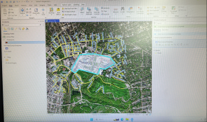
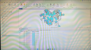
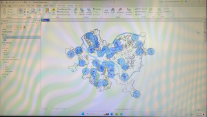
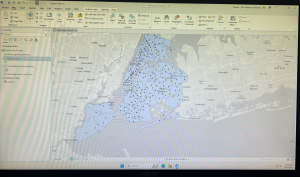
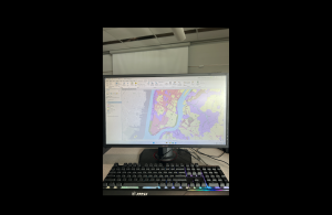
Inserted above is the image of my map after adding the three layers: Parcel, Street Centerline, and Hydrology

Gist Week 6

Chapter 7:

Chapter seven focuses on creating polygon features, digitize point features, using cartography tools to smooth features, CAD drawings, and spatially adjusting features. Tutorial 7-1 has you edit polygon features to select a specific university building. It has you do this feature to multiple different buildings, with complex shapes and sizes. Into 7-2, the focus is on adding a feature class to polygons. Adding a feature class allows for a select tool along the contents pane that can be clicked on and off for each item you want highlighted. In this chapter it focuses on parking lots. The parking lot highlighted below in red was relatively simple. The only slight issue I had was finding how to make the background color transparent. Into the next steps, it showed us how to remove buildings as the map is updated. One thing I noticed about this specific map was it had been further updated since the book and there was another building still labeled that needed deleted. I went ahead and also deleted that one to get the most accurate map, as well as some more practice. Overall, I have noticed multiple times this semester that many steps are not accurate to the book and the wording has changed, or the map within the software. This has lead to multiple moments of confusion for me using the GIS software. The final step of this tutorial was to outline the main campus portion using snapping. The snapping feature was much easier than the previous selecting, and made the shape much more accurate. This was helpful for the next steps when it had you take the measurements. The next few tutorials were very similar with outlining different buildings and landmarks in different circumstances. This chapter was extremely helpful to learn more about the special features of GIS.

Chapter 8:

Chapter eight focuses on learning about geocoding. This includes geocoding zip codes and addresses using streets. The tutorial I did for this chapter was 8-1, however this one took a lot of time and gave me multiple difficulties. The first step was building a zip code locator. I was able to do this, but I was confused on the next few steps when it was having us fix certain zip codes. I was able to get the red circles and view the tables and the data pretty easily, which was helpful in this long tutorial. I also was able to symbolize the dot very easily, this step has been used in almost all of our GIS chapter so far. While I had confusion in the unmatched zip codes, I was able to figure it out. I think the reason some step similar to these has given me confusion over the semester is due to the chapter not clearly explaining the reason behind these steps and what it is really used for. However, the book continues to have clear explanations over. The next few steps had us using the same tutorial data, but showing it on different base maps. I liked looking at the separate maps it allows us to use, it was very interesting. The final step was symbolizing using the Collect Events tool. This gave me a lot of trouble this tutorial. I opened up the tool like it said, and attempted to type everything the book states, however the book options were not available and kept failing when I tried to run them. I messed around and used the provided options of what I thought it would be, but each time it would fail and say the folder was wrong. This was another instance I found when the book was not accurate to the computer, and do to not having a full grasp of the technology I did not know how to figure it out on my own.

Chapter 9:

This was the final chapter of this week, and entered the third part of the book that focuses applying more advanced GIS technologies. Chapter nine’s focus was spatial analysis and shows us how to use buffers, multiple-ring buffers, create service areas of facilities, and preform cluster analysis. I focused on Tutorial 9-1 for this chapter. The focus of this tutorial was using buffers for proximity analysis. It starts by showing us how to use the Pairwise Buffer tool, which allows us to find what is in proximity to the feature being buffered. For this one, it has us create a buffer around the pools in Pittsburg. I had no trouble in the first step and was able to create the blue buffer pictured below. This was a really cool feature and made it really easy to visualize where all the pools are. It then had us use block centroids to sum the number of youths. This opened up the teal circles and the graph pictured below. I also had no trouble with this step. For the Your Turn portion of this tutorial, it asked to create a mile buffer around the pools. I attempted this by adding the same commands, but changing Distance to 1 U.S. Survey Mile. This created a new and larger buffer around the blue circles. However, the buffer looked much different from the picture and took up more space which makes me wonder what the correct measurements would be or if anything else needed changed. It moves on and shows us how to create multiple ring buffers using the same data. Overall, this chapter was relatively simple compared to the last chapter.

Gist Week 5

Chapter 4-

Chapter four focuses on importing data into file geodatabases, modifying attribute tables and fields, using Python expressions to calculate fields, joining tables, getting an introduction to SQL query criteria and carrying out attribute queries.  The part of chapter four below was tutorial 4-3, carrying out attribute queries. I had a little bit of trouble with the attribute queries and making sure everything was inputted correctly for it to be able to run. With a little bit of trial-and-error I was able to get the DateOccur values to appear. The little caution buttons that explains what was wrong about the function was extremely helpful to get the parenthesis inputted correctly. I liked the visuals of this map and all the different colors for each crime in the area. I had more trouble with the next part of getting just the frequencies for Burglary and Robbery, due to the colors glitching and not showing correctly. However, I was able to solve it and they eventually all turned the blue color in the picture on page 104. It was also very interesting to learn how to reuse a saved query to reuse a definition query. It was cool o see the number of crimes continue to go down with each step. I also liked how they connected the information I was using back to the area. In one part, it explained how violent crimes are normally clustered in specific areas, while crimes like burglaries are often more widespread. It was cool to read this and be able to visualize it with the map in front of me. The final part of this tutorial had you use multiple Select by Attributes to narrow down to the unsolved burglary to be John Bond. The next step was a Your Turn and had you create a choropleth map with gradient colors choosing your own color scheme. I appreciate these sections because they are helpful to then use the tools learned on your own.

Chapter 5-

Chapter five focuses on spatial data and the learning goals including working with world and US map projections, set a projected coordinate system, work with vector data formats, and explore sources of spatial data. The first tutorial inserted below was 5-1. This tutorial was the easiest out of all I have done so far, but was helpful to see all the map options and types that can be used through the software. This tutorial had us start with a flat world map and convert it into a rounded version shown below. It was cool to see all the coordinate systems and to learn about the Hammer-Aitoff  (world) system that we used.  The Your Turn of this section had us do the same thing, but instead with the Robinson (world) projection. The next chapter focused more on the US map projections and the Albers equal-area projection for the country. Also shown below was tutorial 5-4. This tutorial focuses on working with vector data formats. This chapter was a little more complicated that the last few, and required you to find the certain tools it wanted you to utilize. The first step was importing a shapefile into file geodatabase, and being able to add that to the map. This step was self explanatory and I was able to find everything to get the purple overlay of New York City. This chapter also showed how to add X,Y data, which was more tricky to find. With a few google searches I was able to get to the coordinate graphs and tables inserted below. It had you visualize the amount of libraries, which are shown as dots, and the school district boundaries. It also has you learn to just highlight certain aspects, which was highlighting specifically the New York school districts. The rest of chapter five focuses on similar aspects.

Chapter 6-

The focus of chapter six is geoprocessing and dissolving block polygons to create divisions, merging water features, apportion data between polygon layers, and appending separate fire and police station layers to one layer. Chapter six covered a lot more complex topics as the last two, and the ones mentioned before were just a few of the learning goals of this chapter. The first few tutorials focused specifically on dissolving features to create neighborhoods, fire divisons, and battalions, extracting and clipping features for a study area, merging water features, and intersecting features. I was very interested by tutorial seven, photographed below. This tutorial focused on the Tabulate Intersection tool. I had some trouble with this chapter finding the tools section and where you can search for the tools needed in these tutorials. After finding it, the rest of the tutorial was much simpler. This tutorial had us look at tracts and fire company polygons specifically in Manhattan. Using the Tabulate Intersection, I was able to apportion the population of persons with disabilities to fire companies. I liked how we were able to visualize both the map and the table, and organize it in a cleaner way by ascending the numbers of the TRACT-ID. This allowed for easier location and made finding things much simpler. With the Your Turn portion, it had you use the Summary Statistics tool to calculate the total number of persons with disabilities in each fire company. It gave the data to input to get these numbers and what to place in the inpust and outpust table, field, statistic type, and case field. The photograph below is what I got in the table after inputting this data. Overall, I had more trouble with chapter six than the other chapters in this section, but it was a lot of useful GIS information.


Gist Week 4

Chapter 1- Tutorial 1.1

This tutorial was the easiest, and relatively self-explanatory in my opinion. However, it took much longer than needed as I started figuring out the software and where everything was. I also had trouble with connecting my hard drive into the computer to save, but ended up figuring that out with some help from a classmate. Once I got through the set up portion of GIS it was much more smooth sailing. The actual tutorial began by showing how to overlay maps with the other included data in Allegheny County. What I found interesting was how you could clear everything that is outside of the map to just show what is inside. It made it much cleaner to look at. This reminded me of the previous chapters read of how when creating a map it is important to think about the audience and what would be easy for them to understand. This map ended up being very easy to read and understand while I was constructing it. The left sidebar that lets you turn the specific layers on and off. For this one specifically, it had you select the Urgent Care Clinics, FQHC Clinics, and Poverty Risk Area, as well as the landforms and streets in the area. It also lets you reorder to have specific layers be on top of each other. One part I had trouble with here was right clicking rather than left clicking and the difference between the two. The book was very helpful in explaining when right clicking was needed for the next step. One specific question I had during this tutorial was how the data was already included into the system. I was wondering if we will be shown how to input our own data in the future of this class. Overall, this chapter was explained very well in a step-by-step manor that allowed me to create the graph inputted below.

Chapter 2- Tutorial 2.1

This tutorial was my favorite of the three done this week. I liked all the customization options and colors shown to put onto the graphs. I really liked how we did the whole process ourselves of going from a blank, black and white map to the colorful one inserted below. I also found it interesting how you can change the border thickness, color, and even the color of the water. While doing the extra step of choosing the water color, I scrolled through and saw all the different customization options, and I enjoyed seeing all the options it gives. I thought this was a really cool way to get the information across in a clean way. This part of the chapter left me wondering how GIS is able to know the information and tell what is land and what is water. My guess is that is has something to do with the information inputted into it for each tutorial and the data behind the scenes. However, I found it extremely convenient that the software is smart enough to already know the options that can be selected. The only issue I had at this point was knowing where everything was. The coloring step was very repetitive, but I still needed to refer back to the instructions multiple times to remember where everything was. Into the next few tutorials of this chapter it showed how to label different features, create a definition query, and create a choropleth map. When adding the labels, I liked how they used the pastel colors, gray borders, and bold labels. This made the map very aesthetically pleasing, and it was easy to see each of the components. This chapter was a lot more complex than the previous two, but I was able to complete it in less time than the last one.

Chapter 3- Tutorial 3.1

This tutorial was the hardest one of the three in my opinion. This one took more time than the last two tutorials together, and was not super smooth sailing. I first had trouble with getting the two specific maps and accidentally grabbed two of the blue ones multiple times. When deleting to try and get the green, I accidentally deleted the new layer portrait and had to completely start over. To do this I had to delete the entire tutorial and resave a new one from the original chapter three folder. Once I got back into the new tutorial, I had an easy time redoing it and going back into the New Layout tab to select the size for the background the maps are placed on. I also was having trouble getting the maps into the right spot, before I realized that the rulers are available to use. Once I put the guides in, looking at the picture and the rulers made it a lot easier to get the pictures into the place the tutorial wanted. I also liked how you could go to each specific map and choose the specific dimensions rather than guessing on the size. I also was confused on whether or not I did the Legend right. I think I did it right, but I moved on to the next part of the steps. The easiest part of this map was adding the text above each map, I had no trouble with this part! That was the last step I did on this tutorial after being frustrated by all the mistakes and troubles I kept having. However, I read the rest of the tutorial and the next steps made sense on how to continue. This chapter had multiple examples that I would not expect to be done on GIS, and it was really cool continuing to see all the options and customizations that are possible. Overall, in the three chapters this was a good introduction to GIS and the software. While I had lots of confusion, most of the steps were understandable with the steps in the books.


Gist Week 3

The first thing Chapter 4 introduces is mapping densities. Mapping densities is what allows you to look at patterns over areas rather than individual features. In the examples, it includes an area map and uses different shades of red to show each density and the space it covers. Another example used the same shades of red but put the colors within county lines to measure a census track. It shows examples of how you can either map density in defined areas or by density surface. For a defined area, you would use a dot map; and for density surface you utilize the GIS raster layer described in the previous chapters. While continuing learning about GIS, one thing that interested me was how GIS is similar to a choose your own adventure. There are so many different types of maps, and values to show that each requires their own process and customization. Each GIS is completely unique depending on what can best show your information. This was especially true for densities when the chapter included a chart of what to do depending on what density you are graphing. Another interesting piece of this chapter was the description of what the software does when graphing density. I enjoyed the inclusion of the image showing GIS creating a radius around the specific cell center to then create a smooth surface of the density amount. The cell size changes based on how detailed the pattern will appear on the map. It also showed how you can use contour lines to specifically show the rate of change within the data. Another interesting feature that surprised me was how much math GIS uses. I imagined it to be more similar to coding, rather than having different equations that it has shown in these first few chapters. 

The focus of Chapter 5 is to map inside an area to monitor what is occurring inside of it. To do this you have to either draw a boundary line on top, use an area boundary (selects or summarizes features inside), or combine the boundary and features. With this, it explains you can include multiple areas so you need to determine how many you have. The chapter gives lots of examples of both single areas and multiple areas and shows what the final product could look like. The inside data can be categorized as either continuous or discrete features. The continuous features being seamless, geographic phenomena, and discrete being unique, identifiable features. You can also graph the information in either a list, count, or summary. It also lets you use lines to show specific features within the boundary lines. Similarly to the last chapter, I think it is fascinating to see all the options and examples of how to customize the map being created. This chapter also explains that there are three ways to specifically find what is inside. The first way is through drawing areas and features which is good for seeing one of few features inside or outside a single area and is made through a dataset containing boundaries and the features. The next method is selecting features inside the area which is good for getting a summary of features within an area and is created through a dataset of the areas and specific attributes. The final way is by overlaying the areas and features which is good for finding how much of something is in one or more areas, and is created by having data containing the areas, a dataset for features, and any specific attributes. From what I read, the third option is basically a combination of the previous two. This chapter also goes into detail about the calculations behind GIS and how you can find the mean, median, and standard deviation of the data being graphed. It also allows you to overlay the areas and features explained to create more complex models. 

Rather than finding what is inside, Chapter 6 is all about finding what is nearby. The main purpose of mapping what is nearby is to find out what is occurring within a set distance of a feature and what is in traveling range. To start, you have to measure what you consider near through distance or travel cost. While distance measures specifically how close something is, cost is a way to measure without distance. One common cost is time, money, or effort expended, which all together equal travel cost. When measuring distance, you have to be specific about whether it is over a flat plain or using the curvature of the Earth. This also is started by determining whether you need a list, count, or summary. One thing I am noticing after reading up to 6 chapters is the patterns in GIS. While each different type of map and feature appears to be confusing and different, oftentimes the processes are similar and involve the same steps and decisions. When determining how many distance or cost ranges to include, you can include inclusive rings or distance bands. Inclusive rings show how the total amount increases as the distance increases. The example it used to help clarify was that you can use the rings to see the number of customers within 1,000 feet, 2,000 feet, and 3,000 feet, and note how the number increases. Distance bands compare distance to other characteristics. This example was that you could find the number of customers within 1,000 feet, the number between 1,000 feet and 2,000 feet, and the number between 2,000 feet and 3,000 feet. Distance bands can basically split up inclusive rings to find more specific data. Similar to finding what is inside, there are also three ways of finding what is nearby! These include straight line distance, finding the area of surrounding features within your selected distance; distance/cost over a network, specifying distance or travel cost along the linear feature; and cost over a surface, a new layer showing the travel cost from each source feature. Like the last chapter, I found it helpful that this one also includes a graph explaining what each one is used for and the pros and cons. This reading  goes into specifics over each method and includes lots of images and examples to make it easily understood.

Gist Week 2

Chapter 1

GIS, or Geographic Information System, is a process for looking at geographic patterns and features. This works by creating softwares and models to view data in a complex or simple way. To start, you have to decide the question you want to answer which will help in the next steps of determining the approach. Depending on the reasoning behind the question and the purpose of observing the data in this way will determine how complex or simple the visualizations need to be. After reading the first part of this chapter, it has helped me gain a better understanding of why someone needs to use GIS for their jobs. It also helped describe why more data would be needed and that getting more information can be as simple as adding new calculations into the software. Also, I appreciated how it explained the difference between using GIS for a quick study compared to a long, time-consuming one that could be used for a more official purpose. I found it interesting how the chapter mentioned that you want to find a way to represent your data clearly so that the intended viewers would be able to understand the information. I think it was also good to note that this can take many attempts to get to the final product and it is not a simple process. The features you include can be discrete, where the location gets pinpointed; continuous phenomena, where the data blankets the entire area being mapped; or summarized by area, representing data within area boundaries. Geographic features are additionally represented by either vector or raster. With vectors, each feature shape is defined by an x,y location. With raster, features are represented by a matrix of cells in a continuous shape. The representation used depends on what specifically needs to be shown with the data. When combining layers, the same map projection and coordination should be used to show accurate results when comparing relationships between information. This chapter did a great job explaining while also utilizing examples and pictures making it easy to understand. Finally, through using attribute values (categories, ranks, counts, amounts, and ratios) you can combine the numbers into a data set to then be able to use calculations. 

Chapter 2

Deciding what to map with GIS is dependent on the question you are asking. By looking at the location of these features, we can then explore the patterns being shown. To find these patterns, the data should be layered within the map with different symbols. This connects back to the first chapter where it must have the same coordination so the relationship can be easily visualized. The use of the map created also is dependent on the audience. Extra information should be included in the map when the intended audience does not clearly understand the data or location. The chapter explains that when you prepare your data to create the map you should assign geographic coordinates and category values. This step helps ensure that your map will clearly show what information you are trying to inform others on. What I found interesting about this chapter is how customizable the software is. GIS allows you to tell it what features to display and how to symbolize them as well as storing the specific coordinates of your data points. While this concept seems complex, the chapter included photographs to help visualize what it is trying to explain with each type of map. GIS can be mapped in multiple ways, including dots, lines, or others depending on what your data is. For example, the chapter included lines for mapping streets, and points for mapping location of crime. The color can additionally be changed to allow for the overlap described in chapter one that lets the viewers see the relationship between the data. It also included that a rule of thumb is to have no more than seven categories because most people can only distinguish up to seven colors on a map. This is especially an issue when data is displayed in small scattered features. The main example the chapter showed was zoning maps and how much clearer it is to read with less categories. It gave an example of grouping categories in order to create less color difference while also showing the same information. In the zoning map example, it combines heavy industrial, light industrial, and mixed used industrial into one industrial category. The chapter included multiple more examples on how to choose colors, symbols, and lines when creating GIS to help get the point across in an easy viewable way. The clearer that the information is presented, the easier it is to view the patterns. 

Chapter 3

When using GIS, another component to think about is to map both the most and the least. This allows for them to find the places that meet their criteria and see the relationship between locations. Mapping quantities allows for another layer of depth beyond mapping location. To begin this step, the chapter explains that you first must consider what features you are mapping. One part I found interesting was that it explains your map should be created with the purpose in mind. When presenting the map to an audience more components need to be considered compared to if you are looking at the data yourself. Quantities on a map can be counts, amounts, or ratios. Counts and amounts show you the total numbers while ratios show the relationship between two quantities. This chapter also introduces using ranks. Ranks show relative values and can be useful when direct measures are difficult. An example I liked in the chapter was stating what portions of the trail had an excellent or good view compared to portions with fair, poor, or no data. Once the quantities are determined, the next step is dividing them into classes or giving each value its own symbol. Mapping individual values requires a lot more precision, yet can allow you to spot relationships in the raw data. I found it extremely interesting how it explains GIS is able to calculate mean and standard deviation when creating the map. It also explains how deciding classes is not just a simple process and it must consider outliers in data and how you want it to be presented. Additionally, you want to make sure it stays easy to read. This chapter did a great job of explaining the process of creating a map and including options and steps and the advantages and disadvantages of each. It also provided many charts, graphs, and examples similarly to the last two chapters. Towards the end, what I found most interesting was the inclusion of the Z-factor. The Z-factor increases the variation in the surface making the differences much easier to see without exaggerating. You can also include a light source to determine how shadows appear within the surface. What I found most interesting about this was the effect it gave the map and how big of a difference it made in the examples to be easily understood.

Gist Week 1

Introduction: Hello, my name is Reghan Gist! I am a freshman from Delaware, Ohio and am planning on double majoring in Environmental Science and Zoology. With this degree I would love to do some sort of fieldwork with animals, I love animals and have 4 pets back home! I am also a part of the cross country and track team here at OWU. I am new to GIS, but I am very excited to learn what I can create and do with the software.

Chapter Reflection: The first thing that caught my attention reading this was the explanation of how GIS has experienced a boom of popularity and is used in a variety of different fields. When learning about this class I did not realize how many other non geography related career paths, including Starbucks, would also use this technology. I assumed GIS was used solely for graphing environment related data, which is very wrong after reading. I found it very refreshing to hear that the software is considered confusing because of how different people see it differently. I enjoyed reading about how each person can utilize GIS in a way that best fits their needs and interests. This chapter provided so many examples of what GIS has or could be used for and shows that the opportunities are endless, which can explain why so many are drawn to the technology. I especially was interested in how GIS is affecting our lives even if we do not notice it. Oftentimes I, and presumably others, want something to have a clear and correct identity, however because this chapter provided lots of examples of uses this helped me understand it better. I especially liked the part of the chapter where it explains how GIS impacts society through shaping decisions that affect our lives. Of these impacts, the one that interested me the most was how GIS created crime maps that were able to stigmatize neighborhoods and hazard maps that pointed environmental pollution to be mainly in low-income communities. Overall, through Schuurman’s emphasis on GIS being more than just a software tool and having much larger impacts, I was able to gain a better understanding, learn examples of where it is found in everyday life, and be much more interested in the class and having the opportunity to gain my own experience working with GIS.

GIS Applications (1): Marine Life: One of my interests within the environmental science field is marine life and oceans. I was curious how GIS could be used to gather information on specific marine species and their habitats. Through this search I found an article titled “Using GIS to Analyze Animal Movements in the Marine Environment” (https://www.researchgate.net/profile/Jerald-Ault/publication/249994071_Spatial_modeling_of_fish_habitat_in_Florida/links/00b7d51e967547ab22000000/Spatial-modeling-of-fish-habitat-in-Florida.pdf#page=47) This article provided lots of useful information and graphs on spatial processes and management of marine populations. Specifically, it focused on tracking certain marine animals. The graph inserted below was one of the specific trackings done in this article that focused on the Halibut, a very odd looking fish I had never heard about. It was done in Glacier Bay, Alaska and found a significant amount of the Halibut locations were close to the Rocky reef compared to being in random locations. 

GIS Applications (2): Wildfires: Due to my sister being in California during one of the widespread wildfires, I was very interested in how GIS could or has been used to track these wildfires and provide the graphs and information that we watched on the news while she was there. I found this article (https://www.proquest.com/docview/2179993356?pq-origsite=gscholar&fromopenview=true&sourcetype=Dissertations%20&%20Theses) that focused specifically on tracking wildfires in Santa Barbara that pose threats to the citizens in the area. The student created a web map using local data that allows residents to monitor the evacuation potential, fire size, and emergency updates. This provided a resource to the public to ensure they have access to live information regarding current and past wildfires. There were no graphs provided with the article, however I found it to be extremely interesting and a great way to utilize GIS that could help protect local residents. 

I completed the GEOG 291 quiz!