Villanueva Henkle Week 4

Chapter 1

Nearly everything went smoothly for me. Whenever I tried something, it worked, but I could not figure out to rename a column in the attribute tables using Aliases. Even with things being slightly different due to software updates to ArcGIS, everything was very straightforward.

Chapter 2.

Again, nearly everything went smoothly. Even though there were more new concepts and tools being thrown at me than chapter one, the work felt just as manageable. However, my 2-4 Tutorial file got corrupted, so I was not able to finish that specific tutorial. I really enjoyed learning about visibility ranges, and I can see myself using them a lot in the future.

Chapter 3

The first tutorial went just fine, but I must have forgotten to register for ArcGIS Online, as I cannot post any of my maps nor login. In spite of this hinderance, I did as much as I could on ArcGIS Pro and will make sure to go back and finish the online work once my account is setup.\


Villanueva Henkle Week 3

Chapter 4: Mapping Density

The chapter starts off by explaining why it is important to map density in a map. The primary reason being to show patterns rather than showing locations of features. This is especially helpful when you have a large abundance of features on a map, and it is hard to discern the concentration of said features. There are a few ways to map density, so in order to find the way that fits your goals, you need to assess a few things. These would be whether you have dots and lines or summarized data. Dots and lines benefit from a density surface. Another thing to keep in mind is whether you are mapping features, or feature values. A map of the density of businesses could look completely different then a map of the density of employees. Areas with high amounts of businesses could only have one worker each, while areas with low amounts of businesses could have a high amount of employees. The two ways of mapping density are either by using  density surface, which is continuous, or by defined area, which is segmented/separated. It is also important to keep in mind the scale at which you are mapping. If you have a large map with hundreds of tiny dots, it can be overwhelming and hard to read. If you group/combine some dots, it can make your map more accessible. You could have a similar problem with density surfaces. If you make your cells too small, your gradient will become too smooth, and finding distinguishable areas will be impossible. On the other end of the spectrum, if your cell size is too big, you lose clarity and information in your gradient. It is also possible to combined the two methods, by rending density as a density surface, and then placing your map with boundaries, i.e. county lines, over that map to see a continuous gradient and how it is spread through each county.

Chapter 5: Finding What’s Inside

Shockingly, this chapter describes why you might need to find what features are inside an area in GIS. There are a multitude of reasons, including crime analytics (finding where crimes are located to identify hotspots), how many roads are in a county or a park, and assessing flood damage. Looking at your data, you may only need to find what is inside one area, such as one state, county, park, or zipcode, or multiple areas. The multiple areas could be adjacent or disjunct. The features you are looking for could also be either discrete or continuous, Which could be land parcels or soil types. GIS is also helpful for gathering different types of data. By overlaying continuous values over discrete land parcels, such as smoke plumes over a city, you could either get a list of parcels affected, the number of parcels within the smoke,  find out what each land parcel does, and more. There are three methods to “finding what’s inside”, those being, Drawing Areas and Features, Selecting the features inside the area, and Overlaying the areas and features. Drawing can help you easily find which discrete features are inside or outside an area. Selecting is good for grouping areas together and finding what is within a given distance of a feature. Overlaying features are good for seeing how much of a discrete feature is in a certain area, and what type of feature it may be.

Chapter 6: Finding What’s Nearby

Mapping what is nearby a feature can be helpful in many ways. Figuring out the time it would take to get from your house to the store, or monitoring logging near a river or property line. However, what is near to a feature could be defined in different ways. It could be a set distance, like mapping every tree of a certain species that is within a mile of a river. It could also be travel to or from a feature, like a fire truck driving to a fire.The units of measurement could also be different than just distance. Time, money and effort are also units of measurement when measuring what is nearby to a feature. It is also important to decide whether you want to factor in the curvature of the Earth when measuring distance or not. You can find what’s nearby in three ways: Straight line distance, Distance or cost over a network, and cost over a surface. I have already talked about the first two, so I will just describe cost over a surface. This approach is really only good for finding the cost of traveling long distances, as it uses a raster surface to show how much it costs to move away from a feature across the map. You can also use GIS to just select features within a distance. By inputting a distance from a source, it will highlight every feature within that distance, and give you either a list, count, or summary of those highlighted features without setting a boundary. Although, when doing this with multiple sources, you must label each feature for every source you place in order to know which is near which. GIS also has a street network built in, so you do not have to put in any data when measuring distances or costs over a network.

Villanueva Henkle Week 2

Chapter 1: Introducing GIS Analysis


This chapter begins by briefly introducing the uses of GIS and defining GIS Analysis, which is looking for patterns between geographic features and the relationships between them. This can be done by creating/ using a map or overlapping multiple layers to see differences that may not be readily apparent.

The next section describes the first step in the process, which is Framing a Question. Knowing what information you want from an analysis is key to creating this question, and you need to determine the audience (yourself, your peers, a professor) to successfully set up your methods and frame the question more accurately. The book also describes the different features that you will encounter while doing GIS Analysis, those being Discrete features, Continuous phenomena, and features summarized by Area. Each has it’s own specific use case, with Discrete features being single points on a map, Continuous being variables that are present across the whole area but change (such as temperature or Elevation), and summarized features show counts within a boundary, such as population within county lines. 

The book then shows us two different ways of visualizing data using ArcGIS, those being vector and raster modeling. Vector is good for showing discrete features and summarized features, as they typically use one layer, and Raster is good for showing continuous categories or numbers. However, either render can be used to show any feature. I found this section fairly interesting, as it seemed for continuous data, there was not too much of a difference between vector and raster models, however, there were large differences when discrete and summarized data were done on both models. The next section, dealing with Attribute values, seemed fairly easy to understand, especially after doing work on Rstudio Cloud for the past few semesters, and the final section seems to be nearly identical to R. 


Chapter 2: Introducing GIS Analysis


The main focus from this chapter, in my opinion, is to make your maps as accurate and as easy to read as possible. The chapter starts with numerous examples of how and why you may need to show others your maps, emphasizing the fact that you will need to know this information. I appreciated that each mapping strategy had its pros and cons described, as it showed that none of these methods are truly useless, just have trade offs.

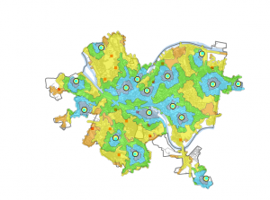
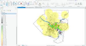
Every one of these strategies was a different variation on creating different layers to show information, by subsetting the data in different ways. With discrete or continuous data, you can highlight a certain subset by making it a strong, striking color, and the other subsets different background colors.  If you have one map that has every data value on it, it can become clustered and hard to look at. Because of this, it can be very helpful to make multiple maps that each show a different subset, as well as one map which combines them all. 

Another important piece of information that the book emphasizes is to use no more than 7 categories at once, as this can also be overwhelming. If you have more than seven features, you can group certain categories together that have similar traits. Your use of symbols is also important when designing your map. Colors are much more distinguishable than symbols, so they should have a higher priority. However, when using Linear features, you should use different widths rather than colors as that is more easy to see.  Text labels can also be used to label your different categories. The last section of the chapter talks about how you can use different features to understand more about the feature you are looking at. For example, if looking at patterns of growth over an area, elevation can be key to finding the origin of these patterns. 


Chapter 3: Mapping the most and the Least


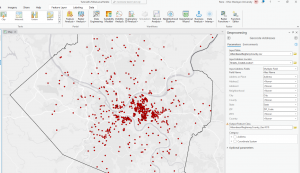
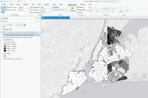
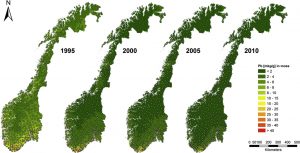
This chapter starts out by explaining why mapping minimum and maximum values in data is important. This is because it can show weak points in current systems, and where we might need to improve. There are multiple ways of recording these values, those being “Counts and Amounts,” which are the number of features, “Ratios,” which show the relationship between quantities, and “Ranks,” which order quantities from high to low (and assigns a value). These features can then be grouped into classes, which simplify and group amounts to prevent your data from getting too cluttered. To create these classes, you can either do it manually or use a classification scheme. You only need to do it manually if you are trying to find features suiting a specific criteria, such as a specific percentage or something specific to your area of study. If not doing it manually, you can use the aforementioned classification schemes. Natural Breaks (Jenks) find large jumps in data values and group the data between those lines. Using a Quantile divides groups so that each one has an equal number of features (Essentially having small amounts of large data and large amounts of small data). Equal Intervals makes the difference in groupings equal across the data (Regardless of size or quantity). Finally, there is standard deviation, which groups data by its distance from the mean. When choosing between these schemes, you have to take into account the distribution of your data and if you are trying to find a difference or similarity between. The book also discusses what to do with Outliers if you find them, as some schemes cause these outliers to heavily skew your results. Next, we are taught how to visualize our data on a map. We have five options; Graduated Symbols, which are good for discrete data but can be hard to read if too abundant, Graduated Colors, which are good for continuous and area data, but do not always accurately represent the difference in data, Charts, which essentially have the same pros and cons as the symbols, Contours, which are good for continuous phenomena but does not show individual features well, and 3D perspective views, which have the same pros and cons as Contours. You need to know which schemes to use to make your maps statistically accurate and how to use these map types in order to effectively display our data.

Villanueva Henkle Week 1


Hi, my name is Rene Villanueva-Henkle, and I am a triple major in Junior Environmental Studies, Biology, and Philosophy. I spend a lot of my time being outside, staying active, and working on building/fixing computers.

I found it interesting that after the introduction pushes this idea that all disciplines, City Planning, Construction, Conservation, and Social Work use GIS, the initial software was created by two men with an ENVS Background. While I know anyone can use this software, it makes it feel that much more special to use it within this discipline. I found the story of the creator of the initial concept of GIS pretty interesting, in that it preceded its own technology. I was having trouble understanding the difference between GISystems and GIScience, but it became clear to me after the example of John Snow. It was easier for me to see how his work mapping and tracking cholera deaths was GISystems, and him going out into the field and asking questions to the Workhouse inmates and investigating himself was GIScience. 

I was also surprised to read that GIS is the program used in Traffic distribution and disruption calculations. I honestly think at times that Delaware City Planners don’t care about traffic, especially with the booming population coming in from Columbus workers, but I fear I will have to give them more credit. Or perhaps lenience would be the better word. 

I also found the usage of GIS is E-commerce, specifically for sites like Amazon to be particularly interesting. I have noticed in the past few years that there could be as many as 5 different delivery drivers for Amazon on my block wide stretch of Sandusky within one week, all of them being regulars as well. I now realize that it is possible there are people (or automated programs) using GIS to find the most efficient route for each individual driver based on their packages each day, which is fascinating to me. I can’t imagine the processing power it would take to do that for every driver in central Ohio, let alone the U.S. and internationally.


First Search GIS+MOSS+POPULATION

This is a pretty primitive version of GIS, but this map shows concentration of lead in moss across Norway over a 15 year span. There are also other maps showing cadmium and mercury concentration in moss, as well as the concentration of all three of these metals in the surface soil in the same places. This study revealed that the Surface soil was soaking up much more of these heavy metals than the moss was. https://doi.org/10.1016/j.atmosenv.2014.09.059


Second Search: GIS+COMPUTER+INCOME

This also did not provide what I was looking for (A map of household income compared to how many computers in each household) but proved to be equally interesting. This is a 3d model of the town of Innsbruck, Austria, that is imported into GIS, and shows the locations that would be able to use solar most effectively. The group did computations to show irradiation for 183 simulated days.

https://doi.org/10.1016/j.compenvurbsys.2016.02.007