Tomlin Week 3

Chapter 4 Summary

This chapter explores various methods for mapping density and how the choice of method can significantly affect the way data is interpreted. Mitchell shows how changing what you map—like workers vs. businesses—can drastically alter the message of a map, which surprised me. He explains the differences between dot density and shaded density maps. While dot density helps compare specific locations, I personally prefer shaded maps since they’re less overwhelming and easier to read. Dot density can also be misleading, as the dots are evenly spread rather than indicating exact locations, and they can get lost in maps with complex boundaries.

Mitchell also discusses density surfaces vs. density areas—concepts I grasp generally, though I still find their differences a bit unclear. He introduces how to calculate density, which I understand in theory but feel I’d need to practice. One fascinating aspect of GIS is how it layers data to create richer, more detailed maps. Small elements like cell size, search radius, calculation method, and units all influence how a map looks and performs. That said, I’m still confused about the difference between areal and cell units, even with the example maps shown.

Chapter 5 Summary

This chapter focuses on mapping specific areas and identifying what features fall within them. Mitchell explains how drawing an area over existing data can help with comparisons. He also covers discrete vs. continuous features—I found continuous features a bit confusing since they change over time. Do they need constant updates, or can you only include them at a single moment?

I found it interesting that you can mark either partial or whole parcels in an area. Mitchell highlights how GIS handles many complex calculations for you, especially when creating overlays. He also explains how to layer data differently to get specific results, and how frequency can be shown with both maps and charts. One unclear part for me was how lines are handled when they cross multiple areas—Mitchell mentions GIS splitting them into new datasets, but doesn’t explain it much.

Chapter 6 Summary

This chapter is about mapping features within a set distance, especially for travel and travel cost analysis. I get the overall idea, but the details—like accounting for turn times, traffic lights, and stop signs—seem tedious and a bit overwhelming. Mitchell briefly mentions turntables for displaying this data, but doesn’t go into enough depth for me to fully understand.

He also introduces inclusive rings to show areas at different distance ranges. I’m curious if these require remaking the map each time or if there’s a faster method. A tool I found useful was buffering, which highlights features within a distance without adding a border. Another method he shows is the spider diagram, which looks cool but gets messy on larger scales. A particularly helpful application is mapping locations within a certain travel time—useful for businesses analyzing customer accessibility.

Tomlin Week 2

Chapter 1

This chapter introduces the fundamental concepts of Geographic Information Systems (GIS) and highlights the wide range of applications it supports. It serves as a solid foundation for understanding the analytical side of GIS by emphasizing the importance of beginning each analysis with a guiding question. This question shapes both the approach and interpretation of spatial data. Mitchell effectively outlines the essential steps involved in conducting a GIS-based investigation. A key component of this involves understanding how geographic features are represented, which can be done using either the vector or raster data models. In the vector model, each geographic feature is stored as a row in an attribute table, with its shape defined by x,y coordinates. Features such as roads, streams, and pipelines are typically modeled this way using a sequence of points. Conversely, the raster model displays features as a grid of cells, with each cell representing a specific area on the map. While raster data can be useful for representing surface features or continuous phenomena, adjusting cell size can affect both performance and storage efficiency. Regardless of the data model used, it is critical that all layers in a GIS project share the same coordinate system and map projection to ensure accuracy. Attribute data, which describes the characteristics of features, can take several forms—such as categories (groupings of similar items), counts and amounts (totals or quantities), ratios (comparative values), and ranks (ordered values).

When working with attribute tables, three key operations are often performed are selecting, calculating, and summarizing, all of which help users interpret and analyze the data effectively.


Chapter 2

Chapter 2 focuses on how GIS can be used to analyze cause-and-effect relationships through spatial data. One of the most engaging aspects of this chapter is its explanation of how data is collected, prepared, and geocoded—either by entering street addresses or by using coordinate pairs. Whether you’re analyzing a single variable or multiple datasets, GIS can reveal meaningful insights by preserving the spatial location of each feature. However, when visualizing this data on a map, it’s important to consider how many categories you include. If more than seven categories are shown at once, the map can become difficult to interpret. Grouping categories thoughtfully can improve clarity and effectiveness. The text presents two comparative map examples: one with numerous distinct categories and another with fewer, more generalized groupings. The simpler map is notably easier to interpret. Still, careful attention must be given when grouping categories to avoid misrepresenting the data. Over-generalization can obscure patterns, while too much detail can overwhelm the viewer.


Chapter 3

Chapter 3 explores the statistical dimensions of GIS, particularly how different types of data can be represented spatially. Three main types of mappable data are discussed: discrete features, continuous phenomena, and summarized area data.Discrete features represent specific locations, lines, or defined areas. Continuous phenomena refer to variables that change across space, such as elevation or temperature, and are often displayed using gradients, contour lines, or 3D visualizations. Summarized area data presents values aggregated over defined regions and is typically shown through shaded areas or charts. The method of visual representation—such as using points, lines, or shaded polygons—should align with the type of data and the goals of the analysis. Understanding your objective is crucial: whether you’re exploring patterns in the data or presenting findings to others, your mapping approach may differ significantly depending on the purpose.

Tomlin – Week 1

Hi, my name is Parker Tomlin, and I am a senior this year. I’m majoring in Exercise Science,

I did the quiz for GEO 291. While reading Chapter One of Schuurman’s text, I gained a deeper understanding of the history of Geographic Information Systems (GIS) and how they have evolved over time. I was especially intrigued by the wide range of applications GIS has today and the ongoing debates within the field of geography about its use and implications. Schuurman draws an important distinction between understanding how GIS is applied (GISystems) and the deeper theoretical understanding of how and why these systems work (GIScience). This differentiation helps frame the conversation around GIS not just as a tool, but as a field of study in itself. The origins of GIS date back to the 1960s, when Ian McHarg used spatial analysis to determine the best possible route for a highway. His work laid the foundation for computerized spatial analysis, which at the time was largely undervalued. However, pioneers like Harold McCarty and William Garrison began to recognize its potential, followed by Roger Tomlinson and Lee Pratt, who were instrumental in developing computerized cartography systems in Canada. These early contributions helped GIS become what it is today—a powerful and evolving field. As GIS has advanced, it has been categorized into two branches: GISystems, which focuses on the tools and technology, and GIScience, which explores the methods, ethics, and implications behind those tools. While GIS has practical applications in areas like agriculture, urban planning, and even e-commerce, GIScience plays a crucial role in ensuring these systems are accurate, ethical, and free from bias. It also raises important questions about who controls GIS data, how it is collected, and how it might impact individual privacy.

Application 1

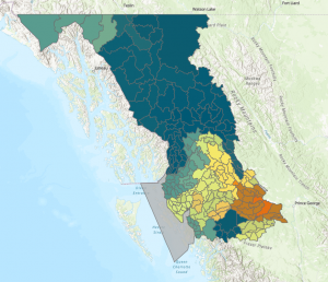
For my first application, I wanted to look at grizzly bear populations and compare them to salmon populations in the same area.

The yellow, orange, and red areas on the map indicate an area of concern for grizzly bear populations. The map of the salmon population made it easy to see that the areas where the grizzly bear population was healthy were also where the salmon population was the most dense.

Sources:

https://www.arcgis.com/apps/mapviewer/index.html?layers=856c6b542ede4815a14be63bd5e261cc

https://www.arcgis.com/apps/mapviewer/index.html?layers=fbe6f9687c90440a9aef0194c8f0f2e6