PLSS: This data is called the public land survey systems where all the public land is visible in Delaware county. This data is useful for both U.S and Virginia military districts and it is updated monthly.
Zip Code: This data set contains all the zip codes in Delaware county. Some of the zip codes were manually created because they did not automatically appear on the system. They also used U.S postal service and other sources to gain the information. This map is also updated monthly.
School District: This dataset contains all school districts within Delaware County. The data comes from the Delaware County school district records. It is updated and published monthly.
Township: Includes information of 19 different townships in Delaware County. It is also updated when needed and published monthly.
Delaware County E911 Data: This data includes information on all certified addresses within Delaware County. It contains information regarding 911 agency information to improve their services. It is also updated when necessary and published monthly.
Building outline 2021: Data consists of all building outlines in Delaware county. The most recent update was in 2021 but it is updated as needed.
Original Township: I couldn’t find any information regarding this dataset.
Recorded Document: This includes points which represent recorded documents in Delaware county’s Recorder’s Plat Books. This is helpful when it comes to locating specific documents that may be scattered throughout the county. This is updated weekly and published monthly.
Building Outline: I couldn’t find any information about this dataset.
Dedicated ROW: Represents all the Right-of-Way paths in Delaware county. Information was gathered from Delaware’s County Parcel data. This is updated daily and published monthly.
Building Outline 2023: Shows all the building outlines in Delaware county from 2023.
Precincts: Included information about voting Precincts in Delaware county. Information was gathered using Delaware County Auditor’s GIS from the Delaware County election board. It is updated when needed and is published when needed by the election board.
Delaware County Contours: It looks like the data is from 2018 and it shows the Two Foot Contours for Delaware County.
Street Centerline: Includes data on paved public and private roads within Delaware county. It is used to support road safety and improve 911 services, as well as ensuring the roads are up to date. It looks like it is updated annually but the data is published monthly
Condo: Includes data of all condos within Delaware county.
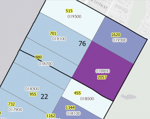
Parcel: Includes data on all registered parcel lines in Delaware County. The data was collected through the Delaware County Auditor’s GIS office. It is monitored daily and is published monthly
Subdivision: Includes data of all subdivisions and condos from the Delaware County recorder’s office. It is updated daily and published monthly.
Tax District: Includes information of all tax districts in Delaware county. The data is recorded on the Tax district code. It is updated as needed and published monthly.
Address point: This includes information of all registered addresses in Delaware county. It helps 911 agencies to find the most suitable places for their job. It is updated daily and published monthly.
Map sheet: I could not find any information about this set.
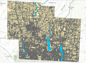
Hydrology: includes all major waterways in Delaware county. Information was gathered and updated using the LIDAR enhanced dataset in 2018. It is updated as needed and published monthly.