Zip Code: This dataset contains all existing zip codes, covering different outlines of land, for Delaware county. It references a collection of data found on Census Bureau, the United States Postal Service, and tax mailing addresses.
School Districts: A visual compellation of different school districts throughout Delaware county. Information on this dataset is updated regularly, sourced from Delaware County Auditor’s parcel records.
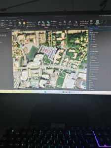
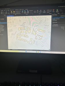
Building Outlines 2023: This is a dataset that contains blocked out outlines for each building located within Delaware County up to the year 2023.
Building Outlines 2021: This dataset contains blocked out outlines for buildings existing within Delaware county in the year 2021.
PLSS: This dataset visually displays the Public Land Survey System, with the polygons representing data from the U.S military and Virginia military survey districts. The creation of this dataset aided in identifying the boundaries of the prior mentioned survey land. The data is updated when needed.
Township: The data includes 19 townships that reside within Delaware county. In order to keep the information up to date, the data is updated when needed.
2024 Aerial imagery: imagery captured in 2024 of Delaware county.
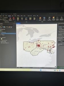
Delaware County E911 Data: This dataset represents the different location based response system locations in place within Delaware county. Each address data-point is a different emergency response location. The information provided is intended to aid emergency responders in the closest response site from particular surrounding addresses. This information is updated daily.
Original Township: A dataset that displays the state of Delaware’s townships before tax districts changed their shape.
2021 Imagery (SID file): Imagery captured in Delaware County in 2021.
Recorded Document: This is a dataset that is composed of points that indicate locations with recorded documents such as Plat’s books, slides, and instrument records. The records themselves consist of various surveys regarding different features within Delaware. The purpose of this dataset is to aid in the locating of different types of documents.
Dedicated Row: The features that this dataset represents are the different lines that are designated the right of way within Delaware County. This information was created through daily updates. The changes made are sourced from Delaware county’s recorder office.
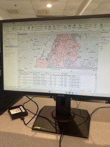
Precincts: The data from this set is in relation to differentiated voting precincts. The information is regulated by the Delaware county board of education. It is updated on a regular basis to keep the information up to date.
Delaware County Contours: A datafile of the different elevation contours of the landscape of Delaware county as of 2018. The data is in Geodatabase format.
Building Outlines DXF: An outline of buildings residing within Delaware.
Street Centerlines DXF: Contains data that indicates the centerline of pavement in both public and private roads running through Delaware county. The dataset was created using building permit information.
Address Points DXF: This specific dataset includes information about location based addresses to increase accuracy. The information in this dataset was created by the state of Ohio and Delaware County, and is maintained using the Delaware County Auditors GIS office.
Parcel: The dataset contains polygon information that outlines the parcels within Delaware county. Any changes within the dataset are done in reference to recorded documents, and information is maintained by Auditors CAMA.
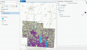
Street Centerline: Outlines are made that indicate the centerline of public and private roads within Delaware. The information is collected from field observations and existing addresses.
Condo: A dataset that contains polygons that indicate the location of existing condos within Delaware County. The polygons have been sourced from Delaware County’s recorders office.
Subdivision: This Data file contains a combination of both subdivisions and condominiums within Delaware County. The data is updated regularly in order to maintain accuracy.
Address Point: This data file contains geographically accurate addresses for Delaware County. The information is upheld by the Delaware County Auditor’s office. This data is intended to support emergency first responders as well as other services that require geographic understanding.
Map Sheet: This file contains all map sheets depicting Delaware County.
Farm Lot: The datafile displays existing farmlots within Delaware County. The data is in correlation to both U.S military and Virginia military survey zones. This dataset was created to clarify the borders of the county’s farmland and military districts.
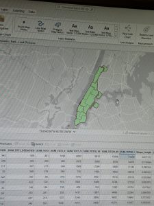
Annexation: This file displays Delaware County’s annexations on a time frame from 1853 and up to present day. This data is updated when needed, particularly when annexations are recorded.
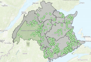
Survey: This dataset contains dot style data features that represent different surveys of land across Delaware County. The displayed information is sourced from the Recorder’s Office. All of the surveys residing in the Recorder’s Office since 2004 are collected by GIS scanners.
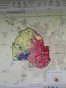
Tax District: This file displays all tax districts within Delaware. The information is described by Delaware County’s Auditor’s real-estate office. It is updated when needed.
2022 Leaf-On Industry: Imagery taken of Delaware county from 2022 in high resolution.
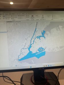
Hydrology: This dataset displays major waterways that exist within Delaware County. This information is updated when needed.
GPS: This information depicts all GPS monuments that had been recorded between the years 1991 and 1997. This data is updated when it is deemed necessary.
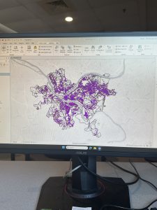
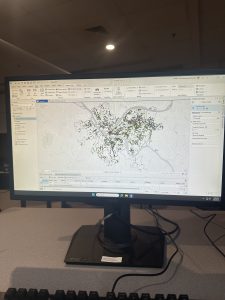
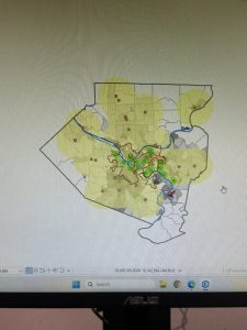
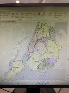
This section of the data was easy upon learning about the add Data section. I had even took the time to modify the colors of the map to my personal liking.