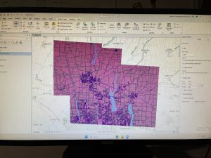
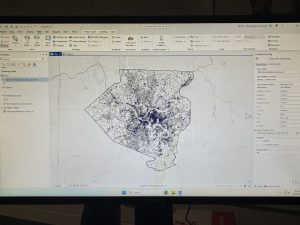
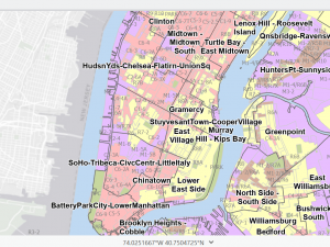
Zip code:Contains all the Zip codes in Delaware County, Ohio. It was made by using data from the Census Bureau and the US Postal Service from 2000 and was created in 2005. It is not regularly updated but is updated on a when-needed basis, using the US Postal Service, which is updated monthly.
School District: This holds data that pertains to all schools within Delaware County, and is updated on a as needed basis, and issues the data from Delaware County Auditor’s parcel records to create it.
2021 Imagery: Imagery that was captured in 2022 and last updated then as well.
2022 Leaf-on Imagery: Imagery created in 2022 that has a different resolution of 12in
2024 Aerial imagery: data that was obtained during the spring of 2024 and contains 3in an aerial view.
Address Point: Locates the individual building location as accurately as possible while using data from The State of Ohio Location Based Response System and through a partnership between The State of Ohio and Delaware County.
Annexation: This contains information about conforming boundaries and annexations from and that date all the way back to 1853.
Building Outlines DXF + Building Outline 2021 + Building Outline 2023:The DXF uses CAD drawings and was last updated in 2020, while 2021 and 2023 are new updates. The building outlines that were updated in two years after their respective names,while being service features files.
Condo: This data consists of condominium polygons that assess and give a view to the individual units within a condo. This uses data from the Delaware County Records Office and was last updated a few days ago 2/27/2026
Dedicated ROW: Shows all Roads within Delaware County that consist of Right-of-ways, It is updated on a daily basis and published updates once a month and it was published in 2020
Delaware County Contours:A geodatabase file last updated in 2021 that shows the ‘contours’ of delaware county that is basically showing the terrain, the elevation etc.
Delaware county E911 Data:Uses data and address points to locate the centroids of buildings, which is important for emergency services. It was also published in 2021 but is also updated daily and published on a monthly basis.
Farm lot:This was built with the intention of showing military farmlots in Delaware County. It is updated on an as needed basis whenever new surveys are done on these areas. It was 2020 and was last updated in February of this year.
GPS +Delaware County GIS Data Extract Web Map:Identifies monuments from 1991 – 97 and is updated on an as needed basis. Also hasn’t been updated since 2021.
The extract web map of Delaware County in GIS that is able to be extracted into a variety of formats.
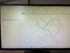
Hydrology: This data set shows the major ‘water ways’ within the Delaware County Region, also updated on an as needed basis.
Fall Background: A background for fall that was created in 2019 and last updated then as well.
MSAG:A master street address guide that depicts the different political jurisdictions.
Map Sheet: All map sheets within Delaware county. Created in 2020 but most recently updated in February.
Municipality:Pretty self-explanatory it is basically data that consists of all the municipalities within Delaware County. Created in 2020 and last updated in February as well.
Original Township + Township: The original township lines of Delaware County before tax districts changed these lines. Township consists of the 19 different townships that makeup the entirety of Delaware county.
Parcel:Parcels are polygons that represent all cadastral parcels which are
Precincts: Shows the division between the voting precincts in Delaware County.
Railroads: Shows a view of all railroads within the Delaware County lines.
Recorded Document:A sum of miscellaneous recorded documents in relation to Delaware county. It is updated on a weekly basis.
Street Centerline + DXF Centerlines:This uses LBRS to depict pavement centers of public and private roads with intentions to support appraisal mapping and emergency response services. DXF Uses field surveys
Subdivision: This data contains information in regards to all recorded subdivisions and condos in Delaware county.
Survey:These are survey points that represent shapefiles of surveys of the land. Old volumes are not currently included in this.
Tax District:Includes all and separates the tax differences within Delaware County. It was published in 2020 and recently updated last month on an as needed basis