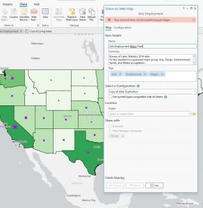
Pratt Week 4

Ch. 1  ArcGIS pro

This is such fun software! It was hard to get used to at first, but with practice and repetition, all was well. My favorite was Ch1Tut4 when we got to make features 3D. It’s like if a bar graph and a map had a baby. My eyes hurt now so I’m done here. Excited for 3 more hours in the GIS lab next week.

Tutorial 2

forgor to take a picture for tutorial 3 and 4 rip

why are there so many for chapter 2

Ch. 2

accidentally  eliminated the map for tutorial 1 and i dont know how to get it back so… moving on to tutorial 2-2

tutorial 3

tutorial 4

tutorial 5

tutorial 6

tutorial 7

tutorial 8

chapter 3

tutorial 1

i got lost this is as far as i got:

tutorial 2

wouldn’t let me share it online because i dont have the privledges (??) so couldn’t go any further. but now i know how to share!

tut 3 story map: https://storymaps.arcgis.com/stories/0a6ca81879c74582834cf809981f4ed5

tutorial 4 map: https://www.arcgis.com/apps/dashboards/0af898a2311a4ad79e6f440dd7fa42e9


Pratt Week 3

Mitchell 4, 5, 6

Ch. 4

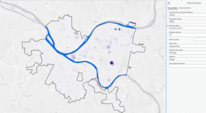
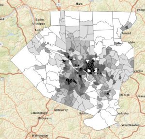
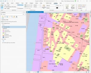
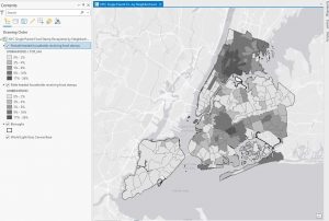
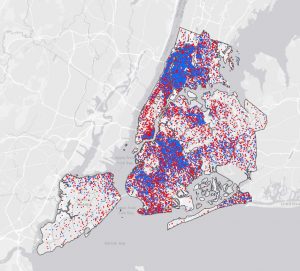
Mapping density is an invaluable technique for analyzing spatial patterns, allowing for a deeper understanding of how features are distributed across different areas. Depending on the type of data—whether lines, points, or defined areas—the approach to mapping density varies. If you have point data or lines, density can be mapped through graphical methods or density surfaces. For graphical methods, you might use dot density maps where each dot represents a certain number of features, visually demonstrating the distance between them. Density value maps, on the other hand, shade defined areas based on the number of features per unit area, offering a quick visual reference without pinpointing exact density centers. For more precise analysis, especially with point data or lines, density surfaces are useful. These surfaces assign density values to cells, and the patterns are displayed through shading or contours, which can highlight concentration areas more accurately but require more processing.

When mapping density for defined areas, consider factors such as cell size and search radius. Larger cells make for coarser maps with less detail, whereas smaller cells provide a smoother and more accurate map but require more intensive processing. The search radius affects pattern detail; smaller radii reveal more detailed patterns, while larger radii offer a more generalized view. Calculations can be simple, counting features within a cell radius, or weighted, giving more importance to features near the cell center. When transforming summarized data into a density surface, the center points of defined areas can be used to reflect the value assigned to each area, helping to highlight patterns with less emphasis on shapes.

Displaying a density surface involves choosing appropriate classification methods like natural breaks, quantiles, equal intervals, or standard deviations, which affect how patterns are visualized. Graduated colors or contours illustrate variations, with darker shades often representing higher values. It’s essential to find a balance in the number of classes to effectively show patterns without distorting the data. Interpreting these results requires understanding that the patterns observed may vary based on sample point distribution and the specific data layers used, as GIS calculations are tailored to each layer’s data.


Ch. 5

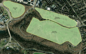
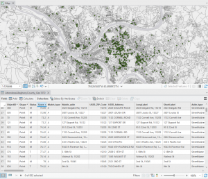
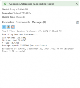
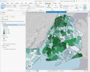
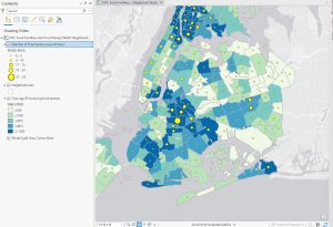
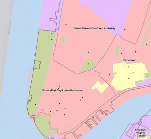
Mapping and analyzing what is inside a defined area involves several techniques to interpret spatial data effectively. The process starts with creating an area boundary, which allows you to identify and summarize the features within it. The method you choose depends on your data and the type of information you need, such as lists, counts, or summaries.

There are three primary approaches to finding what is inside an area:

  1. Drawing Areas and Features: This approach helps determine whether features are inside or outside a boundary.
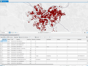
  2. Selecting Features Inside the Area: Useful for obtaining a list or summary of features contained within the boundary.
  3. Overlaying Areas and Features: Effective for analyzing which features fall within which areas and summarizing data based on these areas.

When features partially intersect with the boundary, you need to decide whether to include the entire feature or just the portion inside the boundary. GIS can help by generating reports and statistical results based on your selected features. Overlaying multiple areas on a set of features allows for detailed summarization and comparison based on specific statistics.

The chapter highlights the importance of understanding what is inside a given boundary, which is crucial for applications like determining the impact of events within specific zones, such as assessing speeding violations in school zones. Choosing the right boundary—whether a service area, buffer, natural boundary, or manually drawn territory—affects how features are analyzed. Effective mapping involves creating a suitable boundary and using GIS tools to produce relevant reports and summaries based on the analysis of areas and features.

Ch. 6

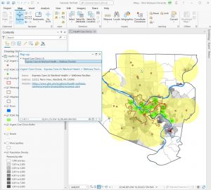
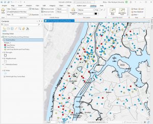
The chapter focuses on using GIS to map what is nearby a feature, measuring within a specified distance or travel range. This involves understanding how to define “nearness” based on the information needed from the analysis. Travel range can be measured by time, distance, or cost, and the choice of measure depends on the analysis requirements and how you define proximity.

For small distances, the planar method is appropriate as it assumes a flat surface, while the geodesic method is used for larger distances to account for the Earth’s curvature. Your choice of method should also consider the desired end result, whether a list, summary, or count, and the number of distance or cost ranges needed.

To find what’s nearby, there are three primary methods:

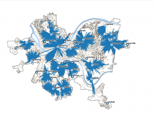
  1. Straight-Line Distance: Defines an area of influence around a feature using a fixed distance to create a boundary or select features within that distance.
  2. Distance or Cost Over a Network: Measures travel based on a fixed infrastructure like roads, capturing the cost or distance of travel between points.
  3. Cost Over a Surface: Measures overland travel to calculate the area within a travel range based on varying travel costs.

The chapter explains that mapping what is nearby involves creating buffers or rings around a feature to visualize the distance or travel range. It also discusses creating multiple buffers to assess how the total amount changes with distance or using distinct bands to compare distance to other characteristics. To create effective maps, you may use various visualization techniques such as point-to-point distance, color-coding, or spider diagrams. The process starts with data gathering and separation before mapping, emphasizing the need to choose appropriate methods and visualizations based on the analysis goals.


Pratt Week 2

Mitchell

Ch. 1

Creating a map might not initially seem like a deep analytical task, but it involves several layers of analysis. Mitchell categorizes data into different types to better understand and represent geographic information. Discrete features refer to specific locations that can be precisely pinpointed, such as linear paths or individual spots. In contrast, continuous phenomena can be measured anywhere within a given space. Interpolation is used to estimate values for areas between measurement points. Although parcels provide a broad area of data, their non-legal definition can introduce some margin for error.

Boundaries help group data into similar types or categories and are usually legally defined, creating a structured way to summarize data by area, like demographic or business information. When features are tagged with codes that assign them to specific areas, statistical analysis on the data table is required to prepare it for mapping. GIS technology allows for overlaying features on areas without predefined codes to determine what belongs where.

Geographic features can be represented in two main ways: vector and raster. Vector representation involves defining features by specific x,y coordinates and tables, which requires precise location data. Analysis with vectors typically involves summarizing attributes in a data table, though sometimes raster data is used for combining layers. Raster data represents features as a matrix of cells in a continuous space, with each layer representing a different attribute. The accuracy of raster data depends on cell size—the smaller the cell, the more precise the information.

Map projections and coordinate systems are crucial when mapping large areas, as they account for the Earth’s curvature. Attribute values can be categorized into several types, including categories (groups of similar things), ranks (ordering features by relative importance), amounts and counts (total numbers showing magnitude), and ratios (relationships between quantities to better reflect feature distribution).

Ch. 2

This chapter highlights the crucial role of statistics and mapping in Geographic Information Systems (GIS) for interpreting spatial data and identifying patterns. A solid understanding of statistics is vital for analyzing spatial data, with spatial statistics specifically designed to quantify and analyze spatial patterns. The chapter covers essential statistical concepts such as descriptive statistics, including mean (average), median (middle value), and standard deviation (variation from the mean). These tools are important for comparing outliers and understanding data distribution.

Effective map creation involves balancing detail with clarity. Users must assign geographic coordinates and category values to each location and decide how to present this information. Too many categories can clutter a map, while too few may obscure important details. The choice of map type and design should be aligned with the intended audience and purpose. Complex maps may suit experts, while simpler versions are better for the general public.

GIS mapping focuses on visualizing the distribution of features rather than individual data points, aiding in the identification of geographic patterns. Users should select the appropriate map type based on the issue and audience. For instance, a crime map can reveal high-crime areas, while a zoning map is useful in a committee setting. When mapping, it’s important to limit categories to around seven to avoid confusion, using different symbols and colors to distinguish them. Including recognizable landmarks can improve map readability.

The chapter stresses that understanding what to map, how to display it, and tailoring the map to its audience are critical for effective spatial data representation. Proper data preparation and thoughtful symbol selection are essential to creating maps that clearly communicate patterns and insights.

Ch. 3

This chapter discusses methods for analyzing spatial patterns through mapping, emphasizing how different techniques reveal patterns in various types of data. Mapping the most and least of certain features helps identify patterns and characteristics within data, such as in real estate. Data can be categorized into discrete features, continuous phenomena, or data summarized by area. Discrete features are often represented by graduated symbols, while continuous phenomena are displayed using graduated colors or 3D perspectives. Data summarized by area is typically shown with shading to indicate quantities.

When creating maps, it is crucial to consider the intended audience and purpose. For presentations, clear explanations of data points are necessary, while exploratory maps should offer a solid baseline for identifying patterns. Numerical considerations like amounts, counts, ratios, or rankings help determine the best representation method, such as gradients or varying shapes.

To effectively represent data, users must classify values into categories. If mapping individual values, detailed data patterns can be observed. Grouping values into classes involves assigning the same symbol to similar values, using standard classification schemes to simplify patterns. Common schemes include natural breaks (based on natural data groupings), quantile (equal number of features per class), equal interval (uniform value range across classes), and standard deviation (class based on variance from the mean). Choosing the appropriate scheme and visualization method is essential for creating clear and informative maps.

Understanding and selecting the right mapping techniques and classification schemes are crucial for accurately analyzing and presenting spatial data. Proper visualization and statistical analysis help reveal significant patterns and insights, making it easier to interpret and act upon the data.

Pratt Week 1

me and my cat cletus!

Hey everyone! My name is Maizy Pratt- I’m a senior microbiology major with a minor in environmental science. I’m pretty spread out across campus- I’m a Theta, a member of the ENVS student board, working to start a microbiology club, and I work at Del-Co as the watershed intern. I’ve always been passionate about the outdoors, but I prefer the little organisms, so I’m pursuing a career in environmental microbiology. Outside of science time, I love listening to music, working out, being outside, learning new skills, painting/drawing, and thrifting.

I found this chapter incredibly interesting. I’ve always been aware  that GIS exists and that it’s a tool able to be used across so many disciplines, but I guess I never really digested it to the point that this chapter did. John Snow’s visualization of Cholera outbreaks is something that gets talked about crazy often in microbiology classes because it was one of the first epidemiological investigations, but I never thought of it as an early development in GIS. I also enjoyed the discussion of precision farming; not only is it useful for farmers to save resources when solving problems, it’s also useful when studying the impact of farming practices on the surrounding environment. As part of watershed crew duties, we take nitrate samples from different parts of the Scioto to get a good idea of what levels will hit the treatment plant in the coming days, especially after big rains. I think it would be very interesting to compare runoff data and precision farming data to understand how the nitrates make their way into the river. It makes a lot of sense to me that GIS has developed in the way it did because humans are such visual creatures. Schuurman’s comparison to visualizing genomic data made my microbio brain very happy. I can absolutely see how GIS became so widespread as it allows for a better understanding of data that would make zero sense on the surface as just a set of numbers. Go GIS!

Search one: GIS+corn+diabetes

I was not given an article by the Google gods that talked about diabetes but I did find Atrazine exposure maps of Nebraska. 

“Fig. 5. Exposure to Atrazine in Nebraska in 2005 (note: this is a population grid level map generated by the pesticide weighted exposure model developed in this study; exposure to Atrazine was categorized based on natural breaks; pixels with the value of 0 were distinguished from the first category 0–31.2).” (Wan 2015)

This paper explores the usage of pesticides, notably Atrazine, in different counties in Nebraska. Pesticide exposure has been shown to result in diseases such as cancer, neuro-degeneration, and reproductive issues. Wan used buffer-based exposure modeling to determine likelihood of exposure to Atrazine.


Search two: GIS+water+table

Here are some really cool maps of drainage density, lineament density, slope, land use and land cover, annual rainfall mean, soil, lithology, and geomorphology. RS-GI

S-based weighted overlay analysis and water-table-fluctuation technique were used to develop a potential map for groundwater abstraction in the northwest region of Bangladesh, which helps determine potential groundwater sources in the region. I didn’t realize how many variables go into determining groundwater availability and resources, so it was cool to learn about that.