Butte_Weeks 6-7

Week 6 Work:

Chapter 7:

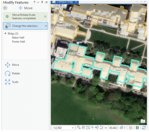
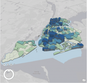
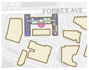
This chapter/ tutorial was actually a lot of fun to work with. It felt a lot like working in Adobe Illustrator, with making the point lines, and moving the features. I also felt very fancy using the Cartography tool, and “improving the aesthetic” of my map/ its lines. Learning how to edit, delete and move the buildings around was super cool. This is extra useful in the world we live in today, with construction and deconstruction always affecting/ moving locations and landmarks. It was interesting to think that no matter how “good” a map might be, there can still be aspects of it that are warped between the system and ground map. Being able to fix that distortion can be an extremely invaluable tool. Creating features is also very useful when starting a map from scratch, or if the project doesn’t include the needed feature class. Because this chapter dealt with a lot of permanent modifications, it included good advice to keep an unedited version of whatever map you’re working on in case of any errors. That way you can just go back to the original file and start the map over again. Using a style of system work that mimics the work of Architects and professional location planners at the end made the assignment feel very professional. Like, it ran us through what the professionals do, giving us an idea of what to expect if any of us wish to go to that level.

Chapter 8:

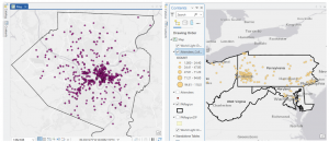
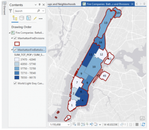
This chapter went very local, working primarily with Zip Codes and Counties. Using geocoding to map the charts of zip codes and counties, the chapter bridged the gap between chart data and actual geographic locations, inputting them into analyzable features on the maps. This chapter introduced Match Scores, something that I am still trying to understand a little bit more. Essentially, the match score shows the percentage of accuracy of an address when evaluated with a reference. Around 85%-98% is usually an acceptable score range, but in some situations it’s ideal to try to have a perfect 100% match. I did have a few issues with this chapter when trying to Rematch Addresses. Whenever I would try to click the map to set the rematch, I would continue to get pop-ups and the rematch selection wouldn’t actually register. I turned off the pop-up setting from the map (temporarily) and it seemed to bypass the issue. As I stated before, I believe that longer tutorials are more beneficial to my learning process- and this was heightened using chapter 8. As this chapter only actually has 2 assignments built into it, they both build off of every step followed in the textbook. If something was missed, or incorrectly done, the entire assignment would be messed up and needed to be redone. This was a bit annoying, but in the end the repetition definitely aided my understanding of the topics taught in this chapter.

Chapter 9:

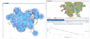
Learning about and setting up buffers was something that was briefly recapped in some of the much earlier chapters, so I had some initial knowledge on them. My first thought when working with them was that they’re bubble letters for feature plots! These bubbles were quite fun to set up, and I can visualize a lot of reasons why someone would use them on a map- like finding a specific feature within a distance from certain features, and gathering data on what’s outside these zones as well. It’s very neat that the buffers can have multiple layers of distances applied to a single feature set at the same time. And although I actually like the “target” look on the map, and how it visibly shows the change in distance on the plot, I can understand that there might be reasons to make a single “multiple ring” buffer containing both blended together. A small note for the future, that using Optimized seed in the Multivariate Clustering tool is the setting that should be used when making your own projects/ data. This entire chapter was extra visually appealing for some reason, the colors used as symbology on the features fit well, and I absolutely love the way the map looks with the Locations-Allocation assignment with the lines diverging from the “ideal” location points. That entire assignment was fascinating as well, how the system was able to calculate the best locations of pools from the data collected and accessed. It was a great representation of the ability of GIS to manipulate datasets to create purpose driven maps. The system works for real world problems, using analysis to work out relationships between features/ points, and provide a simple answer to questions asked about data.


Week 7 Work:

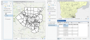
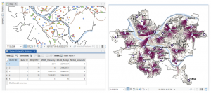
The Delaware City maps have been downloaded, and inserted onto a created GIS Pro map for the final project map. I moved the maps around adjusting their map display from the drawing order to see which layering was best, featuring all the needed datasets. The Parcel map is very interesting to explore, with how much detail it has within its data and display. I generated ideas for my final project and evaluated each dataset’s information.

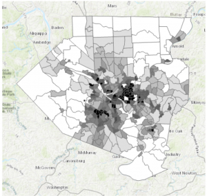
The Parcel map is managed daily by the Delaware County’s Auditor GIS Office, with data kept by the Delaware County Recorder’s Office. It shows clearly defined boundaries of land plots and features from all around Delaware. It is packed to the brim with every single road, building and section of land, complete with their IDs, data, and building names. I will note that the map looks like it could be a little bit off, with some features not in the correct location on the map, or it could simply be the way I have it layed out creating this illusion. This dataset is key to working on the “What’s Inside?” section of the final project, as it requires the data being gathered to be set from within, or inside a parcel of Delaware land.

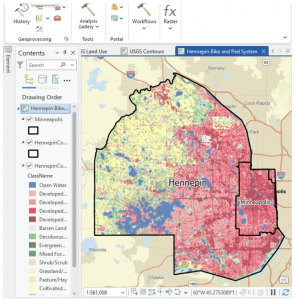
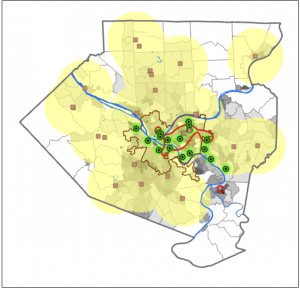
The Hydrology map shows all major waterways of the Delaware County, and was made in July of 2022 with no updates since then. This dataset could be useful if inspired to work with runoff into waterways, or a specific project with water. However, it may not be entirely useful for other areas of mapping besides acting as a location identifier. 

The Street Centerline map is a highly adaptable map with many ways to use it and displays exactly what it sounds like, all the public and private roads located within the Delaware County district. Made from data collected by The State of Ohio Location Based Response System (LBRS), the map remains updated daily for most aspects except for the monthly 3-D model updates. This map is great for landmarking, and making the map easy to understand if reading it for specific locations. This map can be useful for a number of things ranging from emergency response maps and ranges, to appraisals and accident reports. 

Butte_Week 5

Chapter 4:

Chapter 4 gets into the databases/ Geodatabases. A very helpful thing to understand when working within ArcGIS- they are the central storage bank for all information/ data that pertains to a certain organization or project. File geodatabases have no limits to the size or amount of feature classes or raster datasets could be stored in it, and it keeps all your project information in one easy to access place! Over the course of the next few chapters, I used the geodatabase for each chapter to select any files I needed, quickly. It’s good to learn how to convert external files into the proper format for the file geodatabase, so you know how to work on a map from an external source. This is primarily because when working on a project from scratch, a lot of the data needed might not be available from the Esri/ ArcGIS collections, and would prompt the need for an outside source (like a census bureau tract for example). There was a bit of bookkeeping this chapter, with moving files around and developing understanding of these databases. One thing I learned that I found very helpful was that if you delete something from the contents pane, it is still filed in the geodatabase and can be brought back to the map. While on the other hand, if something is deleted straight from the database, that is permanent. As someone who is very nervous when deleting anything on a project, understanding how the files work within their environment and where backups are is good knowledge to have! I also liked that the system won’t let you accidentally delete any important keys from the field table. This is very reassuring as working with the tables can get somewhat confusing, and I’m always worried I’ll hit a button and accidentally erase a needed field. It was also interesting to learn that GEOID and GEOIDNumber are technically the same data, but two different ways that the field can be categorized. While they are the same kind of attribute, they cannot be joined together due to their different codes (GEOIDNum- 4048 vs GEOID- 04870). Diving deeper into the Python language and SQL helps me develop a stronger understanding of what I am doing when adjusting the code on my map. Like understanding that using ‘OR’ within a data query is essentially saying and/ adding the two fields instead of using one or the other like it sounds- and using ‘AND’ means the opposite, picking one or the other. Using the SQL and Definition Query to plot out exact pockets of dates and times to find the specific data you’re looking for is especially important when you need a small time pocket of data from a larger scaled data set.

Chapter 5:

This chapter felt like we were learning how to read a map the “old-school” way, developing skills on reading and understanding the longitude and latitude, and positioning of locations. I appreciated that it explained map proportions and showed that most of the maps we’re taught about in school are technically all distorted/ inaccurate. I learned a new word that I actually quite like: Graticule. In regards to the longitude and latitude, a graticule is the coordinate point system. Chapter 5 gets back into the local versus world aspect of maps, detailing that certain maps work better on a smaller vs. a larger scale. For example, using localized projected coordinates for a smaller map such as Minneapolis or Hennepin works best due to its specialized data that focuses specifically on that region. This chapter also talked more about the file types, with specifics on shapefiles and the continued use of the geodatabase. I also learned how to access other websites to download their maps/ data- like the ArcGIS Living Atlas and dealing with the US Census Bureau again. At the end, I had a few issues when working on the joint data/ choropleth map section. The copied fields had been showing no data, and although I went back and repeated the steps from the start, the fields continued to not provide any data needed to even change the symbology into the graduated scale. 

Chapter 6:

I love how this chapter began with more examples of real-world applications with the GISystem. That it did not abandon the initial idea that Geospatial Analysis tools can be used for many more reasons than people would first assume. On tools, the chapter explores a lot more, various geoprocessing tools. Because there are so many tools within the GIS system, it’s very helpful that the tutorial runs through as much of them as possible. Giving more examples and definitions, and having us actively use and have our own “turn” at using the tools. Intersecting features was surprisingly simple, and although the chapter has a lot of assignments, they were all short and sweet. That being said, I believe I learn better from the longer tutorial assignments, where if something is done wrong at a certain stage, then any work that connects to that could be off as well. It raises the stakes, and makes me pay close attention to what the tutorial says, and what I’m doing in my project. Setting a Study Area was one tutorial that I found particularly useful. When working in a location (like New York City) that has an overwhelming amount of streets and attributes, blocking off a specific work area quiets the noise and makes everything easier to work through. On the topic of simplifying everything, putting all classes into one single feature class really keeps things decluttered and simple- definitely something I will take advantage of in the future. This chapter really showed how many different ways there are to combine features, maps and tables (like the Union tool, or Intersect tool).

Butte_Week 4

Chapter 1:

Starting with a completed map and working backwards is an interesting tactic to teach beginners how the system works. That way the maps are already mostly constructed and the learning is very specific/ centered in a certain task within that map. Connecting to that, the “Your Turn” sections of the book is a smart way to ensure the reader is actually grasping the material. It makes you use your own brain to work through what was just done as a tutorial on your own. Also, the textbook including photo examples alongside the tutorial is very helpful in making sure I haven’t messed something up. It’s a good visual guideline. On the contents pane, the way it’s arranged to be from what’s drawn first and “on the bottom of everything” makes a lot of sense in regards to a map and layering. I knew everything had its own layer from reading the earlier chapters, but the tutorial extended that thought even further by having this particular overlay. It makes a lot of sense to me that the layers are drawn on top of one another, it’s almost like altering a physical map by adding marks directly on top  of the paper.

A personal connection to the system of GIS that I had thought about when working was the shortcuts. Taking “snapshots” and using Ctrl S to save the project is something I’ve instinctually been drawn to do after spending years working in Photoshop with a similar shortcut interface. I never wanted to lose work, and from that I learned to always save my work, which I’ve found really carries over to this system as well. By having an original base saved/ snapshotted, it lowers the impact a mistake might have on the project, ensuring there is always that beginning point to return to if needed.

Finally, I had a slight moment of frustration at the end of the tutorial when it came to the labeling. The program is such a large system, and it has a crazy amount of buttons, so simply locating where all the different buttons and options are was a lot to process. It was frustrating when I couldn’t figure out where something was hiding in the interface.


Chapter 2:

This chapter diverged from the 2D maps, into adjusting them to be seen as a more prominent 3D. I really liked the way that the interpretation of the maps can completely change between 2D and 3D. How some details that may relay a certain type of information isn’t the same linear with the two styles, or how an aspect of the 3D model can bring to light information that couldn’t be seen the other way. This really brings to light the idea of understanding your map. Knowing who/ what the map is for, in order to adjust and label it in a way that will relay the kinds of information needed within its purpose. This chapter really focuses on clarifying the details of the map. By making the subject notable while also adding the necessary context to the background.

Something that I found interesting while working on this chapter, was the mention of color blindness. Which was something I hadn’t actually thought about once when creating all these models of colors. It was neat to see the inclusion of altering how a map is displayed so a person with color blindness could achieve the same aspect of detail when mapping, even without using bunches of colors. It also doubled as a lesson in understanding how to change the symbols of a map, and explaining that a variety of shapes can be used instead of colors to convey the same knowledge of the key.

I will add as a side note, that I absolutely love playing around with the different colors! Obviously the purpose of a map is to convey information, but I find it fun to adjust the colors in an aesthetically pleasing way, or to pair associated colors with the topic of the map.

Chapter 3:

This chapter was interesting because we pivoted even more and went from working within the ArcGIS Pro, to learning the Online system. On that topic, I feel as though in a way, ArcGIS Online is a much smoother/ easier interface to work with. I don’t know exactly how to explain that, but maybe it’s due to the fact that it’s online and available for anyone to access. Perhaps it’s made a bit simpler and cleaner for anyone to play around with and use. Before that section of the tutorial however, I really liked following the detailed explanation of how to create layouts from scratch. This is a very useful skill, in being able to make any style of chart or map view of the project for easy download and display. I liked how the textbook described going about making these layouts. To think about retaining this goal of designing it in a way that anyone could understand it, like you’re sharing the maps to those with no experience in the software. It reminded me of the explanatory mindset of teaching something in a way a child or an alien could grasp.

I have a creative mindset, so I adored the section of the chapter that revolved around storytelling within the StoryMaps. We were giving the map’s their story. In a sense, this is leaning into the analytical aspect of the “Geospatial Analysis.” I appreciated the angle of art, from adding a cover image, to having the potential to completely change the design/ layout. This part, just like creating layouts, is highly important to know how to do. The uses for the completed story and layout are endless. My first thought was using it for a website, or some form of journalism as I thought it resembled an article in a way. It’s returning to the idea in the first textbook of the many everyday uses that GIS has.

The quote from the mathematician, John Tukey, “minimize ink!” is very applicable to mapping on GIS. And I rather enjoyed the idea of never deleting any values even if they don’t add anything to the image. It’s like with art, you might take a hundred photos or create notebooks of sketches, and only a handleful could be things you actually like and will use. You don’t just throw the others out though, because they still hold power in what they don’t show. It’s better to keep something and not use it, then to delete it and realize you really did like it, or did need it after all.

Butte Week 3

Chapter 4:

This chapter gets into the details of mapping the density of a feature. Meaning the map shows the locations of the highest/lowest concentrations of the feature- a mapping style that is very good for observing patterns. Similar to the previous chapters, being aware of the information you’re looking for from the map, and what the features are is a key thing to keep in mind before and when building the map. Chapter four really begins to step out of the correlation aspect between features and tip into a causational mindset of asking questions and developing factual statistics based on an aspect of the map. The textbook goes into detail about all the different ways to map through density, from using points, lines or by area to visualize the map- to measuring specific features, versus their mathematical value. Each method can be placed onto a map in various visual representations, like a dot map or by color blocking areas. I personally find the color blocking to be a much easier, more comprehensible map. Although, I do recognize that there may be specific reasons for conveying a map through a dot map, and appreciate the simpler graphical plotting it takes rather than the area’s calculated steps. This chapter also explains that in relation to a specific location the density and population can be two very different things. The population may be the same, however, the density could be scaled way in or out depending on the size of the area. Think if Texas and California had the same population. Texas is larger, so the density would be more spaced out, while California’s would be a bit more crowded and localized. Chapter four explains how to display density surfaces, which are usually displayed through raster layers, commonly good at representing point/ line concentrations on a map. Continuing off this, the maps can be calculated/ determined through these methods: Cell size (coarse and fine), search radius (generalized vs localized), calculation method (a simple method- only in radius areas, weighted- mathematically), and units (areal units where the density value is calculated). Compared to the next two chapters, this one was relatively basic- and contained an amount of generalization similar to the past chapters, albeit with more depth.

Chapter 5:

Chapter five explains how to make maps within specific areas and to analyze that data from inside areas on a map. Like all the other chapters, it stresses the importance of defining what it is that you are trying to analyse or get information of- if it’s a calculation from single or multiple areas, or from a discrete or continuous feature. The distinction between these two features determines whether you’re making a map with a uniquely identifiable feature or a continuous and seamless geographic feature. Again, it is important to know before you create the map what kind of results you would like to obtain (a list, count, or summary). Knowing this will alter how the map looks at the end of its mapping. I found it interesting that you could decide to manually leave certain features out of the map/ data set. Like, some features can extend outside the area boundary (rivers or roads), so understanding if the information would benefit from keeping those features within the area data, or not is a good skill to develop. It is also good to note that certain results require these partial boundary features to be included in order to complete the data (example being lists and feature counts). The textbook describes three ways to make the calculation of this inside area. These are: Drawing areas on top of features (map contains a strong boundary of the area), selecting features inside an area (a subset of features from within an area, and is good for summaries), and making an overlay area with features (a mixed method, and is good for comparisons). This section contains examples of what each method is good for and their comparisons, which is very helpful in understanding how each one works, and which ones to use in practice. In this chapter, it provides further detail on how to actually create these area maps, with separate explanations between discrete areas and continuous ones. It explains that GIS can create reports (tables or lists) based on the data of the completed map and area. That it can also make statistical summaries like counts (total numbers), frequency (table/ bar/ pie chart, number of features with a given value) and summaries of a numeric attribute (summary, average, median, standard deviation). Chapter 5 provides clear and distinct step by step tutorials on how to use/ analyse the data acquired and other steps within map making. I also appreciate the call backs to previous chapters, instead of just repeating the information, the textbook references where you can find it and moves on. This kept the chapter from being too repetitive and not getting stuck in past information.

Chapter 6:

Chapter six focuses on a different use of GIS, of finding what goes on within an area and distances around that area in a certain range. It also showed an ability to monitor data within a range, to see the changes and develop a continuous data set. A key component of this chapter’s analysis is through traveling range, the calculation of this data through the measurement of distance, time or cost. Ways to measure this is through straight-line distance, measure distance over a network (streets/lines, connected plots) and measure cost over a surface. This cost is most commonly time, but can also represent money (the literal cost), the effort taken, or travel costs- which are the more precise measurements over the other distance measurements. One thing I thought was interesting was mentioning that maps can differ depending on planar/ geodesic methods, aka flat maps vs. curved maps following the earth’s curve. This is something that when you stop to think, would obviously be different from one another, but because most people are so used to planar flat planes, isn’t a big thought. Following this, once again the concept of localized or global maps is something to keep in mind when creating your analysis. Know the basic, groundwork information before beginning on your map. Another call back to the previous chapter is the list of features, counts, and summary statistics. It repeats certain information in further detail, only better ingraining it into my memory. Like the previous chapters, there are a lot of technical things that are actually quite grounded in common sense. For example, the ability to determine cost ranges through singular and several ranges, or visually creating a map with either inclusive rings or distinct bands. It is simply the technicality of engaging the GIS software to make/ calculate the maps with these features that can be confusing, and need solid explanations. I liked the clarity on three main ways to find nearby features, although by the end of the chapter it did feel repetitive between them. Like, by the end I wasn’t fully confident which method or style the textbook was explaining how to map out. A lot of the instructions are more or less similar to one another- or at least have one thing in common, so that’s helpful. One thing I keep thinking of when reading all these chapters is that I’m quite glad that the GISystem does most of the calculations for me… I would for sure mess up the map if I had to do the calculations myself. It makes me think about how people might have worked with maps and calculating features back before the system was built, how they must have had to learn to do all the math themselves and map it by hand! Finally, I said this for chapter 3, but I love how the textbook includes comparisons between the two options. It was relevant to all these chapters. It makes everything very clear- able to distinguish and figure out which mapping method I should use and why. One question I had regarding the ability to set max distances was if you could also specify a minimum distance, and what reasons someone might have to do so?

Butte Week 2

Chapter 1:

“GIS analysis is a process for looking at geographic patterns in your data and at relationships between features.”

Chapter one goes through a lot of the basics and general definitions about the methods, systems and steps of GIS analysis. I found it informative but lacking anything beyond the simple overview on the topics, explaining a further “deep dive” in the following chapters.

The key ideas/ notes I gathered are: Paying attention to the geographic features are important to figuring out how they’re represented within a map as each feature can vary greatly between one another. Discrete features are specific, pinpointed locations. Continuous features are things that can be found everywhere, all of the time- like the weather. Summarized area explains the density of individual features that are within a boundary and can be categorized through totals and percentages of demographic data. Another important basic explanation was how to represent these geographic features, through vector (specific locations in space) and raster models (continuous space). A major note to remember is that the cell size of the raster layers can change how the image comes out- for example, too large of a cell size can cause the image to lose details. Finally, at the end of the chapter it explains the geographic attributes the features would have. This section was very straightforward and easier to understand, providing a good example of what/how exactly GIS is used to find and convey information.

I will add after reading this chapter that it is a bit confusing to simply read the textbook without putting what it is stating into practice. I think I will probably understand more once we begin working on these systems/ maps through the software. Then I would really be able to come back and connect the dots from the textbook to the software.


Chapter 2:

The second chapter repeats heavily the importance of paying attention to patterns within the maps and data. Stating that identifying patterns are meaningful and can be helpful in deducting why things are located a certain way, or finding the correlation between two features. Chapter two gives a lot of information on the key words and ideas that were discussed in a general sense from chapter one and in the beginning of this chapter. It very clearly explains what GIS does for each map- from storing the location of a geographic feature through coordinates to drawing images/ symbols from those coordinates, creating patterns between them. This chapter also contains a few addditional guidelines for what the created maps should look like, and how to make them. With a key point of making sure the maps are easy for the audience to comprehend, appropriate for the issue being discussed, and contain no unnecessary information. Occasionally including a landmark or reference location depending on the type of map/ data, the audience and reason for being made- the map presentation should vary considering the information being processed within it. How people are directed to perceive a map is a significant detail to keep in mind when creating it. A very important note on the creation of the map to first ensure that all the geographic features have coordinates and are categorized accordingly. That being said another important mapping note is when categorizing and laying features, to keep the map clean and comprehensible there should be no more than 7 categories (aka colors) per map! Finally, it is overall important to understand what the data represents in order to know how to group and display the data on a map when creating it.

I did make a personal connection between the mapping systems and photography while reading. I can envision that the editing and development of layers within the map are similar to the layers in Photoshop. You can remove, alter, swap and hide certain layers to view the end photo/ map in a specific way, creating different patterns on the map with certain overlays. It is also similar to art in the sense that you need to edit the visuals of the map/ project in a particular way in order to make it clear and  comprehensive to the viewers.


Chapter 3:

In chapter three, the reading expands upon what the earlier chapters were building up concept wise. It returns to creating maps in further detail, explaining how to show the quantity of features rather than only where they are located. It describes that when mapping quantities, they can be categorized through different types. Those are, counts/ amounts, ratios (one quantity/another) or rankings. Simply defining them: counts/ amounts are the standard quantity number of a feature, ratios represent the relationship between quantities like an average, and ranks are the relative ranking of features from high to low. The text then goes on to explain and guide how to create and use more strategies of grouping (these types are grouped in classes), similar to the many forms of grouping and sub-classing represented in the past chapters. I will add that I found the comparisons of the classification schemes to be very informative, with how it included disadvantages and “how it works” for each classification. Chapter 3 also includes outliers, which is a very normal aspect to scientific research and data. How the outliers are dealt with depends on if it’s an anomaly, error, or valid data point, so it’s imperative that it’s observed carefully.

Chapter three once again emphasizes the importance of interpreting patterns within the map, evolving from the patterns of location into the quantity of a feature- leading to the speculation and discovery of why something has a certain quantity. This chapter also describes the beginning basics of the analysis process of the class/program. Where the previous chapters were basic guides and definitions, chapter three shows readers how to think analytically about all the information learned until this point. It also demonstrates how GIS is actually this analytical process, stating that every decision made when working through a map can impact the final result. Your intention when developing the map matters! Through this point, although chapter two began to show how to create a map, this chapter finishes the job in high detail, along with a ton of helpful example maps/ charts.

I appreciate how all of the chapters continue to include many more examples- through very specific representations of how GIS is used in everyday life. The fact that the examples didn’t stop after the intro of the first chapter is a good decision teaching-wise. Specific examples of certain maps in relation to the section of the chapter it’s talking about. Although the technical definitions and explanations were confusing, this kind of connected everything back to real world use and made it easy to understand what GIS is. The visuals paired with the examples and descriptions are also very helpful when beginning to understand the information.

Butte Week 1

My name is Mia Butte, I am a freshman at OWU who is planning on doing a double major in Film and Biology (possible to change to Environmental or Earth Science). I am highly interested in Paleontology so I wished to study Geology- but as it’s not offered anymore, I plan on taking similar courses with an alternate major to fulfill this interest. I am a commuter from Lewis Center, and have a passion for all creative arts as well as evolutionary and paleosciences. I hope that I can find ways to bridge art and science during my time at Wesleyan.

After reading the chapter the biggest takeaway for me, in connection with my interests, is the direct use for archeological sites and research. This was both something I knew about when entering the class, and the main reason why I decided to learn the skill. That being said, the reading provided much more information as to what GIS actually is and how it’s used as a tool. I learned that GIS sort of developed through technological evolution- that GIS was developed as a collective of similar research from many different locations. It also wasn’t initially made with Geography in mind, but rather for Architecture and population censuses, which I thought was interesting. One thing that surprised me was how many different uses the system has, spanning across all kinds of fields and daily encounters. I didn’t realize it was something that was actually used every day rather than for specialized projects/ research. For example, city development plans have to account for where certain buildings and facilities are built, using GIS and data points to map out the best areas for construction. But it can also be used to map out GPS and routes on everyone’s phones/ vehicles. It’s also interesting that there are so many different interpretations of GIS, between being GISystems vs. GIScience (and viewing it with a scientific approach), and many opinions on the “correct” definition or use. Whatever the opinion is, it remains the fact that GIS has many different levels to it, varying between each field of use. To put it simply, GIS is the visualization of data, turning tables and numbers into easily understandable maps. Most people I told about this class were confused and said GIS was something that they had never heard of before. They might recognize a map or GIS application, without understanding its meaning or use towards their lives. This chapter helped me develop a deeper understanding of these systems myself so that I can better explain its concept and uses to those who are initially confused, but interested in learning more.

GIS Applications:

I have always found it interesting that there have been bear sightings in Ohio, considering the landscape here. This GIS map report shows the amount of sightings since 1993, and the regions they can be found in.

Link: https://dam.assets.ohio.gov/image/upload/ohiodnr.gov/documents/wildlife/wildlife-management/blackbearreport.pdf 

Similar to the last application, this map follows sightings of an animal thought to have been extinct in Cleveland since the 1800s, but has recently made a comeback.

Link: https://www.news5cleveland.com/news/local-news/fisher-spotted-on-cleveland-metroparks-trail-camera-animal-hasnt-been-seen-in-cuyahoga-county-in-200-years 

Lastly, I completed the quiz!