Chapter 7:
- In this chapter, I learned how to trace, select, and move, and rotate polygons.
- I learned how to add vertices under the edit tab.
- The lasso tool is used to drag vertices and change the polygon shape, and the split tool is to split a polygon.
- Creating a polygon: On the Edit tab, in the Features group, click Create. In the Create Features pane, click the desired feature, and confirm that Polygon is selected. On the Configure toolbar, with the Line button active, click to add points and draw a feature outlining the polygon. Double-click the last vertex point to finish the polygon.
- Delete polygons also using the delete button in the edit tab after selecting the polygon you want to delete.
- Use the trace tool to create a polygon feature: On the Edit tab, click Create, and turn Snapping on. In the Create Features pane, click the layer you want and then the Trace button.
- Use the smooth polygon tool when creating the vertices of a new path. A shorter length will result in a more detailed (or smoother) path but will take longer to process.
- Transforming polygons: Turn off the base map layer. Then with the features you want selected, on the edit tab in the features group, click modify. In the Modify Features pane, click the Transform button. Under transformation Method, click Similarity 2D, and click Add New Links. Then, draw lines from vertices to where you want to move your polygon to.
Chapter 8:
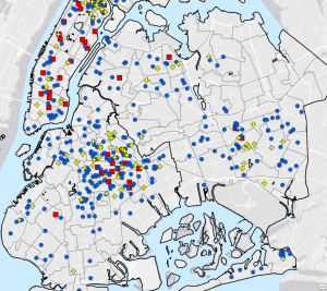
- Create locator -> put in appropriate fields -> run (geocodes survey data). In the Catalog pane, expand Locators, right-click the layer you want, and click Properties. Click Geocoding Options, and expand Match Options.
- Rematch addresses: In the Contents pane, right-click Attendees, click Data, and click Rematch Addresses.
- Symbolize using the Collect Events tool: Search for the collect events tool, apply settings, and run the tool.
- Geocode addresses -> fill in fields -> run (converts addresses to geographical locations).
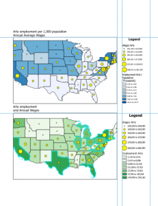
- There was very little in the tutorials for this chapter, mainly just geocoding, looking at attribute tables, and sorting data.
Chapter 9:
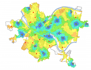
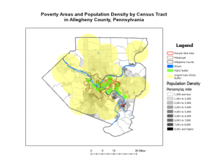
- The pairwise buffer tool dissolves interior lines of overlapping buffers, merging them into a single buffer.
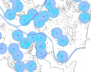
- Buffer rings create concentric zones around input features. (Multiple ring buffer tool).
- This chapter had more spatial join tool practice.
- Making a scatterplot example for this tutorial: In the Contents pane, select Polygons_Tags_Pop. On the feature layer’s Data tab, in the Visualize group, click Create Chart > Scatterplot. In the upper left, above Contents, click Chart Properties. In the Chart Properties pane, for X-Axis Number, click AverageTime; for Y-Axis Number, click UseRate.
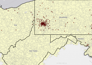
- On the Analysis tab, in the Workflows group, click Network Analysis > Location-Allocation. Click the Location-Allocation layer tab. In the Input Data group, click Import Facilities, and apply necessary settings. Click Import Demand Points, and apply necessary settings. In the Travel Settings group, for Direction, click Towards Facilities, and type x amount for Facilities. In the Problem Type group, for f(cost, β), click Exponential. For β, type 0.25, and press Tab. Run the model. For this tutorial, this is how specific pools were located (by cost efficiency).
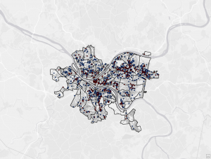
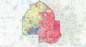
- Data Cluster Analysis: Multivariate Clustering tool -> apply settings -> run the tool.