Downing Week 4

GIS Tutorial for ArcGIS Pro: Chapter 1

The first chapter takes you through step-by-step on how to complete the first tutorial through ArcGIS Pro. Downloading the chapter was easy once you learned how to do it, and I really liked how the process was so thorough. I completed Tutorial 1-1 and felt like I had a decent understanding of the rest of the work we had to do. It seems like the most there is to do is just following the directions, and that will be really helpful in the projects to come. Some parts were a little confusing and I had to go back and make sure I did everything correctly, so it seems like the biggest part of this is just making sure that you’re paying attention. 

I also liked how it gave us examples of what the maps and graphs were supposed to look like! It definitely helped keep me on track. One of the biggest components was recognizing where everything was on the website. For example, the “Ribbon” at the top features most of the main functions, and that is what Chapter 1 seemed to focus on the most. I also liked the “Your Turn” parts of the demonstration as well, that truly helped me find where everything was and helped me remember, even though it simply just had you do the same steps again. 

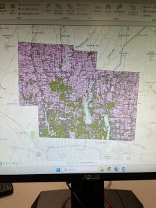
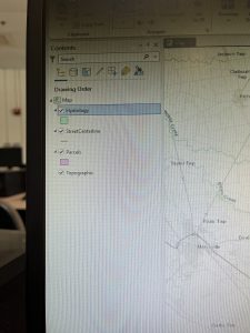
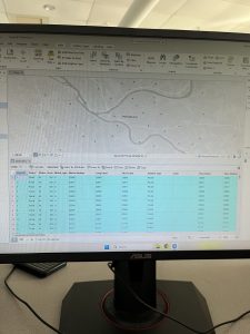
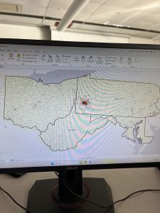
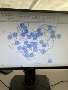
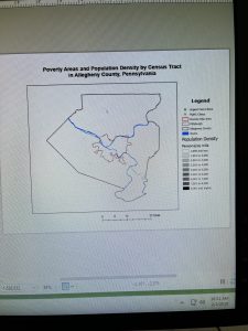
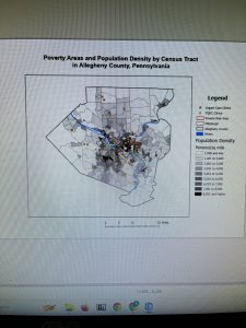
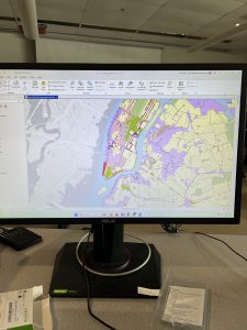
Tutorial 1 was focused on health clinics and the poverty and population densities, which was a good one to start. It was not overly complicated and the rest of the tutorials throughout the chapter removed different layers, added features, zoomed in on pixels, and things like that. It also told us how to select different FQHC’s using the control button, and that helped a lot. Overall I thought this section was pretty easy once you got into it! It did take a long time to get everything going, but after that it was good. I have attached two screenshots from my work throughout this chapter. 

GIS Tutorial for ArcGIS Pro: Chapter 2

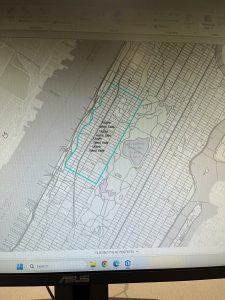
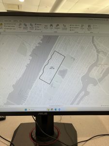
Chapter 2 was focused primarily on how to create a “thematic map”, which is defined as a map that tries to help define or solve a problem. There are a lot of layers that require attention to detail and “symbology”, which is when ArcGIS Pro uses attribute features and drawings to make figures on a map. I completed Tutorial 2-1, where we primarily focused on changing the different colors on a map of Lower Manhattan. I liked this section because it showed us how to change the color many times, and also gave us a shortcut on how to do it. It also gave me a way to check my work with the finished product located at the end of the tutorial. 

I liked this tutorial because it then showed me how to change the different layers when you want one off or if you want a few more combined. We were able to change the Object ID in one of the next tutorials as well. This chapter also included the “Your Turn” sections, which was good to practice with too. Neighborhoods and the surrounding areas were the primary focus of this chapter, and I like how each one focuses on a different section and appearance. It’s cool that there are different maps for each specific problem or experiment that people are working on. 

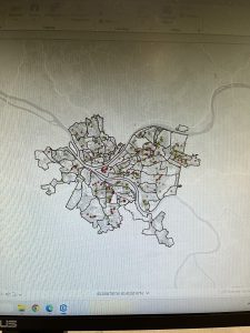
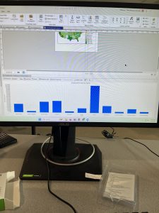
We also could do charts with this too! Tutorial 2-6 showed me how to make a histogram which was neat. I’m excited about using this for our final project in the future. This chapter did go by faster, I think because I had gone through the first one and kind of learned where everything was at. I was still having trouble locating things on the “Ribbon”, but I think it’ll just take some time to get used to. By the end of it, I was going through pretty well and was able to locate a lot of features. And all the colors were pretty! I attached a screenshot of my first tutorial of this chapter. 

GIS Tutorial for ArcGIS Pro: Chapter 3

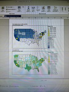
The final chapter for this section was a little more in-depth for me, but still went fairly quickly. I was able to easily access the tutorials through the ArcGIS Pro icon on the computer, and luckily I didn’t have any issues downloading the book onto my external hard drive (Hopefully it stays that way). And this tutorial was focused on making different kinds of maps, which was cool! I felt experienced by the end of it, especially in how to make bar graphs. The two maps were fun to play around with in Tutorial 3-1, and I felt like it helped me better understand how to create maps. 

The first tutorial was longer but had a lot of useful steps. We were taught how to make a layout with two maps and two legends on it, which will be helpful for our final project. Again, I liked the “Your Turn” sections and how it let us complete a section without using direct instructions. It was informative on how to create titles and different papers within one project. I was confused at first on how to create another layout page, but I just had to look harder underneath the “Ribbon” and its underlying sections. 

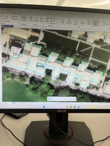
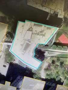
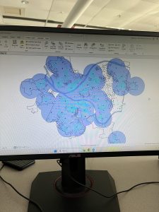
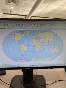
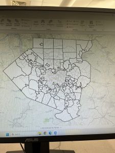
The chart was also a little difficult at first, because some of the instructions were in different numbers and I skipped over them by accident. However, I figured it out! I liked how we could do the Map Viewer on the website itself, and how it’ll eventually be uploaded into that section. It’s also nice how this book is so useful and easy to come back to if you need any help in the future. Learning how to create a briefing was neat, and even though this chapter began to get more in-depth, it was still fairly easy to navigate with the through instructions. I attached two screenshots of my work from this chapter as well.


Downing Week 3

Mitchell Chapter 4:

This chapter begins with talking about map density and why it is important. Using a density map will allow you to see different features and high/low concentrations of features. You can use the GIS map in order to graph different points of data. There are two different types of mapping: 1) the density of features (like the locations of businesses) and 2) feature values (like the number of employees at each business). There are also two ways to map density, the first one being by the defined area, and the second being by the density surface.

The next section of the chapter compares the two methods of mapping, and allows people to see which method would be better for their data. I found this comparison very useful and something I will come back to! The next step of the mapping process is to calculate the actual density of the area being mapped. A dot map in particular gives people a really quick glance at the density and is very visual. I liked how the graph was portrayed in this. Specifically for a dot density map, they made sure to tell us that we have dots based on smaller areas, but the bigger boundaries would have to be defined. 

I think it was interesting how they discussed calculating density values. It seems to me like they are just based on the cells and what values are in them. But I liked how they included the conversion and equations that would be helpful! The search radius allows for larger and more general patterns within the map. It lets you specifically put what data points you want to be calculated for density in there. Assigning the number of classes and using contours helps with creating the map, as discussed in Chapter 3. The chapter ends with learning about how to discuss your results!

Mitchell Chapter 5: 

As the chapters have discussed, everyone uses GIS differently depending on their job. For example, the authors provided an example of how many drug-related arrests take place within a certain distance of a school, because that will enforce a bigger penalty. There are different types of boundaries you can draw as well. They also discuss how features can be discrete: unique, identifiable features; or continuous: seamless geographic phenomena. You also need to discover if you need a list, count, or summary based on your data. I think it’s cool that you can only choose features that are inside or outside your boundaries and not both, it makes it easier to comprehend. 

However, Mitchell does go on to say that if you need information about what is beyond the area, then you can include that as well. There are three ways of finding out what is inside, and those three ways are: 1) drawing features and areas, 2) selecting the features inside the area, and 3) overlaying the areas and features. Similar to Chapter 4, I liked how they put in a little table of comparison on how to choose the different methods! This is very helpful to me. Making a map is the first step, and after that you have to follow the instructions based on what data you have. Discrete areas are important to note because the parcels inside can affect what is outside. 

You can also specify features using geographic selection, which is finding out what features are in a particular distance of another feature. You can summarize using categories or quantities. The GIS will then select what features are inside the area and then flag the ones that are inside to let us know that they are inside. To read the results you can use the sum, the average/mean, the median, or the standard deviation. The final step is overlaying areas and features, and that seems like the coolest way to me! It will read the boundaries and make a map for us to examine the continuous categories or classes. 

Mitchell Chapter 6:

While using GIS, you can find out what locations and features are nearby. Travelling ranges can include measuring distance, time, and cost, and that can be specific to a certain facility. However, to define a certain range, you can use one of three methods: 1) straight-line distance, 2) measure distance or cost over a network, or 3) the measure of cost over a surface. However, cost does not have to be an amount of money, it can also be measured in time. I thought that was interesting because I didn’t think about it that way! Like in Chapter 5, they talk about a list, count, and summary, and that is how it is defined. 

The authors discuss how the different methods work, and what each method is specific for. Again, they provide a table that allows people to compare the best ways to use each method. If you have features that are within a given distance of a source feature, you should use a straight-line distance method. If you have to create other features in which you have to specify the buffer and source feature, then you create a buffer. It tells you how you can select and tag different features within the map. They also make different diagrams based on the data and also create a distance surface. 

Summarizing discrete and continuous features depends on what data you have, and ArcGIS creates default displays that will do their own colors and features. I think it’s cool that you can specify the colors and boundaries that you want. The GIS will identify the lines in a network, and that will also help define the boundaries. Centers: “they usually represent centers that people, goods, or services travel to or from. You can then find the surrounding features along, or within, the area covered by those lines”. The map will start measuring at the center of your feature, then it will create the map around that and based on your boundaries. You can always make multiple centers too. The chapter ends with more ways to calculate data! It seems pretty easy as long as you’re thorough. 

Downing Week 2

Mitchell Chapter 1:

The most important thing I found from the beginning of this chapter was that GIS stands for Geographic Information System. It allows us to see patterns and relations in geographic data, and is used in many jobs. Using GIS is very helpful in understanding more about a specific place, however you still need the right tools and analysis to make that happen. The first step in GIS Analysis is asking a question. It can be any type of question, and then you simply have to understand your data. Then you choose a method, process the data, then examine the results. I found that it seems very similar to the scientific method. 

There are different types of geographic features, such as discrete features, continuous phenomena, and features summarized by area. In discrete features, the specific location can be pointed out and is there or not. Continuous phenomena can be found or measured anywhere, such as precipitation. Interpolation: the process of assigning values to the area in between points. Centroids: center points. Summarized data is the counts of individual features within area boundaries. Demographic data in particular tends to come as summarized data, but you can use GIS analysis in order to overlay the data in which you want. 

Geographic features are represented in two ways: vector and raster. In the vector model, each feature is represented by a row in a table and X,Y points on the map. Specific areas on the map are defined by borders. In the raster model, the features are represented by cells in a continuous space. The cell size does matter because information can be lost, which I think is interesting. Discrete features are often represented by the vector model. There are many types of attribute values, such as Categories, Ranks, Counts, Amounts, and Ratios. These values matter depending on the map type you’re making. The main tasks we will have to perform are Selecting, Calculating, and Summarizing. The equations are represented in Chapter 1. 

Mitchell Chapter 2: 

It is important that people understand that mapping is important, but understanding the patterns in certain types of geographical spaces can be helpful with GIS. It is used by police officers, wildlife biologists, and retail analysts. These jobs all have different uses for GIS, and it helps to have categories on the maps to describe the areas and features. You have to assign geographic coordinates and category values to each map, which I think sounds fun! To start your map, you simply have to tell GIS what you want and where you want things. Maps can be very simple, with features that represent simple patterns. 

One of the main functions that GIS does is it stores the locations of different features as a pair of geographic coordinates or as a set of coordinate pairs that define area. Using these specific coordinates, you can make symbols at each point and connect them (it reminded me of connect the dots)! Using the data layers and subsets, you can ask GIS analysis to specifically point out what kind of data you are looking for. For example, if you are tracking wildlife migration, you can tell it to focus on one particular animal or route. I also think it’s nice that the GIS will store a category value for each feature in the data’s table layer. 

I like how they mentioned that you can only use up to 7 colors, because humans can’t really process more than that, which is fair. It is definitely easier to understand an area with less colors and less features if possible. This can be helped with grouping categories, but we have to keep in mind that some important information can be lost if we combine too many things. The main thing being discussed is simply knowing your data and what categories would make sense together. Choosing symbols is also important! They state that you can use different colors, or shapes, but colors are preferred because they are easier to distinguish. Text labels are also necessary so the audience can see what you see. Overall, it seems pretty easy, but I understand how it could be very picky and difficult to analyze if done improperly. 

Mitchell Chapter 3: 

At first, I was a little confused at why it said to map the most and the least. But, upon reading more, it made sense because you have to associate the data with quantities of each feature. As discussed in Chapter 1, there are different patterns of features needed to map certain data. There can be dots, colors, shapes, and shading on different maps used for different purposes. Data summarized by area typically are displayed by shading charts. I liked how it also defined the differences between exploring the data and simply presenting a map. You have to understand your quantities, counts, ratios, ranks, and amounts. 

One of the next steps in using GIS analysis is to create classes. Counts, amounts, and ratios are typically the data that are grouped into classes. When you map individual values, you can search for patterns within the raw data and also present an accurate picture of the data you are exploring. I think it’s cool that you can group classes together by using the same symbol. The classes also require you to find the upper and lower level, so the class can be used in between those values. You can also use standard classification schemes, which let you look at different patterns in the data using similar values. Some of the subsets of standard classification schemes are natural breaks (jenks), quantiles, equal intervals, and standard deviation. 

Each classification scheme has a specific way of identifying the different patterns and groupings within the data. However, to choose one of these, you have to know how the data values will be distributed across the map or the graph. I found that it seems very similar to choosing the correct graph for your data sets in math classes. It appears that we also deal with outliers, and we put those into their own classes. Once you have all this information, you can make your map, yay! Of course, the map types are different as well, and also depend on what kind of data you have. The symbols, colors, shapes, and general charts will all be different for what you are trying to examine. One hint I found useful was using contour lines for continuous phenomena! In the map, you can also edit viewer location and that will make a difference, as well as the Z-factor and the light source.

Downing Week 1

  1. Introduction: My name is McKenna Downing, and I am a senior who is majoring in Zoology and minoring in Environmental Science. I am from Pleasant Hill, Ohio, which is 30 minutes north of Dayton. I am on the cross country and track and field teams as a distance runner. After graduation, I plan to find a job in wildlife rehabilitation and environmental education at a nature center (preferably somewhere warmer than Ohio). I am new to GIS but very interested in how it can affect many areas of science, especially in terms of deforestation and land loss.
  2. Schuurman Chapter 1: Nadine Schuurman begins Chapter 1 by illustrating GIS as a large system, not a specific tool with a fixed or secure identity. Different companies or organizations use GIS for their specific jobs, and do not consider what others use it for. GIS dates back to the 1960s, when pieces of paper were layered on top of each other in order to find the best route for a highway. I think that’s really interesting because a problem that seemed difficult was made easy using a form of GIS. There were many people who were involved in the technology of GIS, such as Roger Tomlinson and Lee Pratt, who created the first computer cartography system to create a map of an area featuring all geographic features. I think that it is also interesting that GIS came around when it did, when information was being translated into technological terms and being distributed that way. The main way Schuurman tells us GIS was used in the early stages was to map data distributions, particularly within the environment. It makes me curious if these people would know how much of an effect it would have on the future! She then goes on to discuss how some GIS researchers perceive the system as a way to increase accessibility for spatial analysis. I think that’s really cool because there are so many professions in the world that can benefit from using this system. I also love the idea of GIScience and GIScientists. The classification of spatial entities can be difficult, because people can easily disagree on these parts. An example of this that Schuurman mentions is how to define where a mountain stops and the foothills begin. And it’s so cool that John Snow was able to use the concepts of GIS to figure out the cholera outbreak! I really liked how this chapter discussed how we use GIS in our daily lives, mostly without even realizing it. So many people use this system in different ways, and Schuurman wrote and described it very well.
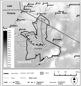
  3. GIS Applications (1): Wildlife Migration: Understanding the migration of wildlife is incredibly important, and this research paper focused on how scientists used GIS mapping techniques to track the migration of wildebeest across the Serengeti-Mara habitat. The research included the mean routes of the wildebeest across the landscape and the amount of green space before and after the wildebeest had come through. The results found that the less green space in an area before the wildebeest arrived, the less likely they were to travel through that area because of the lack of water. Source: Musiega, D.E. and Kazadi, S.-N. (2004), Simulating the East African wildebeest migration patterns using GIS and remote sensing. African Journal of Ecology, 42: 355-362. https://doi.org/10.1111/j.1365-2028.2004.00538.x
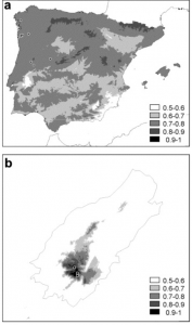
  4. GIS Applications (2): Plant Conservation: This research paper focused on using GIS methods in order to implement plant restoration programs in Portugal. They focused on bryophytes and how they grew within a natural reserve with different species of vegetation, including alien species of plants, and varying levels of altitude. The researchers collected information from the reserve using aerial GIS mapping. it was found that the bryophytes all had differing levels of need within the reserve, with some doing well at altitude and others not. The alien species (invasives), also played a part, because they would grow quickly and outcompete the endangered bryophytes. GIS was helpful in finding these results, and is demonstrated in the map below. Source: https://www.sciencedirect.com/science/article/pii/S0006320703001253
  5. I completed the GEOG 291 Quiz!