Week 6 Tuttle

Chapter 9

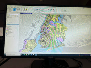
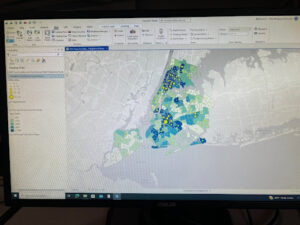
First two sections went really well and they seemed very straightforward. I had a hard time finding the ā€œTravel Settings groupā€ in 9-3. I searched for it in the search bar and looked around and couldnā€™t find it. The picture in the book looked really cool so I was disappointed I couldnā€™t find it. The rest of the chapter was simple and I was able to finish it with no problems

Chapter 10

This was the longest section for me. I really had to muscle through the first two sections. When I got to the third I couldnā€™t get the ModelBuilder to work for me. I tried to skip that section but after that I think I was flustered and I just couldnā€™t figure out any of the other sections. I might revisit this one next week if I am stuck on the final and want to take a brain break.

Chapter 11

This one introduced 3D modeling which was very exciting. I didnā€™t run into any issues in this section. I had a hard time finding some of the panes because the tutorial assumed that I already knew. I wish I had taken notes or remembered where the different sections were. I had to use the search function a lot and sometimes that made it very clunky. Overall it was not too bad and I feel like I learned a lot in this chapter and through the whole book

Tuttle Week 5

Chapter 4

I had a little bit of difficulty with 4-1, but 4-2 was interesting and I enjoyed being able to edit the attribute table. It made me feel like I understood what I was doing. Being able to edit and condense the material made the tutorial much easier. It was definitely a long winded section of the tutorial but I felt like I learned a lot in this section. 4-3 was confusing because I kept getting the time and dates wrong when I would input it into the expressions. Once I got that it was much better. The pictures in the tutorial were helpful during this section. 4-4 and on were all on one map. I liked getting to play around with the map and use the symbology to create the most digestible map.

Chapter 5

5-1,2, and 3 were all relatively straightforward. My map ended up looking very similar to the map that was in the tutorial. 5-4 was difficult because whenever I would input the features it would say that it did not exist. This is becoming a trend that I see as I get deeper into the chapters. I plan on addressing this later in the week. 5-5 was easy to download and deleting the excel columns was easy thanks to Liberty! I saved the file and did everything as the book asked, but once again I would not import the files. Iā€™m not sure if I missed a step, but I have reread the book and tried downloading it a different way and I canā€™t seem to figure out where I went wrong. For 5-6 I was in the process of quitting and deciding I didnā€™t know how to do it. I ended up figuring it out. It was gratifying figuring out how to download something off of the internet and successfully finishing the module

Chapter 6

This chapter was pretty smooth sailing. I didnā€™t spend too much time on any particular section. 6-3 was the fastest because we really had to merge the different water datasets so that it can all be displayed as NYCWater. We used the attribute table a lot more often in this chapter and I have definitely gotten much better at moving throughout the table and knowing what to do. I noticed myself working through bits of the sections without needing to read every single word of the tutorial. I feel like Iā€™m getting the hang of it.

Chapter 7

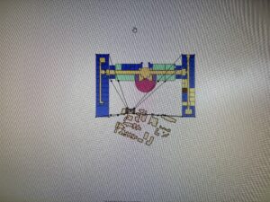
Chapter 7 introduced the move tool which has been my favorite addition so far. I feel like I actually got the hang of it very quickly and I probably spent too much time trying to make the polygons and the map line up exactly. The only problem I ran into was in 7-4. I lined up all of the links and hit transform but it never moved. I let it run for quite a while and still the pieces did not move. I moved on from the project after a while because I was at a standstill.

Chapter 8

Chapter 8 was really short and only had two modules. Doing all of the toolbars is getting much faster. If this chapter had been earlier in the book I probably would have had a hard time moving through the chapter. It definitely took focus. If I did incorrectly input something there was a red message which I thought was helpful. Thatā€™s definitely better than if it just let you run it and the whole system would just be wrong. That happened in 8-2 but once I realized the mistake it was a very simple fix and my map ended up looking just like the tutorial.Ā 

Week 4 Tuttle

Chapter 1

Once I finally figured out how to download the tutorial I have had a much smoother time working on the assignment. Chapter 1 took me about an hour to complete and I did not have any trouble. I thought the 3D model was really interesting and I really enjoyed being able to manipulate the map to explore how a map can look in 2D vs. 3D. Chapter 1 was pretty short. Once I got it open the manual has been pretty easy to understand and I havenā€™t had any problems so far.

Chapter 2

Chapter 2 was much longer than the first chapter. It introduced me to conditional data and symbology. I feel like the big takeaway from this chapter was being able to edit the map so that it is more clear for the reader. I had a hard time with 2-4. I could not figure out how to do the label layering and I ended up skipping it because the words didnā€™t match up with the ArcGIS tool. I can feel myself getting more comfortable with the application and even noticed myself working ahead and changing the colors of certain points without being prompted.

Chapter 3

This chapter was my favorite one. I actually ended up deleting 3-1 on accident but when I redid it, it was much faster. As frustrated as I was when it happened, I think having to redo it actually made me more comfortable with the software. 3-2 has us upload to ArcGIS online. I could not sign into the pro version. It repeatedly gave me the popup that I did not have that type of account. I could not complete the rest of chapter three because it ended up locking my account for a certain time. I plan on returning once the time is up and if I still can’t figure it out, ask Dr. Krygier for help. I could sign in the ArcGIS online, it was very odd because I had signed in on ArcGIS Pro yesterday.

Tuttle Week 3

CH4

Chapter four covers mapping density. ā€œMapping density lets you see the patterns of where things are concentrated. This helps you find areas that require action or meet your criteria or monitor changing conditions.ā€ Mapping density is to highlight patterns more than the individual features that might be better represented in a different type of map. Mapping density is best represented using shades of colors to represent different ranges of data. The data available will determine what the map might look like. There are two ways to map density: by defined area or by density surface. A defined area can be shown using a dot map and the places with a higher density of dots represent the higher density of features on the map. Defined area map density would also be used if we were interested in how much of a feature is sequestered to a certain area. We might see this map type divided by state, county, country, or any other predetermined separation. The density surface is created in the GIS and shows the density without the predetermined separations. This map does require more work but is more accurate. GIS will calculate the density surface for you. You can determine what the cell size will be. If a cell is too large the map might be too vague, but a cell too small makes the map convoluted and hard to digest. A cell too small also takes a lot of time to process and can take up a lot of storage on the computer/external hard drive. The book gives a detailed description of how to calculate the proper cell size based on how much space is being shown on a map. A map that covers 1 sq. km would have a cell size of 100m. The search radius depends on what the goal of the map is. A search radius too small might not have enough significant features, but a search radius too large can lead to the map becoming too generalized. These types of maps allow the researchers to get a good picture, but it might not be the whole picture.

CH5

People map certain features on a map to determine what is inside the area. Politicians, police officers, and even business owners use these maps to decide whether or not to take action. If a business owner sees that in one area in a city, there are other businesses nearby that are doing well, they are more likely to try and open a branch in that general area. Itā€™s necessary to determine how you will split your data into a single or multiple areas. A single area might be useful to determine if a hotspot is occurring. Multiple areas allow you to compare each and determine if there is a common theme spread amongst them. These areas might be zip codes or state parks. Defining each area and comparing it will give researchers the ability to identify interesting patterns within the maps. You can determine the type of map you need by identifying whether the individual feature is continuous or discrete. The book identifies three ways of finding what is inside the map. Drawing areas and features allows the researcher to highlight what features are inside and outside the boundaries. This is the quickest way to map, but it is strictly visual. Selecting the features inside an area can show the reader information about a single area but does not go deep enough to show several areas. Overlaying the areas and features is the most time-consuming method, however it is also the most detailed. This way finds features inside the areas. This does take the longest, but if a detailed map is what’s most important this is the map in question. Drawing areas can be difficult to decide on a map. A map either has discrete or continuous areas. Discrete areas are often quantitive data like types of injury or crimes in an area. Continuous areas might be more fluid like elevation, population, or even businesses in a specific area.

CH6

Chapter 6 tries to answer the question, ā€œwhy map whatā€™s nearby?ā€ Traveling range can be determined not only by distance, but also by time, cost, or other factors. The three main ways of finding whatā€™s nearby are straight-line distance, distance or cost over a network, and cost over a surface. Straight line distance is the most simple way for the GIS analysis to work. This type can only measure distance and provides only a rough estimate of the time that it would take a person to get to that destination. This might be used to determine the radius of a school or police station. A cost over a surface allows the researcher to combine different layers of features to determine the travel cost. This type specifically measures cost. It does require a lot more data than the previous type, but the calculation over a range is relatively reliable. The third type is distance or cost over a network. This type is a hybrid of the two previously mentioned methods. This method needs both locations of source features and information about the length or cost value of a particular area. This is the most precise method because it combines both travel distance and cost, but it requires a very accurate network layer that might be difficult to obtain. Calculating costs in GIS can be confusing. The last section of the book goes over how to calculate cost over a geographic surface. Cost can mean time, money, or other factors. Cost layers in GIS can be based on a single factor or using several. Once you have inputted all of the layers, GIS will combine them to determine the total cost. Each cell is given a cost and based on the type of map assigned a color or shade to represent the cost. Once GIS has determined the cost of each cell the researcher can manipulate the map to exclude costs, either too high or too low, and even exclude entire sections due to geographic concerns. The maps that GIS can make are so highly specialized that with the right data GIS can make whatever map the researcher wants.
Tuttle Week 2

CH 1

This book (site it) defines GIS analysis as ā€œa process for looking at geographic patterns in your data and at relationships between features.ā€ This chapter walks you through exactly what GIS analysis looks like. Sometimes itā€™s just creating the map, while other times it is a lot more complex by adding layers and different data that’s been previously collected. Frame the question, understand your data, choose a method, process the data, and look at the results are the steps the book suggests a person should take when running the analysis. Different methods could make the information easier to gather but slightly vague or more tedious to gather and precise. It is up to the creator to decide which is better for the question that they are trying to answer. The book also walks the reader through the types of maps and the types of data that can be shown through mapping. These include categories, ranks, counts, amounts, and ratios. Categories group similar things together and determine if there is a geographical pattern. Ranks order the data from highest to lowest. An example of this could be precipitation in a given region or libraries within each school district. Counts and amounts are expressed on a map as the actual value. This might be universities in a state or grocery stores in a county. These allow the viewer to understand the scale at which the feature is prevalent in the space. Ratios show a direct relationship between two pieces of data. Continuous values would be projected using ratio counts and amounts. These features will have a range of data so it is considered continuous. Noncontinuous values are usually quantitative. These would be categories or ranks. GIS analysis allows you to individualize the data by selecting and calculating the exact type of data that you want to express.Ā 

CH 2

GIS analysis allows you to layer information to identify possible correlations between two variables. This chapter is entirely about mapping and how to use mapping to identify important pieces of information. It is so interesting to me that so much information has already been entered into the GIS database. Each time I read something else I realize that GIS is so big and it’s something I have not been privy to at all. When creating a map there are so many possibilities and GIS allows you free reign to adapt and curate the perfect map for the information that you are trying to display. You can map a single type which would be something like roads or forests. You can type and subtype layers of your map. The example in the book is all crimes are a type that would be entered into GIS. Then you can subtype the crimes into different categories. This makes the map more or less detailed based on what is needed. Category mapping is using different colors to differentiate within a category. This could be stored with the subcategories being which stores. The book uses roads and crime as an example. The book says that you should not display more than seven categories because otherwise it could become blurred and people may have a hard time distinguishing between different shades of colors. Mitchell goes on to discuss that it is important to use scale when creating a map. Using too many or too few categories can make the map confusing or too vague for the viewer. Categories can be grouped in different ways. One way is to give each record a general and detailed code that can be used when creating the map. The second option is to create a table for each detailed code within the general codes. This one is more tedious but it is easier to edit once it has been input. Assigning symbols to each piece of data is the third option. This is the least invasive for the dataset, but it does not save in the dataset itself. The biggest thing to consider when picking symbol designs is that color is easier to distinguish than shape, and using a variety of widths and colors will make reading the map easier.

CH3Ā 

Chapter three begins by describing different types of maps and the different figure types. ā€œDiscrete features can be individual locations, linear features, or areas.ā€ These discrete features are represented with different levels of a single dot. The example given is smaller and bigger dots representing the locations of businesses by number of employees. Continuous features can be an area or surface with continuous values. This might look something like a COVID-19 infection map. Continuous maps usually have shades of color to display the values that they are trying to represent. The person creating the map must know what type of map they want. What question are you trying to answer? It is also important that the numbers that are being represented are accurate and the values are understandable to a viewer. Mitchell goes on to describe how to create ranks and classes in the GIS analysis. Standard classifications are natural breaks, quantile, equal interval, and standard deviation. The best scheme will be evident based on the type of data and the goal of the map. Natural breaks can be determined by viewing a chart of the data and seeing a jump in the intervals. That would be a good time to split the data. Quantiles might cause the data to present in a deceiving manner if this is not the best classification. It displays the data and then identifies the quartiles within the data. Equal intervals break down the range into four even groups to display where the majority of the figures are. The standard deviation is decided based on the intervals away from the mean. Standard deviations would be good for seeing which features are outliers and which are above and below the mean. This type does not show the actual values which would not be beneficial in certain situations. Outliers can be dealt with in different ways depending on what they might represent. In some cases you can use a different symbol to identify outliers, another example would be to group them in their class or a class with other outliers. Mitchell goes on to outline a way to determine the best map that is available. This job is subjective, but itā€™s important to know the pros and cons of the different types.

Tuttle Week 1

Hi! My name is McKenna Tuttle. I am a junior on the softball team. I am a huge UK fan and have a cat named Zeke. I am an exercise science major and environmental science minor. I am from Richmond Kentucky. I’m the oldest of four girls and two of us have moved to Ohio since graduating high school. I plan on going into physical therapy after undergrad but the environment has been a big part of my life pretty much as long as I can remember.

McKenna Tuttle

This is my introduction to GIS. I have been impressed by the magnitude with which GIS can be used. I am particularly interested in how GIScientists and GISystems can tell us very specific information on how a community is being served and whether one neighborhood is treated the same as another. Before taking this class I did not even know that GIS existed, so it was shocking to realize how quickly GIS and spatial analysis has grown since its beginning in the late 1950s. Vancouver has dedicated over 135km of pavement to bike paths that have been determined with the help of GIS. The system also keeps bikers away from heavily trafficked areas and ensures they are safe. Seeing GIS as something that can be used so broadly is interesting to me. Using GPS to determine where the blight is on a wheat field and GIS can assist the farmers in determining where the best place for the next planting of crops is such a unique tool. In the text, it talks about how the GIS application is only as good as the data being put in. I also find that very interesting because there arenā€™t a lot of spaces where something so black and white can be skewed by false data. I would be very keen to do a study on what we could falsify using slightly incorrect data and GIS applications. It says that GIS has assisted urban planning. I am invested in walkable cities and city planning that are specifically designed for patrons to lower their emissions by walking/biking. Iā€™m curious if GIS would be able to determine areas of a city that could be renovated into walkable areas only. If the information given to the system about traffic and jobs and living conditions was accurate I would see no reason that would not be available.Ā 

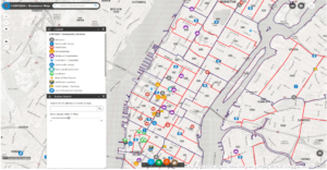
The first thing I looked into was GIS applications for LGBTQ+ youth resources because I know that it can be difficult for kids and teens to find help in some parts of the country and world. I asked ChatGPT to help me get familiarized with GIS and how exactly to research the topic on Google. Once on Google, I found a couple of maps with resources, but they were only in big cities like LA and New York. I had a hard time finding a nationwide map of resources. I would like to know if there is a disparity as we move into the Midwest and Bible Belt.

https://www.esri.com/about/newsroom/blog/nypd-pride-lgbtqia-resources/

Next, I looked at the Appalachian Mountains and coal mining. Iā€™m from Kentucky and obviously, coal mining is a very divisive topic there. I found some interesting maps of counties that were most affected. I think the most interesting thing I found was a timelapse of mountaintop removal from 1984 to 2022 from an aerial satellite view. Below I left a link that will take you directly to that. I am also interested in looking at the GIS application of maybe where the mountaintop removal is taking place and where jobs are in Eastern Kentucky/West Virginia.

http://appvoices.org/end-mountaintop-removal/before-after/#%20Ā