Chapter 1
- In Chapter 1, I worked through several tutorials that introduced the basic tools and concepts of ArcGIS Pro. At first, it took some time to locate certain features, and I felt a bit confused in the beginning. However, as I continued through the tutorials, I gradually became more comfortable navigating the software.
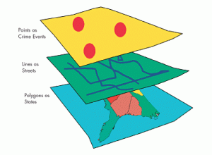
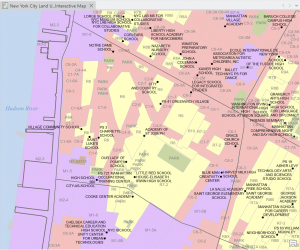
- One concept that stood out to me was how layers are organized on a map. I learned that layers are placed on top of a basemap and that the order of layers is important, because one layer can hide another if it is placed above it. Understanding how to arrange layers correctly is important for making sure the map displays the information clearly.
- In Tutorial 2, I worked with feature classes and practiced zooming to features. It was interesting to see the different types of feature classes and how they are used to represent geographic information.
- Tutorial 3 focused more on attributes and how they can be managed. I learned how to search for, rename, arrange, and select features in the attribute table. I also used the Summary Statistics tool to calculate statistics for attribute values.
- In Tutorial 4, I learned how to change labels, such as those for municipalities, and how to modify symbols using the symbology tools. I also practiced adding and removing feature classes. One of the most interesting parts of this chapter for me was working with a 3D map for the first time and seeing how spatial data can be visualized in three dimensions.
Chapter 2
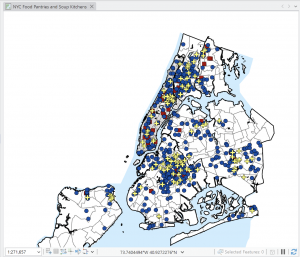
- In Chapter 2, I learned more about symbolizing maps using qualitative attributes, labeling features, and configuring pop-ups. It was interesting to see how ArcGIS can use attribute values to automatically symbolize different features on a map. I also learned how to create definition queries to show only a subset of features from a dataset, which was very helpful when focusing on specific information. I also practiced symbolizing maps in the exercises, which helped me understand how attributes control how features appear on a map.
- Another thing I worked on was setting visibility ranges for labels. This was mostly about understanding map scales and how the scale of a map relates to real-life distances and areas. I learned how labels and features can appear or disappear depending on the zoom level you choose. This helps keep the map clear and prevents too many features from appearing at once.
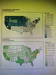
- I also learned about different ways to symbolize quantitative data, such as using graduated symbols or proportional symbols to represent differences in values. This makes it easier to see patterns and comparisons across the map. Another interesting concept was dot density maps, which help visualize how certain quantities are distributed across an area.
- Overall, Chapter 2 focuses more on map design and how to make thematic maps clearer and easier to understand. It shows how the choice of symbols, labels, and scales can help highlight the main subject of the map while keeping other information in the background.
 .
. 
Chapter 3
- In this chapter, I learned how to build map layouts that can include more than one map. It was interesting to see how layouts are designed for reports, presentations, or websites, and how guidelines help place maps and other elements neatly and precisely on the page.
- I also learned how to share maps from ArcGIS Pro by publishing them to ArcGIS Online as web maps. It was interesting to see how maps created in ArcGIS Pro can be used online and then edited further in the ArcGIS Online Map Viewer.
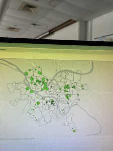
- I created a dashboard using ArcGIS Dashboards and displayed spatial data more interactively. The dashboard had a map, tables, and charts that updated dynamically based on the area shown on the map. It was interesting to see how this type of tool can help organizations monitor service requests and make decisions more efficiently.
- While working with the dashboard tutorial, I explored different tools like bookmarks, basemaps, and layers. I was also supposed to find the “Expand” button on the top right corner of the map to enlarge it, but I honestly could not locate it, so I continued exploring the map using the other available tools.
 .
.