Bechina Week 6

Chapter 9

9.1    I was ready to get started on a clean slate for part 3 so I’m glad this section was straightforward and simple. It was cool that when the buffers overlapped they just joined together. 

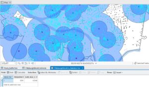
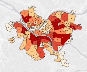
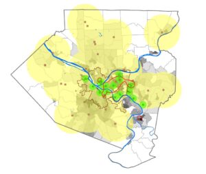
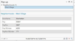
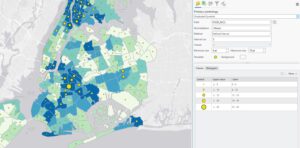
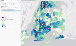
9.2    Creating multiple ring buffers was cool and I could see myself using it in a project in the future. Using the spatial join tool to see how many youths had good vs. excellent access was also very cool. Doing it with 3 rings was cool too.     

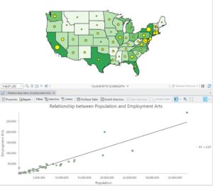
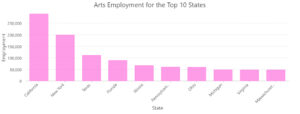
9.3     This section was a bit more tedious but it was good. It was cool to create the scatterplot.

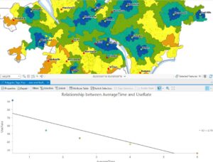
9.4    I had no problems with this section. The lines looked really cool. It is interesting how many ways you can interpret one data set.


9.5    I liked doing the “Your Turn” part of this tutorial. I wasn’t sure if I knew how to do it but I figured it out as I went on.


Chapter 10

10.1     Changing the transparency of the land use map so that we could see the hillshade with it at the same time was so cool and I definitely see myself using this in the future.

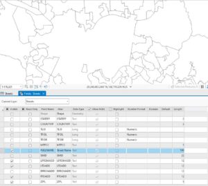
10.2      This section was super easy. There was one part where I got confused: the book said to “run the tool” after symbolizing a layer. That was weird but I just ignored it.

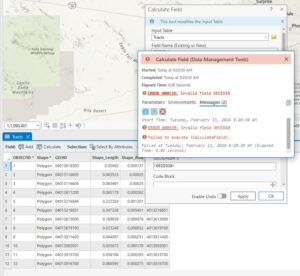
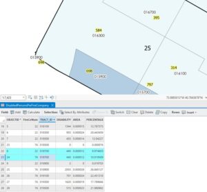
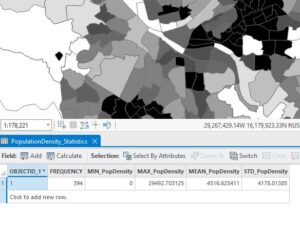
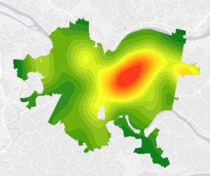
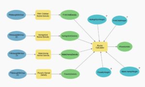
10.3     I had quite a few issues with this section. When I was using the raster calculator, and I clicked on the raster names to add them to the calculation, they wouldn’t fill in so I had to write everything out. I also messed it up the first time so I had to do this a lot and it was very tedious. I also suspect something else went wrong because my poverty image did not look the same as the books. 

Chapter 11

11.1     This part was so cool!!! I feel like it might take a minute to get used to navigating with the keyboard but I feel like I’m already getting it! So fun! Picture from Denver.

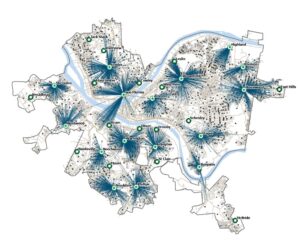
11.2    This was another good section. I liked that we took out everything but the AOI. It would get kind of overwhelming with the whole world map. 

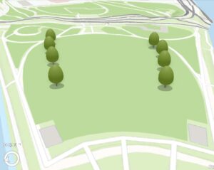
11.3   This section was so fun! The trees are so cute.

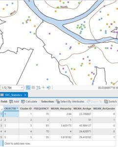
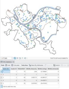
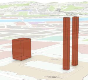
11.4    I didn’t really have any issues with this section, I’m just not sure I fully understand it. I know that a lot of the work done was to create the building heights, but I didn’t fully understand the process to get there. Creating the line of sight was so cool.

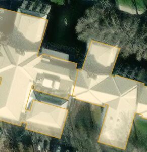
11.5   This tutorial was cool. Extruding the buildings was very simple.

.     


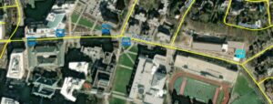
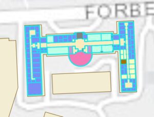
11.6    This section felt like google maps because of all the buildings on smithfield street.

11.7     Creating the video was so cool… I didn’t even know you could do that on ArcGISPro.

Bechina Week 5

Chapter 4

4.1 I had a little trouble when I was inputting my data because I couldn’t see my contents tab. Eventually I figured it out and was able to open the tab. Because I tried so many times to import the data, I had to delete a few files that were duplicates. 

4.2 I had a small issue with calculating the GEOIDNum column. The book says that the expression should read “GEOIDNum = !GEOID10!” but when the system created it, the “10” did not autofill, so I wrote it in myself. This gave me an error so I just took out the 10 and it worked fine. I also had a small issue when calculating the TractName but it was a quick fix. I just had to click “Apply” instead of “Ok.”

4.3 I had to go back and redo work a few times in this section. I don’t know if it was me, or if the directions were unclear, but I kept messing up.


4.4  This section was very easy for me. It was quick and simple.

4.5 This section was also pretty quick and easy. I tried to figure out how to increase the point size of the burglaries by neighborhood because they seemed too small to be useful… but I couldn’t figure out how to change the size. 

4.6 I almost immediately got stuck in this section. Once I went to the fields design view, I wasn’t able to edit the field to add any new fields (this was instruction from the “Your Turn” part). I couldn’t figure out how to add a field so I just moved on. The rest of the section went fine.

Chapter 5

5.1 The first thing I noticed about the world map was the lack of great lakes in the US 🙁 There are SO many different map projections!!!

5.2 I am surprised again at how many different map projections there are. When I clicked on different projections within Continental, North America, it would always load very slowly and look like the below image for a few seconds before fully processing. 

5.3 This whole section went pretty smoothly until the “Your Turn” section. Those are hard for me sometimes just because of the lack of detail. I got through it eventually though.

5.4 This section was fine. My favorite part was taking the color out of the NYSchoolDistricts Polygon.

5.5 This section was a bit frustrating. I couldn’t figure out which columns to keep (they did not match up to what the book said). After asking Krygier, he was able to share what Liberty found (thank goodness) and then it was no problem. After that, this section didn’t really get any easier. I had trouble using the Calculate Field tool and kept getting an error when I would run it.  

5.6  When I zoomed in and out, it took a while for the data to fill the page. It was very slow. It was fun to play with the other files in the Atlas. The “old timey labels” were cool. The later part of this section felt a little difficult because it wasn’t as specific with the directions, but I guess it made me figure it out and learn more. 

Chapter 6

6.1 This part went smoothly. At the end, when I had to symbolize the ManhattanFireBattalions with graduated colors, I was confused for a minute because I forgot how to change from single symbol to graduate colors. Then I remembered and it was fine. I couldn’t figure out the very last part, though; labeling the battalions. 

6.2 This section was not fun.

6.3 This part was nice and short and easy. I did have a little trouble with the “Your Turn” section though.

6.4 Loved this section. It was so simple and quick!

6.5 This was also a pretty straightforward section.

6.6 This section was fine. I forgot how to join the fields for a minute, but then I remembered.

6.7 It was cool to be able to use two maps and investigate how they relate to each other. 

Chapter 7

7.1 This section was fine. It was easy to play around with the edit tool to match the building up correctly. I didn’t have any problems until using the split tool. Mine looked a bit different than the books and I’m not sure if it worked. I think I did it right though because the next section went smoothly.

7.2 Doing the your turn section, I couldn’t figure out how to place the bus stop symbols. It took a minute of clicking around, but eventually I found it.

7.3 It was cool to see the shapes get smoothed out. I anticipate being able to use this tool in the future.

7.4 This part was very cool. Matching the edges up in order to make the figure smaller was cool.

Chapter 8

8.1 I forgot to save my file right away so the original file is gone. Oops! I liked this section though. While I completed it all ok, I feel like I might have not fully understood this section. 

8.2 This section was also a bit confusing and I’m not sure if I fully comprehended it. Yay I’m done!

Bechina Week 4

Chapter 1

1.1

Right off the bat, I like how straightforward the directions are. Though, there could be a bit more detail with where to save files… but, I understand the book may not be written to save files to hard drives.

1.2

I really appreciate how the book first tells you what tab to go to, then group, then the individual features. It makes it a lot easier to navigate things. Learning how to zoom in and out seemed a bit silly to me, but I guess it doesn’t hurt to go over that. 

1.3

I was very surprised at how many “tools” there were in the “toolbox.”

1.4

I ran into a problem in this section… when trying to open the 3D map, I got an error that said “failed to open map view.” I couldn’t figure out how to troubleshoot this so I just read the rest of the tutorial and moved onto the next section.


Chapter 2

2.1

Starting off chapter 2, it was refreshing to see a map other than Pennsylvania… It was getting old. It is interesting to see a map that requires a lot of zooming in to distinguish features.

2.2

This section took me two tries to get down. On my first try, my labeling got all messed up and I restarted from scratch. On my second try, I found it a lot easier. I think I was just rushing through the first time.

2.3 

This section was pretty straightforward and didn’t give me any issues. I liked experimenting with the street width and color just because it’s so detailed and can easily get overcrowded.

2.4 

I had to skip this section as well because it was not opening for me. I made sure to read the tutorial in the book though.

2.5

Chapter 2, tutorial 5 was a very straightforward section. I was overwhelmed initially when the under 18 symbols were so big but it was an easy fix.

2.6

Using the swipe feature to reveal the map underneath was very cool.

2.7

This section really explained why values of certain things are important when considering how detailed you want to be.

2.8

When I first opened this map and zoomed in and out, I noticed how cluttered the school symbols became when I zoomed out a lot, so it was nice that we fixed this in step 3.

Chapter 3

3.1

I enjoyed making the chart in 3.1. It felt like a very advanced version of making charts with google sheets in high school.

3.2

It was very cool to be able to “publish” what I was doing on Arc online. When I was trying to change the symbol color online, I couldn’t do it. I wasn’t seeing a color option like the tutorial said.

3.3

Learning how to publish work in 3.3 was pretty tedious and I was anxious for it to be over. It was pretty cool though.

3.4

3.4 was also a pretty tedious section and I am glad to be done with it.


Bechina Week 3

Ch. 4

Chapter 4 covered the concept of density. Density is an important variable because it can convey to the audience the concentration of features on a map. This is useful for analyzing patterns. Density allows us to show accurate data in proportion to other locations on the map. We can do this by plotting something by square unit of distance. 

Features can be mapped either by the value of that feature or of the feature itself. These two ways of mapping density can produce very different results. Feature values will likely deal with a lot larger numbers then only features will. 

There are two ways of mapping density: by defined area and by density surface. Mapping by defined area uses dots to represent the density of individual areas. These maps are easy to read. Mapping by density surface uses a raster layer in GIS. This creates a map with shaded regions that provide a lot of detail. Something to note with density for defined areas is that locations within the area could have different densities than the overall value. With a dot density map, each dot does not represent the exact location of a value, but rather the number of features that can be found anywhere in that polygon.  

This chapter also outlined cell size (which I think of as pixel size) and how to decide what to set your cell size at. This is actually a very important aspect to consider. Using an inappropriate cell size could present your data inaccurately. 

Contour lines were also discussed. They show the rate of change across a surface based on how close the lines are together. It is important to make sure the contour interval isn’t too big or too small. Oftentimes, contour lines are paired with shaded density to present more information on the map. 

Ch. 5

Chapter 5 opened with information about finding information on a single area and well as several areas. Discrete or continuous values can be used for this. The information that you are seeking out can help you decide what to use. Said information can be a list, count, or summary. 

Next, this chapter addressed ways of finding what’s inside of a boundary. One way is to draw the areas and features. This is just creating a map with the boundary and features on it and observing which features fall inside the boundary. The next method is selecting the features inside the area. To do this, you would specify the area and the GIS will select a subset of the features that fall within the area. The last method is to overlay the areas and features. With this, the area and feature layers are combined to create a new layer using GIS. 

The writing then went in depth about how to draw areas and features, outlining different types of features and how they can be used. This included discrete areas and continuous features. Discrete areas had multiple choice on how to display them including shading, labeling, outlining, and more. Continuous features didn’t have as much wiggle room. To use continuous features, you draw the boundary lines and then the continuous data with a dark outline to make the map easier to read. The use of shading as well as boundary lines helps to create a clear map.

Selecting features inside an area is another method of mapping. This method allows you to use GIS to see what features are included in your boundary. It flags the features on the map as well as highlighting them in your data set. 

In terms of numeric values, there are a few common summaries. These are: sum, to show total; mean, to show averages; median, to show the middle value; and standard deviation, to show extent/broadness of data.

Ch. 6

The first section of chapter 6 went over how to define your analysis of what’s nearby. Is first acknowledged that there are several ways of measuring what is considered “near.” Travel can also be measured in different ways, depending on your mode of transportation. I never thought of measuring nearness by anything other than distance, but this chapter introduced some new variables. Nearness can be measured using time, cost, effort/difficulty of transportation. It was interesting to see how the example map changed when mapping streets within three-fourths of a mile of a fire station to streets within three minutes of a fire station. It shows just how important choosing the correct feature to map is.

The next thing that was introduced was the planar and geodesic methods: methods to use that consider the curvature of the earth. The planar mapping method is used when the area of interest is small, like a city or state. The geodesic method is used when the curvature of the earth will have a larger effect, like when considering a continent. 

Distinct bands is a feature used to show the distance from one characteristic to another. It uses multiple rings of increasing size on top of each other with a common center. 

There are a few ways of finding what’s nearby. The first is straight line distance. This measures a distance in every direction from a center point (to create a circle). This is useful when creating a boundary. The next one is distance or cost over a network. This one uses distance or travel cost to create the map. It is useful when finding what is within a travel distance/cost from somewhere. The next one is cost over a surface. This method creates a layer on the map to show travel cost from each feature. It creates a shaded map.

Bechina Week 2

Ch. 1 

Chapter 1 laid some groundwork for understanding and using GIS Analysis. This section focused on geographic features and data. Some of these topics were: how to use data and decide how you want to represent your data, understanding geographic features and ways to represent them, utilizing data tables, summarizing, etc. Another topic that was addressed that I am excited to learn more about is coordinate systems. It seems that they are very important to understand that your data will appear accurately. 

Something I found important was the different types of geographical features. Understanding that there is not just one type of feature used in GIS helps me comprehend part of why GIS is so advanced and useful. The 3 different types of features (discrete, continuous phenomena, summarized by area) are something I feel like everybody knows but it sits at the back of your head and it’s not really something you’re ever conscious of.

It was interesting to see (through images and writing) how GIS allows you to visualize different data sets together using overlaying. It seems like such a simple and common thing and I’ve never thought about how data is layered to create maps like these. 

Reading about the different geographic attributes and when to use them was very valuable. It’s definitely something I’ll come back and refer to when we start using the software. 

I found the data table information difficult to understand. It took me a few read-throughs to make sense of the information. Data is obviously a crucial part of GIS so I made sure to grasp the information.

Ch. 2

Chapter 2 focused more on the actual mapping and how to use different mapping techniques to achieve different outcomes. It also addressed how maps should be presented with the audience in mind. An audience familiar with the area wouldn’t need as much detail and as many references points as an audience that isn’t familiar with the area. Also, not all maps will have the same amount of details, depending on size (although this seems to be more for aesthetics than practicality). 

This section also addressed how inputting data and creating the map will look. I learned about using a subset of features. This is useful when you want to be able to separate different features on a map. Although I learned more about subsets and when to use them/what to use them for, I think I am still a little confused on what they actually are. But, as I read on, I did understand how mapping by category can be more logical than mapping with subsets. Mapping by category makes different features distinguishable.

Displaying features by type is a productive way to display large amounts of data. It allows you to combine a lot of data onto one map in a way that is not cluttered. It also offers an option to make multiple maps in order to separate large amounts of data. Another way to simplify the data is to group categories together. The text provided multiple ways in which to group categories effectively. Of course, it notes that a con of this is that important information can be lost. In this case, if it is really important, you could just split the categories up onto multiple maps.

Lastly, this chapter describes how to interpret geographic data patterns. The 3 types of patterns were clusters, uniform, and random. Looking at geographic patterns is useful when observing maps in order to understand why a community works a certain way or when planning a visit. 

Ch. 3

This chapter addressed mapping quantities and the different ways that can be useful. When using quantitative data and summarizing by area, ratios should be used so that the distribution of the data is accurately represented. The text mentioned the most common ways to find ratios in GIS: averages, proportions, and densities. It talked about when each of these are useful and how to calculate them. 

Ranks is another feature that was addressed. Ranks put things in order and don’t show exact values, but values in relation to each other. This is useful when the feature you’re using is hard to get an exact measure on or if it takes multiple data factors into account. I learned why it is wise to group values together because if you didn’t, the map would be confusing and would not convey any valuable information.

Classes should be used when comparing data to a specific value or trying to see which data meets a certain criteria. Classes allow you to group data based on your needs and what you are trying to gain/understand. 

A new topic to me, standard classification schemes, was introduced in this chapter. These are valuable when looking for patterns in your data. There are four common schemes. Natural breaks is one where classes are broken up by the natural grouping of the data values. There can be an uneven number of features in each group using this method. Another common grouping, quantile, contains an equal number of features in each group. The next scheme was equal interval. The way I understand it is that the max and min of each interval are the same distance apart. I am not sure if this is completely correct though. The last one is standard deviation. This one, I am familiar with. This organized features based on how far their value is away from the mean. The text then went into depth about these and when to use each as well as combating problems that may arise.

This chapter was long, so it covered quite a bit more material throughout the rest of the chapter. This included how to choose, use, interpret, and find patterns in different map types. I anticipate this information to be extremely helpful once we start to create our own maps.

Week 1

Hello! My name is Lily Bechina. I’m a sophomore environmental studies major. I play on the volleyball team here. I’m from Chicago. I don’t know exactly what I want to do yet but definitely something in the environmental studies field.


Reading through the short introduction, I found it interesting how geographers would dispute the value of GIS. I just didn’t quite understand how it could be bad. Of course, as I read on, I began to understand how using GIS takes away from other research methods that possibly require more and/or different skill sets.

The story about where GIS comes from (1962 McHarg) really helped me put into perspective what the basis of spatial analysis is and what purposes it serves. Visualizing a physical map on top of map on top of map helped me comprehend the fundamentals of GIS. Something else that helped my understanding was the calculator comparison. GIS is only useful to users if you understand how and why it works. 

Reading about how GIS is based on two digits that are combined and composed to represent different things, I was reminded of work I did in high school engineering with interpreting and creating binary systems. I hope that this previous knowledge will help me in this course.

Something I hadn’t considered is how GIS is only useful in collaboration with humans. Unlike much modern technology, GIS only works if there are humans to use it. This is a comforting fact as the rest of modern technology is becoming more and more AI generated. This idea was further confirmed with the water well example. Dr. Snow saw an inconsistency in his data and was able to find what caused that inconsistency through some research. He found that his data was sound and the inconsistency was due to outside circumstances. This is not something that a software would be able to figure out (at least I don’t think it is). 

I looked up “GIS Applications Chicago Public Schools”. I was interested in finding any information on public schools in Chicago. Instead, I found an interactive map where I could add many different features. The one that stood out to me was “Recycling Drop-off Site.” Being a big city, you would assume we have many of these. But, I can’t even think of one recycling drop-off site. So I clicked this filter and found that there are 6 drop-off sites within a 3 mile radius from my house. This is not a bad number but it was just interesting to see.

*green dots are recycling drop-off sites

https://gisapps.chicago.gov/mapchicago/ 

The next thing I looked up was GIS application death rates in the United States. It sounds grousome but I was interested to see where the highest death rates were. I found a map with the ranking for the causes of death. As I zoomed in, the map became more detailed, which is something I learned about in the reading.

https://www.arcgis.com/apps/mapviewer/index.html?webmap=e323996be3a845b1880f3cdd9381d369

Bechina – Week 1

Hello! My name is Lily Bechina. I am a freshman environmental studies major. I am from Chicago, Il. I became interested in the environment over covid lockdown. I found the effects from everyone staying indoors (very little travel) for a year very interesting. I went on to take an environmental studies class my senior year of high school and really enjoyed it. 

Schuurman ch.1 Response

I found the reading from Schuurman very interesting. I really didn’t know anything about GIS and how it works so the reading was very helpful in understanding what we will be working with in this course. Although the diction could get technical at times, I still understood what I was reading and was able to take a lot away from it. The comparison made between GIS and calculators helped me to understand the uses and benefits of GIS technology. GIS must be used with an understanding of what is being modeled and how it is being done to be used properly. 

Learning about how people use GIS differently and see different purposes/functions for it was eye opening to how complex the technology really is. I enjoyed reading about how GIS technology allows for unspecific data to be utilized and interpreted.  

For GIS being such an intricate piece of technology, it produces something that people form their opinions off of in a more abstract way. Schuurman describes it as “unscientific” while also pointing out that forming opinions based on the visual aspect is supported by some researchers. 

Although this is a small detail, I appreciate the author using the word “she,” when making a statement about GIScientists in general. The author is a woman herself, but it honestly caught me by surprise. Furthermore, I enjoyed the mention of GIScientists’ questioning if the technology is gendered and even touching on the social side of GIS technology. That dynamic is something I would love to learn more about.

Reading about GIS as a language that is much harder to understand and use than the English language helped me to see more of what exactly GIS technology has to offer. It honestly made me somewhat nervous about my own use of GIS because learning and understanding a new language is not quite easy. 

GIS Applications

One GIS application I found is for disaster management. Technology is used to study disaster patterns over time. It helps to understand the ways in which certain areas of land are impacted by disaster and better help to reduce damage in the future. 

Another GIS application I found is for water resources. This application helps to predict where pollution may come from. With that, the pollution can be hopefully avoided. It also helps to watch the flow of polluted water and infer what that water will go.

Sources: 

Faisal, A., & Khan, H. (2018). Application of GIS and remote sensing in disaster management: A critical review of flood management. In International Conference on Disaster Risk Mitigation. 

Tsihrintzis, V.A., Hamid, R. & Fuentes, H.R. Use of Geographic Information Systems (GIS) in water resources: A review. Water Resour Manage 10, 251–277 (1996). https://doi.org/10.1007/BF00508896