Hughes Week 3

Chapter 4


Chapter Four is all about mapping density, in other words, looking at how particular criteria are disturbed. Density doesn’t just show us locations of the criteria we are searching, but instead helps us see concentration and relationships among the data. We are able to find per unit area with density. This helps in many different fields and areas. There are two ways to approach density maps. The first way looks at density in defined areas. Existing boundaries are used to calculate how many of a particular criteria fall in a particular square mile. Maps of this nature are displayed with shaded areas. The other method is density surface mapping. Continuous areas can be used for this instead of predefined boundaries. The raster type layering is used for these maps. This helps show patterns as well. When using density mapping you first have to decide if you are looking at how many, called raw counts, unit area amounts, called normalized values, or density gradients, called interpolated surfaces. If you want a simple distribution, use raw counts. If you want to make comparisons, use normalized values, and if you want to see patterns, use interpolated surfaces. I like that density mapping is more than just seeing dots on a map. We can see where things occur the most and when they thin out. We can also easily see outliers. This all helps to add context to points. For another class I have selected a project idea about hellbenders and the effect the PFAs have on them. I would use density mapping to determine where populations of hellbenders are highest and lowest. I would do the same for PFA levels. These layers together would help me draw relationships and make educated guesses about the effects of PFAs on the hellbender population. My point is, this can be used to make sorts of comparisons and relationships. 


Chapter 5


Chapter Five is focused on isolating the relevant data needed, instead of looking at the big picture. GIS helps isolate the features and boundaries that the researcher is interested in looking into and filters out the rest. There are three methods to use to do this. The first method is drawing areas and features by using either the boundaries already existing in the software or creating new ones to look at the area of interest. This method is limited however because manual drawing can be less precise. The second method is selecting features within an area. This has more precision. The program selects features inside specific boundaries. The last method is using overlaying areas and features where layers are stacked so that datasets intersect. This chapter helps pull some of the broad concepts of earlier chapters together and focuses on methods using spatial reasoning. This chapter helped to understand more of the “science” behind mapping. I like that in each chapter there are multiple methods to do things and the book helps outline the reasoning behind choosing one over the other. This brings back the point from earlier chapters, where the researcher needs to know what they are looking for and how they want to convey that message, in order to choose the correct method. This chapter also reviews the idea of discrete vs continuous data. This is important to remember when selecting methodology, and I like that the chapter did a reminder of that. 


Chapter Six


Chapter six focuses on the concept of proximity. This means finding what is nearby a particular place or feature. Proximity is important in real-world applications. Distance plays a role in assessing risks, distribution of goods, and access to different things. For example, if you are planning a park, you may need to map how close the park is to a school or other parks in order to determine if a park is needed or if there are likely to be people to go to a park. You also wouldn’t want to put a park next to a prison. So looking at proximity to different features is really important. Just like in previous chapters, this chapter mentions that it is important to define what you are looking for, before you begin. The proximity question starts with defining. You need to define what nearby means, what metrics are you using? One way to find nearby is to use the straight line distance. This is measurement of a direct like between two features. This is simple, but doesn’t account for obstacles in the way. My mom would call this “straight as the crow flies” measurement. We have all been told that something is just a mile down the road, but it took 10 minutes to drive there due to stop lights and cross walks, and having to keep the car on the road. None of those things are accounted for in the straight-line method. A second method is measuring distance or cost over a network. Network distance is more meaningful when a straight path can’t be taken. This accounts for the time and distance along actual paths. This is what you get when you put your destination into Google Maps. Lastly, there is the calculated cost across a geographic surface. This takes barriers into account. Environmental analysis uses this method. It is important to account for the method needed for what you are analyzing. If we think back to the park example, if there is a river running through town and a railroad track, there are barriers to kids accessing the park. You can’t just pick a point and assume that everyone has access that is inside that circle of proximity.


Hughes Week 2

Chapter One

The most important part of this chapter for me was the statement about what GIS analysis is, “lets you see patterns and relationships in your geographic data.” However, I find it difficult to read all of this and not have practice with it right away. There is so much to this. I truly feel like I do not understand what this is all about. One point the text made is that using analysis will give you insights to focus your study of different areas. GIS helps with trends and patterns. I liked the example of the process that is followed. It is similar to the scientific method: Framing the question, understanding the data, choosing the right analytical method, processing the data, then examining and interpreting the results to create your conclusions. The vector vs raster representations confused me a little. Discrete values which are specific points or lines are usually represented with vector data. Continuous data are usually represented with raster. However the text notes that any feature can be represented using either method. Discrete values that are in layers may use raster as well. However, when looking at some of the examples, I didn’t see much of a difference. The various attributes section was much easier to understand. These descriptors give meaning to different patterns. I think overall, my problem with reading through all of this is that there is a disconnect between the reading and actually experimenting with the software. It is clear however, that GIS isn’t just playing around with maps, it is a methodological approach to understanding the data provided by the maps. 


Chapter Two


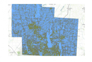
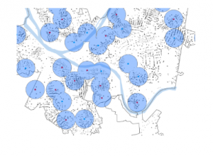
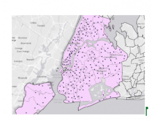
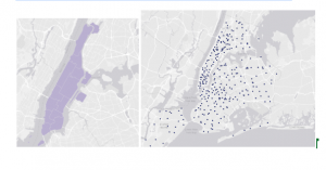
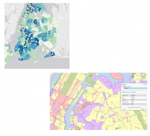
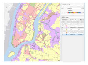
Mapping Where Things are helped explain how we will make our own maps. One point that the book made that stood out to me is that we should only put on the map what needs to be displayed so it doesn’t take away from the overall effect of the map. What is actually mapped is decided on the purpose of the map and who will be seeing it. When preparing the map each feature will need to have coordinates. Sometimes these coordinates are in the software, but sometimes they have to be hand entered. When different features are mapped by type, you create a symbol for each type. If that map only has one type of data, all the points will use the same symbol. However subsets help show more patterns. Sometimes it may be necessary to create two maps so that it is easier to discern what is being shown. One thing I really took away from this chapter is that there should be a limit of seven categories. More than that gets confusing for viewers. However, too few categories may not make the point you are trying to show with your map. Another point the text made was that the creator needs to be careful that the map is portraying what they are after. This chapter did help clear some things up for me and help with the feeling of being overwhelmed. The emphasis on preparing the data seems tedious, but choosing the symbols and categories seems interesting. I also like that the chapter talked about how different colors and widths of lines can be very helpful. I thought it was interesting that it said that printed maps are easier to see than those on a screen, but I would argue that with many screens today, it may be easier to view on a screen. 


Chapter Three


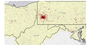
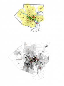
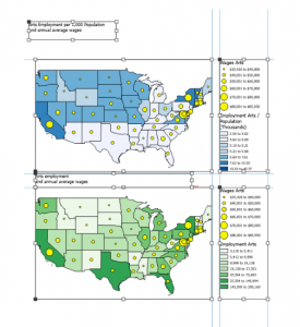
Chapter three builds on Chapter two significantly. The purpose of what you are doing helps you determine how to present the information of a map. For example, you may just be looking at the given relationships, but you may be trying to show a specific pattern. When mapping quantities such as the most or the least of something, this helps to not only see relationships, but also to make decisions based on those relationships. There are different quantities to consider in mapping, depending on what you are trying to portray. There are counts, rations, and ranks. These need to be represented in different ways. I liked how the book points out that knowing what you are mapping helps you present it. The new concepts to this chapter are about classification. Natural Breaks, Quantile, Equal Interval, and Standard Deviation are discussed. Jenks was a new word for me. Each of these classifications are important, but selecting the one that fits what you are presenting is important. Symbolization and cartographic displays are also a part of this chapter. This is the concept of choosing the elements that help to visually represent the data how you want it represented. Once a map is mad, patterns should be looked for as well as outliers. I like how the chapter helps me understand how the maps are up to interpretation. However, the choices made for a map communicate many things. Making the map visually pleasing is extremely important because it weighs heavily in how viewers are able to interpret the data. 


Hughes (Elliott) week 1

My name is Lane Hughes. (It will appear as Lane Elliott until this gets fixed by the registrar).  I just switched majors from Business Management to Environmental Studies. I found that business didn’t align with my values. I am a commuter student. I work at Cackler Tree Farm. My sister also attends OWU and my brother will be next year. 

My biggest takeaway from the reading is that I am among those that did not recognize the GIS acronym or how it affects my daily life. Chapter one of Schuurman’s work explains pervasive GIS is in modern life, but also how it began. In its origins, people were reluctant to use it or acknowledge its usefulness. GIS is used in so many different ways that it is hard to define. The idea that GIS is simply a computer program is what Schuurman wants us to get away from. GIS has shaped much of the current world. Policies are made based on information obtained from GIS. The beginnings of GIS were based on industry needs. It is important to remember that although GIS is computerized, it is still reliant on human input. Therefore, it may not be error free. GIS can also be thought of as an academic discipline to be studied. Schuurman believes that because there is room for error and so many different purposes, GIS should be used with an understanding of its vast abilities, but also its limitations. GIS is extremely influential in our world today. One part of this chapter I enjoyed was the story of how one of the early computer cartography systems was developed. It is wild that something that became so fundamental began by two guys who happened to sit next to one another on a plane and share a common need for a system such as this. After reading this, I still have a lot of questions. One question is if GIS can be objective, since data and classification is determined by human input? Additionally, if there is a lack of objectiveness, what is misrepresented and how would one know? 


GIS Application One: https://storymaps.arcgis.com/stories/a08e4636ef6945b0a1a93820bcb334ca

Nesting Sea Turtles on a Changing Caribbean Island shows interactive maps where turtle nesting sites are located and how these locations have changed over time. Research collected helps management practices. This is valuable because it helps with decision-making and influences policies. 

GIS Application Two:

https://www.esri.com/arcgis-blog/products/arcgis-pro/mapping/how-to-make-this-animated-map-of-blue-whale-migration

This application walks through the GIS project of tracking Pacific blue whales on their migration. ArcGIS Pro is used for this. 

I completed the quiz!