Miller – Week 7 (Delaware Data Inventory)

Data Review:

  1. PLSS: Contains all zip codes within Delaware County.
  2. Township: Consists of the 19 townships that make up Delaware County. 
  3. Delaware County E911 Data: Includes all addresses within Delaware County.
  4. Building Outline 2021: Contains the building outlines for all structures.
  5. Original Township: The original boundaries of townships in Delaware County before tax district changes. 
  6. Street Centerlines – DXF: Shows the center of the pavement on all public and private roads in Delaware County. 
  7. Recorded Document: Shows the location of miscellaneous documents recorded in the Delaware County Plat Books. 
  8. Dedicated ROW: Displays the Right-of-Way lines within Delaware County.
  9. Precincts: Consists of voting precincts within Delaware County. 
  10. Address Points – DXF: Shows the exact location of the center of each building, as well as the address of each building in Delaware County. 
  11. Parcel: Consists of polygons that represent the parcel lines within Delaware County.
  12. Zip Code: All zip codes within Delaware County. 
  13. School District: Shows all school districts within Delaware County. 
  14. Building Outline 2023: Shows building outlines for all structures in Delaware County. 
  15. Condo: Shows all condo polygons within Delaware County.
  16. Subdivision: Consists of all subdivisions and condos in Delaware County.
  17. Map Sheet: Consists of all map sheets within Delaware County.
  18. Address Point: Representation of all certified addresses within Delaware County.
  19. Farm Lot: Consists of all farmlots within Delaware County. 
  20. Annexation: Contains all annexations and boundaries from 1853 to the present in Delaware County. 
  21. Survey: Includes all surveys of land within Delaware County.
  22. Tax District: Consists of all tax districts defined by the Auditor’s Real Estate Office in Delaware County.
  23. Hydrology: Displays all major waterways (lakes, rivers, etc.) within Delaware County.
  24. GPS: Identifies all GPS monuments established in 1991 and 1997 in Delaware County.

Delaware Data Inventory: 

Miller – Week 6

Chapter 7

  1. Editing polygon features
  2. Creating and deleting polygon features
  3. Using cartography tools
  4. Transforming features

I really enjoyed moving the features around and “fixing” the map. It felt like doing a puzzle. Creating polygons and outlining areas was also pretty cool. Everything in this chapter went smoothly, and I can see how this chapter would have some real-world applications in things like architecture. 

Chapter 8

  1. Geocoding data using zip codes
  2. Geocoding street addresses

This chapter was super easy and short, I wish all of the chapters were like this one. The only issue I encountered was with the “create locator” tool at the beginning of the chapter, I think I accidentally made a copy of the output locator, which I fixed by just renaming it “PARegionZIP_CreateLocator1.”

Chapter 9

  1. Using buffers for proximity analysis
  2. Using multiple-ring buffers
  3. Creating multiple-ring service areas for calibrating a gravity model
  4. Using Network Analyst to locate facilities
  5. Performing data cluster analysis

I felt like this chapter repeated a lot of things from earlier chapters, just using different methods to get the same results. This was all fairly easy, but it took me a while. I also liked the visuals that the maps created, I can see how this could be useful for someone who works in data analysis or something similar.

Miller – Week 5

Chapter 4

4-1: Importing data, setting up a folder connection, converting a shapefile to a feature class, importing a data table into a file geodatabase, and using database utilities.

  • This was all fairly straightforward, but I was glad to familiarize myself more with the folder structure, as I’ve never really used folders outside of this class before.

4-2: Deleting unneeded columns, adding a field and using the Calculate Field tool, joining a data table to a feature class attribute table, exporting a feature class, calculating a sum of fields, calculating percentages, and extracting fields.

  • Again, this chapter was pretty easy, but I did struggle with deleting unneeded columns at first because I couldn’t find the “Delete” button. Overall, I thought that this subchapter included some pretty useful features that have very modern applications. 

4-3: Viewing crime incidents, creating a date-range query, reusing a saved query, using OR connectors and parentheses, day-of-week range, and querying person attributes.

  • This was probably my favorite subchapter so far, because I felt like a detective or something like that, trying to find crime statistics and locations of certain crimes. Using actual code was something new that I learned, although it was pretty basic coding. 

4-4, 4-5, 4-6: Building a spatial join, creating a central point feature class, creating a point layer, and making a one-to-many join.

  • These subchapters were all pretty straightforward, although I did run into some trouble with the Calculate Geometry Attributes tool, and was a little confused on the formatting, but I figured it out in a few minutes. 

Chapter 5

5-1, 5-2, 5-3: Using coordinate systems

  • This was also pretty useful information, as I was able to change the way that the map was oriented and focus on different locations and regions. I had no issues with these subchapters. 

5-4: Shapefiles, adding x,y data, converting KML files to feature classes.

  • This subchapter was a bit more complicated, as I am still familiarizing myself with files and other computer features, but it didn’t take me too long to figure it out.

5-5: Downloading census data and files, processing data in microsoft excel, adding data to ArcGIS, and joining data and creating a chloropleth map.

  • This subchapter was very hard for me, and I ran into a lot of problems using excel spreadsheets and downloading census data. The first time that I downloaded the Commuting Characteristics by Sex table, not all of the data was displayed in the spreadsheet, so I had to troubleshoot and redownloaded the data following the steps more carefully. 

5-6: Adding a land use layer, extracting raster functions, downloading contours from a government organization, and downloading local data from a public agency hub.

  • I liked this subchapter (and the previous one, excluding the issues I had) because it used data from Hennepin County in Minnesota, which is where I am from, so it was cool to apply GIS to something that relates to me. I didn’t run into any of the issues like in 5-5, but it took me longer as I was very careful in following the instructions to download data correctly. 

Chapter 6 (Disclaimer: I completely forgot to take pictures of my work from this chapter, and will edit this post with pictures the next chance I get)

6-1: Dissolve fields and dissolve block groups.

  • This was all pretty straightforward, but I did struggle a bit with the “Your turn” section as I had to retrace my steps from the first portion of the subchapter and was confused on exactly what to put in the input and output fields. 

6-2: Creating a study area, creating study area block groups, and clipping streets.

  • I had no issues with this subchapter, as I am familiar with all of the features.

6-3, 6-4: Merging features, and appending features.

  • The merge and append tools were very easy to use, and I had no issues. 

6-5: Intersecting features, summarizing street length.

  • This was all pretty straightforward, and I found the tools to be very useful.

6-6: Calculating acreage, and summarizing residential land-use areas.

  • This felt similar to some of the previous subchapters, almost repetitive at this point. 

6-7: Using tabulate intersection.

  • This was something new, but I found the tool pretty easy to use.

Miller – Week 4

Chapter 1

I found this chapter to be the easiest by far. My biggest takeaway from Chapter 1 was the importance of the “contents” tab, and I quickly learned that most functions run through this feature. Another important feature was the “catalog” pane, through which many of the major functions are run. Finally, I realized the importance of using layers and raster layers in the contents pane, how to zoom in and out, as well as how to use attribute tables. Overall, the content in this chapter was pretty straightforward, and I only encountered minor issues when I didn’t read the directions closely enough.

Chapter 2

Chapter 2 was significantly more challenging than Chapter 1, but I found it to be equally as interesting and useful. Some things I found that seemed important were: adding labels and editing text, polygon symbols, and creating pop-ups. I also began to learn the importance of the Symbology pane, how to make a 3D visualization of a map, and how to make a density dot map. I found editing text to be difficult at first, especially adding holo to the edges of the text, but I got the hang of it with a little practice. 

Chapter 3

I found this chapter to be a little harder than Chapter 1, but easier than Chapter 2. Creating bar charts and line graphs was fairly easy, but I found formatting the graphs to the page to be somewhat difficult, especially adding guides to the page, which took me a minute to figure out. I had no problems sharing maps online and creating stories in StoryMaps. 

Miller – Week 3

Chapter 4: Mapping Density

Mapping density helps show where the concentration of features is the greatest, and is useful for looking at patterns instead of the locations of features by themselves, for both areas with many features or features per unit of space. When deciding what to map, you should think about the features you’re mapping, as well as any information you might need (density surface), using either data that has already been summarized or by mapping density or feature values yourself. The two ways of mapping density are by a defined area, such as a dot map, if the data is already summarized, or by a density surface, using a raster layer in which each cell gets a density value based on the number of features within a radius of the cell, if you have individual locations, sample points, or lines. A density surface is created by using raster layers, where GIS calculates a density value for each layer. A neighborhood is defined, and the total number of features is divided by the area, which is then assigned to a cell. This creates an average of the features per area. Larger cell sizes create a coarser surface that processes faster, while smaller cells create a smoother surface that processes slower. To calculate cell size, you need to convert units to cell units, then divide that by the number of cells, and take the square root of that number. The search radius is the number of features divided by a correspondingly larger area, in which a larger search radius will produce more generalized patterns, and a smaller search radius will produce less generalized patterns. Calculation methods for cells are either simple (creates overlapping rings), or weighted (creates a smoother surface). Units chosen to create a cell should correspond with the features and what you hope to get out of the map.


Chapter 5: Finding What’s Inside

Mapping inside an area shows what is occurring inside an area, and is useful for comparison. You should consider whether you will need a single area or multiple areas. A single area is useful for monitoring activity and summarizing information, while multiple areas allow for them to be compared. Features can be discrete (unique and identifiable) or continuous (seamless, a summary). A count, list, or summary should be used as information. Three ways of finding what’s inside an area are drawing areas and features, selecting features inside an area, and overlaying the areas and features. When making a map, Locations and lines should be used for individual locations or linear features, discrete areas for seeing parcels inside a single area, and continuous features for drawing the areas symbolized by category or quantity. Selecting features inside an area is used for specifying the features and the area, and GIS then flags features in a specified area. The amount of features in an area can be counted in the following ways: 

  • Count – total number of features in an area
  • Frequency – number of features with a given value, or range of values
  • Sum – overall total or total by category
  • Average – total / # of features
  • Median – middle value of a dataset
  • Standard deviation – the average amount that values are from the mean


Finally, overlaying areas and features is used for finding discrete features within each area. 


Chapter 6: Finding What’s Nearby

Mapping what is nearby an area or feature allows GIS to find what is occurring within a set distance of a feature, and also find out what is within traveling distance. In defining your analysis, you should be able to define what is near, expressed as distance, time, or cost of traveling to or from that location. Of those options, mapping travel is most precise. You should also be aware of whether you’ll need to take into account the Earth’s curvature (geodesic method) or not (planar method). Information needed to map what is nearby should be a list (ex, a parcel ID and address), a count (by category), or a summary statistic (total amount, total/category, or a statistical summary). Distance and cost ranges can either be an inclusive ring, which is a circular area, or distinct bands, which are essentially multiple inclusive rings stacked on top of each other. There are three ways to find what’s nearby: 

  1. Straight-line distance: Specify the source feature and distance, and GIS locates the area or features nearby
  2. Distance or cost over a network: GIS finds segments within range or specified source locations and a distance or cost within each linear feature
  3. Cost over a surface: GIS creates a new layer showing travel cost based on a specified location of the source features and a travel cost

Straight-line distance can be used by creating a buffer defining a boundary and what’s inside it, selecting features to find features within a distance, calculating feature-feature distance, or by creating a distance surface. The equation to find distance is as follows: square root of (x1 – x2)^2 + (y1 – y2)^2. To create a buffer, specify the source feature and the buffer distance, and GIS will draw a line around a certain distance from the feature.

Miller – Week 2

Chapter 1: Introducing GIS Analysis

GIS is a powerful tool for analyzing and visualizing data. It is used to map where things are, show concentrations (most/least), analyze density, finding what’s inside a specific area, and track changes over time. At the core of GIS analysis is the process of asking questions, selecting appropriate methods based on available and required data, processing that data, and interpreting the results in the form of maps, tables, or charts. 

GIS data comes in several forms. Features can be discrete, meaning their locations can be pinpointed, or continuous, which can be measured anywhere. Features can also be summarized by area. These features are represented using either vector (coordinates) or raster (layers) data. The accuracy of representation depends on map projections (globally) and coordinate systems (specified area). 

Each geographic feature in GIS has attribute values, which describe its characteristics. These values are classified into types such as categories, ranks, counts, amounts, and ratios (proportions and densities). This classification helps in selecting the appropriate analysis technique. Ultimately, GIS allows users to reveal spatial patterns and relationships that may not be obvious, making it an essential tool for decision-making in a wide range of fields. 

Chapter 2: Mapping Where Things Are

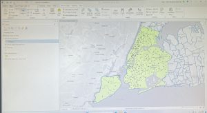
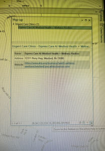
Mapping where things are is a foundational function of GIS that helps identify geographic patterns and relationships. Before creating a map, it is crucial to decide what information needs to be shown and why. GIS analysis allows users to pinpoint where features exist or where they don’t, identify their types, and determine their distribution. However, map design should balance detail and clarity, where too much detail can overwhelm viewers, while too little might leave out crucial data. 

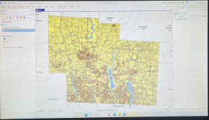
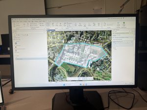
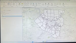
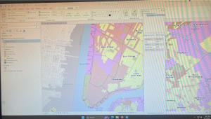
The first step in preparing data is assigning geographic coordinates or addresses to features. Each feature must also be assigned a category value that identifies its type. When making maps, there are many different approaches. You can map a single type using the same symbol, focus on a subset of features, or map by category, using distinct symbols for different types. If features belong to multiple categories, it’s important to visually distinguish each group, but it is suggested not to use more than 7 categories on one map. If more than 7 categories are needed, they should be grouped to avoid clutter. 

Choosing symbols is essential for clear communication. Individual locations can be shown using color coded markers, linear features can vary in width or pattern, and areas may be differentiated using raster layers or shading. Text labels can also help in identifying areas. Including reference features like roads, rivers, or landmarks adds context, which can make a map more meaningful to the audience. 

When analyzing geographic patterns, zooming out can help identify broader trends. Combining spatial patternswith background knowledge often reveals why features are arranged in a certain way. Well designed maps, supported by prepared and categorized data, allow GIS users to communicate spatial relationships effectively to an audience.

Chapter 3: Mapping the Most and Least

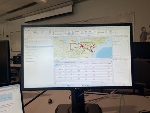
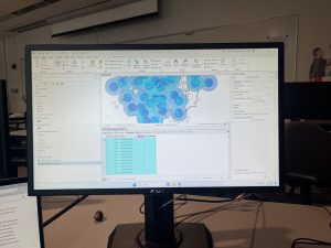
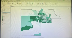
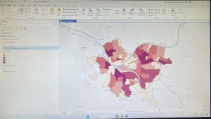
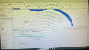
Mapping the most and least is a method in GIS used to explore how quantities vary across locations. This approach allows users to see relationships between places, revealing patterns not visible in raw data. This technique is especially useful for comparing counts, amounts, ratios, ranks, and densities across geographical areas. When mapping quantities, it is crucial to consider the audience, whether the map is exploratory or intended for presentation, influences the choice of using data or visual maps.

Understanding quantities is important. Counts represent the actual number of features, while amounts are total values associated with features. Ratios compare two values, while proportions and averages divide values to show relationships. Densities show distribution over space. Ranks order features from high to low, either through text (high, medium, low) or scales (1-10). 

These quantities are often grouped into classes to make patterns easier to interpret. Creating classes of data helps readers compare areas more quickly, though this can reduce the precision of the data. There are several classification methods:

  • Natural breaks (Jenks): classes are based on natural groupings of data values
  • Quantile: Each class contains an equal number of features
  • Equal interval: the difference between high and low values is the same
  • Standard deviation: features are placed in classes based on how far away from the mean they are

When making a map, various visualization techniques can be used:

  • Graduated symbols
      • Features: locations, lines, areas
      • Values: counts/amounts, ratios, ranks
  • Graduated colors
      • Features: areas, continuous phenomena
      • Values: ratios, ranks
  • Charts
      • Features: locations, areas
      • Values: counts/amounts, ratios
  • Contours
      • Features: continuous phenomena
      • Values: amounts, ratios
  • 3D perspective views
    • Features: continuous phenomena, locations, areas
    • Values: counts/amounts, ratios

Using these tools, GIS helps reveal spatial patterns in quantitative data.

Miller – Week 1

Hi all, my name is Luke Miller. I am currently a junior majoring in environmental science with a minor in Spanish, and I also play lacrosse. 

From the syllabus quiz and reading, I learned that the uses of GIS are vast and varied, being used for environmental, geological, economic, and even medical purposes. Along with this, GIS does not have its own fixed and secure identity, as the user determines its value and how they choose to use it, even within specific fields. For example, a marine biologist might use GIS for completely different reasons than a wildlife biologist. Another variance in the uses of GIS is that it deals with both the “why?” and “how?”, and can be used in different ways based on what the user seeks to answer or find. I enjoyed reading about the first use of GIS, which was to optimize the construction of a highway in a way that would minimally interfere with the environment, which made me wonder what percentage of highways in the US were built using GIS, as I find many of them to be inconvenient. Another concept I learned about was that spatial analysis is different from mapping, as it extracts more data from preexisting data, whereas mapping is just a presentation of existing data. I was also intrigued by the idea that people “reason” using imagery and are able to better understand spatial analysis using imagery. It is for this reason that GIS has become increasingly popular over the years, in that its applications make complex relationships easier to understand and visualize. Finally, I found Bruno Latour’s concept to be interesting in that scientific knowledge and technology must first be disputed to become legitimate. Once they are legitimized, they are then assumed to always be true. This is true with GIS, in that because it has become a legitimized technology, no one questions the validity of its findings, which is both a good and bad thing. 


I found the application of GIS to assess the water quality of lakes in my home state of Minnesota to be interesting. In a 2002 study, researchers took existing maps of lakes over a 25-year period and used GIS to correlate them with information about the surrounding areas, such as pollution, to determine the most prevalent causes of water pollution in that specific area. 

Another use of GIS I found to be interesting was a study conducted in 2009 in Indiana. This study investigated the prevalence of ticks, which are the main cause of Lyme disease, found on deer harvested from 2005-2007. All deer in this study were entered into a GIS database to find where deer ticks were most prevalent. 


Sources

Brezonik, P. L., Kloiber, S. M., Olmanson, L. G., & Bauer, M. E. (2002, May). Satellite and GIS Tools to Assess Lake Quality. Water Resources Center; The University of Minnesota. https://citeseerx.ist.psu.edu/document?repid=rep1&type=pdf&doi=7c6ca4d3d77ef0b0417e3f8304f1e66427809323

Keefe, L. M., Moro, M. H., Vinasco, J., Hill, C., Wu, C. C., & Raizman, E. A. (2009). The Use of Harvested White-Tailed Deer (Odocoileus virginianus) and Geographic Information System (GIS) Methods to Characterize Distribution and Locate Spatial Clusters ofBorrelia burgdorferiand Its VectorIxodes scapularisin Indiana. Vector-Borne and Zoonotic Diseases, 9(6), 671–680. https://doi.org/10.1089/vbz.2008.0162