Aslam Week 5

Chapter 4

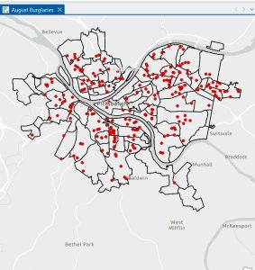
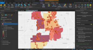
Chapter 4 mostly involved working with the attribute tables and understanding how the data is stored inside the file geo database. Before this chapter, I did not fully comprehend the extent to which GIS works with tables and data. As I opened the attribute tables as part of the tutorials, I realized that every feature on the map has rows and columns attached to it. This made me comprehend that the map is only half the work; the data that is associated with it is just as important. As part of the tutorials, I got to work with the attribute tables to sort the fields, view different columns, and comprehend the meaning of each field. I also got to work with the Select By Attributes tool to select data based on different criteria. The SQL statements were new to me. I had to ensure that I spelled the fields correctly and entered the correct value. If I made a small mistake, nothing would be selected. As I got to select different things like burglaries that occurred in a particular month, I realized the extent to which attribute queries are powerful. I also got to work with the field calculator and exporting the tables. I was a bit confused as I had to work with different tools that had similar names. I was not always sure which tool to use. I had to try it a few times before getting it right. The “Your Turn” sections were a bit difficult as the instructions were not as detailed. As part of Chapter 4, I realized that GIS is not all about working with the maps. It is also about working with the data that is associated with the maps.

Chapter 5

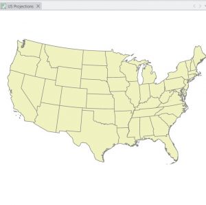
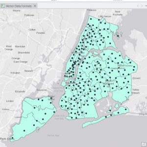
Chapter 5 dealt with map projections and coordinate systems. I didn’t quite grasp the significance of map projections at first. However, once I started experimenting with different map projections using ArcGIS Pro, I understood how a map changes depending on its projection. I realized that it would be impossible to accurately depict the Earth on a flat surface. I learned about various world projections too as well as those commonly used in the United States. I utilized the Map Properties window to learn about coordinate systems. I learned that coordinate systems play a crucial role in displaying data. In this chapter, I also learned about how to add a vector layer and work with tables. I had to learn how to add data to ArcGIS Pro, making sure that I had done it correctly. I realized that if I had not organized my files well, I would be in a worse position. I learned about how to work with tables, as well as how to join tables to spatial data. I learned that this chapter was conceptual and that map projections are not just something you select and forget. I learned that they play a crucial role in how you view your maps. Another part of the chapter in this section that stood out to me was the ability of the different layers to appear together even if they were originally given a different coordinate system. I learned that even though the program can automatically change the data display in the map, it does not mean that everything is lined up correctly. This made me realize that I need to be more aware of the properties of the different layers rather than assuming they will automatically match. Another thing that stood out in the chapter was the importance of the projection depending on the size of the area that the map covers. A world map and a city map cannot be the same projection if accuracy is a priority.

Chapter 6

Chapter 6 dealt with various tools that are utilized to alter or change spatial data. I learned about various tools such as Clip, Extract, Merge, and Dissolve. With the tutorials, I learned how to choose a certain area and then use the Clip tool to create a new layer that only includes data within the boundaries of the area. It took a few attempts to get it right because sometimes I would choose the wrong input or save the wrong output in the wrong location. Once the error was corrected and the tool was executed correctly, it was nice to see the new layer appear. Another tool I got to work with was the Dissolve tool, which allows features to be combined based on shared information. This reminded me of Chapter 4 because the attribute data plays a part in the combination of the features. If the data is different, they will not be able to be dissolved together. The “Your Turn” sections were a little more independent, and I had to really think about what the tool was doing instead of just following the instructions. Although I did receive some error messages, they were mostly because of a mistake that I had made. Chapter 6 taught me about the ability of GIS to transform data, not just display it. It made me feel comfortable using the geo processing tools in ArcGIS Pro. The other thing I noticed in this chapter is that it is essential to be careful about where you save the output. I noticed a few times that I had saved a new layer in the wrong place, which would later be hard to find. I realized that it is as important to be organized as it is to be able to run a tool successfully. I also began to understand that most of my errors were not because the tool was hard to work with, but because I had made small mistakes. I learned to be patient with this tool as I read this chapter.

Aslam Week 4

Chapter 1
In Chapter 1, I was finally introduced to ArcGIS Pro, and I have to say, I was immediately struck by the complexity of the interface.  There are just so many tabs, panes, and buttons, I didn’t even know where to look at first. However, as I followed the instructions in the tutorial, I began to get a better understanding of all the different elements.  This entire chapter focused on the basic fundamentals, such as opening a project, navigation, bookmarks, attribute tables, and learning to symbolize a map. All of these are probably basic, yet I quickly learned that they are also the foundation upon which all other learning will be built. One of the most important things I learned throughout Chapter 1 was the organization of ArcGIS. For instance, the top ribbon allows me to access different tools, which are then organized by different categories. Additionally, the Contents pane allows me to see the stacking of different layers. Turning different layers on or off, as well as moving them around, also helped me understand the construction of a map, piece by piece. Tutorial 1-3 was also very helpful, as I had never even opened an attribute table before. Learning about all the different data behind a feature helped me realize that there is a lot more to GIS than mapping, as there is also data management. Finally, with Tutorial 1-4, I learned about symbols and labels, which change the entire meaning of a map. At the end of Chapter 1, I must admit that I felt much less intimidated by the program. I didn’t become an expert, by any means, yet I began to get a sense of how the program thinks, which will be important throughout all the other chapters.


Chapter 2

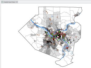
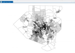
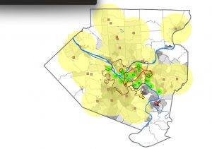
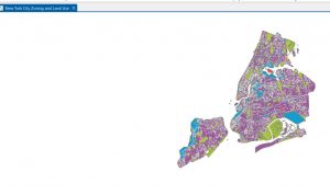
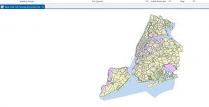
Chapter 2 was all about map design and the various methods of symbology. This was the chapter where I finally started to feel comfortable altering the way maps actually look. It seemed like almost every section required me to alter the colors, values, classification methods, and labels. Although at first this seemed quite repetitive, by the end of the chapter, I saw why this was so important to a GIS analyst. One of the biggest takeaways for me from this chapter was realizing that symbology is not just for looks; it actually affects the way a person will interpret the map. When I was working with different classification methods, the map looked completely different even though the numbers didn’t actually change. This really drove home the importance of choosing the appropriate symbology method for the data. One section that really stood out to me was the section on working with buffers. When I saw the yellow appear as the clinics were buffered, I finally saw the spatial relationships. No more guessing which clinics are close enough; this really helped me understand how someone would use this program to answer questions. I also found working with different datasets, especially the NYC zoning and land use dataset, really helped me speedily work with symbology and understand the visibility range. I finally saw why labels shouldn’t appear at all zoom levels. This chapter really helped me feel more comfortable and not as scared to alter the colors, shapes, etc. I think this chapter really helped me understand the connection between design and communication.


Chapter 3

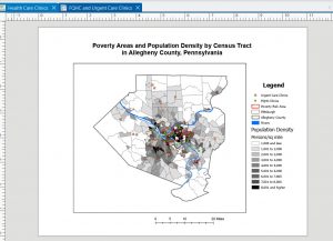
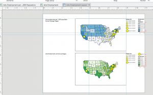
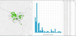
In Chapter 3, there was a shift from creating maps to a greater focus on sharing maps with those who do not use ArcGIS Pro. This chapter also involved a greater level of switching between ArcGIS Pro and ArcGIS Online, which was a little confusing at first since the interface was not quite the same as the book showed. However, once I got accustomed to where everything was, the instructions made a lot more sense. The first section, which was creating a layout, felt somewhat like a graphic design project. I had to place titles, a legend, a scale bar, and a map into very specific areas. This required the use of guides and grids to ensure everything was lined up correctly. I didn’t realize until I had to do this exercise how much goes into creating a final, clean-looking map. Tutorial 3-2 had me share a map to ArcGIS Online. Once this was done, I opened the map in ArcGIS Online, which was a very different experience than ArcGIS Pro. This was a surprise, as I had no idea how different these two platforms were until I had to use them. This section also introduced me to StoryMaps and Dashboards. StoryMaps seems like something that could be used to present a project or idea to others, as the format allows the reader to be walked through the project. It is very well-organized, easy to read, and follows a logical path. The Dashboard was probably the most interesting section of Chapter 3. I enjoyed seeing and creating the green dots on the map and the histogram next to it. I also enjoyed being able to click on different features on the map, which automatically changed the chart. Even though Chapter 3 was probably the most difficult chapter due to the constant switching between platforms, I think it helped me realize how GIS is shared with those who do not use GIS themselves.

Aslam Week 3

Chapter 4
This chapter has been helpful in assisting me in understanding how a GIS maps density.  Mitchell discusses how there are various ways in which density is mapped. There is defined area
density and density surfaces. Defined area density includes dot density mapping, in which the number of features represented by the dots is chosen by the analyst, as well as the location of the
dots inside the defined area. I learned that the final product can be greatly impacted by the choices the analyst makes, especially because the dots do not show the exact location of the
features. Shade density mapping is also included in defined area density and is greatly impacted by the classification methods. Quantiles and equal intervals, discussed in the first few chapters,
come into play again in this chapter, as they play an important role in the final product. However, density surfaces display the density differently because they create a surface based on the search radius from each point. I learned that the final product can be affected by the cell size because it can be coarse or smooth depending on the choices the analyst makes. Mitchell discusses how density surfaces can show subtle patterns that defined areas might not show, but they require extra work and care. I learned that the final product can be greatly impacted by the choices the analyst makes and that density surfaces require extra care. I also learned the importance of using the same classification methods when comparing multiple density maps. One thing that caught my attention is the importance that the analyst has in the final product, as their decisions may affect the final product to a large extent.

Questions:
1. When should a dot density map be used over a density surface?
3. How do the classification methods stop or create false density patterns?

Chapter 5
Chapter five discusses what is inside an area.  Mitchell states that if the analysis is done on one area, the goal is usually to summarize or monitor what is going on inside the area. If the
analysis is done on several areas, the goal is to compare the amount or kind of information inside each of the several areas. There are three ways that this can be done: listing what is inside the
area, counting what is inside the area, and summarizing the attributes of what is inside the area. The third method involves adding up or averaging the attributes of the features inside the area.
One problem that Mitchell presents that I had never thought of before is how to determine whether or not to count features that are only partially inside the area. The second problem is
how the boundaries of the areas are represented. In some cases, the boundaries are represented with an outline, and in other cases, the interior of the area is shaded to help identify the area as a
whole. This, in my opinion, affects interpretation because, with the boundaries, the focus is on the separation, and with the shading, the focus is on the area as a whole. What I got from this chapter was the importance of consistency. For example, the boundaries, if one is represented differently from the other, then the two areas are not being compared fairly. Mitchell is able to
connect this chapter to the previous ones by showing the use of the concepts discussed in the future. This chapter has helped me understand that area analysis is simple but detailed, requiring
a lot of decisions.

Questions:
1. How do you determine whether partially included features should be included in an area?
2. What methods of mapping are best suited to represent the results of boundary-based analysis?

Chapter 6
Chapter six of the book discusses how GIS solves the problem of what is near a feature. This is another important problem that occurs in spatial analysis. In this chapter, Mitchell
explains that there are three different ways of measuring what is near a feature. One way is by straight line distance. This is the simplest method to use, but it is not always realistic since it
does not take into consideration any obstacles that may be encountered along the way. The second way is network distance. This is more realistic since it considers what path one has to
follow. The third one is cost over a surface. This is more advanced since it considers many different factors that may influence movement. The path that one has to follow may be difficult
even though it is straight. There are also buffers, which are used to define what is near a feature by creating a buffer around a feature and defining what is a certain distance away. Buffers can
be used to represent distance, time, or cost, depending on the analysis. The reminder about using planar versus geodesic distance was important to me because it is crucial for obtaining accurate results. Smaller areas can be analyzed using planar methods because the curvature of the Earth is insignificant, but as the area gets larger, it is crucial to use distance to obtain results that accurately represent the Earth’s curved surface. Another topic that Mitchell reviews is earlier concepts such as counting or summarizing features within zones, demonstrating how each
chapter builds on the previous one. What stood out to me is how proximity analysis, although simple at first, can become complex depending on the real-world situation. Different issues call
for different approaches, and if the wrong one is used, it could lead to the misrepresentation of the level of nearness of something. This also made me think of how easy it is to misrepresent the
distance between two points on a map if one does not take into consideration the real situation.

Questions:
1. When is straight-line distance sufficient to be used on its own?
2. How do buffers change depending on the units used, such as distance, time, or cost?

Aslam Week 2

Chapter 1 

Chapter 1 helped me to better understand what GIS really is and what it’s supposed to do. I thought that GIS was pretty technical and computer-based, but I realized through reading Chapter 1 that GIS analysis really begins with thinking through a question. GIS is a system to store, manage, analyze, and display spatial data, but the value of GIS depends on how well the analyst frames the problem. The author, Mitchell, points to important concepts that include geographic features, attributes, and layers, and shows how they all contribute to answering a question. What I found interesting was that it’s not accidental or arbitrary to do a GIS analysis; you make a decision about what you want to find out and then use appropriate data to do it. I think I now see it as a process of reasoning rather than a technical process. I also appreciated that I could see how maps were used to make important decisions, including public policy, and that it really makes you think about your decisions, even small ones, that you make while working with your data. Reading this chapter really made me think about how important it is to be clear about what you want to do before you start to do it. It also made me realize the level of responsibility that comes with conducting GIS analysis, as the choices you make at the beginning can affect how other people will interpret a place or a pattern. It also made me ask questions such as: How do analysts ensure that they frame their questions correctly? How do they deal with incomplete data? How does uncertainty play a role when maps are being used to make decisions?

Chapter 2 

In Chapter 2, Mitchell discusses how before analyzing why something is happening, one should first understand where it is happening. He goes on to say that mapping locations is the first step in GIS analysis and helps one understand basic spatial patterns such as clustering, dispersion, and gaps. This may sound like a very basic concept, but as I read through this chapter and the rest of the book, I understand why this concept is important. Sometimes it can be difficult to understand patterns when using a table or list, but with a map, it can instantly become clear. Another important point that Mitchell makes is how scale affects a map. What may look significant at one scale may not look significant at another scale, and this shows how easy it is to come to a false conclusion when one does not think about scale. Another important point that was discussed in this chapter was how mapping involves making decisions about what to map and how to map it. This shows how mapping can sometimes be more interpretive than I initially thought. I found this to be interesting because sometimes when one looks at a map, it seems to be a very factual piece of work, but with this reading, I can see how it involves interpretation just as any other type of analysis does. This chapter has made me think about how mapping can sometimes mislead people unintentionally if one does not make these decisions carefully enough. Some questions that I had while reading this chapter were: What is the right way to go about choosing a scale when mapping? What is the right way to go about choosing a classification method to avoid misleading patterns? 

Chapter 3 

Chapter 3 introduces the reader to the importance of mapping quantities in providing more depth in the analysis, rather than just the location of the data. Mitchell introduces the reader to the difference between mapping totals and mapping ratios or density. It was clear that the importance of normalization cannot be overstated, especially when dealing with data that is not normalized. A larger area is likely to have higher totals despite the density being low. Another important aspect of mapping quantities that the author introduces is the different ways in which data is classified. I found the chapter interesting in that the author shows the reader that the choice of classification is likely to affect the general look of the map. Another important aspect that the author introduces is the issue of dealing with outliers. In some cases, the outlier is likely to distort the map if not handled with care. This reminded me that the importance of understanding the data cannot be overstated before mapping the data. The author also introduces the reader to the importance of density mapping in highlighting the data. In my view, this chapter reminded me that mapping quantities is a powerful tool that requires careful consideration in order to avoid misinterpretation. After going through this chapter, I had some questions in my mind. When is the use of totals more important compared to the use of ratios? How does one deal with the issue of outliers in classification? How does density mapping affect the interpretation of the data?

Aslam Week 1

My name is Kainaat Aslam, and I am a senior at Ohio Wesleyan University. I decided to take GEOG 291 to make myself more comfortable working with spatial data and to gain knowledge of how GIS is actually used in life. I have not really worked much with GIS before, and I am excited to see how mapping and visualization all come together. I like to travel, go out with my friends and explore different places of interest so learning more about geography tools actually feels pretty connected to my interests. I am working and going to school at the moment; hence, I like that this class is flexible and allows me to stay on top of my work with weekly due dates. I have also completed the GEOG 291 Quiz.

Schuurman Chapter 1 Response

In Chapter 1, I learned about the importance and widespread usage of GIS. I have come to realize that GIS is everywhere and that it influences almost every field of study. Schuurman starts off by demonstrating that GIS is involved in numerous fields that people would not associate with GIS. She presents examples such as navigation systems, policing, organ donations, detecting clusters of diseases, agriculture, archaeology, and even the placement of businesses. I was struck by the rapid development of the technology to the point that many people now rely on it on a daily basis without being aware of the degree to which it influences their decisions in life. Schuurman observes that many geographers have a kind of ‘love-hate’ relationship with GIS technology because of its strengths and weaknesses.

Another important concept that stood out in my mind during the reading was the “identity problem” of GIS. What I mean by that is that GIS does not mean one single thing; its definition varies depending on the user’s perspective. A city planner might think of a GIS as a computer program that finds boundaries or locates a property, while a researcher might think of a GIS as a science that concerns itself with the way spatial phenomena are represented in computers.

Another concept that came to mind while reading this chapter is that GIS has both technical and philosophical roots. She mentions some research done in the 1960s that would later influence computerized GIS systems such as the early Canada GIS. The chapter also makes the point that GIS isn’t neutral. The choices people make about things like boundaries, categories, scale, and how the map is displayed all shape the way the information ends up being interpreted. There is always some decision-making involved with GIS that will affect what people interpret from their use of the program. This chapter helped me understand that GIS is not just software but rather an approach to thinking about places and what they mean.

GIS Application 1: Public Health and Disease Mapping

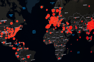
GIS technology is commonly used in the field of public health. GIS can track disease outbreaks and the spread of disease. An outbreak can often be represented as clusters or groups. Using the technology, public health officials can easily pinpoint the areas that are most affected by a disease and plan the most appropriate course of action. Outbreaks tend to occur in clusters on a map, and GIS helps health departments visualize where these clusters are occurring and how they are changing over time. By adding environmental information, population density, or transportation routes on top of the case information, health officials can begin to identify what might be driving the spread of the disease. This makes GIS useful not only for identifying where the disease is occurring, but also for beginning to form hypotheses about why the disease is occurring in a particular place.

https://online.utpb.edu/about-us/articles/gis-geospatial/how-public-health-experts-use-gis-to-fight-disease-and-save-lives/

https://www.cdc.gov/field-epi-manual/php/chapters/gis-data.html

GIS Application 2: Crime hotspot Analysis

Another important application of GIS is the study of crime patterns. Police departments create maps to represent the areas in which various types of crime are occurring and use GIS to identify “hotspots,” or areas that experience repeated or high volumes of crime. This helps to identify the areas that need to be targeted by police patrols or crime prevention programs. Crime mapping also enables the study of the relationship of various environmental factors to crime patterns. Hotspot analysis aids in the identification of crime trends and the evaluation of the effectiveness of crime prevention strategies. 

https://www.esri.com/en-us/industries/blog/articles/crime-analysis-with-arcgis-pro-video-blog-series-part-3

https://www.esri.com/en-us/industries/law-enforcement/strategies/crime-analysis