Address Point: represents all certified addresses in Delaware County. These addresses are updated daily and the updates are published once a month.
Annexation: annexations and boundaries since 1853, annexation just means territory here.
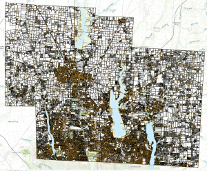
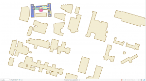
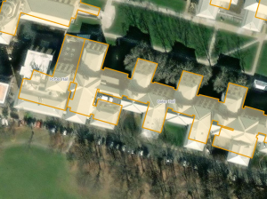
Building outline: this set is of building outlines and structures for all structures in Delaware county. It was last updated in 2023.
Condo: All condo polygons within Delaware county.
Dedicated ROW: lines that are designed Right-of-Way. This data is updated daily and published monthly. Consists of all dedicated road right of way polygons in the county.
Delaware County contours: 2018 two foot contours, topography of the county?
Delaware County E911 Data: Uses address point data to reverse geocode coordinates to determine the closest emergency services location. Updated daily and published monthly.
Farm lot: identifies farm lots in both US Military and Virginia Military Survey Districts.
GPS: all GPS monuments that were established in 1991 and 1997.
Hydrology: All major waterways in Delaware County.
MSAG: master stress address guide. Used political jurisdictions in the townships, cities, and villages within the county.
Map sheet: all map sheets within Delaware county.
Municipality: all municipalities within Delaware county.
Original township: has all boundaries of the townships within the county before tax districts change their shapes.
PLSS: public land survey system polygons are used for the US Military and the Virginia Military Districts for Delaware county.
Parcel: represents all cadastral parcel lines within Delaware County. These geometries are maintained by the Delaware County Auditor’s office.
Precinct: consists of the voting precincts for Delaware county under the data of the Board of Elections
Recorded document: recorded documents in Delaware County Recorder’s Plat Books, Cabinet/Slides and Instruments Records that would not be represented by the subdivision plats that are active. This is used to track down miscellaneous documents within the county.
School district: school district boundaries within Delaware County.
Street centerline: center of pavement in public and private roads within Delaware County. This was developed by address information.
Subdivision: subdivision and condo records for Delaware County.
Survey: shapefiles of point coverage that are representative of surveys of land within the county.
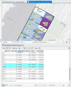
Tax district: tax districts defined by the Delaware County Auditor’s Real Estate office.
Township: data of 19 townships that make up Delaware County.
Zipcode: all zipcodes within Delaware country defined by the 2000 census, the postal service, and the tax mailing addresses.


 (Also including a photo of Marlin)
00205-X/asset/99d69831-e43f-4808-a21e-2215c27e6abe/main.assets/gr3_lrg.jpg)