listing and defining all 28 data analytics. Almost all of these data sets are updated regularly/daily and published monthly.
- Zip Code – Contains all zip codes in Delaware County. Cleaned up in 2003, and in 2005, Delaware County dissolved parcels by their property address. Also used to populate the zip right and left attributes into road centerlines.
- Tax district: This data is all the tax districts in Delaware County, Ohio. The data is defined by the Delaware County Auditor’s Real Estate Office, is dissolved on the Tax district code, and is updated as needed and published monthly.
- Parcel – This map consists of polygons representing all cadastral parcel lines in Delaware county. Includes cadastral data that shows land ownership information. Indivudal data is maintained by the Auditor’s CAMA. This dataset is maintained daily and updated monthly.
- Address Point – Maintained by Delaware’s Auditor GIS office, it is a spatially accurate representation of all certified addresses within Delaware County. Provides 911 services with address information and is updated daily and published monthly.
- Recorded Document – Contains points representing recorded documents in the Delaware County Recorder’s Plat Books, Cabinet/Slides, and Instrument Records. It was created to facilitate the process of finding random or uncategorized documents by relating to the cadastral landbase.
- School District– Contains all school districts in Delaware County. Created by the Delaware County Auditor’s records of the school districts. Published monthly.
- Map Sheet- Contains all map sheets within Delaware County.
- PLSS- Contains all of the Public Land Survey System polygons to be used by the U.S. military and the Virginia Military Survey Districts of Delaware County.
- MSAG- Master Street Address Guide, contains all 28 different political jurisdictions in Delaware County. Was made to locate the boundaries of the cities, villages, and townships of Delaware County.
- Municipalities- Contains all municipalities in Delaware County.
- Farm Lot- Data of all farm lots in the U.S. military and Virginia Military Survey Districts of Delaware County. Made to identify all farm lots and their boundaries in Delaware County.
- Township- Data of all 19 townships that make up Delaware County, Ohio. Updated as needed and published monthly.
- Street Centerline- The LBRS or State of Ohio Location Based Response System is a spatially accurate topolically represnation of the road system. Depicts center of paved public and private roads in Delaware County. Used to assist in appraisal mapping, 911 response, accident reports, geocoding, etc. Standard layer updated daily, 3-D layer annually.
- Annexation- Data on Delaware County land annexations and boundaries from 1853 to the present. Updated as needed when an annexation is made and published monthly.
- Condo- Data of all condominiums in Delaware County that have been recorded with the Delaware County Recorder’s Office.
- Subdivision- Consists of all subdivisions and condos recorded in the Delaware County Recorder’s Office. Updated as needed and published monthly.
- Survey- Contains points representing the land surveys within Delaware County. Updated daily and published monthly.
- Dedicated ROW- Data set of all lines that are designated Right-of-Way within Delaware County. The data was created using parcel data. All its changes are represented by recorded documents in the Delaware County Recorder’s Office.
- Building Outline 2024- Outlines of buildings as of 2024.
- Building Outline 2023- Outlines of buildings as of 2023.
- Railroads- Displays all locations of railroads in Delaware County.
- Precincts- All voting precincts in Delaware County. The dataset is maintained by the County’s GIS Auditor’s Office, with the direction of the Board of Elections. Updated and published by the Board of Elections, as needed.
- Delaware County GIS Data Extract Web Map- Web map that allows for Delaware County GIS data to be extracted in various formats.
- Delaware County E911 Data- Used by LBRS. Data set is accurate to all certified addresses within Delaware, Ohio. 911 emergency response location data. Intended to provide 911 agencies with information for Phase II 911 requirements.
- Building Outline 2021- Building outlines of all structures in Delaware County, Ohio last updated in 2021.
- Hydrology- All major waterways in Delaware County. Data was enhanced in 2018 with LIDAR data, updated as needed and published monthly.
- GPS- All GPS monuments established in 1991 and 1997.
- Delaware County Contours- Map of Delaware County containing two-foot contour data, from 2018.
- Original Township- A dataset of the original boundaries of the townships of Delaware County prior to a shape change caused by tax district shifts.
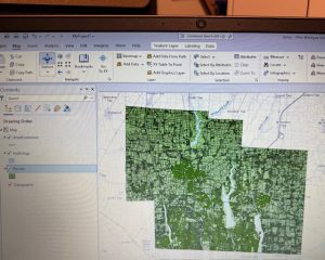
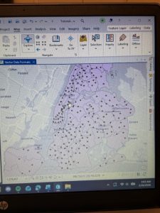
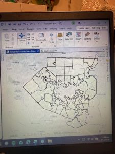
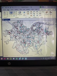
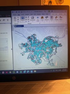
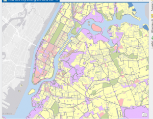
The map gave me a little trouble at first because I forgot when extractinng my files to press the “Add Folder” button. I figured it out though. I recolored the map from its default and played with some of the features before uploading.
I also plan for my final to be on 1-Selecting and Classifying Land Uses and and 5- Mapping change.