Chapter 1:
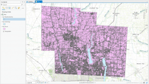
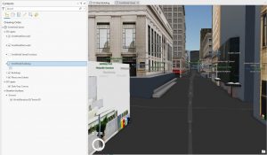
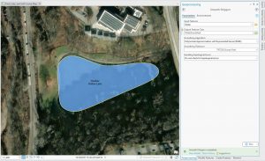
This chapter had similarities to what I did in Geog 291 but was different since it is applied to ArcOnline. I started strong but quickly got confused when trying to upload the Redlands data. As I continued, I was able to familiarize myself with each of the tools and discovered there is a lot you can do. I think this chapter was well explained but lacked some necessary pictures I felt I needed to better understand what I was doing. As I navigated through 1.4 I ran into another issue, I was unable to complete step 11, I could not find the “select layer field or sort by”. Anytime I clicked where it would be, it disappeared. I reviewed other students’ maps in our organization, and mine did not resemble theirs, but I tried.
Chapter 2:
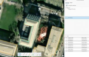
I started this chapter with excitement and optimism that it would go better than the first chapter. This went a lot smoother, and I was able to successfully create a hosted feature layer using geocoding. In 2.3 it was asked to configure pop-ups, something I struggled with previously. I enjoyed this part because it made the map easier to understand and more useful than before. While creating my story I could not find the “Map Action” button and could only find the “media action” one. I also could not find the “swipe” button when adding it to my sidecar. I ended up finding it but put it in the story separate to the sidecar narrative. I have mad a story before but doing it a second time I feel much more confident in my ability to create my own.
Applications:
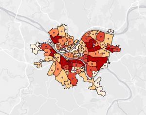
I have lived and gone to school in many different places including Stuttgart, Germany because of my dads different job placements while serving in the Coast Guard. Each location and school I went to varies and I could make a heat map that measures the amount of time I attended each school. Where a warm color would represent a longer time stayed and color tones would be short times. I possible could couple this with an express map, that would allow me to place arrows and annotations to explain each area.