Payne – Week 3

Chapter 4: 

Chapter Four’s focus is on density mapping, which is a way to understand how specific features or events are distributed across space. Rather than simply showing where things are located, density mapping highlights the concentrations, variations, and spatial relationships within data. By calculating the values per unit area, density maps allow users to see where features are clustered, sparse, or unusually high or low, which adds important context that simple point maps cannot provide. 

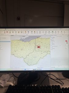
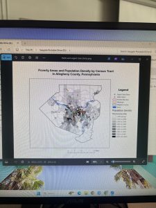
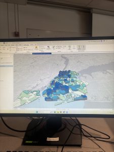
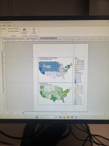
The chapter explains that there are two main approaches to mapping density. The first is mapping density within defined areas, such as counties. This method relies on existing boundaries and calculates density by dividing the number of features by the area of each region. These maps are often displayed using shaded polygons and are useful for comparing one area to another.

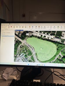
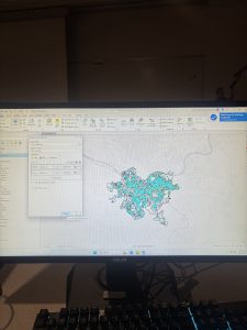
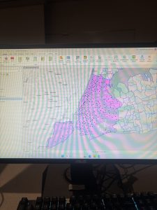
The second approach is density surface mapping, which produces a continuous surface using raster data. Instead of fixed boundaries, density values are calculated for each cell based on nearby features within a given radius. This method is more detailed and visually expressive, making it better suited for identifying spatial patterns, gradients, and hotspots. However, it also requires more processing time, storage, and careful design choices on the users end. Before creating a density map, the user must decide what they want to analyze such as raw counts, normalized values, or interpolated surfaces. Raw counts will show simple distributions, normalized values will allow fair comparisons across areas of different sizes, and interpolated surfaces will reveal patterns and relationships. The chapter also discusses practical GIS considerations to take into account, such as choosing cell sizes, classification methods, and effective color schemes to represent the data.

Overall, the chapter demonstrates how density mapping can be applied across many fields from environmental science and public health to business and urban planning by clearly showing how values vary across a region and where concentrations are highest or lowest.


Chapter 5: 

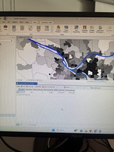
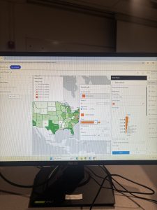
Chapter Five shifts the focus of GIS analysis from broad spatial patterns to narrowing in on specific areas and features. Rather than viewing the entire dataset at once this chapter emphasizes how GIS can be used to isolate only the information that is relevant to a particular research question. This targeted approach will allow users to answer questions about what exists within a defined boundary by making spatial analysis more precise and meaningful. A major theme of the chapter is the importance of clearly defining the area of interest before beginning any sort of analysis. GIS provides several ways to make these boundaries, including service areas around facilities, buffers that represent distance limits, and natural or administrative boundaries such as watersheds or political regions. You may work with a single area or multiple areas, which can be contiguous, disjointed, or nested. Choosing the correct type of boundary depends on both the question and the nature of the data being examined.

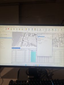
The chapter outlines three primary methods for determining what lies within an area. The first involves manually drawing areas or features, which can be useful for quick visual checks but may lack some precision. The second method uses GIS tools to automatically select features that fall within a specified boundary, producing more accurate lists or summaries of those features. The third and most powerful method is overlay analysis, where layers are combined so their attributes intersect. This approach allows users to calculate how much of a feature exists within an area or to create new datasets that merge information from multiple layers.

Chapter Five also revisits the distinction between discrete and continuous data, reminding us that feature type plays a key role in selecting the appropriate analytical methods. This chapter highlights how effective GIS analysis depends not just on technical tools, but on thoughtful decision making about data types, boundaries, and analytical goals to accurately represent your data. 


Chapter 6: 

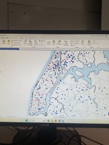
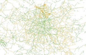
Chapter Six focuses on the concept of proximity which involves determining what is close to a particular location or feature. Proximity analysis is essential in many real world situations because distance strongly influences access, risk, and decision making. Whether planners are deciding where to locate public facilities or scientists are studying environmental impacts, understanding what is nearby provides critical insight. The chapter emphasizes that proximity analysis must begin with careful definition. Analysts must decide what “near” actually means in the context of their study and how it should be measured. GIS offers several ways to do this, each suited to their different situations. 

The most basic method is straight-line distance, which measures the shortest path between two locations. This method is simple and useful for creating boundaries, it does not account for realworld obstacles such as roads, rivers, or terrain. To address these limitations, the chapter introduces network based distance or cost, which measures travel along actual paths like streets or sidewalks. This method is commonly used in navigation systems and is more realistic when movement is restricted to established routes. A third approach, cost over a surface, incorporates barriers and varying levels of difficulty across a landscape. This method is particularly valuable in environmental and ecological studies where movement is affected by natural features. The chapter also explains how proximity can be measured across the Earth’s surface using either a flat plane approach for small areas or a geodesic approach for larger regions. In addition to this proximity ranges can be specified using inclusive rings, which show how effects accumulate over distance, or distinct bands, which allow comparisons between distance zones.

Chapter Six demonstrates how GIS based proximity analysis accurately helps translate spatial data into practical information. By selecting appropriate distance measures and methods, we can better understand how an event or data can affect its surrounding area, allowing for more accurate data representation in our maps. 


Payne – Week 2

GIS Week 2 HW


CH 1: 

I found this chapter very introductory and not super informative as it was introducing the basics of GIS a lot of which I’m already generally familiar with. It focused on how to structure and approach GIS projects and gave steps on how to process your data within a given project which will be helpful I imagine for this course. I found the section labeled “Types of Features” a little hard to understand as its wording was very technical and lacked some background explanation of what these different feature types were. I found the part about Discrete Features especially confusing but hopefully these are things that I will sort out as I work through projects. The section on Vector and Raster made a little more sense to me as they are two different models used for different GIS projects depending on the data group you are trying to represent but I also think this section lacked a little verbiage or examples that would help break down the concepts. Another large focus of this chapter was on types of attribute values such as ratios which help represent the relationship between two quantities and these are made by dividing one quantity by another. The final part of this chapter talked about how to interact with data tables by selecting, calculating, and summarizing them. I again found this section a bit dry and hard to understand but I imagine this will make sense once we start using them. 


CH 2: 

Chapter two starts to go a little more in depth in why we use maps to represent data and how this can and should be presented to your given audience. It starts off by discussing why we map where things are and the main reason why we do this is to see if there are any patterns or trends that overlap and relate to each other such as a relationship between assault crimes and auto theft. We also map things where they are to see if correlation equals causation as a data point’s physical location can affect what it represents and why it represents it. Another interesting part of this chapter is the small section on how you present you maps to your target audience as there are effective ways to represent your data and results and very ineffective ways so choosing the right map size, boundaries, and reference points can change how the info is comprehended. The next half of the chapter becomes a bit more technical with how GIS forms maps and what it does with the data points its given. It talks about very basic one layer maps that businesses can use for customer data too maps with many layers to represent multiple data points can possible correlations between them. It also discuses mapping by categories which allows for more specific data representation such as types of roads instead of simply roads. Categorizing data again allows for more accurate mapping and data representation. 


CH 3: 

Chapter 3 seemed the most interesting to me. I’ve never thought about the very basic use of numbers for understanding things as it seems so simple but this chapter discusses how having it or not makes a huge difference in what you represent. I found all the maps at the start of the chapter showing various symbols used to represent numbers very interesting as they all subconsciously convey their point but looking at it from this perspective helps understand 1) how simple yet complex these decisions of data representation are and 2) how you can represent the same data set in two different ways and have the understanding be completely different. I think the question of “Are you exploring data or representing a map” is a very key point for GIS and something I need to keep in the front of my mind when working on GIS projects. I think this question shows the two sides of mapping which are maps that you create strictly for analysis of numbers and data, and then maps that you create to represent and communicate social issues or other things that numbers alone can’t represent. This chapter also features some technical topics such as classes and outliers which are things you need to understand to make sure you create an effective map. Overall I liked this chapter the most because it branched away from the technical side of GIS and began discussing the importance of map representation and presentation which are the aspects of GIS that I am most interested in. 

Payne Week 1

Hello my name is Jack Payne, I am a senior here who is hopefully graduating in the spring! I am a business management major with a environmental studies minor with more of my personal interests laying in the envs minor. I am from Clintonville in Columbus, Ohio and have lived there my whole life but I have traveled a good bit through school to Italy, Patagonia in Chile, and out west on backpacking trips. Im excited for this class so I can learn the skills necessary to understand and use GIS incase it ends up being something I use in my post grad years.


Schuurman Chapter 1

I found this reading very engaging and insightful into the history and development of GIS programming. I have little to no prior experience with GIS and so my initial understanding of it was that it was used as a mapping software to create physical maps that represented various data inputs for geography and similar fields of study. However, from reading this chapter I now know it is so much more than just this. I liked that the author gave much of the theoretical processes behind why GIS came to be and what struggles and innovations allowed for GIS to evolve from hand done cartography which helped me understand why and how GIS software should be used. I learned that GIS software alone is not a one stop shop for theoretical problem solving but rather a tool to pair with human understanding of all the other nuances that affect a given issue. I also learned that GIS has an almost infinite amount of applications in our life, with the most interesting to me being its uses in agricultural transportation mapping as I would never imagine this being an application of GIS. I feel that the author in this chapter clarifies a lot of confusing topics about what GIS is effective for and what it should be used for and draws a sort of framework for its capabilities of data representation. The examples of GIS’ implications in farming are good examples of this as it shows many small areas where GIS can help such as identifying areas of a field that are not growing, but it has its limitations in these applications too which often is the point when human understanding and problem solving comes in to create a solution. Overall I found that this chapter gave me a very strong baseline understanding of what GIS is and how it can be used which will be crucial for this class.


The first application of GIS I looked into was its use in Paris during Covid to create a “15 minute city” bike network that allows people in the city to have safe bike transport anywhere across the city. I personally have used this network and it is an amazing feat of urban transportation in a city with a massive population. GIS was used in this to over lay cycle path data with subway data and road ways to create a map that is fast, safe and effective for urban transportation via bike or scooter or other wheeled transportation.

This image is slightly smaller than the one I found as I could not zoom out on the website to get the whole picture but this represents the bike ways overlayed with subway lines (https://www.apur.org/en/open-data-maps/open-data/cycling-facilities-paris-and-greater-paris#:~:text=By%202023%2C%20the%20metropolitan%20cycling,de%20rencontre%E2%80%9D%20and%20pedestrian%20areas.)


The second application I chose to look into was the use of GIS mapping in Patagonia to understand and help with wildlife movement, I chose this as I have worked with rewilidng chile and some of these things were things we talked about but GIS was never mentioned so I wanted to see how it was used. What I found is that GIS was used to help create the Ruta de los Parques which is a 1,700 miles of connected wilderness that spans across 17 national parks. This is a “route” that insures that wildlife that move across these areas can do so safely without reaching dead ends or man made blockages. I found this super interesting because some of our volunteer work we did in Patagonia was removing barbed wire fences from old farmers had put in place for livestock grazing which is now inhibiting the movement of native species that migrate from valley to valley such as the Guanacos. It is super cool to know that GIS mapping is almost like the over arching program used to put all these small plans into place to solve this issue.

(https://rewildology.com/chiles-route-of-parks-of-patagonia-how-1700-miles-of-connected-wilderness-is-revolutionizing-conservation/#:~:text=I%20had%20all%20these%20maps,way%20down%20to%20Cape%20Horn.) website used to get some of the genral info along with using meta to help me understand the application of GIS with this issue.

I also finished the quiz.