Here is my final exam!
Author: jonathanmunroe
Munroe – Week 6
Zip Code: Contains all zip codes in Delaware County. Created in 2005 by dissolving all parcels in the county by property address with tax exempt parcels and dedicated roads with no zip codes being manually populated. Published monthly.
Recorded Document: Contains points that represent recorded documents in the Delaware County Recorder’s Plat Books, Cabinet, Slides and Instrument Records not represented by subdivision plats that are active. Documents such as vacations, subdivisions, centerline surveys, surveys, annexations and miscellaneous documents. Updated on a weekly basis and published monthly.
School District: Contains all school districts within the county. Created via the Delaware County Auditor’s parcel records of the districts. Updated on an as-needed basis and published monthly.
Map Sheet: Contains all of the map sheets of Delaware County. A map sheet is a single map or chart in a map series, such as a USGS 7.5-minute topographic map, or printed map.
Farm Lot: Consists of all the farm lots in both US Military and the Virginia Military Survey Districts of Delaware County. Data is maintained on an as-needed basis where new surveys are recorded.
Township: Consists of 19 different townships that make up Delaware County. Dataset is updated on an as-needed basis and published monthly.
Street Centerline: Contains a spatially accurate topologically correct representation of the road system in Delaware County. Depicts center of pavement with public and private roads with address range data developed from data collected by field observation of existing address locations and manual addition from building permit information. Supports appraisal mapping, 911 emergency response, accident reporting, geocoding, disaster management and roadway inventory given to ODOT Roadway Inventory Standards. Updated on a daily basis for all fields but 3D, and published monthly.
Annexation: Contains Delaware County annexations and conforming boundaries from 1853 to present day. Updated on an as-needed basis and published monthly.
Condo: Consists of all condominiums within Delaware County.
Subdivision: Consists of all subdivisions (which there’s a lot of) within Delaware County. Updated on a daily basis and published monthly.
Survey: Shapefile of land surveys in Delaware County using point coverage. Old surveys have been scanned from the map department and added in. All surveys after May 2004 were and are being scanned by the map department. Updated on a daily basis and published monthly.
Dedicated ROW: Consists of all lines that are designated Right of Way within Delaware County. Updated on an as-needed basis and published monthly.
Tax District: Consists of all tax districts in Delaware County and defined by the Delaware County Auditor’s Real Estate Office and dissolved on the Tax District code. Updated on an as-needed basis and published monthly.
GPS: Consists of all GPS monuments established between 1991 and 1997. Updated on an as-needed basis and published monthly.
Original Township: Similar to the township layer, but only using the original townships from Delaware County. Updated on an as-needed basis and published monthly.
Hydrology: Contains all major waterways in Delaware County, enhanced by LIDAR data in 2018. Updated on an as-needed basis and published monthly.
Precinct: Consists of all voting precincts in Delaware County. Maintained by the Delaware County Auditor’s GIS Office with the direction of Delaware County Board of Elections. Updated on an as needed basis and is published as needed by the Delaware County Board of Elections.
Parcel: Consists of polygons that represent parcel lines of Delaware County, maintained by the Delaware County Auditor’s GIS Office. Represented by recorded documents in the Delaware County Recorder’s Office. Maintained on a daily basis and published monthly.
PLSS: Consists of all Public Land Survey System polygons in both the US Military and Virginia Military Survey Districts of Delaware County. Maintained on an as-needed basis where new surveys have been recorded, updated on an as-needed basis and published monthly.
Address Point: State of Ohio Location Based Response System Address Points dataset is spatially accurate representation of all addresses in Delaware County. Maintained by Delaware County Auditor’s GIS Office. Intended to support appraisal mapping, 911 emergency response, accident reporting, geocoding and disaster management. Updated on a daily basis and published monthly.
Building Outline: Consists of building outlines for all structures in Delaware County. Created in 2008 from Orthophotos. Updated on an as-needed basis and is published monthly.
Delaware County Contours: Consists of two-foot contours to show topographical and elevational changes in Delaware County.
Munroe Week 5
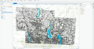
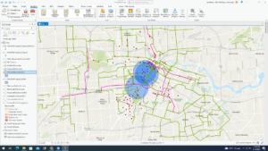
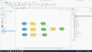
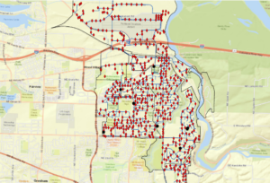
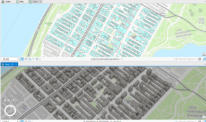
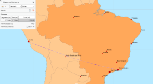
Chapter 6 went smoothly at the start, but soon failed me when I transferred the data to ArcOnline. I started by setting up a domain for a tree inventory, specifically classifying trees by planted, ingrowth, unknown and dead. I completed all of the symbology and fields on ArcPro and shared it as a web layer. Once I opened up the new layer on the map viewer, none of the trees showed up on the map (as seen in the first picture). This was disappointing but I was reassured that this was a recurring problem with other students and decided to skip over the rest of the chapter, which helped with the efficiency of getting the other chapters completed. Chapter 7 was a tad easier to complete, and while there were a few roadblocks I managed to finish the chapter and produce a map somewhat like the one featured by the author. This chapter worked with preparing project data by joining a table and managing symbology, geocoding location data through address locator and rematching addresses, and using geoprocessing tools to analyze vector data. This included creating buffers, merging and dissolving features, clipping features, selecting by attribute and location and creating a spatial join. I thought it was beneficial that this chapter focused on correcting data. From personal experience, I’ve had many mess ups on my data and it’s very helpful to have guidance through these issues. After correcting data, I was able to produce a map of Houston showing zoning districts, bike lanes and potential retail sites. This exercise reminded me of a lab in remote sensing involving selecting a potential home for Dr. Rowley in Delaware. Chapter 8 also gave me problems, and I tried three times to make the data work but was unsuccessful. The purpose of this chapter is to create a kernel density map, perform hot spot analysis, explore the results in 3D and animate the data. I was able to narrow down robberies in January 2014 Philadelphia and use that to create a kernel density map and create a hotspot analysis but was unable to continue with a space time cube. My map (as shown below) had hot spots drawn to a bigger size which didn’t have enough data to produce the space time cube. I then went on to the next chapter. Chapter 9 was focused on mapping a winery with preparing data, deriving new surfaces and creating a weighted suitability model. I was also familiar with some of the exercise with refreshers from remote sensing, in particular creating a mosaic raster and deriving hillshade and slope. I had no big issues with this chapter and was able to zip by pretty quickly. I did have a final issue at the end with my model when I couldn’t find the model raster in my geodatabase. Luckily this was the final step and Krygier let me off the hook. Lastly, chapter 10 encompassed all of the steps of GEOG112. This chapter was concerned with applying detailed symbology, labeling features, creating a page layout and sharing the project. I found this chapter to be rewarding as it makes me happy to have a final copy of a map I created. I think this was pretty self explanatory and a good refresher of everything basic covered in the book. I didn’t have any issues with this chapter but I did think that the second map on the page (the one of Provo) should’ve had a legend to explain the points on the map. I’m happy to be done with this book but I think it will also be beneficial to retouch on some of the chapters I had issues with, as I’m always trying to improve my skills in GIS.
Munroe Week 4
Getting to Know ArcGIS by Amy Collins and Michael Law: chapters 1, 2, 3, 4, and 5
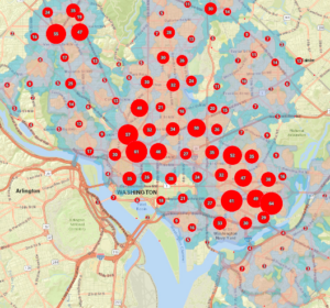
While increasingly frustrating in tasks, I enjoyed working with these few chapters as it’s the first real “hands-on” activities we’ve been able to do in this class. The first chapter was focused on the basics of GIS, much like we read in the previous book. It was a good refresher, as jumping into five tutorials was a good amount to take on. The key takeaway was that GIS is all about connecting spatial data, information that represents real-world locations and the shapes of geographic features and the relationships between them, and attribute data, information about spatial data. The first chapter then opened up into talking about how information has become more widely available within the past few years, as government agencies and NGOs are becoming more willing to put their data out on the internet. The principles and concepts remarked in the first book are reiterated once again, and the authors also make a point to talk about the difference between ArcPro and ArcOnline. The second chapter starts with the first tutorial of the assessment, with mapping the relationships of schools, walking distance to schools and transportation safety issues in Washington DC. The second assessment focuses on distance between major cities, looking at ranking population in datasets and classifying countries by air pollution statistics. The second chapter also works with 3D modeling in New York City. In all, the second chapter focuses on extracting parts of datasets, tabular data, data statistics and connecting spatial datasets. The third chapter works on mapping food deserts and obesity rates in Illinois counties, using attribute tables and diagram features to display data with the map. The fourth chapter works on building and maintaining a dataset, this time for Troutdale, Oregon, a suburb of Portland. This exercise puts you in the shoes of a city planner keeping track of data for the city. This chapter helps build geodatabases, create features and modify features. Finally, chapter five focuses on the continent of Africa, specifically the countries of Rwanda, Nigeria and South Sudan. These exercises focus on managing a repeatable workflow using tasks, creating a geoprocessing model and running a python command and script tool. I found myself getting frustrated toward the end of this assignment, as the directions became less explicit from the authors. I have to constantly remind myself to go slow, remember what I’ve learned from the previous chapter, and try my best to figure out a solution before seeking help from a fellow student or Dr. Krygier. I think I’ll go through these exercises again once I have more free time to better understand the steps and become more comfortable with the program.
Munroe – Week 3
Chapter 5
Chapter 5 is concerned with defining and analyzing what’s inside of the areas you’ve created using ArcMap. To begin, the chapter discusses defining analysis, specifically how many areas and what features are inside the areas. If you were to select a single area, you’d be focused on a specific, controlled area which could be something like a manually drawn territory or a natural boundary. Multiple areas would pertain to zip codes, disjunct parks or counties. Then, you have to determine if the features are discrete or continuous, where discrete are unique, identifiable features and continuous are seamless geographic phenomena, either spatially continuous or continuous values. Then, you need either a list, count or summary. With this step, you also need to determine if your values can be partially inside or outside of the boundaries, and how you want to quantify them. The chapter then discusses the three methods of finding what’s inside. These are drawing areas and features (which are good for finding out whether features are inside or outside an area), selecting the features inside the area (getting a list or summary of features inside an area) and overlaying the areas and features (good for finding which features are inside which areas and summarizing how many or how much by area). When you’ve selected features in the area, you can visualize results by count, frequency, or a summary of numeric attributes, using either mean, median or standard deviation. The chapter then finishes with how to overlay areas and features. First, overlaying areas with discrete features then overlaying areas with continuous categories or classes, where GIS tags each feature with a code or the area it falls within and assigns the area’s attribute to each feature. Second, overlaying areas with continuous categories or classes, where GIS uses vector or raster method to overlay areas with continuous categories or classes. Lastly, Mitchell mentions overlaying areas with continuous values, where GIS finds out which cells fall within each area and calculates the statistic for the characteristic you’re interested in and assigns the value to each cell it’s identified.
Chapter 6
Chapter 6 moves on to finding what’s nearby. A theme I’ve caught on to with these chapters is that Mitchell always wants to start with defining analysis. For this chapter, he talks about measuring what’s near whether it’s by set distance or travel to feature, cost or distance, or distance over flat plane or using earth’s curvature. Then, he asks us for the necessary information, meaning list, count, summary, distance or cost ranges, specifically inclusive rings or distinct bands. Mitchell goes further with defining three ways of finding what’s nearby. Straight line distance (good for creating a boundary or selecting features at a set distance around a source), distance or cost over a network (good for finding what’s within a travel distance or cost of a location), or cost over a surface (good for calculating overland travel cost). For straight line difference, you can either create a buffer to define a boundary and find what’s inside, select features to find features within a given distance, calculate feature-to-feature distance to find and assign distance to locations near a source, or create a distance surface to calculate continuous distance from a source. For measuring distance or cost over a network, you first specify the network layer, assign street segments to centers and set travel parameters. You can also specify more than one center and select surrounding features to be included in the map. Lastly, with calculating cost over a geographic surface, you begin by specifying the cost (where GIS totals the cost as it crosses each cell from the source, assigning a cumulative cost to each cell in a new layer it creates) and then modify the cost distance.
Chapter 7
The book finishes with mapping change, where we once again define our analysis. Mitchell mentions two types of change: change in location (seeing how features behave so you can predict where they’ll move) and change in character or magnitude (showing how conditions in a given place have changed). The type of features you choose to map also matter. They can either be discrete (physically move) or change in character or magnitude (events that represent geographic phenomena that change location). Additionally, you have to quantify time. It can be a pattern (trend, before and after or cycle) or partition (two or more times or dates or several time periods). Once you’ve determined this, you have to decide what you want to take away from the analysis. It can be how much it has changed (talking about change in magnitude or percent change) or how fast it changed (measuring the rate of change over time). There are three ways of mapping this information. The first is a time series, showing changes in boundaries, values for discrete areas or surfaces which is good for movement of change in character. This is good for strong visual impact, but readers have to visually compare the maps to see where and how much a change has occurred. The second is a tracking map, good for showing movement in discrete locations, linear features or area boundaries. This makes it easier to see movement and rate of change especially when subtle, but can be difficult to read if there are more than a few features. The third is measuring change, showing the amount, percentage, or rate of change in a place which is good for change in character. This will show actual difference in amounts or values, but doesn’t show actual conditions at each time and is calculated only between two times.
Munroe – Week 2
Chapter 1
Chapter 1 focuses on understanding GIS analysis and better framing data to fit the needs of your map. This chapter’s structure gives us a bottom-up approach to GIS, starting with the basis of geographic features, as this shows us how our data will be represented. Mitchell talks through a few examples, such as discrete features, continuous phenomena, and features summarized by area. Further, he talks about the difference between vector and raster models. The vector model centers feature as “a row in a table, and feature shapes defined by x,y locations in space” and areas defined by borders represented as closed polygons. The raster model is different, displaying features as “a matrix of cells in continuous space.” Any part can be displayed using either model, but it’s important to be conscious of which will be more visually appealing to the viewer. Discrete features and data summarized by area as usually represented with the vector model, while continuous numeric values are defined using the raster model. Endless categories can be represented by either the raster or vector model. I’m already pretty familiar with coordinate systems, with experience from GEOG112, so this section was not of great need. Mitchell finishes the chapter by talking about understanding geographic attributes, specifically attribute values. He lists categories, ranks, counts, amounts, and ratios. Types are used to group similar things and can be represented using numeric codes or texts. Classes put the features in relative order when direct measures are complex. Counts and amounts are used to show total numbers, while ratios establish relationships between quantities, usually resulting in a percentage. This is all data-driven and extremely important, as maps are just products of data. Mitchell finishes the chapter by talking about data tables, which helps us understand how to convey selected attribute values properly.
Chapter 2
Chapter 2 begins by mentioning the means by which you’re making your map. This reminds me once again of GEOG112 and KryKrygier’smic book regarding the information and audience your map needs to have to be successful and engaging. Mitchell progresses to the basics of making your map, starting with mapping a single type, where you draw all features using the same symbol. Then, he moves on to mapping by category, where you draw features using a different symbol for each category value. Mitchell makes a point that when choosing how many categories to project, it’it’sportant to look at the visual appeal of each map with its scale to judge which would be better for your audience. If you have over seven categories, it may be useful to summarize certain categories to fit together, as to not distract the audience or deter away from the meaning of the map. If youyou’reing symbols to display categories, it’it’sso important to prioritize colors over symbols, as colors are more effective to be visualized and grouped together. For example, when showing maps that have distinct categories like soil and geology maps, combining the projected features with their prospective color to a two-or-three letter code can help the viewer better see the projection, even with an included table showing the values. The same goes for implementing reference features into the map. The ultimate goal with mapping information clearly is for the viewer to recognize and establish patterns. This helps prove the data that youyou’vepped and shows that youyou’vepped something meaningful and necessary. It should be clear and evident with what youyou’reying to prove to the audience. My goal throughout this course when using ArcMap will be centered around this point, as I want my work to be successful, evident and clear with useful information being pulled from the data visualized on the map.
Chapter 3
Chapter 3 is focused on quantitative data, as mapping the most and the least helps us compare relationships between places. This helps show where help, intervention or policy is needed or of least concern. One way to do this is by shading. The darker an area, the higher the quantity of data is being reported from that location. To do this, data is summarized, usually using ratios, and set into categories with the highest percentage being darker in value versus the lowest being lighter in value. Mitchell speaks specifically on the purpose of the map, begging the question if youyou’reploring the data or presenting a map. If youyou’reploring data, youyou’retively looking for patterns and relationships versus presenting a map where you already know the pattern and relationship youyou’reying to prove. Keeping this in mind will help you build and promote a map of true purpose. Mitchell then dives back to the first chapter, recapping on quantitative data being interpreted as counts and amounts, ratios or percentages, each specific in their own characteristics and useful for differing scenarios. The chapter then turns to creating classes, specifically how to group your data to represent values accurately and efficiently. Once youyou’veeated classes and a corresponding legend, choosing an appropriate color scheme is necessary as it will help put the spotlight on your data. As mentioned before, higher percentages being darker and lower percentages being lighter is a recommended option. Mitchell mentions natural breaks, quantile, equal interval and standard deviation. Further, he mentions the different options to show quantities like graduated symbols, graduated colors, charts, contours and 3D perspective views, each is very specific and Mitchell dives into each to show the accurate ways of using them to show data. It’It’sportant not to go overboard, though, because you still want the viewer to be able to comprehend the data easily and come away from the map with the accurate interpretation and information.
Chapter 4
Chapter 4 turns to mapping density, in particular how to show where certain objects or data are concentrated which is great for census tracts or counties varying in sizes. Mitchell recommends starting with the question “Do”you want to map features or feature values?” D”nsity of features uses the example of locations of business, versus the features values which has an example of number of employees at each business location. The density will obviously shift, with more workers at certain locations and more businesses in another location. Because you want your map to be easy to comprehend, it’it’sportant to ask this question before beginning the process of making your map. Moving along, if you map by defined area, you create a shaded density map with area boundaries. If you choose to map by density surface, you create a map that almost looks like a weather radar, with density sprawling over area boundaries. To create these calculations, you first have to define and create categories. Relying on information from chapters 2 and 3, you can extrapolate your data to fit your tables and then take those quantities and create corresponding classes, specifically with a graduated color scheme. You can also create a density surface using GIS, where GIS calculates a density value for each cell in the layer which shows where point of line features are concentrated. To do this, you need information about cell size, search radius, calculation method and units. The cell size determines how coarse or fine the patterns will appear, while the search radius will construct how generalized the patterns in the density surface will be. There are two calculation methods you can use, the first being simple which counts only those features within the search radius of each cell while the weighted method uses a mathematical function to give more importance to features closer to the center of the cell and units will let you specify the areal units in which you want the density values calculated. You can also imply contours, but that makes the map more rigid and helps show the values of the legend easier. After completion, the density surface will replicate a weather radar map and can help the viewer find where the selected data is more likely to be found.
Munroe – Week 1

Hi! My name is Jonathan Munroe and I’m a junior from St. Louis, Missouri. I’m majoring in geography with a minor in music performance (violin). I’ve taken quite a few classes regarding GIS but I’m excited to take this course specifically on ArcMap. After graduation I’d either like to work for a nonprofit urban planning agency doing neighborhood revitalization without displacement or work making maps out in the woods for the forest or national park service.
Schuurman Chapter 1- Introduction to GIS: I found this passage very interesting, as I’ve read about the history of map-making and remote sensing but I’ve never learned about the history of GIS. The program itself is so versatile and especially in today’s age, it’s widely popular and sought after. As an example, last year when I worked at the Flying Pig I was talking about my major to a customer who worked for Nationwide in Columbus. He told me that if I got a degree or certificate in GIS I should come to him and he’d have a job ready for me. While insurance isn’t a field I’m interested in, I think the story speaks volume and adds on to Schuurmans emphasis on how popular GIS has become in recent years. Another thing I found fascinating was his topic of visualization where he said “visualization is used to manufacture meaning from data…people are able to discern information from visual display with greater facility than from tables or printed text.” I’m a visual learner myself and think my love for maps stems from my availability to understand the data. Schuurman further proves his point by saying that “people ‘reason’ using imagery. GIS can better connect, market and convey any information, which is why it’s so sought after in the job market. This reading has made me excited to take this class through the semester and become more knowledgeable and familiar with GIS, helping me excel my research skills, resume and general knowledge.
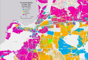
For my map, I chose to look at the racial segregation of Cape Town, South Africa with the failure of the Group Areas Act of Apartheid. I chose this map because I’m currently writing a TPG to visit Cape Town regarding racial housing segregation in comparison to the Red Line Policy of the United States. This map shows the racial composite of Cape Town using census data from 2011.