Address Point: All of the addresses in the county and this data is updated/published monthly.
Annexation: The annexations and boundaries and this data is updated/published monthly.
Condo: All of the condos in the country and is recorded by the county recorder office.
Dedicated ROW: ROW (Right of way) data in Delaware County and is based on Delaware parcel records.
Delaware County E911 Data: Data from the location based response system for Delaware County and is updated daily.
Farm Lot: The farm areas in Delaware County and gets data from US Military.
GPS: All GPS monuments in the county that were established between 1991-1997.
Hydrology: All of the major waterways in Delaware County.
MSAG: MSAG (Master Street Address Guide) consists of the 28 political jurisdictions such as the townships and cities that make up Delaware County.
Map Sheet: All the map sheets in Delaware county.
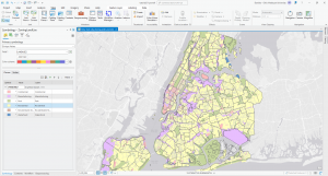
Municipality: All of the municipalities in Delaware County.
Original Township: The historical township boundaries before modifications made based on tax districts.
PLSS: PLSS (Public Land Survey System) contains land division information based on public land surveys.
Parcel: Cadastral parcel lines that define property boundaries.
Precinct: Voting precinct boundaries in Delaware County.
Recorded Document: Points that represent recorded documents in Delaware County and is updated weekly.
School District: The boundaries of all school districts within Delaware County.
Street Centerline: Road systems, public and private paved roads.
Subdivision: All recorded subdivisions and condos in Delaware County.
Survey: A shapefile of a point that represents land surveys in Delaware County.
Tax District: Dataset defines taxation zones and determines property tax rates based on location.
Township: Current townships in Delaware County.
Zip Code: ZIP code boundaries in Delaware County based on postal and census data.