Bryan Week 6

Chapter 9
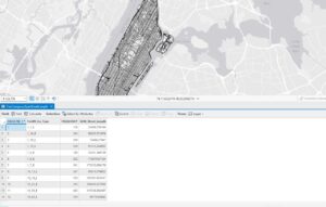
9.1- I got a bit confused during the Your Turn part and accidentally overridden the previous buffer, but I was able to fit it.
9.2- This made the last chapter’s “Your turn” seem like a redundant step, as it just taught us how to make multiple buffers.
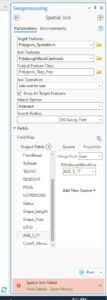
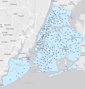
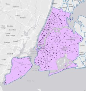
9.3- The spatial joins failed. I am unsure as to what caused this error as I triple-checked the textbook instructions.
9.4- This one was a bit confusing, not in the steps, but more what I was trying to achieve.
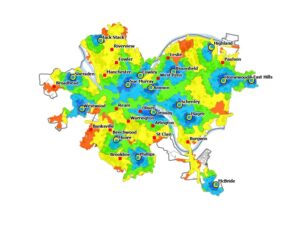
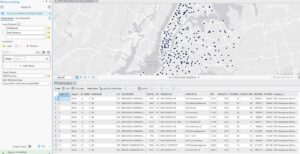
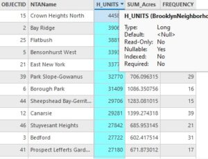
9.5- While I was able to complete the tutorial, I believe I did the “Your Turn” part incorrectly, as my table did not match the book’s. However, I am unsure as to what the mistake was, as I tried to follow the instructions closely.


Chapter 10
10.1- For some reason, LandUse.Phg did not appear in my folder, although I completed all prior steps correctly. I am unsure if this was a personal or computer error.
10.2- Pretty straightforward and easy to follow. However, I wish the book would specify which tool it wants me to use, as there are sometimes different types with the same name.
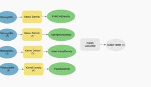
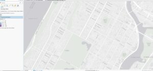
10.3- The beginning “Your Turn” part confused me, as I felt I wasn’t given enough information to properly build the tool. I’m not sure if this affected the rest of the tutorial, as no helpful pictures of the map were included

Chapter 11
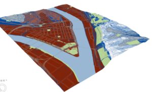
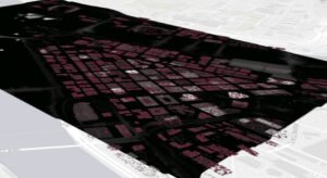
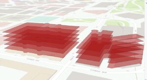
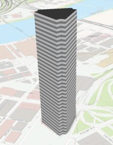
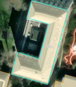
11.1- It was really cool to see the 3D version of the map, and the tutorial was very easy to follow
11.2- This was pretty straightforward
11.3- It was really cool seeing how to add trees to the map
11.4- I noticed that the processing tools in this chapter were really glitchy. They kept overriding my inputs, and I had to repeatedly redo the specific tools. I also received a lot of warnings, and at one point, the tool did not have settings that matched the textbook.
11.5- This one was pretty straightforward, although some of the instructions weren’t very clear.
11.6- The 3D street view did not load after 10 minutes so I decided to move on.
11.7- The animation was pretty intimidating at first, but it turned out to be really easy and super cool to see.

Bryan Week 5

Chapter 4
4.1- This tutorial felt pretty simple in comparison to chapter 3, and I was able to complete all the steps easily.
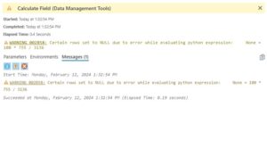
4.2- After calculating the PopYouthUnder20 field, I received a warning and several of the values were labeled as null. I am unsure as to why this happened. This also occurred while calculating the PercentPopYouthUnder20. I believe this might have interfered with the rest of the tutorial.
4.3- I found this one to be pretty easy to understand, but also pretty repetitive.
4.4- I appreciated how short and straightforward this tutorial was.
4.5- I didn’t struggle at all with this tutorial, and found it to be enjoyable.
4.6- I got confused on the “your turn” part of the tutorial, as I was unsure what table it was wanting me to open as the usual attributes table was not an option. Because I was unable to add this new code, I was unable to complete the tutorial.


Chapter 5
5-1: This tutorial was very straightforward and easy to follow, and I was able to complete it in just a few minutes.
5-2: This one was pretty much the exact same as the last tutorial, so it only took me a few minutes. However, I noticed that the program seemed to struggle with loading all of the states, as it took about a minute or so to fully refresh.
5-3: I found this one to be relatively boring, as it was mostly just confirming if already existing settings were correct. However, the California UTM map did not load.
5-4: It worked properly.
5-5: The link and download did not work properly, and had a very long waiting time. I was unable to complete this tutorial.
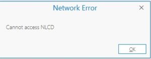
5-6: I was unable to access NLCD, even after verifying that I was logged into ArcGIS Online and restarting the app.


Chapter 6
6-1: I got stuck on the “your turn” part, as the Pairwise Dissolve tool kept failing. I am pretty sure I inserted the information correctly, so I am unsure as to why this problem occurred.
6-2 – 6-3: Fairly uneventful and easy to go through. The main part I struggled with was understanding when I needed to search for a file to input, or simply name the field. The book wasn’t very clear on this.
6.4- The book did not clarify which append tool to use, so I had to guesstimate. I think I used the right one in the end.
6.5- I found this one to be fairly easy, and I didn’t encounter any errors.
6.6- I found this chapter to be very repetitive, as it was mostly “Open this table. Now close it”. I did get a bit confused on the joining step, but I was able to figure it out in the end.
6.6- It seems like the tracts layer for the second map was not working.


Chapter 7
7.1- I actually found this one to be interesting and a nice change of pace. It was enjoyable to see my actions immediately have an effect on something tangible.
7.2 I was able to complete the work and found it interesting
7.3- This tutorial was easy to follow and only took a few minutes.
7.4- It was really cool to see how the map transferred into the tiny version, though I’m very happy the text had pictures because the wordings were very unclear.


Chapter 8
8.1- This tutorial went smoothly, and I found no errors or continuity flaws in the text.
8.2- Everything worked well in this text, and I was able to finish it quickly.

Bryan Week 4

Chapter 1

  • A feature class is a building block for displaying geographic features on a map. Feature classes are vector data and have corresponding attributes for each feature.
  • A Raster dataset is a major type of spatial data. A raster is an image made up of pixels- a common example is satellite imagery.
  • A file geodatabase is a folder with the extension.gdb that stores feature classes, raster datasets, and other files. 
  • A project is a file with the extension.aprx that contains one or more maps and related items.
  • This tutorial was quite easy to follow, as long as I didn’t try to read too many steps at a time. This can get easily overwhelming, especially since I have never been very good with computers. Surprisingly, the step I struggled most with was exporting, although I’m not quite sure what I did wrong on my first attempt.
  • Seeing the map and layers visually helped me better understand how GIS can be used for analysis. While I still don’t fully understand the process for making these maps, it’s definitely helpful to be able to pull them up and look at each layer of data
  • Overall, this tutorial was quite easy to follow. However, some of the technical terms, while sort of explained, felt unapproachable to someone with little technical experience/ knowledge.
  • In 1.4, I ran into an error and was unable to open the 3D map.


Chapter 2
2.1- I found that in this tutorial, some instructions were left out or incorrectly written, making it a bit difficult to follow along without help from another.However, the content itself wasn’t difficult.
2.2- This chapter was pretty easy to follow, although I have a habit of forgetting how to do something 30 seconds after being shown, so I managed to get through most of the tutorial without having the labels applied. Anyways, I figured it out in the end
2.3- This tutorial was a lot easier than I thought it would be initially, and only took a few minutes to do. However, I think some things in the textbook could be worded better.
2.4- I received an error message stating that I did not have a valid data source on step two and was unable to complete the tutorial.
2.5-This one was super easy and I was able to complete it in a few minutes. I’m beginning to have a better grasp on using the program.
2.6- This one was actually a lot of fun. I’ve grown more comfortable with the software, and being able to see the various layers at ease was really interesting.
2.7- This map was very interesting to analyze, and the first where I’ve really focused on the patterns being revealed.
2.8 This one was very fun to complete, and it was really cool seeing immediate results from my work.


Chapter 3
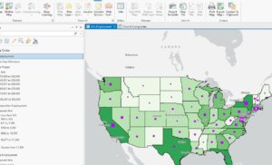
3.1- I followed the instructions, but for some reason, the Arts Employment map would not load in. I am unsure of what caused this error.
3.2- For some reason, the sharing feature was simply not working. The buttons it wanted me to press were fully grayed out, even though I followed all prior instructions. I am unsure if this is my fault, or an error in the program.
3.3- This tutorial just fully does not exist in my files, and I am unsure as to why.
3.4- I was able to successfully log into ArcGis online, but the sharing feature is still not working for me. Am unsure as to why, but I was unable to complete this tutorial.
Overall, this chapter was full of errors and I was unable to complete most of it.

Bryan Week 3

Chapter 4

  • Mapping the density of features helps you see the patterns of where certain things are concentrated
  • Density shows you where the highest concentration of features is in your map. Good for looking at patterns rather than individual features.
    • This is useful for analyzing things such as census population or number of burglaries within an area.
  • Can be used both for features (locations) and feature values (eg. Number of employees at a business).
    • This makes density maps more versatile and able to be used by a much wider audience for a more varied amount of analysis needs.
  • You can use either dot mapping or cell layers to form a density map.
    • Density surface (cells) shows more information, but requires more effort to make.
  • Density surface can be used for individual locations or linear features (roads, rivers, etc.)
  • You should map by defined area if you already have the data you need summarized, or if you want to compare areas with defined borders. A density surface map is needed if you want to see the concentration of points or line features.
  • There are also two different ways to display density maps; you can choose to use either gradual colors or a contoured map.
  • Contour maps are good for showing the rate of change across a surface of the map, with closer lines indicating a faster rate of change.
  • Gradual color maps are more cell-like with layers of color to display the data. For example, you can use a light color over a dark background to shower higher density, or vice versa. 


Chapter 5

  • People map a specific area to monitor what’s going on inside of it, which can be used to compare what’s going on inside several different areas
    • This helps them know whether or not they might need to take action regarding the problem they are trying to monitor / analyze.
    • This can be used for policy changes, deciding specific penalties, etc.
  • For your data, you need to consider how many areas you have, and what types of features are within the area.
  • With GIS, you can find what’s within just one area, or several.
  • Discrete features are unique, identifiable features that can be listed, counted, or summarized. They can be things like student addresses, crimes, or linear features such as rivers and pipelines.
  • Continuous features are seamless geographic phenomena, such as the soil types within an area, or the number of inches of rain per year. 
  • Continuous values are numeric values that vary continuously across a surface, such as temperature or elevation. 
  • The GIS can help you see whether or not an individual feature is inside of an area. 
  • There are three ways to find what’s inside the map
    • Drawing areas and features for a visual approach. This is done by collecting the data set containing the boundary areas, and a dataset containing the features.
    • Select the features inside of an area to get a list or summary of the features within an area.
    • The GIS combines multiple layers of maps to overlay the areas and features. This is useful for finding which features are in each of several areas or finding out how much of something is in one or more areas.


Chapter 6

  • Mapping what is nearby allows you to see what is within a set distance or travel range of a specific feature. This helps with monitoring events within an area, or finding the features affected by a particular activity.
  • Traveling range is measured using distance, time, or cost. Finding out what is within the traveling range of a feature allows you to define the area defined by a facility.
  • To find what’s nearby, you can measure straight-line distance, measure distance or cost over a network, or measure cost over a surface
  • Distance does not always equal nearness. You can also measure using cost, of which time, effort, and money are the most common. 
  • You have the option of calculating based on the assumption that the earth is a flat surface (planar method), or you can account for the curvature of the earth (geodesic method).
    • The planar method is useful if the area of interest is relatively small, such as a city, county, or state.
    • Geodesic method is good for when your area of interest is much larger, encompassing an area such as a region, continent, or the entire earth.
  • Using a straight-line distance to find what is nearby is useful for when you are trying to create a boundary or selecting features within an area. This method involves specifying the source feature, and then having the GIS find the area or surrounding features within the distance. 
  • You can also use the GIS to find  which segments of the network are within the distance or cost of the source locations.
  • This can also be done using the associated travel costs.
    • Use straight-line distance if you’re defining an area of influence or want a quick estimate of travel range.
    •  Use cost or distance over a network if you’re measuring travel over a fixed infrastructure to or from a source.
    •  Use cost over a surface if you’re measuring overland travel.

Bryan Week 2

Chapter 1
This chapter was extremely helpful in offering a step-by-step breakdown of the process I would need to go to in order to properly perform an analysis. Map-based analysis can be really daunting, so having it broken down into smaller, easy to follow steps is definitely a benefit of this chapter. Frame the question, understand the data, choose a method, process the data, and look at the results- these all help to break a large task into something easily digestible. The textbook also does a good job at explaining the phenomena we would be working with. Continuous phenomena will be found everywhere, with no gaps across the area of the map. This can be helpful for measuring elements such as rainfall or temperature. Summarizing data can represent the density of features within a boundary, which can be useful for analyzing things such as number of businesses or amount of streams within a set area. Another thing I hadn’t known before was the different ways data can be represented. There are two main ways to represent geographic features; vector and raster. The vector model takes feature shapes and defines them by their x and y locations within the location. Basically, the GIS places dots and connects them to draw lines and outlines. These spots can also be represented as points with geographic coordinates. The raster model, however, is made up of groups of cells in a continuous space. Each layer of cells usually represents one attribute, and more layers are combined in order to analyze the map. While raster maps are personally more easy for me to see and understand, it seems that they also lose some of the detail that vector maps can display. They definitely seem to have their own unique benefits, though I imagine I will need to use them myself before I am fully able to understand them.

Chapter 2
This next chapter explains the practice of choosing what to map and how to present it. It explains that mapping features of an area can be extremely useful for recognizing patterns within an area. I can see this being helpful in measuring things such as animal population, or potentially the amount of deforestation in a specific area. It’s also helpful to know that analyzing with GIS does not necessarily need to be complicated. Sometimes, all we need to know are two different variables in order to sufficiently identify a pattern or problem. The chapter also explains the importance of understanding your audience in order to make the most helpful map. For example, if the audience is unfamiliar with the area, it can be helpful to include data such as geographic features, as well as city-specific zoning (industrial, commercial, etc.). Creating a map is definitely a daunting process, as you sometimes have to manually input the location of each feature via coordinates or address. Adding value codes also seems confusing, although that could simply be a result of having not practiced it yet. Either way, it was certainly very interesting to learn what the GIS does with the data I input and how it can be such a beneficial tool for identifying patterns and analyzing them. It’s also very helpful for looking at specific subsets, such as if I want to identify the population of a specific animal from within a larger group. There is also definitely a dilemma in choosing to feature a smaller or larger map. Larger maps can show more categories and details, but they can also be overwhelming to unfamiliar audiences. Smaller maps have the opposite problem, with important information being potentially left out in order to compartmentalize categories.

Chapter 3
This chapter, while a bit repetitive, goes into more depth about quantities (being counts, amounts, ratios, and ranks. It also begins by explaining the “most and least”, which is when you map features based on the quantities associated with them, then use that to either find places that meet certain criteria to take action in, or to see the relationship between those places. The book once again describes continuous phenomena and summarizing data, this time featuring many example graphs in order to better showcase exactly what they are talking about. I find these graphs very helpful, although it can be difficult to understand some of them due to the amount of information they are detailing. My personal favorite graph is the one ranking rivers based on the quality of their fish habitats. While some of the lines can be too similar to know exactly which rank they are, it is a relatively simple and easy to understand map. This, along with the several other maps are excellent for showing the range of both use and complexity that GIS can be used for.
While I am not personally the best with numbers, this chapter does a good job at breaking down what each quantity type means, and how they might be used. They also feature a few maps for each type, which makes it easier to understand what they are talking about. The book also does mention that there is often a trade off between showing accurate amounts and generalizing the values in order to see patterns on the map. One way to get around this is by mapping individual values. However, this takes a lot more work since the values are no longer grouped together. It is, however, possibly the best way to do it if you are unfamiliar with the data or area being mapped, or want to see the raw data. This map can then help you figure out how to group the values.

Bryan Week 1

  • Hello! My name is Jade Bryan and I am a freshman hoping to double major in Environmental Science and Anthropology. I am from Waco, Texas, but I have lived in Ohio for the past two years. I have experience in wildlife rehabilitation, but I am interested in learning more about botany and ecology. As for personal hobbies, I spend a lot of time on arts and crafts, as well as playing video games such as Minecraft, Hollowknight, Skyrim, etc. I hope to be able to learn and improve a lot over the course of this class! Also, the ‘r’ key on my laptop is broken, so I have to manually paste each one. Please forgive me if I miss any!


  • As someone unfamiliar with GIS, this chapter helped me understand a lot of the basic concepts of the software, as well as the history behind its creation and eventual widespread use. At first, I had thought GIS to just be fancy mapmaking, but now I am aware that its main purpose lies in analysis, which is more than any standard map can bring by itself. In addition, one of its main selling points is its versatility, as it can be used for anything from tracking animal populations to helping businesses understand their main demographics. However, because of this intense versatility, GIS has historically lacked much identity of its own. It is not just a specific software, but a specific approach; an approach that can be used by a variety of people in a variety of ways. Because of this, it has been hard to define over the past several decades. Even at its conception, it was marketed as a simple map making software, which is wholly undermining its value. This caused most of the mapmakers at the time to stray away from computerized GIS, and it has now only recently become fully appreciated. Personally, I found the figure of the cholera outbreaks to be very interesting. Because of our modern medical knowledge, it can be easy to forget that sewage wasn’t always known to be a key factor in many sicknesses. It’s extremely interesting to know that GIS was what helped people understand the correlation between pump location and disease outbreaks. Because of this, it’s very easy to see how this system could be absolutely game changing for the analysis of different fields. Personally, I would be very interested in using GIS in urban planning in order to introduce more fauna into the layout of cities and towns. I believe Delaware has actually done something similar, though I am unsure of the details of their use.
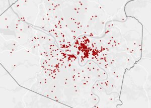
 

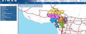
  • Speaking of urban planning, the city of Los Angeles has a public GIS map called the “Zone Information and Map Access System” (ZIMAS) in order to show city-zoning and land use information. This helps them with analysis and projections for a plethora of things, including housing and employment rate.
    https://planning.lacity.gov/blog/why-gis-technology-important-urban-planning


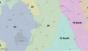
  • As someone from Texas, I know how important white-tailed deer are to my native state. Because of this, I thought it would be interesting to see if there have been any GIS maps created for the purpose of tracking them. There has been! While much simpler, this map at https://tpwd.texas.gov/arcgis/rest/services/Wildlife/TPWD_WL_WTDMU/MapServer shows the breakdown of different ecological zones based on soil, vegetation, land use, and deer population. While a much simpler map, it provides an interesting perspective on the diversity of Texas. Here is the map surrounding my home town of Waco, Texas.