Inderhees- Week 3

Chapter 4 – Mapping Density
This chapter focuses on map density which is useful when it comes to figuring out the location or concentration of an individual feature to figure out where lost reside. This can turn data into a visualization on a map.

  • Why map density?
    • It makes it easier to compare different areas due to the way it is shown on the map. They are especially useful when it comes to data of a large area.
  • Deciding what to map
    • To map density an area is shaded based on density value or a density surface is created. What is being mapped out helps to decide which to use.  You can either map features which might be locations  or feature values which could be a number of features. 
  • Two ways of mapping density
    • Defined area- mapped graphically using a dot map. A dot map is used to represent the density of individual locations summarized by defined areas. This also makes the map easier to read.
    • Density surface- Typically in the GIS as a raster layer. Each cell in the layer would get a density value. This provides the most information but also is a lot of work to create/ read.
  • Mapping density for defined areas
    • To calculate density, you first add a new field to the feature data table. Then, you calculate the density value for each polygon by dividing the value you’re mapping by the polygon’s area. If the units for the area and density don’t match, you’ll need to include a conversion factor in your calculation. This will typically be shown as a shaded map.
    • With a dot density, you decide how many of a particular feature each dot will represent. The GIS then calculates the number of dots to draw within each area by dividing the total count in that area by the value of a single dot.
  • Creating a density surface
    • GIS defines a neighborhood around each cell. The total is then divided by the area around the cell then that value is given to the cell. The smaller the cell size the smoother the surface will be. The larger the radius the more generalized the patterns will be. There are 2 calculation methods. The results depend on how the map was created.

Chapter 5 – Finding What’s Inside

This chapter focuses on spatial selection and overlay analysis. This is a fundamental task in GIS that allows you to identify parts of features that fall within a boundary.

  • Why Map What’s Inside?
    • This type of analysis is used to determine which features, such as points or lines, are located within another feature. It can also be used to find which portions of a feature are contained within another. Allowing to combine data from different layers to answer a specific question.
  • Defining Your Analysis
    • Before starting what is trying to be achieved needs to be determined. Are you simply trying to count the number of features inside an area or do you need to create a new layer that combines data from both the inside features and the boundary area?
  • Three Ways of Finding What’s Inside
    • Drawing Areas and Features: Sometimes the simplest way to find what’s inside is to draw a new area or feature on a map and then visually see what falls in it. While not precise a great starting point.
    • Selecting Features Inside an Area: A more precise method that uses select features based on their location relative to another layer. Quick way to get a count without changing the underlying data.
    • Overlaying Areas and Features: Advanced technique that combines the geometry and attributes of two or more layers to create a new one. The new layer contains the combined information and more complex analysis. 

Chapter 6 – Finding What’s Nearby

This chapter focuses on proximity analysis, a set of tools that help you figure out the distance or travel cost from a feature.

  • Why Map What’s Nearby?
    • Determining what is nearby is not always as simple as measuring a straight line. Due to proximity analysis nearby can be defined a few different ways. Helps to account for barriers like mountains or rivers where with a simple straight-line measurement would be ignored.
  • Defining Your Analysis
    • What is trying to be achieved needs to be determined first whether that be the closest feature, trying to avoid something etc.The answers to these questions will determine which proximity tool is used.
  • Three Ways of Finding What’s Nearby
    • Using Straight-Line Distance: Most straightforward method. Measures the shortest distance between two points. A common tool for this is creating a buffer.
    • Measuring Distance or Cost Over a Network: This method calculates travel distance or time along a network. This is more accurate for real-world scenarios where travel is limited to specific paths.
    • Calculating Cost Over a Geographic Surface: Complex method that calculates distance or cost based on a raster layer where each cell has a value representing the cost of moving across it.

Inderhees- Week 2

Chapter One:
This chapter was an introduction into GIS. The groundwork for GIS was provided by defining it as a process for examining spatial patterns and relationships of geographical features. GIS analysis starts with a question just like in a research hypothesis. From that question data is collected, modeled, and then presented. The process of GIS can be simply put as framing the question, understanding the data, choosing a method, processing the data, and then looking and interpreting the results. Three main types of geographical features are mentioned. These are discrete features which can be defined as a distinct point where the feature is either present or not like a stream or land value. The second is a continuous phenomena which can be measured anywhere and encompass an entire area such as temperature or rainfall. Lastly features summarized by area which is the amount of something in a specific area such as people per house in a county. All of these features can be shown with a vector model or raster model. Geographical attributes is another major concept which adds meaning to features such as categories- qualitative types, ranks- ordering, counts and amounts- numeric totals, and ratios- numerical relationships. The utility of tables in GIS for selecting, calculating, and summarizing information is a key component of analysis.
What I noticed is how GIS blends different data together to create one source of information. It is also about more than looking at maps but also finding the answers to spatial questions. Accuracy and perception have a huge role on one another. The way it is presented can change perception of the data.
Is there a way to minimize distortions for large areas or do we simply just choose where it has the least effect?


Chapter Two:
This chapter focuses on the practical side of GIS mapping. It explains that the maps help to reveal geographical patterns not just showing the locations. It helps to explain or show why features are there. Each map has multiple layers with different features assigned and symbols for their features. Mapping can be done in a few different ways. These are showing all the features as a single type- having the same symbol for each feature, displaying categories- different symbols/ colors per type, or mapping subsets- features filtered to highlight a theme. It is also warned against overloading a map as we as humans can only really work with seven categories at once. This is due to it getting too hard to tell different categories apart. Due to this, grouping categories together can be helpful and sometimes necessary. Scale and audience are also important. Those who are map experts can distinguish more details than the average person as they have a more trained eye for the smaller details. Geographic coordinates- addresses, latitude, and longitude are a requirement that one must be very careful with. This ensures that placement is accurate.
The crossover between science and communication are shown throughout this chapter. The choice of colors, symbols, and reference features are very important for the design of a GIS analysis and also correlates with psychology and design.
When it comes to grouping categories what guidelines should one be thinking of to avoid oversimplification or messing with the data.


Chapter Three:
This chapter focuses on comparing places based on quantities and where things do and don’t occur. This requires using quantities, can be in a few different forms, ratios, counts, amounts, etc. This chapter has classification schemes to group data values into classes, natural breaks (jenks)- groupings and patterns inherent in your data, so values within a class are likely to be similar and values between classes different, quantile-an equal number of features in it, equal interval-equal range of values, the difference between the high and low value is the same for each class, and standard deviation-distance from the mean value of all the features. Graduated symbols-symbols of different size to represent a variation can be used for mapping as well as graduated colors- colors that get darker or lighter depending on the data in that area, charts, contours- lines around to show variation, and 3D perspective views- looking at something from the side to help show the elevation. These all help to show the continuous phenomena. Ratios are important to normalize data values and allow for fairer comparisons across an area. There is a balance between precision and readability where too many classes or decimals can obscure the meaning while too few can hide something.
This chapter helped me to realize how much power analysts hold when interpreting something. The same data sets can produce different results depending on how it is interpreted. There is a strong link to map-making and statistical choices. Outliers can also affect the data and how they are taken within a data set.
Should consistency be prioritized by analysts while using classification schemes or flexibility?

Inderhees- Week One

Hello, my name is Jocelyn Inderhees and I am a sophomore. I am majoring in zoology, pre-med, and environmental science with a minor in chemistry.

Through reading chapter one of the textbook, I realized the influence and how big GIS is compared to what I originally thought. Prior to this text I believed that GIS was more of a type of mapping software and now I am aware of the fact that it is more of a flexible spatial awareness software. GIS has many uses and that change depending on how it is used. The software can be used to help a business such as Starbucks to decide where to build the new locations for the best profit and what helps the business prosper based on location. It can also be used to help a city to figure out zoning ordnances or data for properties and many other uses. What took me by surprise the most was that GIS is not one fixed identity but many. It is more than a software it is a form of analysis and a science. GIS is very versatile for its uses. The history of GIS dates back to the 1960s. I found the story with the tracing paper and the highways to be very intriguing. How he used it to find the best route by layering the data and information to better make the decisions long before the technology of today came along. Eventually it was converted to be able to be done on computers like how we do so today which gave many more the ability to do spatial analysis and the advanced forms of GIS. Another thing that stood out was the difference between mapping and spatial analysis. Mapping is showing data in a visual way while spatial analysis or GIS goes deeper into analyzing the data and discovering the relationships. This shows why GIS is so useful in many different fields such as agriculture to developing a city and more. This chapter helped me to better understand GIS and that is far more than just a simple piece of software. 

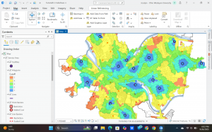
I find agriculture very interesting therefore I decided to research the distribution of cattle across the US. The map below shows there the cattle population is higher and lower. As shown the east coast and northern Midwest states have the lowest percentage while Great Plains regions have the highest concentration of population along with there being a decent amount in parts Texas, Oklahoma, and Missouri. You can tell where the agricultural parts of the country are, and the cattle populations reflect that. Overtime this map will change as more land becomes developed and less families have farms as the bigger companies are buying up the land and taking control of the agricultural businesses. The eastern states will overtime also lose more of their cattle while the Greater plains states will gain a higher percentage. The cattle production is clustered into certain parts. This helps with knowing what Agricultural policies to implement in different areas to help the cattle thrive and protect those in certain areas. Managing resources is also easier with this information. 

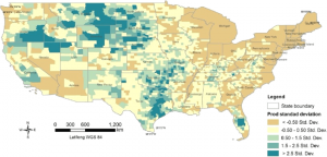
Fig 1. shows the population of beef cattle density across the US. 

Work Cited:

USDA’s Census of Agriculture, accessible via Ag Census Web Maps and downloadable county-level Excel files (NASS).

County-level figures for livestock inventory are updated every five years via the Census, with inter-census updates through “raking” to match state-level totals from agricultural surveys (NASS).

In 2022, total U.S. cattle inventory stood at ~88 million head (a 6.1% drop from 2017), with top beef cow inventory counties found in Nebraska, Nevada, and South Dakota; top cattle-on-feed counties in Texas, Kansas, California, and Nebraska (USDA NASS)