Week 8 Fry Final

Making New Shape Files from Existing Shapefiles


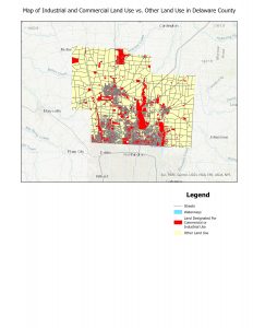
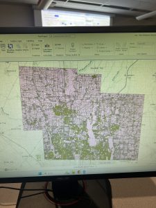
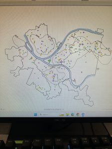
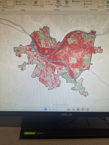
The first application I chose to execute on this final was to find two related datasets within the pre existing dataset, and export them into a separate map. To do this, I first put the hydrology, Street Centerlines, and the parcel data set shapefiles for Delaware County into my new project in ArcGIS Pro. Then, I decided that I wanted to isolate the land used for commercial and industrial purposes because this land is privatized and non-residential, which means they are very similar land uses that can be combined in a map to better understand the land use of the county. I thought this map could be useful for residents and experts when looking at the zoning of the county and where the commercial and industrial lands are located.
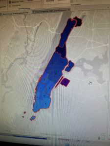
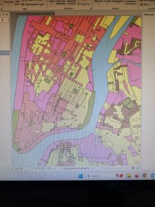
In order to create this map I had to create a separate shapefile for this layer of the combined industrial and commercial land in the county. To accomplish this, I had to first open the attribute table of the parcel layer. Then, I chose select by attributes, and chose the data points–polygons–that had a class number beginning with 3 (for industrial uses) or 4 (for commercial uses). After that, I had to right click the layer in the contents pane and choose data, then export selected data. This created an export shapefile that I was able to put into a map over top of the other parcel layer and added the hydrology and street centerlines layers to provide the context for the rest of this map. Specifically the streetlines are helpful for this because you can see what the transportation around all of the properties zoned for industrial and commercial use is like, and how the land use compares to the density of the streets.
I then created a new layout, put in this map, and zoomed to the most recent active map view. I manipulated the symbology of the layers to be most readable and to have good contrast. Next, I continued to spruce up the presentation of the map by changing the layer names to more presentable versions of their meanings, and adding a legend of the symbology I used on each layer. Finally, I added my title and exported the layout as a jpeg.

Mapping Change


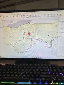
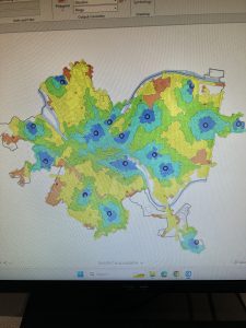
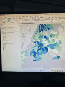
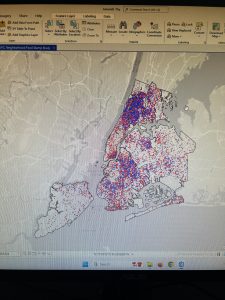
The second application I chose for the knowledge of ArcGIS Pro I gained during this course was mapping the change of subdivisions in Delaware County since the beginning of its settlement in the 1800s. First I imported the shapefiles for the street centerlines, hydrology, and subdivisions data sets. Then I changed the symbology of the subdivisions layer to graduated colors. I had to organize it by the field: REC_DATE, which was the date of the construction of those subdivisions in the form YYYYMMDD. I set the upper bound of each section to the first day of the year for the corresponding year, and noticed that no subdivisions were from before 1800. Then I changed the colors of the symbology to be easily distinguishable. Next, I removed all the outlines of these polygons to allow for easy viewability from the larger frame of the map. Finally, I created a layout and took all the same steps as with the first map to make the layout presentable and understandable for the reader.

Week 7 Fry (Beginning the final)

Address Point: All the valid addresses in Delaware County. It is updated frequently and published every month.

Annexation: All the annexations and their boundaries in the county. This is updated and published every month.

Condo: All of the condos in the county. This is recorded and updated by the county recorder’s office.

Dedicated ROW: This is all the designated road right-of-way lines. It is updated daily and published every month.

Farm Lot: This is the farmlots in both the US Military and Virginia Military Survey Districts within Delaware County. It is updated every month.

GPS: Identifies all the GPS monuments established in 1991 and 1997. This is updated on an as-needed basis, the last time was 2021.

Hydrology: This is all major waterways in Delaware County. Updated as needed and published monthly.

MSAG: The boundaries of all the 28 political jurisdictions that are within Delaware County. It is updated as needed and published monthly.

Map Sheet: Consists of all map sheets within Delaware County. Last updated 2/28/2025.

Municipality: Consists of all the municipalities within the county. Last updated 2/28/2025.

Original Townships: This is the boundaries of the original townships within Delaware County before they were changed based on tax districts. Last updated 4/17/2020

PLSS: Public land survey system polygons in both the US military and Virginia Military Survey Districts within Delaware County. Updated Monthly.

Parcel: Consists of polygons that represent all the cadastral parcel lines in the county. Updated Monthly.

Precinct: Consists of the voting precincts within the county. Last updated 5/3/2023.

Recorded Document: Plots recorded documents from the Delaware County Recorder’s Plat Books, Cabinet/Slides, and Instruments Records, including vacations, surveys, and annexations. Updates published monthly.

School District: Consists of all the school district lines within the county. Updated monthly.

Street Centerline: The State of Ohio Location Based Response System Street Centerlines of private and public roadways. Updated daily and published monthly.

Subdivision: Consists of all subdivisions and condos in the county. Published monthly by the county recorder’s office.

Survey: Survey points is a shapefile of a point coverage representing surveys of land within the county. Last updated 2/28/25.

Week 6 Fry (Catch up)

Chapter 7: In the first tutorial I was able to manipulate the polygons within a campus map, using the editing features. This was helpful because I had not yet used the editing frames, and I had to make sure to be saving each edit after I made it. Tutorial 2, went more in depth with the features used to create and manipulate polygons within maps. I was able to create my own polygons and get a better understanding of the types of polygons that are useful in this kind of mapping. Tutorial 3 taught me how to smooth layers, it was helpful because I was able to still see the underlying mapped features but have a translucent marker over top to designate the boundaries of the noted features. I hit a snag with the fourth tutorial because gis for some ridiculous reason would not allow me to select the polygon layer which therefore meant I could not finish the tutorial because I could not manipulate the layer in any way but it was interesting to learn about how to import this layer of polygons into an existing map, and I hope in the future GIS will work properly so I can get the polygon to layer over map properly.

Chapter 8: The first tutorial helped me plot a large data set on the map, then I was able to make sure every data point was properly matched. This is helpful because in most cases when a vast data set is being placed in a mapping system there is bound to be mistakes or mix ups but learning how to find and correct those within GIS is important to making sure I know how to properly create and use the mapping I am learning. I was also able to use the collect events feature to quickly create a map that visually shows the frequency of events relative to location on the map. This was significantly faster than other methods the tutorials have used in the past to create maps like this. I continued this work in Tutorial 2, where I was able to again use the attribute table to determine the incomplete data in the set. I was also able to use street addresses for attendees and put them on a map which clearly has a cluster in the center, which is useful to know for the organizers of this hypothetical event, and is how these skills can be applied to the real world.

Chapter 9: From the first tutorial I learned how to create buffers and have the mapping system count other mapped features within those buffers. I was able to count how many kids were living within certain distances from a pool, and this could be repeated in many applications, it would be useful to many types of research that might actually be done. The second tutorial expanded on this by teaching me how to obtain more statistics from within these buffer areas which is helpful for more complete data analysis. The third tutorial helped me determine which pools were open, and made a map based on the proximity of the commute to an open pool. It also helped me use the data from this map to count the number of pool tag holders in these regions. This is more data analysis that is helpful for real world applications, not just with pools but with any resource, and can even be applied to animal populations. Tutorial 4 taught me how to use the data and demand tools to determine which pools maximize attendance, this is also an interesting concept to use for real world applications. Tutorial 5 taught me how to create clusters of data points, differentiate their statistics, and create separate labels and map symbols for those groups.

Chapter 10: Tutorial 1 was informative, it taught me how to use, manipulate, and extract the raster data from the mapping system. This helped me to visualize data sets and to integrate two different raster layers by changing the transparency of a layer. This will be helpful in the future when trying to create a multifaceted map that can display more than one type of data/information at the same time. In tutorial 2, I used some of the same skills as well as many I learned previously in order to create a density/heat map which was very interesting. Previously each of the skills that was used here had been used in a different capacity but bringing them all together to create this map really helped me to see the usefulness of some of the skills I have learned in earlier chapters of this course. Tutorial 3 was an even more immersive use of these skills bringing together what was learned in tutorial 2 with more of my past skills and it really made me feel good to make this map almost completely on my own.

Chapter 11: Tutorial 1 really helped me to get oriented in the 3D global view of the mapping interface, with a brief overview of shortcuts and how to manipulate the view point and manipulate the base layers. Tutorial 2 helped me learn to create a TIN layer and my own local view of the 3D map of Pittsburgh, which made the use of a 3D map make a little bit more sense. Tutorial 3 taught me how to add and enable and turn off z-enabled features to my 3D map which was interesting, and I know it will eventually come in handy for something other than trees in a park. Tutorial 4 got more in depth into the practical uses and functions of the 3D mapping interface. It brought in the Raster skills learned last chapter and used them in a 3D map this time. I learned how to manipulate a lot of the different features of the 3D map and use various different types of data to get different views. Both the fifth and sixth tutorials centered around using the 3D interface to add three dimensional shapes (buildings) onto the map in progressive detail. And finally, in tutorial 7 it culminated into a 3D animation which I think will be less useful to me in the future as it would be to someone in more of a city planning or architectural career path.

Week 5 Fry

Chapter 3: I began by finishing the remaining tutorials for this section learning how to integrate with aspects of the online GIS system which was very interesting. I unfortunately could not get my maps to share with the online program, so to accomplish these tutorials I had to use maps already shared by classmates. However, I was able to accomplish and create all the other features on my own within the web system.

Chapter 4: The first two tutorials were interesting because I had to start from scratch and open a project with the regularly set base layers and build from there using database information in the esri folders. It was really helpful to learn how to do this, and I felt like I got much closer to actually being able to create a whole map from scratch on my own, which is obviously one of my goals in taking this course. While doing the third tutorial I was able to save and import the definition query but it would not appear in the mapping system again. I could not find what error was occurring so I moved on to the other queries in the chapter, which will definitely prove helpful in the future when working with large datasets and trying to understand different variables. Tutorial four was quick, it reminded me of how to create a map using simple data and graduated colors, it was pretty basic but at the very least made me feel accomplished. The next tutorial was pretty similar, I just had to add graduated symbols to the map which was a refresher but I was able to accomplish this with no issues. Finally, in tutorial 6 I was able to join the crime type data and manipulate the symbols to make data visualization easier.


Chapter 5: The first tutorial taught me how to change the type of distortion that is used in a 2D map of the world in GIS to be useful for different regions and have different rates of distortion. The second tutorial was the same but exclusively for the United States. Tutorial 3 was useful to learn more about how to use the coordinate systems within the maps and changing and manipulating the the coordinate system of a map. For the fourth tutorial, I was not able to locate the data file within the chapter 5 folder, it was not a part of my initial esripress download which is stored on my external hard drive. So I moved on to the fifth tutorial, which I spent a ridiculous amount of time extracting data from the US Census Bureau, but eventually found the proper way to integrate it all into the map. Finally, I moved on to the 6th tutorial, which involved adding even more data on things like bike stations into this map.


Chapter 6: I began with creating the map of New York City fire battalions which taught me how to dissolve and merge boundaries within the data of the map. I found this very interesting and I was able to execute all the actions without too much issue. Next, I used the instructions in tutorial 2 to clip the streets in the Upper West Side which was relatively simple. Then, tutorial 3 had me merge all the water features in the area of Manhattan. Tutorial 4 taught me how to merge two datasets into one with the police and fire stations of New York. Tutorial 5 was useful to find intersecting features which in this example were the streets of Manhattan and their fire companies. Tutorial 6 was all about calculating and comparing geometric attributes of the mapping data which in this case was the landuse of Brooklyn. Finally, tutorial 7 was useful to learn more ways to analyze counts of data within regions in this case the amount of people with disabilities within a fire companies jurisdiction. Overall this chapter was the smoothest one I’ve completed so far, and I actually remembered to take some pictures while I was doing it.

Fry Week 4


Chapter 1: I began by successfully signing into my account on ArcGIS in SCSC 207. Then, after downloading the necessary files, I was still unable to access the proper data in the program, so I began running an update to the ArcGIS software on the desktop. This took a significant amount of time so I then attempted to switch computers. I was in the lab for over an hour and could not manage to get the map to open properly or display any of the data. Eventually, I was able to get it to show up but, I am honestly unsure what we did that got the program to actually display the data. In the first tutorial I learned how the general program works, saving my project, and using a few different tools. The next tutorial taught me how to make a bookmark, zoom, change my layers, and select an attribute. In the third tutorial, I continued to use the attribute tables. I learned how to manipulate the data stored in these tables and change the view available within them. I also learned why manipulating this data may be useful in the context of census data. I did encounter an error message that I did not understand when trying to save my changes to the municipalities attribute table, but I do not think it will significantly impact the rest of the tutorial. I also learned how to find the summarized statistics for data used in my map. In the final module, I learned how to add more feature planes to my layers.

Chapter 2: The first tutorial helped me learn to change the colors of different areas in a map, in this case based on land use. The following tutorial gave me the skills necessary to label these areas and assign pop-ups within them with additional data. The third combined these to help me manipulate the symbols used for different types of assistance organizations and manipulate the map to better find these places in Manhattan. Unfortunately, I was unable to complete most of the fourth tutorial because there was an error with the tutorial data, and the file did not contain the neighborhoods data that was necessary to complete the work. I did read this tutorial so that I now understand more about how to create a 3D map in the program and how to manipulate the view of this map to get the proper visualization of the data. For the fifth tutorial it was really interesting to see how symbols can be used to better visualize and compare data within the map by comparing the food insecurity of the two groups overlaid as differently sized circles in their residential areas. Tutorial 6 was very interesting because I learned how to assign graduated colors to values in the program, and how to duplicate this on another data set and compare the two easily. Tutorial seven was helpful in understanding the dot density plots that were discussed in the reading section from last week because I hadn’t really read too much about or used that type of map before so it was really interesting to get to make one and look at how the data appears. For the 8th tutorial, the notes about labeling and zoom were helpful, however, I could not locate an “out beyond” button in the visibility range group which made it difficult to take all the necessary steps for this tutorial.

Chapter 3: In the first tutorial I am learning to make a layout using maps that were created in the GIS program. Unfortunately, I ran into an issue with the renaming of my layout so it is just called layout, but I will try again next time on the naming issue. Learning how to add the maps to the layout, resize them, and move them around is nice to know how to do when thinking about the practical uses for GIS knowledge and creating figures from data in the future to use in real life. It was also good to have the knowledge of creating a bar graph from the data and turning it into a graphic which will be useful in the future if/when I ever need to use data from GIS in a figure for research purposes. Unfortunately, due to the delays I had with my technically difficulties in getting started this week, this was as far as I was able to make it in the tutorials, I will begin with 3.2 next week and I intend to start earlier to accommodate for the extra workload I am putting on myself next week and to allow for anything else that may go wrong in the future.

Fry Week 3

Chapter 4 centers around the concept of density and mapping it. Mapping density makes it easier to understand which areas are the most concentrated in some type of resource or landmark, for example in the book it references small businesses. Instead of simply plotting each location on a map where they could become overlapped and difficult to understand, you map with darker colors in areas of high density and include a key so that density can be better visualized. Mapping density rather than simply the location of features on a map gives you a measure of their density per area. Density can be mapped using a graph, a dot map, or calculating density for each designated area. Creating a density surface in GIS is usually preferable but it requires the most data input and more individual data on locations rather than data separated by region or county lines. GIS can also take a map density by area map and use the data to construct a dot density map to represent density graphically.
When using GIS to create a density surface there are many factors to consider including cell size, search radius, calculation method, and units of measurement. Another thing to consider when creating a density surface is that data that is summarized by defined areas can be used to make these types of maps but it must be generalized by the centroid of each defined area. This means that the summarized data is assigned to the point at the center of the defined area for which it is summarized. Additionally, for these maps a graduation of colors is assigned to each value so that the density can be visualized. The results of creating these types of maps in GIS are almost entirely dependent on the choices made with the many variables that can be manipulated in the program, meaning the same data can look different in final products where different visualization choices were made.

Chapter 5 discusses the need to map what is inside an area. This is necessary because the bonds for these areas can be “within 1000 feet of a school” or something like that to impose stiffer punishments on crime. This is an example of finding what is inside one area but you can also use mapping to find what is inside several areas such as each district in a city. In either case, you first have to know the boundaries of your area(s). Then, the discrete or continuous nature of the features you are measuring has to be taken into account. You can also use GIS to list features, count them, or get a summary. You also have to consider if the features being measured are completely in the area because discrete features can easily be partially in or out of a defined boundary.
There are three ways to find what is inside the area. First, drawing both the areas and the features, this way you can see the boundaries of your area and what features are inside it. This is specifically good if you only need to know which features are inside and outside of an area. Second, you can specify the area and the layer that contains your features so that GIS selects a subset of the features which is inside the area. This is best for getting a list of the features inside an area. Finally, you can overlay the areas and the features to create a new layer which compares the two layers and summarizes the statistics for each area. Which is best for doing both at the same time, as it is the most flexible.
Using the results of these summaries can be tricky. Some ways it can be used include: the count of a total number of features in an area, the frequency of a number of features with similar values in an area, or to summarize a specific numeric attribute such as the sum of certain features. These similar principles can be applied to much more complicated data, overlaying layers onto each other and creating understandable visualizations of complicated data over a range of areas.

Chapter 6 focuses on mapping what is nearby to a feature. This is important because some features may require notifying anyone living within a set distance. However, “nearby” is a concept that ranges in distance, within GIS you must define the distance which is being considered as nearby. Sometimes it is just straight distance away, or in some cases distance has to be measured using networks of transportation such as roads. Distance and cost can both be used to measure what is nearby, cost can include the amount of time it takes to get somewhere from your location. You also must consider the information you require from your analysis, sometimes it may be a list of everything “nearby”, a count of the total number of restaurants nearby, or a summary statistic for the area.
To determine “nearby” you can use GIS to set an inclusive ring based on straight-line distance, which is best for defining the area of influence around the feature. To do this you have to create a buffer in GIS at a certain distance from the feature you are discussing. Additionally, using this method you can use GIS to find the distance between two features, or to create a spider diagram with your chosen feature at the center. Another option is using distance or cost over a network (such as roadways), which is best used when measuring travel over a fixed infrastructure is necessary. GIS includes a ready-to-use street network which can be used to find whats nearby in terms of distance; however, this is not the only possible network you may want to use so custom networks can be built in the program. GIS will start at your feature and check the distance to the nearest junction in relation to your specified distance, and it will repeat this until a definition of everything “nearby” has been reached. You can also specify more than one center in this type of mapping. Finally, measuring cost (of time or another variable) over a surface is most helpful when you need to measure overland travel and calculate how much area is within your range. This has to be done using a raster layer of continuous distance from your feature.

Fry Week 2

Chapter 1:

The first chapter is very similar to our reading from last week, it’s obviously designed to provide a solid introduction to GIS for beginners–like myself. The chapter breaks down the core concepts of GIS, discussing how spatial data is analyzed and represented visually through maps. The goal is to highlight the uses of GIS in understanding complex geographic patterns and relationships in an easily comprehending way.

One thing I took away is the distinction between the different types of data that can be handled in GIS. These include discrete, summarized by area, and continuous data. Discrete data represents specific features like buildings or roads, while summarized by area data aggregates information, such as population density in a region. Continuous data, like temperature or elevation, is represented as a gradual change over space. The chapter really emphasizes how GIS can handle this wide range of data types, making it a versatile tool for many types of analysis.

Another concept introduced in this chapter that I find to be important is the difference between vector and raster data models. Vector data uses points, lines, and polygons to represent objects that have clear boundaries, like roads or property lines. Conversely, raster data breaks the map into a grid of cells, ideal for representing continuous phenomena like weather patterns or land elevation. The chapter taught me that understanding these models is crucial when choosing how to map and analyze data effectively.

This chapter also includes the importance of map projections, it highlights how distorting the Earth’s curved surface onto a flat map often leads to inaccuracies. Lastly, it covers how GIS combines different data sources to reveal relationships and patterns, such as linking demographic data to geographic features, which enhances the value of maps as tools for various types of analysis. Overall, the chapter sets the stage for deeper exploration into GIS analysis, emphasizing its role in visualizing and interpreting a variety of spatial data.

Chapter 2:

Chapter 2 dives into the practical process of mapping and analyzing geographic patterns, it emphasizes how the choice of data and map design can influence the clarity and effectiveness of the message conveyed through the map. The chapter discusses the importance of selecting the right amount of information based on the map’s purpose and its intended audience. For example, urban planners might need a map that categorizes different road types, while a tourist map of a park should keep information simple for easy navigation. Too much detail can overwhelm the viewer, while too little can obscure key insights.

One of the applications for GIS that I find most fascinating is discussed in this chapter; the use of GIS to map crime rates in a city, helping law enforcement allocate resources more effectively. This highlights how GIS can be applied in unexpected areas like public safety, showing its versatility in various fields. The chapter also introduces the concept of finding the “center” of a cluster of features, using measures like the mean center or median center to identify patterns. Which reminds me of the use of GIS discussed in our reading from last week to find the source of contamination for a Cholera epidemic. However, the chapter also notes that outliers can skew these results, especially when there are fewer data points, emphasizing the need for accurate data input and careful organization.

Another key takeaway from this chapter is the power of layering data in GIS. Combining demographic data with environmental information on a single map gives the opportunity for deeper analysis and insight. This capability shows how the same dataset can be regrouped and analyzed from different perspectives. The chapter also touches on the technical side of mapping, including coding challenges, though it acknowledges that some of the more technical aspects can be difficult for beginners. As a whole, the chapter provides a solid foundation for understanding how GIS can reveal patterns and relationships, while also highlighting the importance of accuracy and data organization.

Chapter 3:

The third chapter takes a deeper dive into how GIS can be used to map and analyze numerical data in order to uncover trends and patterns. This chapter builds on the concepts introduced in the first two chapters, focusing on how the different types of data—discrete, continuous, and summarized—impact the way maps are created and interpreted.

The chapter revisits the distinctions between these data types but goes into more detail. For example, continuous data, like rainfall, is best mapped using gradient colors to show gradual variations across a bigger area. Discrete data, like car accidents, is represented with specific points on the map. Summarized data, such as average income in a neighborhood, creates a broader view by grouping data into bigger categories, making it useful for seeing patterns across areas.

Another major focus of this chapter is on grouping data into classes to make maps easier to understand. This is done through classification methods like equal interval, quantile, or natural breaks. Choosing the right classification method is pretty much crucial, and it can significantly affect how clear and useful the map is. This process is especially important when trying to communicate complex data in a visually simple way, which is a main function of GIS.

The chapter also touches on the design elements of map-making, such as the use of colors, symbols, and even 3D effects to make maps more engaging and informative. However, it stresses the challenge of balancing aesthetics with clarity—maps need to be visually appealing but still easy to interpret.

The chapter concludes with practical tips for designing maps that suit specific analysis purposes. It ties together the concepts of data types, classification, and map design, reinforcing that good map design is essential to effective GIS analysis. One key takeaway is that how you design a map—from selecting data to choosing visual elements—is what makes GIS such a powerful tool for communicating ideas and insights.

Fry Week 1

I’m Izzy Fry! I am a Freshman Environmental Science and Zoology major, and I’m on the field hockey team. I’m from Dublin, OH.

It’s really cool to learn about all the applications of GIS because I didn’t know it had so many uses in various fields. I also did not know that the technology and concepts were developed in the 1960s. It is also interesting to learn that in the early days manual maps were preferred for the process of overlaying information even into more modern times. It was really interesting to get a little bit of a window into the history of cartography while learning about GIS. I had also not thought much about how the availability data and scale of a GIS based project can impact what is actually able to be produced. It was also very interesting to learn about how GIS can be used in terms of public health, specifically in the example of a cholera outbreak and locating the cause. Additionally, agricultural uses for GIS are very interesting because of the possibility of considering so many variables together. I’m excited to learn more about the possibilities of GIS.

I learned that GIS can be used in zoology for a variety of projects including gaging habitat suitability. This particular map is from “Modeling habitat suitability for endemic Grizzled leaf monkey (Presbytis comata) using geospatial machine learning approach” performed in Indonesia in 2022, by a team of researchers. This is very interesting because without GIS technology it would be very difficult to visualize this data especially in a comparative manner.

I also learned GIS can be used for resources that are important to humans including water quality. This map is from “GIS Mapping for Distribution of Ground Water
Quality in Udaipur” also performed in 2022. Which is interesting in terms of global health, public safety, and animal habitats.