Urton week 6

Chapter 9

This chapter went over things like making buffers, service areas, facility location models and clustering. This chapter was pretty easy and self explanatory except I did have some issues towards the end of 9-3 so I just saved what I had and moved on to the next part which I had no problems with.

Chapter 10:

Chapter 10 covered topics like extract and symbolize raster maps, create hillside maps, smooth data, build raster based risk index and models. This chapter took me way longer than I thought it would because it was only 3 parts, but the parts were very long and had lots of steps in them with lots of reading. I enjoyed making the hillside map and creating the models weren’t too bas either just took a long time.

Chapter 11:

The last chapter, finally, involved exploring global scenes, navigating scenes, creating  TIN surfaces, create z enabled features, creating 3D buildings and bridged from lidar, working with 3D figures, using procedural rules and creating an animation. So lots of stuff was covered in this chapter and it was kind of overwhelming at some points but I got through it eventually. Again there were many steps and reading to this part. I liked working with 3D models and the TIN surfaced but in section 11-4  I had so much trouble with actually creating the 3D city and couldn’t even ge tot he bridge part. Everything else was pretty straight forward though and I thought the last part where I had to make an animation was pretty cool.

Urton Week 5

Chapter 4:

Chapter 4 goes more in depth with working with databases which are basically just places where a collection of data is held for a certain topic. The first task in the tutorial was learning how to import data into ArcGis, putting a data table into a file geodatabase and then utilizing the database into the map. Then continuing on with tables the next part covered how to modify attribute tables and joining a data table with an attribute table. After this, it was a lot of in depth tasks of getting useful information from these tables like filtering the range of when certain crimes occur. Coding has come up a lot in this chapter which was very confusing to me since I know nothing about coding but for the most part if I followed the tutorial I was fine. Overall I feel like I’m starting to get the hang of things and this chapter went by pretty fast. 

Chapter 5:

Things started out pretty simple and easy to follow but I feel like as the chapter went on it took me a lot longer to find things and the tutorials have started to get less descriptive. To start out I learned about all of the coordinate systems that ArcGis has, where to view them and put them to use.I found this part pretty easy and the tutorial matched up well with the software and other websites I had to visit to gather more information from.  After this the tutorial goes over working with vector data, using conversion tools to import shapefiles into geodatabase so that they can be used on the map and converting other various file types. The next part got a bit more complicated with working in outside websites for the US census maps and data tables. For some reason section 5-5 took me too long and I had to do a lot of guessing and rereading to figure out how to get the end product and I struggled to join the 2 data tables together in the end to make the choropleth map. 

Chapter 6: 


Chapter 6 was all about geoprocessing which is basically a framework and set tool for processing geographic data. The purpose of this is to build study areas and perform various tasks. Firstly, I started out with dissolving features in Manhattan, New York to create neighborhoods. I didn’t really understand what dissolving really was but with a lot of these new things that I am learning with ArcGis, you kind of have to trust the process. The data from this section was then used to create a useful map in which emergency response teams can easily identify fire divisions and population. Overall though this chapter went by pretty fast and wasn’t too hard to do.


Urton week 4

Chapter 1:

I was pretty intimidated to start using this software because I’m not very good with computers. It took me a while to really get going with and finish this chapter but by the end of it I had a better grasp of what I was doing. This chapter covers the basics of using  Arcgis such as adding and removing a basemap, turning off and on layers, reordering feature classes, and exporting a map.  Section 1-2 goes more into depth into navigating various features. From this part I learned how to use a pop-up window, zooming in, using bookmarks and searching for features. As the tutorials went on somethings got easier but I started having more problems with not being able to follow the instructions to a T and not being able to find what was being asked. Sometimes after looking for a long time I would eventually find it or I would just have to move on like at the end of 1-3. In the second half of chapter one I learned how to work with attribute data which could be tedious but I started to enjoy it. Finally, I learned how to symbolize and label features and then show the map in 3D which was my favorite part of the chapter.

.

Chapter 2:

Chapter 2 had a lot more parts than chapter 1 so even though I had a better grasp on what I was doing it still took me a lot longer than expected. Nevertheless, I learned a lot of interesting and useful things like symbolizing qualitative attributes by using different symbols and labels. A highlight from this was honestly looking at all of the color options and their names in the symbology pane. I enjoyed seeing all of the layers start to come together to make a cohesive map in this section and learning how to manage pop ups to provide more information without mudding up the rest of the map. When it came to creating a coropleth map things became a bit more complicated and I found myself having to reread a lot but I eventually got it down. For the life of me I could not get the 3D map to work in 2-4 which I was very sad about because I like the 3D maps but I had to move on, I will probably go back and do some problem solving, though. As the chapter went on I learned more about having graduated points on graphs and customs scales that fit the population and then lastly making dot density maps with visibility ranges.

Chapter 3:

Chapter 3 was a lot shorter but dealt with a different format that before so it took me some time to learn where the different tools were. The first part went over  building layouts to display maps and charts in one space which I found very useful for future use in inserting maps into presentations and papers. The later section was where I learned how to share maps online and switched to using ArcGis online with different tools. I got lost on a lot of things in the later parts of the chapter but I got most things figured out after a while.  Creating a dashboard in ArcGis was tedious with many steps but the book made it pretty easy to follow even if I had to reread a few times. I think this process what a bit different that what I did before because it was like I was creating the dashboard for someone else and I wasn’t really sure what a dashboard was but I then understood and saw the usefulness in this application for possible future jobs I would go into.

Urton Week 3

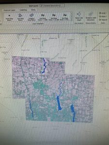
Chapter 4:  Mapping Density

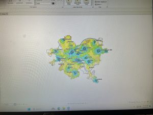
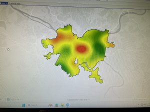
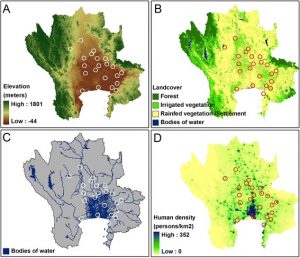
This chapter goes over the types of density maps, what there uses are and how to created them t o effective show you data. Mapping density shows where the highest concentration of a feature is and lets you measure the feature using a uniform areal unit.  They are particularly helpful in highlighting patterns over very large areas. Before actually mapping it is important to think about what features  you’re trying to map, what data you already have  and deciding if you want to map features or values. To map the density of your desired feature, you can either shade defined areas using a density value or create a density surface.  To map a defined area you can use a dot map (to show specific locations) or calculate a density value for each area (divided the total number or value of features by the area and shade each area based on its density. When creating a dot density map it is important to define the about of feature a dot represents and the size of the dots will depend on what patterns you want to highlight. In GIS raster layers are used to create a density surface by defining a neighborhood (based on your specified radius which depends on the map size), totaling the number of features in said neighborhood and dividing it by the area. That value then gets assigned to the cell (the size depends on how defined you want the pattern to be)  and moves on the next. The final result of the map depends and how effective it is greatly depends on all of the variables you decide to utilize as mentioned above.

Chapter 5: Finding Whats Inside

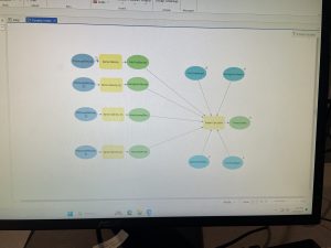
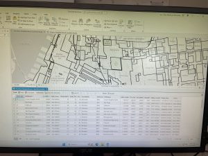
The reason why people even map what is inside areas to monitor whats occurring in said area and compare to other areas so that proper action can be taken in the appropriate place. To actually find what is inside you can draw an area boundary on top of the features, use an area boundary to select features inside then list and or summarize them, or combine both the boundary and features to create a data summary.  Your method will depend on how many areas you have, the type of features are in the areas and the information needed from the analysis. By drawing the areas and the features you can determine which features are inside and out of the area you are looking at. When you just select the features inside the area, you can better list and summarize what features are specifically within the area. lastly, overlaying the areas and features  is a good option for finding what features which features are inside which areas and for summarizing how many or how much by area.  When drawing the desired areas and features it is important to keep in mind what will make it easiest to see the features within the area(s).  When mapping individual locations or linear features you can just use one symbol but if there are multiple then different symbols are needed and are to be defined. If you want to show discrete areas how you decide to do that will depend on if you want to emphasize the features inside or the area itself.  If you are mapping continuous data the areas symbolized by their categories and then draw the boundary on top. Once you have your desires results you can create a chart from the data and compare different areas.

Chapter 6: Finding Whats Near By

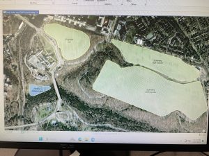
By using GIS you can find out whats happening within a certain distance of a feature and also what is within traveling range. This allows you to monitor the surrounding area and what is in it. Also the traveling range which is measured using distance, time, and cost can help define a certain area served by a facility and it also is helpful in finding areas that are suitable for or capable of supporting a specific use.  To actually find what is near by you can measure in a straight line distance, measure distance or cost over a network or measure cost over a surface. To determine what method works best for what you are trying to you should ask these questions. Is what’s nearby defined by a set distance, or by travel to or from a feature? Are you measuring whats nearby using distance or cost? Are you measuring distance over a flat plane or using the curvature of the earth? Do you need to list, count, or summary? How many cost or distance ranges do you need? In general straight line distance is best used for creating a boundary  or selecting features at a set distance around the source. Using the distance or cost over a network is good for measuring travel over a fixed infrastructure. Lastly, cost over a surface is used for measuring over land travel and calculating how much area in within the travel range. All of the mapping method have practical uses in many things such as a state forester needing to monitor local logging to make sure it doesn’t cross a set buffer, determining the streets that are within a 3 minute drive from a fire station and finding the best route to get from one location to another in the most time efficient way.

Urton week 2

Chapter 1: 

The first thing mentioned in this chapter is that GIS has grown significantly more abundant in the past 2 decades, which doesn’t surprise me at all due to the ever increasing spread of information due to technology advancements and the internet. People have realized that GIS can be used for more than mapping. They can use it to address many worldwide problems and can be used in many different areas. Learning GIS is a very useful skill because you can find out how things are, why there are and where. Many people are learning how this system works because its uses across many fields are ever increasing and that is a big reason why I wanted to take this class even if I wasn’t an environmental science major. One thing I didn’t quite understand that was mentioned under the types of attribute values is ranks. I think it’s interesting how it is used when direct measurements are not easily quantified but it seems very subjective and I wonder how accurate the information could be if they are relative. When the book talks about the process of forming an analysis it reminded me a lot of the steps in the scientific method. Those steps are framing the question, understanding the data, choosing a method, processing the data and looking at the results. Geographical features are a big part in GIS and there are 2 types, discrete and continuous phenomena. A big thing that I took away from the beginning of the chapter was that maps are essentially areas of our globe translated to a flat plane and it made me think about how our world map kind of distorts how we see the countries as far as size and distance. This made me wonder if for larger areas a more 3d approach would be more accurate.


Chapter 2: 

The first question that chapter 2 goes over is, why should we map where things are? Not only does mapping allow us to see where or what a feature is but also by looking at the distribution of multiple features it will help you notice patterns and in turn help you understand the area better. This ultimately is how you will find what areas meet your criteria and where action needs to be taken. When looking for geographic patterns, you first map the features in layers using different symbols in a way that is based on the information you need. The maps that you make are meant to display the appropriate information for the topic being addressed. It’s best to avoid unnecessary information that will just confuse what the actual purpose is and to cater the essential information to your audience. To prepare for actual mapping it is important that each geographical location has a coordinate location unless it is already in the GIS database. Since the information and goal you’re trying to achieve affects how you will make your map, it makes sense that when you have multiple features you make a key to show what each individual one is. I think it is very cool how GIS is able to take the input you give it and output a map and is a major advancement in how we show data. I wonder if how GIS works is kind of like a calculator in that you must put the information in a very specific way to get the information you need, and mistakes are mainly from human error? The type of symbols that will be assigned to features will vary depending on what other information, if you’re looking for patterns and how it will look if printed out. Overall this chapter gave me good insight into what all goes into making a map and what the role of GIS is.


Chapter 3:

The big idea that this chapter goes over is why would somebody map the most and the least of something and what I found was that the big reason is to find relationships and where resources need to be distributed the most. This strategy of adding quantity to the features you map adds an extra level of information that can be very useful. As mentioned in the previous chapter it is important to keep the intended purpose of the final product, whether it’s for exploring data or presenting it in a professional way. Your intentions should affect how the final map looks. Often what happens is you start out exploring and see what patterns pop up and then use that to generalize the map to reveal those patterns. When understanding what quantities are being represented, things like counts, amounts, ratios, and ranks all influence what you’re seeing. Once you understand the quantity that will be used for the map you can use symbols (as mentioned earlier) or something called classes. This looks colored or shaded in shapes with values assigned to the different colors, which makes data more obvious at first glance than if multiple symbols were bunched together. What I find really cool is how GIS can display information in so many ways including 3d. Graduated symbols, graduated colors, charts, contours and 3d perspective are the kinds of ways to display information and there are advantages and disadvantages to all of them. The patterns that can show up in maps can give you so much extra information that isn’t as obvious, such as high and low values, transitional changes, and relationships between features.


Urton Week 1


Hi! My name is Iris Urton. I am currently a freshman and am an Environmental science major with an interest in minoring in botany or zoology. 


Before I decided to take this class I had no idea what GIS even was or what it stood for and even reading the course description I had no idea it has so many uses in our modern world besides environmental purposes. I find it interesting how philosophy plays into this by the way that its use and meaning changes based on the intentions of the user. Spatial analysis is very different from mapping apparently, and in the early days if GIS on was just referred to as the computerized version of the other because the immense application of this tool was not yet fully realized. Many rejected the idea of GIS at first because they didn’t see a benefit in using it if they could do the exact same thing on paper but it could do a lot more than that, it just wasn’t given a chance at first. The roots of GIS are hard to pinpoint because its development came at a time when all sorts of information were starting to be digitized. Not only did geographers start to use it but so did landscapers, surveyors and architects. I didn’t realize how long GIS has really been a thing and I can understand why cartographers were slow to change but I think it’s really incredible how GIS allows you to overlay information to get a clearer picture on the question you’re trying to answer. I wonder if GIS would be what it is today if people hadn’t started to ask questions about the accuracy of the system and how it can be made better. The thought that there could be a gender bias in how the system is used is very interesting to me and that the consequences of it can be bigger than we think. As an outdoorsy person I didn’t think that GIS would be something that really would interest me because I’ve always wanted to do something very hands-on and in the field like conservation but in the modern age I realized after reading this that it is becoming a very important tool and can be combined with many specializations including conservation. 


For my first application of GIS to look into I chose the conservation of endangered species. What I found is that with climate change still an ever prevalent issue in today’s world, our vast biodiversity of life is being threatened. The number of endangered species is rising but GIS has been an incredibly helpful tool in combating this issue. It allows conservationists to monitor and visualize population distribution, both historical and present, and track the efforts of the conservationists. They are also more easily able to gain better insight on where efforts are most needed.

Source: https://geo-jobe.com/mapthis/wildlife-conservation-powered-by-gis/

Another application of GIS I wanted to look into is about fox bats because they are one of my favorite animals and I find them really interesting. Something I learned from researching this topic is that fox bats are carriers of the Nipah virus and the transmission of the virus is due to habitat loss causing them to have to migrate to more populated areas, increasing the risk of human transmission. Pig farms are also a main source of potential contamination and happen to be a big part of Thailand agriculture. To prevent a possible spread of disease GIS is being used to map potential contact between bats, pigs and humans and to track bat colonies’ whereabouts. 

Source:https://pmc.ncbi.nlm.nih.gov/articles/PMC4389713/