Kozak Week 4

Week four was all about introducing the program by physically going through several tutorials on how to operate and understand it. I read the preface, chapter 1, chapter 2, and chapter 3 and did the corresponding tutorials with each section. 

Chapter 1:

Chapter one was the beginning of making/using maps on ArcGIS. This is the first time I have done anything like this so there was definitely a learning curve involved but overall this chapter was easy to follow along and understand. A few things this chapter focused on were base maps and layers, navigating the program/controls, attribute data, and symbolizing maps. I really like the format of this book because as someone who is completely new to this, it doesn’t feel overwhelming and everything is laid out in very simple steps.

Chapter 2:

The goal of chapter two is to learn how to design and symbolize thematic maps. It worked through choosing layers and using spatial context in your map. This chapter was a little more difficult for me as it had more content and started to become more complex but overall it was still easy to follow and laid out well. Things that were learned in this chapter included symbolizing qualitative attributes, labeling features and configuring pop ups, filtering with definition queries, creating choropleth maps for quantitative attributes, displaying data using graduated and proportional point symbols, normalizing population maps with custom scales, creating dot density maps, and setting visibility ranges. In section 2.8 I was having trouble with the visibility range and finding “Out Beyond” as an option where only min and max scale were there. This chapter was helpful in seeing how easy it is to read the maps once you understand what you are looking at/what they are representing.

Chapter 3: 

Chapter three focuses on sharing maps beyond ArcGIS users and with people who don’t have advanced GIS or mapping knowledge. This chapter was heavy on using elements in the ArcGIS online browser and showed how to use many of the available features. Things that were learned in this chapter include how to build layouts and charts, sharing maps online, creating a story in ArcGIS StoryMaps, and creating a dashboard in ArcGIS Dashboards. Overall, I thought this chapter was really helpful in showing how what we are learning can be used in real life.

Kozak Week 3

Chapter 4: Mapping Density

Mapping density helps see patterns of where things are concentrated when mapping areas vary greatly in size. It allows you to measure the number of features using a uniform areal unit (hectares, sq miles). You can map density features( ie locations of businesses) or feature values (# of employees at each business).

Compare methods:

Map density by area: 

  • Use if you have data already summarized by area, or lines or points you can summarize by area
  • Output
    • Shaded fill map or dot density map
  • Trade offs
    • Easy but won’t pinpoint exact centers of density, especially in larger areas
    • May require some attribute processing

Create density surface:

  • Use if you have individual locations, sample points, or lines
  • Output:
    • Shaded density surface or contour map
  • Trade offs
    • Gives a more precise point of view
    • Requires more data processing

Mapping density for defined areas

This section goes through the steps to calculate density for a defined area. It gives example calculations. The GIS can calculate the density for you and shade each area it needs. Then this goes into how to create a dot density map in detail. THe GIS divides the value of the polygon by the amount represented by a dot to find out how many dots to draw in each area. Dot maps are used to get a quick sense of density in a place and represent density graphically. You can compare areas by using GIS to summarize features or feature values for each polygon. 

Creating a density surface:

Density surfaces are created in a GIS as raster layers. They are used to show where point or line features are concentrated. GIS defines a neighborhood around each cell center and then totals the # of features that fall within that neighborhood and then divides that # by the area of the neighborhood. It then creates a running average of features per area which then creates a smooth surface. Parameters such as cell size, search radius, calculation methods and units are used to specify how GIS calculates the density surface. 

Density surfaces can be displayed using graduated colors or contours and are displayed using shades of a single color. Higher values are shown using darker colors. Contour lines connect points of equal density value on the surface, and show the rate of change across the surface. The textbook then goes into detail about how to look at the results depending on how you created the density surface.  


Chapter 5: Finding What’s Inside

This chapter focuses on whether an activity occurs inside an area or summarizes info for each of several areas to compare them. It is important to map what’s inside so you can know where or not action is needed. To define what is inside you have to draw an area boundary on top of the features. Single areas allow you to monitor activity about one place and can include a service area around a central facility, a buffer around a feature, a natural boundary, or a manually drawn area. Multiple areas include contiguous, disjunct, or nested. Features can be discrete ( unique and identifiable) or continuous ( represent seamless geographic phenomena). These were both terms learned in chapter one. By now the chapters are starting to connect and make more sense. There is some information needed to form your analysis which can include a list, count, summary, or sum of the data. This chapter outlines three ways to find out what is inside and lists the best way to choose each method:

  1. Drawing areas and features
    1. See which features are inside or outside of the area
  2. Selecting the features inside the area
    1. You specify the area the the layer with the features and then GIS will select a  subset of the features inside the area
  3. Overlaying the areas and features
    1. GIS combines area and features to create a new layer with attributes from both and then compares them

The chapter then outlines the best way to make the map for each of the three methods. The last part of this chapter discusses using your results to display and analyze what you have looked at using tables that list the areal extent of each category in that area of study. When using a raster, GIS takes care of the table for you but if you are using vectors, you have to summarize the category values for each area. This section discusses the methods to help do that. It then talks about looking at single vs multiple areas and single vs multiple categories. 


Chapter 6: Finding What’s Nearby

This chapter focused on seeing stuff within a set distance of a feature in order to monitor events or activity. It is important to map what is nearby to figure out what is happening with a certain distance that you measured. This chapter then goes into detail on defining your analysis which means figuring out what is nearby by measuring a starting line distance, measuring distance or cost over a network, or measuring a cost over a surface. Similar to chapter 5, when you identify the nearby features, you must then determine what info you need including a list, count, or summary . This chapter then highlights the three ways you can find out what is nearby and they include:

  1. Straight line distance
    1. Used to define an area of influence around a feature and creating a boundary or selecting features within the distance
  2. Distance or cost over a network
    1. Used for measuring travel over a fixed infrastructure
  3. Cost over a surface
    1. Used for measuring overland travel and calculating how much area is within the travel range

The chapter then discusses choosing the correct method for what you are trying to achieve, how to make a map. It discusses creating a buffer using the straight line distance method where GIS will draw a line around a feature at the distance you tell it to and see what information is within it. GIS can use boundaries either manually which is more flexible, or having the GIS do it which can draw either a compact or general boundary. It talks about what a cost is (can be time, money, or other measured source) which is calculated by specifying the layer containing the source features and a second layer that has the cost value of each cell. For each method it discusses the processes of making a map and the features that are important to the process. Chapter 6 felt like it tied a lot of the concepts we learned in earlier chapters together.

Kozak Week 2

Chapter 1: 

In a broad sense, GIS lets you see patterns and relationships in your geographic data. This chapter helps to teach about the process for Performing a GIS Analysis. The first step is to frame the question by figuring out what information you need, often presented as a question. Specificity is important in deciding which methods to use and how you are going to present the results. The next step is understanding your data. You have to be aware of what information you already have and what information you will need to obtain. Next, you have to choose a method by completing the necessary steps in a GIS. Lastly, you have to look at the results and make a decision on what information needs to be displayed/included to best understand your data. 

Types of features: 

  • Discrete features → the actual location can be pinpointed. A feature with a clear and distinct location
  • Continuous phenomena → phenomena that can be found/measured anywhere with no gaps. With continuous phenomena, a value can be determined at any given location. Ex) precipitation (cm)
  • Summarize data → the counts or density of individual features found within area boundaries. Ex) number of houses in each county

There are two ways to represent geographic features in GIS: vector models and raster models. In a vector model, each feature is a row in a table and the shapes are defined by x and y locations in space. Features include discrete locations, events, lines, and areas. In a raster model, features are represented as a matrix of cells in a continuous space. Each layer of the model represents one attribute and analysis usually occurs by combining layers. Continuous numeric values are represented with the raster model. A map projection is used to translate locations on the globe onto a flat surface such as a map. 

There are five attribute values including: categories, ranks, counts, amounts, and ratios. Categories are groups of similar things that help organize non continuous values. Ranks put features in order from high to low and are used when direct measures are difficult. Counts and amounts are used to show the total numbers, counts show the actual number of features on a map and amounts can be any measurable quantity that is associated with a feature. Ratios are used to show the relationships between two quantities. Categories and ranks use non continuous values while counts, amounts, and ratios all use continuous values.

The last portion of this chapter talks about working with data tables. Selecting features to work with, calculating attributes and summarizing values to get statistics are all important for GIS analysis. 


Chapter 2: 

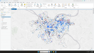
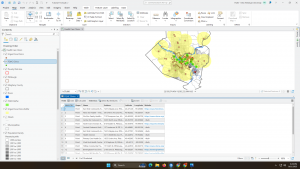
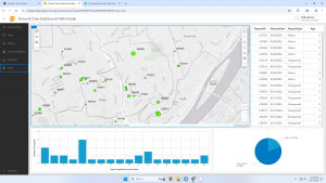
Chapter 2 focuses on mapping where things are everything that has to do with understanding where things are mapped and how to map them properly. When looking at the distribution of features rather than a singular feature, you can better understand patterns of a given area. To look for patterns, you have to map the chosen  features in a layer by using different kinds of symbols. The map has to be understandable to your audience and the issue being addressed. The information will not effectively be shared if your target audience doesn’t understand what is being shown either with too much or too little information, confusing symbols, or overly complicated maps. 

Preparing your data:

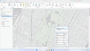
You have to first assign each feature a location using geographic coordinates. Then they must be assigned a code that identifies its type.

Making your map:

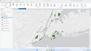
In order to create your map, you have to tell the GIS what you want to be mapped and which symbols to use to draw them. To map features as a singular type, use the same symbol. The GIS stores the data you input and uses the given coordinates to draw single or linear features. It can also represent areas by drawing outlines or filling areas with a specific color or pattern.Features can be mapped by category to provide an understanding of how a place functions such as the major road systems and traffic patterns. It is possible for features to be a part of multiple categories which can help reveal different unseen patterns. When showing multiple categories in a map, be sure to include no more than seven as any more can be difficult to interpret. Density of the features is also important to pay attention to as denser features should have fewer categories. If there are more than seven categories, you can group them which makes representing/understanding larger sets of features easier but may hide key information that could be helpful for interpretation. A good understanding of how you are grouping your data is crucial. Choosing the correct symbols can help to reveal patterns in the data. In order to make your map easier to understand, you can include recognizable features and features that reference your data/ help to interpret the message. 

Analyzing Geographic Patterns

If mapped correctly, you may see some patterns emerge from your data such as clusters or random distributions. Patterns can be used to help explain why things are how they are. You can use statistics to find hidden patterns that cannot be easily seen or understood just by viewing the map. 


Chapter 3: 

Chapter three focuses on mapping the most and least so you can compare places to understand relationships. Mapping most and least map features rely on the quantity that is associated with each and leads to a deeper understanding. You’re able to map quantities that align with any of the three types of features that were discussed in chapter 1. This chapter highlights the importance of keeping a purpose for your map and ensuring you know your audience and their knowledge comprehension capabilities. With GIS you can explore data and how different patterns arise or you can present maps with patterns that tell a story or answer your question.

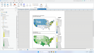
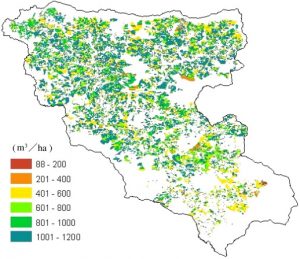
Quantities can be counts, amounts, ratios, or ranks. Knowing which type of quantities you have helps to determine the best type of map to present. The text talks about averages, proportions, and densities and how they relate to ratios. The next section discusses creating classes. Classes are grouped values that represent quantities on the map. Mapping individual values creates an accurate display of the data because no features are grouped together which ultimately allows you to search for patterns found in the raw data. Classes are used to group features with similar values together using the same symbol and these classes can be altered manually or by using a classification scheme. The text then goes over manual alteration and use of a classification scheme.

Comparing classification schemes:

  • Natural breaks → finds groupings and patterns inherent in the data which means values in a class are most likely going to be similar. It’s good for mapping values that aren’t evenly distributed
  • Quantile → each class has an equal number of features in it. 
  • Equal interval → Each class has an equal range of values. Best for presenting data to a beginner audience
  • Standard deviation → each class is defined by its distance from the mean value of all the features. 

As with any set of data, there is a chance for outliers. Using natural breaks can help isolate outliers. There are many different ways outliers can be caused so it is important to pay attention when they appear and double check your data.

Making a map:

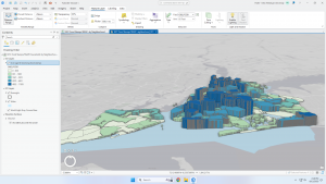
This section discusses creating the map after data value classification. When creating a map with quantities, you can use graduated symbols, graduated colors, charts, contours, or 3D perspective views.

  • Graduated symbols → map discrete locations, lines, or areas
  • Graduated colors → map discrete areas, data summarized by area, or continuous phenomena
  • Charts→ map data summarized by area, or discrete locations or areas. Show patterns of quantities and categories at the same time
  • Contour lines → show the rate of change in values across an area for spatially continuous phenomena
  • 3D perspective views → used with continuous phenomena to help visualize the surface

Kozak Week 1

My name is Halle Kozak. I am a senior and I’m studying zoology and botany. I’m from a small town in central New Hampshire.

I took the quiz and read the assigned text which introduced what GIS is and how it can be used in different ways. I found it interesting how many different uses of GIS there are and how similar processes are used to explore so many different problems. One thing I found helpful in this text as someone who is unfamiliar with GIS was the distinction between spatial analysis and mapping. I learned that spatial analysis generates more information that can be taken from maps alone while mapping is a representation of geographical data in a visual form. It was found that the success of GIS is credited to a combination of social and technological developments. GIScientists have complex jobs that reach further than just data analysis. Some of their jobs include, figuring out how spatial objects become digital entities and showing how to model different relationships within spatial analysis. It is also important for GIScietists to manipulate data in order to ensure that GIS visualization is consistent with the human capacity for visualization. I thought this was really interesting to read about because it helps to explain the complexity behind the human aspect of GIS analysis. When it comes to computational science, sometimes the prep work and behind the scenes can go overlooked when people are only expecting results so I liked that this included the human side of things. I think it is interesting to understand the differences and relationships between GIScience and GISystems. GISystems are the processing aspect of GIS and incorporate classification, digital encoding, spatial analysis, and output into software while GIScience covers the theoretical bases and justification for the way that these processes are executed. Essentially, GISystems are what it does and how it works, and GIScience is why it does what it does. It was interesting to read about the real life example of John Snow’s work on the relation of Cholera and use of public water wells in London and how he was able to prove the spread of cholera related to water pumps. Overall I think this chapter provides good background knowledge and a strong foundation for learning the ins and outs of GIS during this class.

One GIS application I looked into was a spatial evaluation of forest biomass in Yasuhara, Japan. This map shows quantities of material in different areas of forest aged for 40 years. It is related to biomass usage and the thinning of forests due to lack of cultivation. 


Kinoshita, T., Inoue, K., Iwao, K., Kagemoto, H., & Yamagata, Y. (2009). A spatial evaluation of forest biomass usage using GIS. Applied Energy, 86(1), 1-8.

Another application I looked into was the evaluation of Forest fire risk and the use of fire towers for monitoring. This map shows the visibility of the forest area from the Bereket Tower in Kahramanmaras, Turkey. It highlights the lack of coverage for a large area of forest that is at risk for forest fire. I find this application especially interesting as I like learning about forest fire prevention.

Sivrikaya, N. U. R. İ., Saglam, B., Akay, A., & Bozali, N. (2014). Evaluation of forest fire risk with GIS. Polish Journal of Environmental Studies, 23.