Delaware Map
Geography 291: Geospatial Analysis with Desktop GIS
Module 1: 1/14/2026 to 3/3/2026, OWU Environment & Sustainability
Delaware Map
Chapter 7
In Chapter 7, I learned how to edit, create, and delete polygon features, create and digitize point features, smooth features using cartography tools, utilize CAD drawings, and perform spatial adjustments of features. It was difficult to rotate and place them on the map, but I found it interesting to realize that bus stops we often see on maps are created in this way.
Chapter 8
In Chapter 8, I learned to understand the geocoding process, perform geocoding using ZIP codes and street addresses, and I was surprised that approximate matches could be made even when the data did not match perfectly.
Chapter 9
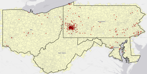
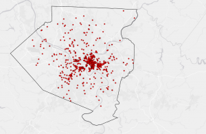
In Chapter 9, I learned about proximity analysis using buffers, the use of multiple-ring buffers, creating service areas to estimate a gravity model of demand based on distance to the nearest facility, optimal facility location using ArcGIS Network Analyst™, and exploring multidimensional data through cluster analysis, and I was able to learn this chapter smoothly.
Chapter 4
In Chapter 4, I learned how to import, transform, and manage data using a file geodatabase.
I also practiced applying Python expressions and SQL queries to calculate and edit fields, as well as joining tables for efficient analysis.
I found it especially interesting that queries can be used to narrow down suspects in crime data.
Chapter 5
This chapter explains how to work with spatial data by learning about geographic coordinate systems, map projections, vector and census data, and how GIS uses location information to analyze and understand spatial phenomena. I was able to follow the steps up to Tutorial 5-4, but in Tutorial 5-5, even though I created and downloaded the Excel file, an error occurred and I couldn’t complete it.
Chapter 6
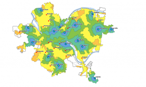
In this chapter, I dissolved block group polygons to create neighborhoods, fire battalions, and divisions, extracted neighborhoods using attributes to form a study area, and used that area to extract features from other layers. I also learned how to calculate street lengths for fire service, which was interesting. I was able to learn this chapter smoothly.
Preface
The preface to GIS Tutorial for ArcGIS Pro 3.1 greets readers to the fifth edition of this comprehensive, step-by-step workbook. The workbook strongly focuses on creating, analyzing, and sharing 2D and 3D maps through portals such as ArcGIS Online and Living Atlas. It uses a systematic learning approach that combines lectures, lab work, and student-driven projects and provides step-by-step tutorials, assignments, and lecture notes to support learning.
Furthermore, the book illustrates actual-world, real-world applications such as poor population’s health access analysis, crime data mining to detect patterns, mapping poverty indices, and urban planning based on LIDAR data. The learning process is organized into three divisions: working with maps already available, preparing and managing spatial data, and problem-solving through spatial data analysis.
Chapter 1
At first, I didn’t know where things were, and it took me some time to figure it out. However, I tried to take my time and carefully follow the steps in the text.
I was especially happy when the bookmark I created actually worked.
Chapter 2
In this chapter, I operated the Symbolize function many times, which helped me understand how it works in depth. What I found especially interesting was learning how pop-ups disappear when zooming in and reappear when zooming out. I had often seen this behavior in Google Maps, so it was fascinating to understand how it actually works.I also realized that combining colors and symbols makes the map much easier to understand. In Tutorial 2-6, I learned that simply changing where to set custom classifications can make information on the map much more readable.
Chapter 3
I learned how to actually share a map and also how to edit a shared map. I realized that many of the tasks in Chapter 3 can be done from my own computer, and once a map is created and shared, it can be edited anytime and anywhere, with the option to add graphs and tables. I thought this was very convenient. Moreover, I felt that not only sharing the map but also including it in a web-based story helps readers understand more deeply. I was glad to learn how to create this as well.
Chapter4
This chapter explains what density maps are and how to create them. Density maps help me understand patterns rather than just the locations of individual features. We can map features using new data or previously summarized data, such as census tracts, counties, or forest districts. I was surprised that even when using the same data, the maps can look very different depending on whether they are density maps or other types of maps. Before reading this chapter, I thought density maps made with layers and different colors were easier to understand than those made with dots. However, after calculating density, I realized that dot density maps often work better because they make it easier to count and compare. I also learned that when creating a dot density map, it is important to specify how many features each dot represents and how large the dots are. Dot maps give the reader a quick sense of density in an area. Shaded maps, using a range of color shades, are also useful to understand which areas have the most or the least density. I was also surprised that some GIS software, such as ArcGIS, allows you to calculate density automatically. It is really cool! I was especially surprised by the textbook examples showing two maps with different cell sizes and two maps with different search radii. The differences in cell size and search radius make a big difference in how the maps look. Therefore, I think I should pay attention to cell size and search radius when creating density maps. Finally, I prefer when areas of higher value are shown using darker colors because it makes the maps easier to understand. I also wonder if there are cases where showing higher densities with lighter colors could actually make the map clearer. After looking into it, I found that this approach is sometimes used in night maps, aviation charts, maps designed for people with low vision, or certain types of visual design where the colors are intentionally inverted.
Chapter 5
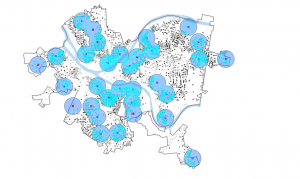
This chapter explains how maps can help us see what is inside an area and compare it with other areas. Knowing what happens in an area by using maps helps people decide what actions to take. In order to find what is inside, we need to know the boundaries, check the features in an area, and analyze them. Before reading this chapter, I did not really understand the meaning of “finding what’s inside.” However, I fully understood it after seeing the map that shows calls to 911 within 1.5 miles of a fire station. The circle on the map, centered at a fire station, helps us see how to evacuate or reach hospitals in an emergency. The map shows this information at a glance. It also made me realize how important it is to know how many areas I have and what types of features are inside those areas. As the next step after mapping, I learned that I should think about what kind of information I need to analyze—such as a list, a count, or a summary—and how detailed the map should be. I think knowing these things helps make a map more efficient. When I make maps, I want to make sure who will use the map and what its purpose is. I also found it interesting that you can overlay another area on data that has already been summarized by area. This makes it possible to combine not only current data but also past datasets for further analysis, which I think is really exciting.
Chapter 6
This chapter explains that finding what’s nearby helps us decide how to measure nearness and what information we need for the analysis, which in turn determines which method to use. I didn’t know that when mapping what’s nearby based on travel, I can use not only distance but also cost, such as time and money. For example, if someone says a store is within 15 minutes from here, I might consider it close. But if you include factors like traffic jams, that perception can change. That’s why I used to think distance alone was what defined nearness. I also learned that inclusive rings are useful for showing how the total amount increases as the distance increases. I had only seen it used to show the relationship between the magnitude of an earthquake and the number of victims, but I learned that it can also be applied to various analyses such as commercial facility service areas, population distribution, and service coverage. According to this chapter, there are three ways of finding what’s nearby; straight-line distance, distance or cost over a network, cost over a surface. First, straight-line distance can create a boundary or select features at a set distance around a source well. Second, distance or cost over a network can find what’s within a travel distance or cost of a location over a fixed network well. Third, cost over a surface can calculate overland travel cost well. We can select one of them depending on what is surrounding features and hot measure. WE need to specify the distance from the source and the GIS selects the surrounding features within the distance.
Mitchell Chapter1
In this chapter, I realized in depth the fundamental information required for GIS analysis. First of all, I realized the importance of identifying the right information that is already available and creating new information as required to fill any gaps in the analysis. On that foundation, there is a requirement to make accurate decisions on what method of analysis is most appropriate based on purpose. There are usually two prevalent approaches to analysis: one that gives immediate results but is only an approximation, and one which requires more time, effort, and lots of data but yields more accuracy. I used to believe that “greater accuracy always is the best,” but found that there are conditions where rough approximation is better and more appropriate, and therefore came to appreciate the worth of analytical flexibility. Second, in order to identify, delineate, and quantify various geographic characteristics, one should know something about the nature of attributes describing them. Whether to employ an analytical approach or not depends on whether the attributes that one is dealing with are qualitative or quantitative. Types (categories) and orders (ranks) are qualitative values which are discrete, while counts, quantities, and ratios are quantitative values which are continuous, and this distinction strongly affects how data are classified and how patterns are perceived. By identifying these differences properly, it becomes possible to categorize data properly and make visualization and pattern detection more understandable. Besides, these fundamental principles are not only required to conduct the analysis per se, but also in order to be employed as guidelines for when and how the analysis results must be utilized and at what accuracy level at which stage. As an example, initial during the planning phase, quick estimates can be of invaluable worth, while in the final stages of decision making, high-precision data becomes absolutely essential. This way, I learned that adaptable selection of methodology is used in GIS analysis depending on the context and quality analysis is achieved by proper classification and visualization based on attributes.
Mitchell Chapter2
I learned in this chapter the value of plotting where things are. Maps can first be used to locate features one at a time and then to explore the patterns of occurrence of these features. Plotting where things are can illustrate where action needs to be taken or where areas meet particular criteria, which will make our activities more effective.
To visualize geographic trends in information, features in layers are symbolized by different kinds of symbols. Which elements to show and how to show them must be established based on the information being sought and the map’s purpose. Looking back on that, I discovered that as my OWU friends and I went to Niagara Falls, zooming out on the map specified road names and traffic status ahead while zooming in revealed nearby gas stations or McDonald’s restaurants. Based on what you need, the map provided the needed information at the moment. I also understood that not just is it important to categorize data, but also to think about how you’re going to make it easy for people to get at a glance. While you can pick up many patterns just by looking at a map, determining whether there are hidden patterns or whether the visible patterns are meaningful requires using statistics to quantify and measure relationships between characteristics. This caused me to think that if one is not careful in analysis, it is easy to be deceived, which surprised me.
Mitchell Chapter3
This chapter is with the identification of patterns on maps. Concentration of values within a place is called clustering, and even distribution of values throughout an area is known as values being spread evenly over a region. Clustering is employed to determine areas of concentration for marketing, city planning, or other purposes. The transition—the rate or form of change from low to high values—is also employed to observe how locations and social processes are related to one another.
Maps can also mark outliers, or elements whose values fall way out of line with the rest of the surrounding region. Outliers may be marked with unique symbols or placed in a special class so that the validity of the overall map pattern is preserved. Another consideration to keep in mind is the effect of aggregation. The mapping of small units highlights local variation, while large units can suppress subtle patterns. To get an even more comprehensive view of an area, supplementary maps displaying varying measures, such as percentages and densities, can be employed.
Applying these principles can prove to be effective in practice. A business owner, for example, can target areas where a particular customer cluster is concentrated, and sociologists can study the distribution of ethnic groups to monitor social trends. Compare places with rapid-changing changes in income, population, or other variables with those that have slow-changing changes to assist in policy or marketing decisions.
Overall, map pattern interpretation relies on correct selection of aggregation units, sound handling of outliers, and optimal utilization of complementary indicators. Correct interpretation of such patterns helps map readers make informed decisions and better perceive the distribution of social, economic, or environmental phenomena at a spatial scale. Detection of clustering, uniform distribution, and boundary transitions is crucial for map interpretation and spatial relations communication.
Hello! My name is Haruno Tadokoro. I am from Tokyo, Japan. I am a junior, majoring in Environmental Science and minoring in Politics & Governance. My mother got COVID the day before my departure to the U.S., so I missed the first week and just got back yesterday.

I did the quiz for this class Geography 291. While reading the first Chapter by Schuurman I was surprised to learn that Geographic Information Systems (GIS), which are instrumental to technologies like car navigation and Google Maps that we use almost every day, actually began to be developed back in the 1960s. I had always assumed that these systems were more recent innovations because they certainly seem so new and high-tech. Reading about where it all came from helped me appreciate how long ago humans started developing digital mapping and spatial analysis, even when computers were far more rudimentary than they are now.
Personally, I have utilized GIS-related tools in my travels. For example, I like to research where I am headed, how high it is, or use web-based maps to explore land and distance. Previously, I imagined that GIS was mostly for personal convenience, like taking the best route or discovering new places. But I learned GIS is far more than that and it’s used differently depending on whom is using it and why. It’s used by urban planners to design cities, environmental scientists to research climate change, and emergency responders to use in times of crisis.
This made me think of the way that technology itself is value-neutral, but we can use it in ways that give it meaning and purpose. GIS can be used to create communities that are safer, more efficient, and more sustainable, but it also raises concerns of data control and privacy. As a user who has been mostly at the surface level, I find myself now curious about learning more about what goes on behind the scenes with GIS and how it might further develop in the future. It is incredible to think that something created over 60 years ago still forms the basis for so many of the tools we utilize today.
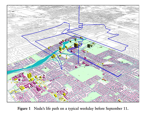
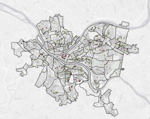
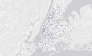
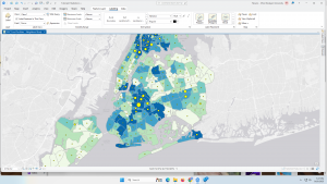
I found Female researchers are using GIS to visualize gender inequality geographically. In Image 1, disparities and burdens based on gender are layered onto a map, visually representing factors such as the degree of impact on women across different regions.