Technical things turn me into a zombie… my eyes just glaze over after a while. I know I’m missing things in these chapters and it’s led to a lot of confusion! Definitely going to look over these tutorials and the previous ones as well before the final, because I keep getting to parts of the tutorials especially in chapters 5 and 6 where it will ask me to do something but the data is missing or the function doesn’t make sense. I gotta say it would be nice if some of the references to past tutorials would direct me towards the specific function that was used, not a refresher but a better reminder (that might just be my lack of working memory talking though).
Anyways chapter 4 wasn’t TOO too bad. Importing and exporting things are pretty self explanatory.(i did forget to choose colors for the outlines but it still works)Altering attribute tables was pretty simple too.
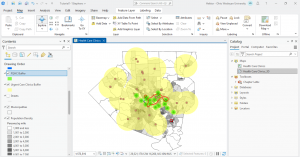
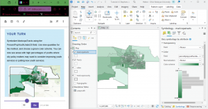
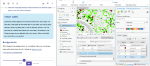
Some of the parts with symbology were what I needed a refresher on. Also the joining part was feasible, if not comprehensible.
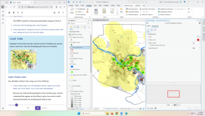
In 4-3, I had to mess with the queries a little but i think I got it?
Spatial joins were mentioned later on only for me to forget them and looking back is reminding me what those were. Also Krygier pointed out that one error in the set can throw the whole thing off and lead to a bunch of null data. I guess I have to make sure everything is lined up and the same!
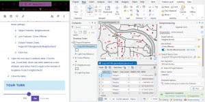
I had to fiddle around again to get the center points to work because x and y weren’t filling in on the tool (and then I failed to take a screenshot of that but I can’t replicate it not working so thats good?)
Finally 4-6 wasn’t too bad either, still pretty intuitive. (I could have chosen more effective symbols though)
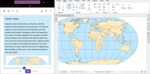
Now I’m on to chapter 5, posting this late because I need to redo a few parts. Like I said, there were definitely a few things I glossed over. Changing projection systems was pretty ok though.
The local and state plane coordinates were pretty intuitive as well
This took more messing around with but I did figure out the coordinates.
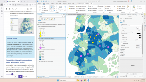
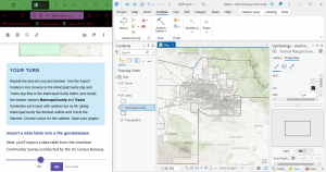
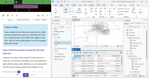
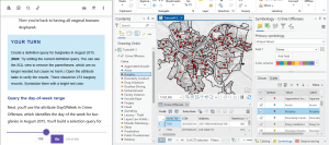
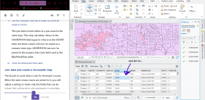
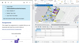
The census data site is kind of confusingly laid out… i definitely need to be told exactly which map is needed. Also the bike data is where I really screwed it up and didn’t clean up the tables properly. This is the best I could do… moving on!
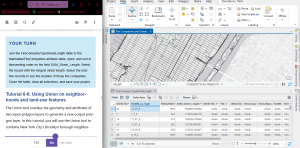
The pairwise dissolve tool was cool!
But I didn’t get the label part.
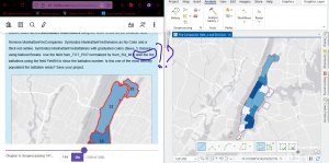
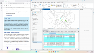
Then I did something weird trying to select the west block groups in the Upper West Side.
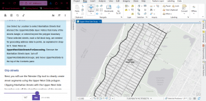
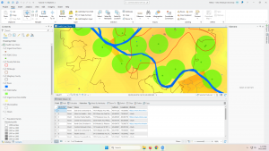
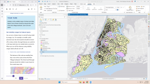
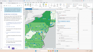
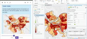
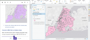
Pairwise clip tool is kind of like a layer mask. The above image is from before I did it but it worked fine. Merging layers was similar!
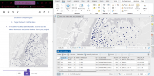
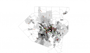
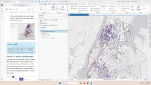
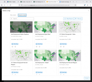
Here’s another bad join!
So yeah. Mostly ok, still pretty confused but I’m just gonna keep powering my way through and review things as needed.