Here is the link to my final : https://docs.google.com/document/d/1HiRza6zAIbqoI9aU0jUt1iGJn3VzasIoQMQPOjH3NIE/edit?usp=sharing
Geography 291: Geospatial Analysis with Desktop GIS
Module 1: 1/14/2026 to 3/3/2026, OWU Environment & Sustainability
Here is the link to my final : https://docs.google.com/document/d/1HiRza6zAIbqoI9aU0jUt1iGJn3VzasIoQMQPOjH3NIE/edit?usp=sharing
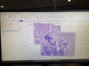
Zip Code: Contains all zip codes within Delaware County, Ohio. Published and updated monthly.
Street Centerline: Depict center of pavement of public and private roads within Delaware County, Ohio. Updated on a daily basis for all fields but the 3-D fields which are updated on an annual baiss, and is published monthly.
MASG: Stands for Master Street Address Guide, and is a representation of the 28 different political jurisdictions in Delaware County, Ohio.
Recorded Document: Consists of points that represent recorded documents in the Delaware County Recorder’s Plat Books, Cabinet/Slides and Instruments Records which are not represented by subdivision plats that are active. Documents such as; vacations, subdivisions, centerline surveys, surveys, annexations, and miscellaneous documents within Delaware County, Ohio. Updated on a weekly basis, and is published monthly.
Survey: A shapefile of a point coverage that represents surveys of land within Delaware County, Ohio. Surveys are found in documents in the Recorder’s office and the Map Department. The dataset is updated on a daily basis and is published monthly.
GPS: Identifies all GPS monuments that were established in 1991 and 1997. Dataset is updated on an as-needed basis, and is published monthly.
Parcel: Consists of polygons that represent all cadastral parcel lines within Delaware County. Dataset is maintained on a daily basis, and is published monthly.
Subdivision: Consists of all subdivisions and condos recorded in the Delaware County Recorder’s office. The dataset is updated on a daily basis and is published on a monthly basis.
School District: The dataset consists of all School Districts within Delaware County, Ohio. The dataset is updated on an as-needed basis, and is published monthly.
Annexation: The dataset contains Delaware County’s annexations and conforming boundaries from 1853 to present. Dataset is updated on an as-needed basis once an annexation has been recorded within the Delaware County Recorder’s office. It is published monthly.
Township: The dataset consists of 19 different townships that make up Delaware County, Ohio. The dataset is updated on an as-needed basis and is published monthly.
Tax District: This dataset consists of all tax districts within Delaware County, Ohio. The data is defined by the Delaware County Auditor’s Real Estate Office, and data is dissolved on the Tax District code. The data is uploaded on an as-needed basis and is published monthly.
Address Point: A spatially accurate representation of all certfiied addresses within Delaware County, Ohio. The layer provides the capability to reverse geocode a set of coordinates to determine the closest valid address and is intended to provide 911 agencies with information needed to comply with Phase II 911 requirements. The dataset is updated on a daily basis, and is published once a month.
Municipality: The dataset contains the municipality parcels that are within the MSAG and Township datasets
Condo: Consists of all condominimum polygons within Delaware County, Ohio that have been recorded within the Delaware County Recorders Office.
Precincts: Consists of Voting Precincts within Delaware County, Ohio. Maintained by the Delaware County Auditor’s GIS Office under the direction of the Delaware County Board of Elections. Dataset is updated on an as-needed basis and is published as-needed by the Delaware County Board of Elections.
PLSS: Consists of all the Public Land Survey System (PLSS) polygons in both the US Military and the Virginia Military Survey Districts of Delaware County. Created to facilitate in identifying all of the PLSS and their boundaries in both US Military and Virginia Military Survey Districts of Delaware County. The dataset is maintained on an as-needed basis where new surveys have been recorded, dataset is updated on an as-needed basis and is published monthly.
Delaware County E911 Data: The database uses the Location Based Response System (LBRS) and is used in 911 Emergency Response. The dataset is updated on a daily basis, and is published monthly.
Farm Lot: Dataset consists of all the farmlots in both the US Military and the Virginia Military Survey Districts of Delaware County. Dataset was created to facilitate in identifying all of the farmlots and their boudnaries in both US Miltary and Virginia Military Survey Districts of Delaware County. Dataset is maintained on an as-needed basis where new surveys have been recorded.
Building Outline (2021, 2023, 2024): Consists of all building outlines in Delaware County. Each of the three databases are updated within their respective years.
Railroads: Allows a user to view the locations of railroads that lie within Delaware County.
Dedicated ROW: Consists of all lines that are designated Right-of-Way within Delaware County, Ohio. This data is line data that is created through the daily updates of Delaware County’s Parcel data. Dataset is updated on an as-needed basis, and is published monthly.
Original Township: Displays boundaries of Delaware County townships prior to divison by tax divisions affected their shape.
Map Sheet: Dataset contains all map sheets within Delaware County, Ohio. Consists of 360 records.
Hydrology: Dataset consists of all major waterways within Delaware County, Ohio. Data was enhanced in 2018 with LIDAR based data. The dataset is uploaded on an as-needed basis and is published monthly.
ROW: A type of easement (right-of-way) that shows accessible street routes in the form of line data.
2024 Aerial Imagery: 2024 3in Aerial Imagery Flown Spring 2024. Published on September 25, 2024 at 7:45 PM EDT.
Delaware County GIS Data Extract Web Map: Web map used in Delaware County GIS Data Extract application that allows users to extract Delaware County, Ohio GIS data in various formats.
2022 Leaf-On Imagery (SID File): 2022 Imagery 12in Resolution, published on September 14 2022 at 1:42PM EDT
Delaware County GIS Data Extract: Allows users to extract Delaware County, Ohio GIS data in various formats. Published June 8 2020 at 6:23 PM EDT.
Delaware County Contours: 2018 two foot contours for Delaware County, Ohio in file geodatabase format. Published April 9, 2020 at 9:51AM EDT.
Street Centerlines — DXF: The LBRS Street Centerlines depict the center of pavement of public and private roads in Delaware County, Ohio and was collected by field observation
Auditor Logo: The logo of the Auditor’s GIS Office in Delaware County
Fall Background: The background for different GIS data
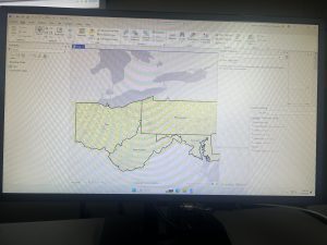
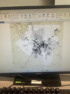
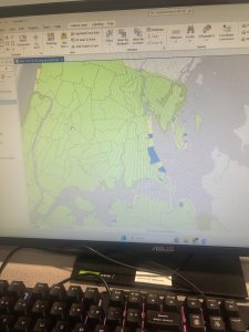
Here is my map that shows all three layers: Street Centerline, Hydrology, and Parcles:
Chapter 7
Chapter 7 was about digitizing, in which I learned how to edit, create, and delete polygon features, create and digitize point features, use cartography tools to smooth features, work with CAD drawings, and spatialy adjust features. I found it very interesting that 7-1 allowed us to edit polygon features on CMU’s campus buildings. I was able to rotate and move existing buildings into a layer, and add vertex points and split polygons to further edit them to match buildings on the world imagery basemap. I found this section to be very fun. I am still a little confused on vertex points and why they are important to use/what the purpose of them are. In 7-2 I was able to create and delete polygon features. I learned that campus planners need polygons of open parking lots for a permeable surface and transportation engineering study. This section was interesting as I was able to work with parking lots and bus stops.
Section 7-3 was very straightfoward, where I learned about the smooth polygon tool, which is a useful tool to improve the aesthetic or cartorgraphic quality of polygons. I also learned that the features are digitized with just a few line segments and don’t match the true geography. Section 7-4 was the most difficult section, which was about transforming features. I learned about the importance of computer-aided design (CAD). CAD drawings and BIM models use Cartesian coordiantes (which I do not know what it is) and are not geographically referenced to geographic coordinate system, state plane, or Universal Transverse Mercator (UTM) coordinates (which I also do not know what this is). CAD drawings contain layers in one drawing and are color-coded according to the layer color assigned in the CAD drawinsgs. I did not know that you cannot edit CAD drawings directly, and in order to edit it, you have to export the drawing to a feature class after you georeference it to its approximate campus location- and this caused me to be stuck at first.
Chapter 8
Chapter 8 was about geocoding, and I felt as if this was the hardest chapter we have done yet. I have not heard of geocoding prior to this, but I learned that geocoding is a GIS process that matches location fields in tabular data to corresponding fields in existing feature classes, such as TIGER/Line Streets, to map the tabular data. I also learned that a problem with geocoding is that soruce data suppliers and data entry workers can write or type anything they want for an address, including misspellings, abbreviations, omissions, and place-names instead of addresses. I would like to read more and research more about what fuzzy matches and fuzzy methods are- I have heard about this in research articles before and was not too sure what that means. I learned that an algorithim computes a Soundex key, which is a code assigned to names that sound alike, and identifies candidate matches of source and reference street adresses to account for spelling errors.
In 8-1 I geocoded survy data collected by a Pittsburgh arts organization that holds an event each year attended by persons across the country. I found the process of building a zip code locator to be difficult. I’m not too sure what I was doing wrong, but I had a lot of trouble on step 3, as I could not find the locators tab in the catalogs pane. I was alos able to geocode data by zip code. I know the book stated to not select ArcGIS World Geocoding Service or Esri World Geocoder for Address Locater, however I am very interested in these two software systems and what they entail. 8-2 was interesting as I was able to geocode street addresses. It was very interesting to geocode attendee data by street address and select minimum candidate and matching scores, as this has broader implications to public health initatives and outbreak response.
Chapter 9
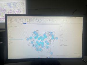
This chapter was about spatial analysis. I have heard this term being used in the first book we use, and in public health courses, but I have not known what the term means. I learned how to use buffers for proximity analysis. A buffer is a polygon surrounding map features of a feature class. I was able to run the pairwise buffer tool through buffering Pittsburgh’s 32 public pools to estimate the number of youths ages 5 to 17 that live close, within a half mile, of the nearest pool. I found 8-1 to be very straight-forward and easy to navigate. I also did do the “your turn” on page 216, which I also was found very easy to change the radius to increase buffer areas. Tutorial 9-2 was about using multiple-ring buffers. I learned that a multiple-ring buffer for a point looks like a bull’s-eye target, with a central circle and rings extending out.
Furthermore, 9-2 annlowed me to use spatial overaly to get statistics by buffer area. This calculates the percetnage of youths with excellent and good access with the limited number of pools open. I found this was very interesting as the information was already readily available, and it is cool to see the differences between various buffer areas. In tutorial 9-3, I was able to create multiplering service areas for calibrating a gravity model. It was interesting to use service areas to estimate a gravity model of geography that assumes the further apart two features are, the less attraction between them. I did enjoy making a scatterplot through ArcGIS Pro, as I can see myself utilizing this tool in the future.
Chapter 4
Chapter 4 was about working with spatial databases. I learned that a database is a container for the data of an organization, project, or othre undertaking for record keeping, decision-making, analysis, and research. I found this chapter to be more difficult than the previous chapters, but I found it very interesting who individuals can utilize GIS to import databases directly into ArcGIS Pro. To me, this chapter was the most useful chapter that we have done yet. I can see myself importing data into the database and using it to analyze trends. I did have a bit of trouble importing the map, as it did say that there was a network error. I did have to switch over to another computer and this was resolved.
I also was able to learn about carrying out attribute queries. Linking tabular data to the spatial features in feature classes allows you to symbolize maps using the attribute values found in tables and enables you to find spatial features of interest using attribute data. An attribute query selects attribute data rows and spatial features based on attribute values. Something that I did have a question about was what SQL is. The chapter discusses how attribute queries are based on SQL, which is the de facto standard query language of databases and many apps, including ArcGIS Pro. I am interested in learning more about what SQL is what it entails. One of the more interesting parts of the chapters was viewing crime incidents. I found this to be very interesting. I never thought about how public health officials/law enforcement may be able to map criminal activity in order to look for areas of need and implement appropriate interventions. I did find the “your turn” on page 116 to be specifically hard, as I had a hard time locating the SQL view to remove the parenthesis.
Chapter 5
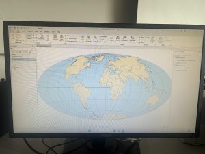
Chapter 5 was about spatial data, and I was able to change the geographic coordinate system to a projected coordinate system by setting the map properites, change the projected coodinate system to a different projected coordinate system by setting the map properites, and set the projected coordinate system for a local-level map by adding a first layer to the map an d specifying the display untis for the map. In 5-1 I learned more about world map projections. I discovered that geographic coordinate systems use latitude and longitude coordinates for locations on the surface of the earth, whereas projected coordinate systems use a mathematical transofmration from an ellipsoid or a sphere to a flat surface and two-dimensional coordinates. This section was very inetesting to learn about the various types of map projections- such as the Hammer-Aitoff projection.
I also found 5-3 to be very interesting, as I was able to change a map’s coordinate system. 5-4 allowed me to examine a shapefile. I was a little confused reading this section on page 134, and was wanting more clarification onn what a shapefile is and why they are important. I understand that a shapefile consists of at least three files with either .shp, .dbf, or .shx and each file uses the shapefile’s name but with a different extension, but I am not too sure how I would use it or what the importance is. I found tutorial 5-5 to be the most interesting, where I was able to work with US Census map layers and data tables. I learned that the advantage of downloading spatial data is that you have more flexibility in modifying it. I was able to download census TIGER files, and process tabular data in Microsoft Excel. I thought the process of adding and cleaning data in ArcGIS Pro was very interesting, and I would like to use this feature in the future, because it would be easy to analyze and interpret data within the same software- and not have to switch around programas.
Chapter 6
Chapter 6 is fundamentally about geoprocessing- which is a framework and set of tools for processing geographic data. 6-1 was about dissolving features to create neighborhoods and fire divisons and battakions. I learned about the pairwise dissolve took, which can aggregate block group attributes to the neighborhood level, using statistics such as sum, mean, and count. In 6-2 I was able to use select by location to create study area block grops. I found this to be very interesting, because the “your turn” was very interestnig I was able to interact within multiple layers. I was able to use the pairwise clip tool to cleanly create street segments. This was useful because clipping Manhattan streets with the Upper West Side boundary cuts off the dangling portions of the streets and creates a clean layer for display purposes. My personal favorite was doing 6-7 where I was able to understand study tracts and fire company polygons. It was very intersting to learn that responsbility for the tract’s population of persons with disabilities should be spilt approximately 50/50. I was able to select tracts to open the disability field, which showed that the population of persons with disabilities in tract is split 50/50 between fire companies 22 and 75, each with 400 persons. Census tract 019300 retains its full population of 1,620 persons with disabilities.
At the end of this weeks tutorial for chapters 4, 5, and 6, I feel as if my GIS skills are improving. At the beginning of the semester, I had no clue what GIS would look like in practice, and using map projections was a big surprise to me- because I did not envision this being a large part of GIS.
Chapter 1 Tutorial
Starting off, this chapter was very confusing for me. I logged in on GIS online at first, but quickly found the GIS Online shortcut on the desktop and this quickly resolved all of the issues. Moreover, I downloaded the tutorials online, but forgot to extract it. I had issues trying to figure out where the chapter 1 tutorial was, but I reread the instructions and realized that I had forgot to extract the chapter files. I found this tutorial very interesting as it relates to public health, because the locations of urgent care clinics are important to reduce mortality. This is a great way for public health officials and policymakers to see where locations are needed, so they can advocate for the construction of more clinics in areas of need. I also found it very interesting how you can look at various factors- like population density, poverty risk areas, and households per square mile. This visualization also allowed me to realize that healthcare clinics are usually placed where the population desntiy is highest, which means that areas of lower population density have lower accessibility to health care clinics. I found the book to be very helpful and was very straightforward with instructions, which I appreicate as GIS is a brand new skill for me. I had learned valuable skills about feature class, raster dataset, a file deodatabase, and a project. Moreover, I learned how to bookmark, locate contents in a panel, how to save a project, how to add and remove a base map, and how to turn layers on and off through contents pane. After completing this chapter, I feel more comfortable with what GIS is, and I feel less anxious and overwhelmed while working. I am happy that I was able to experience the basis of GIS and start honing my skills in hopes I can apply this to my future profession.
Chapter 2 Tutorial
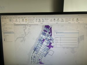
For this tutorial I was able to choose layers for a thematic map through a New York City Zoning and Land Use Map. Thematic maps consists of a subject layer or layers (the theme) placed in a spatial context with other layers, such as streets or politicla boundaries. This allows the viewer to see many elements at once, for example, during this tutorial I saw: commercial, manufacturing, park, residential, residential/lt mtg, and waterfront zoning land use all at once based on different colors. The first part of the tutorial was very interesting, as it was interesting to see the contrast between colors and how we can make use of aesthetics. I had a lot of fun with this, and futher went on to play a lot more with the colors. I did have issues with the water not turning blue. Tutorial 2 wa about labeling features and configuring pop-ups, which are used to identify graphic elements and/or detailed information and included data from several fields, as well as possibly images and charts. I also learned about what a defintiion query is, which is used to filter the features of a layer rather than select a temporary subset of eatures to work with, even though they both use a similiar SQL interface.
I found this tutorial to be fairly straightword, and I enjoyed participating in the “your turn” sections, as it was challenging and allowed me to connect prior steps and definitons from the book into practice. This tutorial did not take too long, and I found it very interesting. I really enjoyed creating choropleth maps for households recieving food stamps. It was interesting working with US Census Bureau data, as I have never worked with that dataset before, but I forsee myself using it in the future.
Chapter 3 Tutorial
Chapter 3 is about sharing maps with people who do not have ArcGIS Pro or GIS skill beyond map navigation. Tutorial 3-1 focused on building layouts and charts. I found this to be the hardest tutorials, as I got stuck on creating a layout and adding maps to it. After consulting help, however, I quickly understood what was going on and was able to move-on. This section was particularly important for creating charts, inserting legends, and adding guides and snap maps to the guides. Tutorial 3-2 was interesting as we were able to utilize ArcGIS Online. I noticed a grand difference between ArcGIS Online and ArcGIS Pro. ArcGIS Online is very useful for smaller projects that require a laptop, and ArcGIS Online is useful for larger projects that may require lots of detail and must be done on a desktop. Tutorial 3-3 was my favorite, because I can see myself creating a storymap through ArcGIS StoryMaps. I have utilized this software before, but I did not realy recnognize its importance. ArcGIS StoryMaps allows you to create briefings that consist of a series of slides with bulleted talking points, interactive maps, and other content for a presentation to an audience. Also, this can be shared online with others through a URL- while it may be more difficult to share a project on ArcGIS Online with somebody who is not familiar with the software. I particularly enjoyed this section, because it combined everything we have previously learned and talked about and allowed us to apply it. Overall, this chapter allowed me to see the more accessible side of GIS and how it can be shared with others. My favorite part of this chapter was creating statis maps with map surroundnigs and the online interactive maps through ArcGIS StoryMaps. Overall, I am excited for next week to learn more about GIS and how this can be applied to public health.
Mitchell Chapter 4
Chapter 4 is focused on what density is, and how to map density via GIS. Mapping density is important as allows you to see patterns of where features are concentrated. This is relatively important as this helps you find areas that require action or or monitor changing conditions. In my opinion, Mitchell’s example of a crime analyst helped me understand why density maps are important. A crime analyst may map the density of burglaries occurring over a year, per square mile, to compare different parts of the city. This aligns with the goals of mapping density, as a crime analyst may then take this data to let policymakers know where intervention is necessary.
The author discusses two ways of mapping density, which is by defined area and by density surface. Mapping density by defined area involves mapping density geographically using a dot map, or calculating the density value for each area. The closer together the dots are, this means that the higher the density of features are within that specified area. Mapping density by density surface involves the creation of a density surface in GIS as a raster layer. Each cell in the layer gets a density value, such as a number of businesses per square mile, based on the number of features within the radius of the cell. Creating a density surface seems like the easiest possibility to me as this technique is used if you have individual locations, sample points, or lines– which is great for raw data that has yet to be analyzed or summarized by another analyst/researcher. In order to map density for defined areas, you may calculate a density value for each defined area or create a dot density map. A density value requires the user to calculate density based on the areal extent of each polygon, while the creation of a dot density map allows for the user to map each area based on a total count or amount and specify how much each dot represents. I find this chapter very useful to understand how to plot features on a map that reflect density, and I see this how this may be applied to the field of public health or epidemiology in the form of disease clusters.
Mitchell Chapter 5
Chapter 5 discusses why it is important to find what is inside a location– which lets you see whether an activity occurs inside an area or summarize information for each of several areas so you can compare them. In order to find what’s inside, you can draw an area boundary on top of the features, use an area or boundary to select the inside and list or summarize them, or combine the area boundary and features to create summary data. It is important to find what is inside a single area, as this allows for intervention. Single areas include: a buffer that defines a distance around some features, an administrative or natural boundary, an area that you draw manually, or a service area around a central facility. Furthermore, finding how much of something is inside each of several areas lets you compare the areas, which can include state parks, zip codes, watersheds, stores, or floodplains.
Mitchell discusses three ways of finding what’s inside: drawing areas and features, selecting the features inside the area, and overlaying the areas and features. Drawing areas and features are good for seeing whether one or a few features are inside or outside a single area, and all you need is a dataset containing the boundary of the area or areas and a dataset containing the features. Selecting the features inside the area is a good approach for getting a list or summary of features inside a single area, or a group of areas you’re treating as one. For this, you need the dataset containing the areas and a dataset with the features, including any attributes you want to summarize. Finally, overlapping the areas and features is good for finding which features are in each of several areas or finding out how much of something is in one or more areas. For this approach you need the data containing the areas and a dataset with the features, including any attributes you want to summarize.
Mitchell Chapter 6
Chapter 6 discusses how to find what is nearby, which lets you see what’s within a set distance or travel range of a feature. This lets you monitor events in an area, or find the area served by a facility or the features affected by an activity. It is important to map what’s nearby, as you can find out what’s occurring within a set distance of a feature, and find features inside an area that is affected by an event or activity. I personally see this being applied for natural disasters, as you may be able to see areas that have been affected or areas that are in more of a need.
The author then discusses three ways of finding what’s nearby, which includes straight-line distance, distance or cost over a network, and cost over a surface. Straight-line distance can specify the source feature and the distance, and the GIS finds the area or the surrounding features within the distance. Straight-line distance is good for creating a boundary or selecting features at a set distance around the source. For this, you need a layer containing the source feature and a layer containing the surrounding features. The second way of finding what’s nearby is distance or cost over a network, in which the user specifies the source locations or travel cost along each linear feature, then the GIS finds which segments of the network are within the distance or cost. This technique is useful for finding what’s within a travel distance or cost of a location, over a fixed network. In order to use distance or cost over a network, locations of the source features, a network layer, and in most cases, a layer containing the surrounding features are required. The last technique is cost over a surface, in which the user specifies the location of the source features and a travel cost, then the GIS creates a new layer showing the travel cost from each source feature. This is good for calculating overland travel cost, and you need a layer containing the source features and a raster layer.
Mitchell Chapter 1:
Chapter 1 starts out by discussing that GIS analysis is a process for looking at geographic patterns in your data and at relationships between features. I do have experience with GIS analysis during my internship last summer at the Delaware Public Health District. During my internship, I was able to gather surveys- and upon completion, participants dropped a pin (via ArcGIS) indicating which part of Delaware County they resided in. Afterwards, participants indicated their experience with food accessibility and security based on their surrounding geographic area. Based on this GIS analysis, we were able to see which areas of Delaware County were lacking in accessibility and security, and therefore place proper interventions to help those select communities in need.
The chapter goes-on to explain that geographic features are discrete, continuous phenomena, or summarized by area. Discrete includes locations and lines where the actual location can be pinpointed- and at any given spot, the feature is either present or not. Continuous phenomena includes precipitation or temperature- which can be mapped anywhere. Phenomena are data that “blanket the entire area you’re mapping- there are no gaps”. This expression that the author used to describe continuous phenomena made it very simple for me to understand, as the term was confusing to me at first. Summarized data represents the counts or density of individual features within area boundaries. Some examples of these types of features include, “the number of businesses in each zip code, the total length of streams in each watershed, or the number of households in each county”.
Overall Mitchell’s Chapter 1 allowed me to think more analytically regarding GIS. Prior to this chapter, I believed that GIS was a lot of plugging data into existing databases. However, this chapter challenged that idea and made me realize that one also must understand what type of data they are working with, and how to use that appropriate data to make sense of it during analysis.
Mitchell Chapter 2:
This chapter discusses the basis of how to map features and where features are located. The purpose of mapping features is to look at the distribution of features, rather than at individual features, so that you can see patterns that better help understand the area that you are mapping. I see this being able to be used in epidemiology, for example. If a citizen is concerned about cancer rates in a neighborhood, an epidemiologist is able to gather information, plot the data, and analyze frequencies in order to determine if cancer is prevalent in one neighborhood rather than another. Analyzing frequencies also allows for interventions to occur to help communities– and in this case, public health officials can analyze the neighborhood to determine the cause of the cancer rates.
I thought it was very interesting that when creating a map, you tell the GIS which features you would want to display and what symbols to use to draw them. I found this interesting because I thought that you had to create a map entirely from scratch, but it is very interesting to know that the platform provides displays and symbols to choose from. I also learned more about the function of GIS– and that it stores the location of each feature as a pair of geographic coordinates or as a set of coordinate pairs that define shape. Moreover, for individual locations, the GIS draws a symbol at the point defined by the coordinate for each address. For linear features, the GIS draws lines to connect the points that define the shape of streets.
Overall, I found this chapter interesting because I was able to learn more about how GIS functions, which seems to be primarily based on geographic coordinates. I am very excited to start working with the GIS software, and I feel as if this chapter lays a foundation for my understanding to create maps, understand how GIS works, and how to apply features.
Mitchell Chapter 3:
The chapter discusses how to map the least and the most, which allows you to compare places based on quantities, so that you can see which places meet your criteria, or understand the relationship between places. The chapter discusses that public health officials may map the number of physicians per 1,000 people in each census tract to see which areas are adequately served and which are not. It also discusses the type of features you are mapping, which are discrete features and continuous features. Discrete features are individual locations, linear features, or areas. On the other hand, continuous phenomena can be defined areas or a surface of continuous values.
A large portion of the chapter included counts, amounts, ratios, and classes. A count is the actual number of features on a map, while an amount is the total value associated with each feature. However, it may not be the best to use counts and amounts if you’re summarizing by area, as using them can skew the patterns if the areas vary in size. Instead, ratios should be used to accurately represent the distribution of features. Classes were a new concept to me, and group features together with similar values by assigning the same symbol, and specify upper and lower limits. You can specify the classification scheme and number of classes, and the GIS will calculate the upper and lower limit for each class. The four most common schemes are natural breaks, quantile, equal interval, and standard deviation. Natural breaks are good for mapping data visuals that are not evenly distributed. Quantiles are good for comparing areas that are roughly the same size and mapping the data in which values are evenly distributed. Equal interval is useful for presenting information to a nontechnical audience. Equal intervals are easier to interpret since the range for each class is equal, and this is especially true if the data values are in percentages. Lastly, standard deviation is good for seeing which features are above or below an average value.
1. Introduction: My name is Hunter Rhoades and I am a Junior majoring in Public Health, Nutrition, SOAN, and Educational Studies with a minor in Biology. As an aspiring epidemiologist, I figured that this course would be great to take – as GIS is often applied to outbreak investigations to identify disease clusters. I am from Zanesville, Ohio which is home to the infamous Y Bridge and Tom’s Ice cream Bowl. Moreover, I’m an RA on campus, a Cooking Matters Coordinator, and involved in our university’s Food Recovery Network. I look forward to see how I can utilize GIS and apply it to the field of public health/epidemiology!

2. Schuurman Chapter 1: I find it really interesting that GIS is being utilized for areas other than geography. For example, I have seen GIS being utilized by Registered Sanitarians at fairgrounds to map which food trucks have passed inspection, failed inspection, or have yet to be inspected. I find the linkage between GIS and public health to be very interesting, as the application allows for quicker visualizations and saves time. I was interested to read about how GIS allows planners to identify residential, industrial, and commercial zones by mapping the exact location and survey coordinations of each taxable property. This allows planners to see impacts on a larger scale in a way that may be hard to do via data analyses or groundwork.
I was very interested in reading about the differences between spatial analysis and mapping, because I have always thought that the two were interchangeable. I learned that spatial analysis generates more information or knowledge than can be gleaned from maps or data alone. On the other hand, mapping represents geographical data with varying degrees of fidelity, in a visual form. It does not create more information than was originally provided, but does provide a means for the brain to discern patterns. To my understanding, spatial analysis is analysis on a deeper level beyond visuals, while mapping just provides visuals.
I was very interested to read about how John Snow utilized mapping during the 1854 Cholera outbreak. This example emphasizes the importance of mapping, as the author states that 50% of the brain’s neurons are used for visual intelligence. Visualization in conjunction with analysis can be a power method to discover outbreak clusters– in other words, visuals can tell stories that allow for researchers/analysts to uncover data/key details about the visual. I believe that the evolution of GIS is essential to uncover trends in data more quickly and precisely.
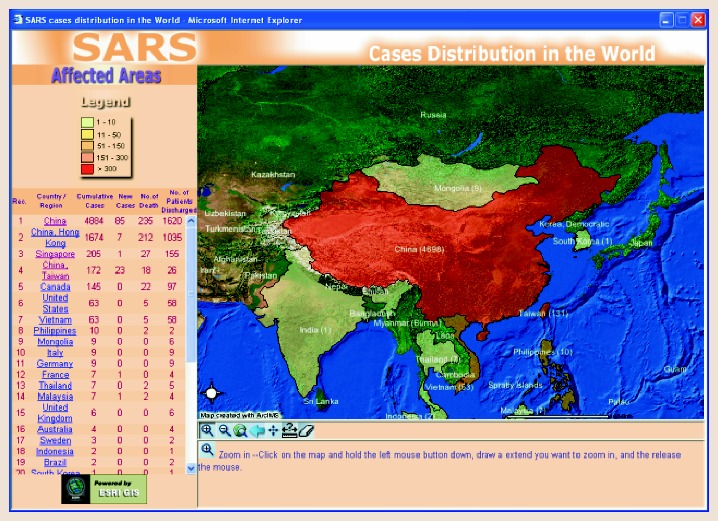
3. GIS Application 1: SARS Cases Distribution in the World
This source discusses the evolution of the application of GIS within Health and Human Services. During the SARS outbreak of 2003, WHO and Hong Kong Department of Health launched an interactive website mapping application to provide current, accurate information on the distribution of SARS in China and surrounding areas. These mapping efforts educated the public and travelers, assisted public health authorities in analyzing the spatial and temporal trends and patterns of SARS, and helped authorities assess and revise control measures.
Source: https://pmc.ncbi.nlm.nih.gov/articles/PMC7121355/
4. GIS Application 2: Emergency Department Usage
This source discusses how the percentage of emergency department visits change from 2010 to 2012 via zip code. This data was created via Wake County’s (North Carolina) Community Health Needs Assessment (CHNA). This visualization allows for public health officials to understand where need is within the community, and implement proper interventions.
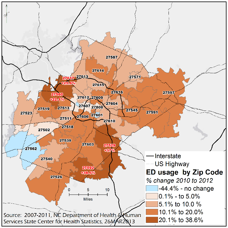
Source: https://sph.unc.edu/nciph/gis/
5: GEOG291 Quiz was completed.