Jolliff Week 5

Chapter 4

Chapter 4 was really weird When I went to set up my folder connection I was unable to do so and since I couldn’t do that I skipped most of the chapter

Chapter 5

For 5-3 after going to to projected coordinate systems>UTM, NAD 1983 wasn’t there, I moved on to 5-4. Council Districts saved in Chapter5.gbd was not available. I pushed through to 5-5, got to 5-5 and couldn’t get the table to download. I clicked ” download” but then I couldn’t find it anywhere. There was just a screen that said “Triggering Download…”. I went to tutorial 5-6. I couldn’tĀ  get past the part where we add Saint Paul to my car. Bicycle _Count_Stations was not available. I went to chapter 6. I was sad that not a whole lot in chapter 5 worked.


Chapter 6

6-1 went great. 6-2 Chap 6 gbd. was unavialable. went ont o 6-3. everythign was goign fine until 6-6 table but kept going. Chapter 6 wasn’t bad.

Chapter 7

Chapter 7 went well only had issues in 7-2 when the parkign lots polygon trace feature wasnt working i just moved on and the rest was fine.

Chapter 8

Chapter 8 was good until i got to re-matching the ZIP codes in 8-1. so i moved to 8-2 the rest was fine.

Jolliff Week 4

Wowza, I didn’t think that following along in tutorials could be so time consuming and difficult. I do however think that IĀ  was able to understand what I read during weeks 1-3 . This being said I realize now that you should start the weekly assignment in advance so that you aren’t cramming assignments because spending 5 hours in the GIS lab in one day is not it.

Chapter 1

Chapter 1 was a good intro into layers and kind of the basics of how to use Arc GIS. I thought that this chapter helped me to piece together some things from the reading. I was grateful for the tutorials and the step by step instructions. I especially was thankful for the hints. Once I got through chapter 1 I felt like I kind of had an idea of where things were and how to save my projects and name them. Honestly, I think figuring out how to download the tutorials was the hardest part for me. But, we managed and got through it.

Chapter 2

Chapter two gave me an idea of how to apply some of the things I learned in chapter 1. These tutorials walked me through how to make a map look like a map someone could use. I learned how to add labels and features. For tutorial 2-4 there was a red “!” next to Neighborhoods so I Couldn’t make the graph or anything for that section, it kept saying that there was no data, I tried reopening the tutorial but it didn’t fix the issue. Because of this I wasn’t able to complete 2-4 but I continued and got the chapter done.

Chapter 3

Chapter three was wild I handled 3-1 well, Building layouts and charts was a breeze but for some reason I had a difficult time figuring out how to share my map online. I managed to get to the part where you get to the MapSharing.pdf but the pdf was blank there was no text any where and often times no matter which browser I used it told me I was unable to see the pdf. This unfortunately hindered me from completing 3-2 and 3-4 . So I need to figure that out but I think once I do, it won’t be that hard.

Jolliff Week 3

Chapter 4

Chapter 4 ā€œMapping Densityā€ explains how mapping density allows you to see ā€œpatterns of where things are concentratedā€. While some maps emphasize specific locations of features, Density maps focus on the patterns of certain features. I thought this was interesting because in the previous chapters we were looking at specific features, like individual crime scenes. With a density map it is more of a broad way of showing where for example the most crimes occur, and through this type of map you can see patterns of where the most crime is located or where there isn’t as much of a concentration of crimes occurring. Density maps can provide you with a density measurement per area. Raster layers are used to create density surfaces. Based on the reading the raster layers allow us to see concentrated features. I think if Iā€™m understanding this correctly, you can have a cell of a map and if you take a radius around that cell you can figure out theĀ  amount of features within that radius and that number is assigned to the cell and after you do that with all of the cells that is where you get your smoothed area of concentrations. Search radius can be large or small. Larger search radiuses show more generalized patterns, while smaller search radiuses show more local variation.

Chapter 5

I am having trouble understanding how all of these maps are different. I think they are different based on the features and also how the features are being analyzed. This chapter seems to be talking about what is going on in an area. You can monitor what’s happening this way, or you can use this information to compare different areas based on what is happening to them. They give the example of potentially mapping the affected area of a toxic plume. If not for this information appropriate action could be taken by the public or those with the ability to handle the situation. You can show boundaries of certain things such as buffers around streams, soil types in a parcel of land, and floodplains. I think that this is an interesting thing that I haven’t thought about before while looking at maps. On the topic of discrete or continuous features, discrete features are features that you can easily identify and they are unique. They are locations, addresses, crimes, etc. With continuous features you can summarize the features for each area.

Chapter6

In the chapter, Finding What’s Nearby, I learned that you can set distances and you can figure out what is going on within these distances of the certain feature you are looking at. You can label the nearness of a feature using distance or travel cost. I have gathered that it is important to know what information you will need because that will help you choose the best way to carry out your analysis. There are three ways of finding out what is nearby. Straight line distance, distance or cost over a network or, cost over a surface. Straight line distance is what you choose a specific source feature and the distance and then the area is found within the distance that you specified. When it comes to layers you need the source feature and then a layer with the distance to form what you are desiring. Straight line distance allows you to create boundaries around a source.Ā  With Distance or cost over a network, I see this as when you put an address in your google maps and it shows you all of the routes and which one is the fastest. At least this is what I have gathered from the reading. Cost over a surface is when you have locations of source features and a travel cost. Adn from that ā€œ ā€œThe GIS creates a new layer showing the travel cost from each source feature.ā€ Cost over surface is more for overland travel, while cost or distance over a network is if you are traveling in fixed infrastructure. And for straight line distance this would be used for estimates of travel range.


Jolliff Week 2

Chapter 1

This chapter did a lot of introduction to GIS. Going along with the reading we did last week helped me to better understand the basic level things that GIS is about. I think until I start to familiarize myself with the actual software and see what certain things do it will be a bit difficult to understand. While the reading gets my brain thinking about it, I can’t really wrap my head around everything fully. This chapter did a good job of explaining what GIS analysis was (before reading I still wasn’t quite sure). It became clear that geographic patterns and relationships between features is a big part of GIS analysis. I believe that the idea behind GIS analysis is to make visual representations of these patterns and relationships. As humans it seems that we need to see things to understand them. By Using GIS analysis we are able to connect the dots between certain attributes of an area. By using different types of data we can find relationships between things, or provide evidence that there is no relationship between certain features. It was interesting learning about the vector and raster models. Vector models tend to be more precise and are good when it comes to showing fixed features like a mountain range is. But if you were trying to show different elevations of a mountain range using a vector model would get confusing. This is where you would use the Raster model with pixels. Raster models are good but if your pixel size is too large then you lose some information if the pixels are too small then you take up alot of storage space. It was interesting to learn that there are certain things that are good about each model.

Chapter 2

While reading this chapter it seemed to me that it focused on the building blocks of making maps, or at least the things you have to think about and do when making a map. Being able to understand why it is important to map where things are, deciding what to map, preparing your data, making your map,Ā  and analyzing geographic patterns are all important if you want to get the most out of your GIS analysis. As I was reading, it made sense that it is good to understand what you are looking for when you are getting ready to make a map. It seems that there is always some sort of question or problem trying to be answered or solved, and that is why a map is being made. For example if a law enforcement agency wants to know where the most crimes are happening in the area of a given period of time, so they record where each crime is taking place and then from there they can see where a majority of crimes are happening. The audience seems to be a crucial part in deciding what kind of map to make and how to present it. Knowing what kind of categories you want to present on your map is important. I understand that each feature that you want to have visible on your map has a code that identifies its type of feature. The way I understand it there are larger areas of features, for example zoning areas like, rural, residential commercial, etc. within those categories they get split down further. ā€œRuralā€ may encompass more specific features like, rural residential and agriculture & forestry. However when expressing the more specific features on a map having too many features in a given area can make the map very difficult to understand and ā€œbusyā€ so in some cases less is more.


Chapter 3Ā 

I recognised in this chapter that it focused more on the quantitative features of map making. When representing quantities on a graph, different sizes of shape, different gradients, and colors are used to depict different features of the map. Quantities can be shown in the form of counts, and amounts, ratios or ranks. The total amounts are shown as counts. Totals are the value associated with a feature. These two, counts and amounts can be mapped for discrete features or continuous phenomena.Ā  Some times when we are mqppign quantities we are looking at quantities in a given area, like anual snowfall in a place. In this case we would not use counts and amounts we would use ratios. Fro example it would be anual rain fall per square mile. When using ranksin a map you are orderign the features of the map from highest to lowest. I enjoyed the part of the reading about contour lines. I fel like those are a very common thing to see on maps and it was interesting to learn about them. Contour lines have to be big enough to show accurately the features that you want to show but not too small that you cant tell what you are trying to represent. Over all this chapter did a great job of explaining more about making maps.


Jolliff Week 1

My name is Hazel Jolliff. I am a Junior and I am majoring in Environmental Science. This is only my second year as an Environmental Science major so I am still kind of new to it all. I run Track & Field here at OWU and my main event is javelin. I am a commuter and I live on a farm and i love my pigs, so that is fun! Other than that I’m taking this course to learn more about GIS and get an idea of how it all works.

The Shuurman reading was very interesting to me. GIS is a pretty new concept to me and I didn’t realize how much it affects our everyday lives. There are alot of people and places that depend on GIS for things. The readingĀ  explained the beginnings of GIS and how it was just a regular map with different layers on top. I thought this to be pretty simple but it explains that with technology now, it is much more efficient and has expanded more than what it originally was. The reading talks about the early computers and how they weren’t able to do nearly as much when it came to GIS as they can do now. Even though the first computers werenā€™t around that long ago it shows that GIS has come a long way in a short amount of time. I find this interesting because GIS seems to have a hold on the way things function in this world. It says in the beginning about how Starbucks uses GIS to figure out where its best coffee shops are. And it seems fairly obvious that Starbucks also has a hold on the way things function in this world. Big businesses, all the way to farmers/ranchers figuring out where to graze their livestock, GIS is an important resource and I guess this reading really opened my eyes to that fact. In the first section of the reading there was a paragraph or two explaining that some Academic Geographers have a love/hate relationship with GIS. Going on to say that GIS is only ā€œone lens on the social and physical worldā€ so Iā€™m wondering if academic geographers are concerned that too many young people are going to only focus on GIS instead of the other forms of mapping and what not.

My Searches:

#1. My search was ā€œ GISā€ and ā€œCrop Damageā€

Reference: Lou, W., Ji, Z., Sun, K., & Zhou, J. (2013). Application of remote sensing and GIS for assessing economic loss caused by frost damage to tea plantations. Precision Agriculture, 14(6), 606ā€“620. https://doi-org.owu.idm.oclc.org/10.1007/s11119-013-9318-5

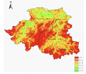
The article titledĀ  ā€œApplication of remote sensing and GIS for assessing economic loss caused by frost damage to tea plantationsā€Ā  focused on developingĀ  a way to determine economic loss due to spring frost in tea plantations. The map used remote sensing and GIS to form a spatial distribution of temperatures in the given production area.

#2. My search was ā€œ GIS Applicationā€ and ā€œArchaeologyā€

Reference: Ebert, D. (2004). Applications of Archaeological GIS. Canadian Journal of Archaeology, 28(2), 319ā€“341.

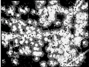
The journal was titled ā€œ Applications of Archaeological GISā€. This is an example of a predictive model, the dark circles represent existing sites that were used to base the model off of.