Uible week 6

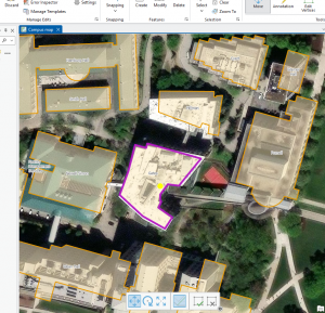
Chapter 7 is much easier than some of the other chapters we have done in this GIS program. For the first tutorial, we had to move specific buildings to align them with the building shapes on the map we were looking at, which was very easy and took only a few minutes. Example two of Chapter 7 began by creating a specific point in the University parking lot, ensuring it was a specific color and could be shown on the map. The other part was that we were deleting specific things and making sure they stayed deleted. In tutorial three, we had to use a smoothing tool to smooth out Flagstaff Hill, which was very confusing at first because I couldn’t find the specific tool they asked for. I looked it up, found it, and it didn’t take me much longer. After that, the specific tutorial asked me to smooth out the specific areas it specified. for tutorial for we had a specifically put the colors on the specific building and have them make sure they were correctly color coordinated at first they didn’t come through due to the layering on top of it, but the tutorial showed us how to make sure that the layering didn’t cover them completel., this one was specifically really fun to figure out as it made identifying specific things in the building more interesting and you could figure out an office space a classroom hallways restrooms and this kind of shows out how building planning works, which is very interesting. Out of all the other chapters we have done, I think chapter 7 is probably one of my favorites. It adds onto things that we’ve already learned how to do, exactly as well as adding some new things on top of what we’ve already learned, and keeps expanding the specifics of what other chapters already showed.


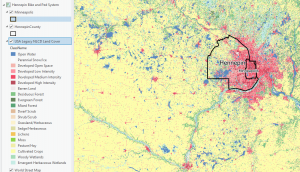
Chapter 8 had only two tutorials, but both were somewhat long, especially the first, which asked us to build specific features based on ZIP Codes in Pennsylvania, Ohio, West Virginia, and Maryland. in the tutorial, we may have started out very big with those four states, but it’s specifically broke down into defining the specifics in a very quick manner where we specifically went down into major cities like Pittsburgh, which was very interesting because we went from very large very quickly to very small, and I only a matter of minutes and only a few clicks between each one. Compared to the first tutorial, the second tutorial was a little easier but a little bit more tedious. We specifically had to put many things down, like our left address and the locator house address, which was very confusing at first when reading the specific tutorial. Compared to tutorial one, this one definitely took me a little bit more time, but it was definitely worth it. It was very interesting to see how, with just a few numbers, you can point out so many different places in such a major area. Both of these tutorials were a little confusing, but after a little bit of time, I figured them out with very little problem and felt like I completed a harder assignment compared to chapter 7, even though chapter 8 only had two examples; these two examples were a lot more complicated compared to the chapter 7 examples

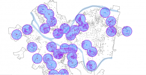
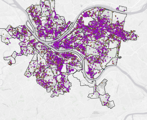
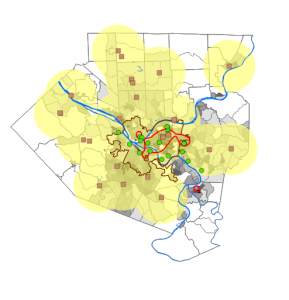
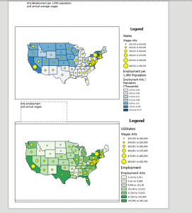
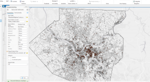
Chapter 9 is kind of like Chapter 7 in that the tutorials didn’t feel as hard, but there were many of them to do in tutorial one of chapter 9, we were trying to find the pools in the area of Pittsburgh, which was really interesting because at first we had a plug-in we were looking for pools directly and then we put them all into .5 of a mile which the map shows us and these giant blue circles, which areas in a .5 mile each other have a pool and some of these areas overlap with each other but certain areas have a pool to them in tutorial too we do almost the exact thing is tutorial one but instead of .5 a mile we switch it to a mile. This gives us another set of circles inside the larger circle we made in the first example. This adds an additional buffering ring to our original circle. in tutorial three of chapter 9 instead of having the circles it’s this time we have the map of Pittsburgh and each pool is labeled with its big dot and where it relates to all the other pools and we can kind of see any more colorful pattern, where each pool is compared to the other one in distance darker the color it has meaning it is the pool and the lighter color it is is how far it is away from a pool. It has to calculate the average of a pool of values that are not adjacent to each other. In Example 5 of Chapter 9, we did a data clustering analysis. We collected data from specific areas in the city of Pittsburgh on crimes committed by age and on how likely people were to commit those crimes in those areas.

Uible week 5

Chapter 4’s tutorial 3 was the most interesting of all the ones that. We’re in this specific chapter. We looked at a bunch of crimes in Pittsburgh and broke down how to examine each one and where they occurred. In this tutorial, we split many of the crimes into exactly where they occurred, when they occurred, which crimes they belong to, and how many of the crimes were specific types of crime. If it were a burglary or a robbery, we would have to look specifically for those things and pinpoint them on this map. They asked us to define where each of these crimes occurred by entering specific codes. Chapter 4 felt much smoother while doing all this compared to chapters 1-2 and 3, after spending lots of time in the lab trying to figure out how to make sure these run right and that I had done them correctly. Chapter 4 went by very quickly and felt like I was moving through it effortlessly, so it didn’t take me too much longer than the previous chapters. 

Chapter 5 Tutorials We’re very simple compared to the other two. The first one they asked us to do was to center the United States in the world, which took very little time.  The second tutorial of the chapter was also quite simple and specifically had us center the world as they have it is on the globe, which was more of an oval shape. The other tutorials we looked at in this chapter led us to examine the census data for NYC. One of the last ones we looked at was the spaces in Minnesota. 


In Chapter 6 tutorials, the ones I remember, we looked at the NYC boroughs, put the name “Upper West Side” on the map, and specifically marked out the neighborhood in downtown NYC. Also, in a different tutorial in chapter 6, we pinpointed multiple of them, Firehouses and police stations in that area on points which. We use a method that lets us pinpoint all of them very quickly, so we didn’t have to pinpoint one after another, since there are multiple firehouses and police stations. . 

Uible week 4

Chapter 1 –  this chapter shows how GIS maps work and how they work and how to run them. in the first example they show the real basics of the map works as well some of the things we can do the GIS map. At first glance it looks really off putting and  but how they set up the tutorials is really simple in how they structure it. They ask us first  to look at the population of the Allegheny county.  They point out if you move some things in a different order they GIS map dose not work when we move it over we cant see the other things like roads or river that are their. They as us to movie it back so we can add more things to they map. They do as us to put the city of Pittsburgh on their were the greatest  part of poverty are. They also tell us we can remove layers so we can get a better view of the things around the city or the population around it . In the second exercise they want us to do is just more around the argpro and get use to doing this in the program. it shows us how to zoom in and how to get really specific to get the best information. shows us how to add date into it and how it should look like when we add it into the software. it also shows how to put symbols  on for point like the health centers .it also shows how you can see things like density in a different way. Before reading this chapter i was very worried about doing GIS stuff because i have never done anything like it. After reading this and doing the tutorials it feels like i can do this and it would be to hard.

Chapter 2

Chapter 2 was a very fun yet somewhat interesting chapter. For the first part, we split the Bros into many different colors to determine exactly what they were, which, in my opinion, was very fun yet somewhat difficult after a long day of classes. It asked us to put multiple of. Each part of the city is a different color which trying to figure that out. Was very interesting because the colors had unusual names and were not the usual ones. In example 2 of Chapter 2, we got to label different parts of the city. Doing this made understanding parts of it much easier and simpler to label, such as the lower part of the east side. Doing this made it much simpler for me to understand and to know exactly what to do with it.  Hudson put labels of specific things, such as Soup kitchens or food pantries. This was simpler than I thought it would be, yet it still had some difficult parts. The other examples I found very interesting after splitting up the Manhattan area into. Where certain things are, you can see the graduation size based on the data we received, which I thought was very interesting. It took a lot more time than the other ones, but it was still very helpful and made it easier for me to understand what was going on with this map One of the other examples was that we got to do the population of New York in the small area of Manhattan and you got to see how spread out the population was, specifically in The southeast part, closer to the Jersey area where it was super dense and it was. The last example I taught us was ranges for the Manhattan area and the other areas around New York City.  


chapter 3

Chapter 3 was a simple, easy-to-understand process. The first part of what we did was create our own map layout. The first part is that we got both maps. Into one page and put it next to both of them. The instructions on this were very simple, making it easy to complete quickly. After you put the two maps on the page, we added guides explaining what each figure meant, population-wise and in monetary terms, for the first map. We did the same things as for the first map, but for the second map. Three put both maps onto the page and made legends for them. We then made charts for each map. We had to enter the X&Y for each state to calculate where they would be pinpointed on an X&Y graph. The second exercise in this chapter was to share our own graph online and explain exactly how to do it. The process was very simple to understand, and it took me very little time to figure this out. Showed us how to share it publicly or privately with specific people so that people from all over can see what we worked on. Also, once we are done sharing this object, we can view it and change how people see it or how they want to view it. They can either zoom in on the feature or adjust multiple layers of the map itself. The last example of Chapter 3 was how to make a Dashboard in GIS Pro. There are a lot of steps to this, but each is very simple and shouldn’t take you long to understand, and it explains exactly what to do for each step. These three chapter have been fun to work on but can be time consuming 


UIble Week 3

Chapter4-Chapter 4 talks about the importance of using. Density maps: how they’re used, what they should be used for, and how the GIS System is used to make these kinds of maps. With your data, you can decide what kind of way you want to map out density. It tells you exactly which density map to use. Is specifically why you should use them. The two ways you can map out density are defined area and density surface. Both use completely different ways of mapping density and have many benefits and some downsides. When mapping by a defined area, you are either using mapping dots or calculating the Density value for each area. Using dot density mapping, maps show density graphically rather than the density value. A density surface is usually created in the GIS as a raster layer. This approach provides the most detailed information but requires more effort. When using a density surface, you usually use colored layers to indicate how Many of one thing are in that area. When using it, use specific colors to better interpret the dot-density map. It is important that you don’t make your dots either too big or too small or place them in a way that makes the pattern unrecognizable. If you do this, it might be very hard for a person to understand your map and the main points you are trying to highlight. Make sure to always double-check your units because this may affect how your map is displayed and the information on it. If you are using. If you have a density layer map and use a different unit, it may calculate and display your information differently from how you want. 


Chapter 5- When trying to figure out what’s inside your map, an important thing the chapter says is that you might want to circle the area that you are trying to understand. When trying to figure out what is in your area, there are many ways to do so, and the methods you use depend on the information and data you have. Ways that may determine your data include whether you are looking into multiple areas or one specific area. If you are looking to explore multiple areas, show how much of something is in each area. If you’re looking at multiple areas, you’ll want to be able to identify each area by name. If you, for example, were using fire stations across multiple areas, you might want to list each fire station as fire station alpha, fire station delta. It lets you compare the areas together. If you’re looking at a single area, you can monitor and summarize information about it. When looking at features inside an area, can we list them as discrete or continuous?  Discrete features are unique to that area. Count them or put a numeric value on them. Continuous features represent seamless geographic phenomena. When reviewing your Analysis, you will need to determine whether to list, count, or summarize all your attributes. You can choose to include only features that fall completely inside, features that fall inside but extend beyond the boundary, or include only the portion of the features that falls inside the area boundary. When trying to find what’s inside an area, there are multiple ways to draw the area and its features, select the features within the area, and overlay the area and its features. Each of these has its own benefits and trade-offs. Drawing areas and features helps figure out whether things are inside or outside an area. The trade-off is that it is quick and easy, but it’s only visual. A summary of what’s directly inside the area. The trade-off is that it is good for getting information within a single specific area. Overlaying the areas and features. Identify the features within multiple areas and summarize them by area. The tradeoff is More time consuming and requires more processing from GIS


Chapter 6: When trying to figure out where something is in relation to something else in GIS, we will have to decide whether to measure it by distance or cost. Distance is one way to define and measure how close something is. The other would be by the coast, depending on how long it would take to get there. Once you find nearby items by distance or cost, you will need to determine how many items to list, count, or summarize that are near what you are measuring. When looking for this, a thing that might be Inclusive rings. Which rings would help you find what’s in the distance or within your budget? Another helpful kind of ring is a Distinct band. These bands are useful for comparing distance with other characteristics. Whenever you’re trying to figure out what’s inside, there are many different ways to determine the distance between each thing. There are three ways to determine whether they are straight-line distance, distance, or cost over a network, or cost over a surface. For using the straight line distance. Its prose is relatively quick and easy, and it measures distance. The cons of it. It only gives you a rough approximation of travel distance. When using distance or cost over a network, it measures the distance or cost. It gives a more precise travel distance. But the downside is that it requires an accurate network layer, which can be challenging. Cost over a surface measures cost. Its prose lets you continue combining several layers to measure the overall travel cost. It requires some data preparation to build a cost surface, which may cost you extra time. After determining which one you’ll use, you’ll have to create a buffer. Buffers draw lines around a feature at a specific distance. 

Uible Week 2

Chapter 1 Notes- GIS use has grown enormously. Spatial data has become more abundant, and we now have new ways to access it using LiDAR and drones. Scientists are discovering that GIS is not just for map-making and geodatabases. By learning to use GIS for analysis, you can obtain more accurate, up-to-date information. By using GIS, you can better understand the place you are studying and make more informed decisions about its future. In the upcoming decades, it is said that GIS will continue to grow and expand our understanding of the world. Chapter 1 also breaks down many different kinds of maps, what they are, and what they show. They also show what they are used for and how to use them. Besides talking about GIS and how it worked, it also gave us websites like ArcGIS, which were pretty interesting to look at. As well as. Living Atlas of the World is another GIS website to look at, which I may spend some time exploring the data they have on their site. Some of the import definitions they gave were for GIS, which, in simple terms, involves analyzing geographic patterns in your data and the relationships between them. They also list the five types of attribute values, describe them, and provide maps showing how each is used. The five attribute values include categories, ranks, counts, amounts, and ratios. Categories are groups of similar things that help you organize and make sense of your data. Rank was described as a feature, ordered from highest to lowest. They also tell us when we should use ranks when direct measures are difficult to obtain. Counts and amounts show you the total number of your data. The count is the actual number that appears on the map, and the amount is a quantitative value associated with the feature of the number. Ratios show the relationship between two quantities. 

Chapter 2 – Chapter 2 mostly discusses how to use maps in GIS and make them readable for everyone. In the first paragraph of the chapter, it asks why we should use maps and why they are important. The example they used was about the police, where crimes are in the area, and what they were. As they tell us, some helpful things to look for when gathering information for mapping. The book’s example was to see where customers were from, so they could put an ad in that area and attract more customers, which led to more business. As well as telling us when we are mapping, that we should have the absolute location of the area by Gps or coordinates. So we can get the right area, we are mapping it out. One of the points they brought up was to make sure that we give Category values to what they are. To bring it back to the first example, when they were mapping the crimes in the area of the business, what kinds of crimes were they, and where exactly were they happening? When making the map, we can place all the figures on the same layer, but make sure they do not overlap. They point out that when we are mapping, we use different symbols for different categories to avoid confusion. The example they used was roads, where a darker, thicker line indicated a main road and a lighter, thinner line indicated a residential road. The chapter also points out that when we put it all together, the layers may reveal a new pattern between the categories. It says we can use up to 7 categories; anything more might be a little confusing to others when they look at the map. 

Chapter 3-in chapter three, they ask why mapping the most and least is important. They explain that having more qualities helps understand and find patterns, and recognizing these patterns helps associate the map with better directions and answers. To map the most and least, you map features based on a quantity associated with each. In the example in this chapter, they give us a company trying to sell children’s clothing. The Company would try to find areas where young families have set up so they could sell children’s clothes to them. Knowing the quantities helps them determine which areas to put ads in or to reach out to more people. This chapter also talks about the things we will be mapping and what they represent. Counts and amounts are one of thing they talked about for mapping. Counts are the actual number of features on the map. Ratios are another type; they show the relationship between two quantities and are expressed as the ratio of one quantity to another. Ranks are the last ones; they are listed in order from high to low. They show relative values rather than measured values. It also talks about creating a class. Once you know your quantities, you can decide what they represent on the map. By mapping individual values, you can make a more accurate map, though it may take more effort and time. Once you know how to classify your data values, you will want to create a map to inform viewers. The chapter shows us the difference between the symbols in maps. Graduated symbols, Graduated colors, Charts, Contours, and 3D perspective views are the. Based on these, you can have a better understanding of what the map is.

Uible Week One


Introduction: Hello, my name is Henry Uible. I am from Jupiter, Florida, and Dothan, Alabama. I am majoring in history and minoring in geology. With a background in history and geography, I plan to teach or work in national parks; hopefully, this class and working with GIS will give me an advantage in getting jobs in these areas. I am new to using GIS and all that entails, but I am very eager to learn and get started.


Reading: It’s interesting to see that college students are lining up to take GIS classes, and that GIS software is generating significant revenue. It’s also interesting how GIS got started in the 60s by some dude using a map to figure out how to build a road that would help his community. It’s interesting to see that when GIS was first being developed, people doubted its usefulness and questioned whether it would benefit many. Sounds like every government around the 1980s wanted to build a GIS system to compile data. It is interesting to see how GIS is used, especially in the modern day. It’s also interesting that it’s not just scientists and students who are studying geography or using GSI for. In the reading, it stated that even farmers and. People doing landscaping use GSI to make sure they’re not damaging the environment by cutting down trees and that they’re growing their crops in the right place to ensure continued crop growth. One of the figures in the reading shows the historical context of cholera breaking out in London in 1854, which is really interesting to see because you can point out where major outbreaks occurred, where specific outbreaks could have been sealed off to save more people, and where particular wells were found to contain cholera, with this diagram. I think I’d also be able to show us many things for medical research, including where major outbreaks could occur and where we could quarantine specific areas. A map like this might also help paramedics and police officers determine where more medical assistance is needed in a city or town, as well as the fastest route to the area that needs it most. One of the takeaways from this was that GIS is not just for scientists; it is for everyone, and everyone can use it.

Historians are using GSI to understand better how battles unfold and why specific tactics were used, particularly when they occurred a couple of hundred years ago, when the terrain around them was destroyed by erosion or other Means. Well, GSI is also used to determine distance by looking at travel-related items from the ancient world shown in the first image. It shows how long a trip from Rhodes to many other parts of ancient Greece and the Mediterranean would have taken. Second image, they’re showing off the bombing of London from the German attacks, specifically during World War 2 of, where all the bombs were explicitly dropped on London. 

I also took the quiz


Using Landsat Imagery to Find Shipwrecks – Geography Realm

About: Bomb Sight – Mapping the World War 2 London Blitz Bomb Census