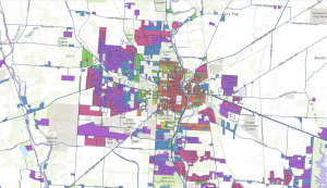
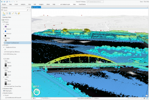
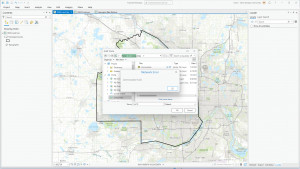
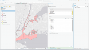
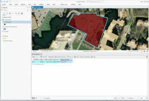
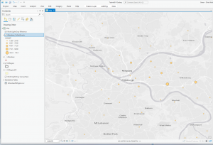
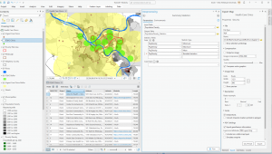
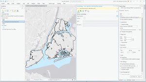
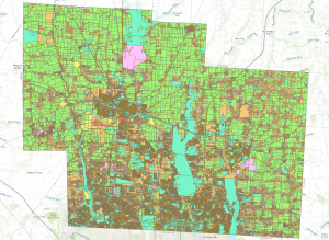
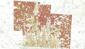
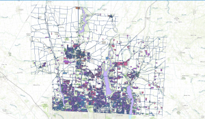
For the final in GIS 291: Geospatial Analysis with Desktop GIS, I began by downloading datasets (Parcel, Street Centerline, and Hydrology) from the Delaware County Ohio GIS Data Hub and opened up the maps in the GIS program. The first application I decided to do was Selecting and Classifying Land Uses. The first step was to open up the attribution table for the Parcel layer; this displays all of the data regarding land use in the format of Delaware County Land Use Codes. These codes include agricultural (100-199), industrial (300-399), commercial (400-499), residential (500-599), and exempt (600-699). Mineral (200-299) is usually a land use code, but the Delaware County area does not have any mineral resource parcels. The next step was to take all 5 of these land use codes and separate them into new layers to highlight the different land uses within Delaware County. I did this within the Parcel attribution table with the tool Select by Attributes; within this popup, I created the query “Class is greater than or equal to 100 and Class is less than or equal to 199” (this example is for agricultural land use). The query highlights all data points with a class code within 100-199, which in turn selects all of the land being used for agriculture on the map. Then, I right-clicked on the Parcel layer, and then under selection, I clicked Create a new layer from selection, which made a new layer in the contents column, which I then renamed to agriculture and selected an appropriate color for. Next, I repeated that process for the 4 other land use codes. The following colors match each of the 5 land uses; green (agricultural), yellow (industrial), teal (commerical), orange (residential), and red (exempt). For the second half of this application, I used the same process of selecting the data and creating new layers to highlight the different agricultural land uses within Delaware County. The 9 other land uses and their corresponding colors include; red (vacant land), orange (cash grain/gen farm), yellow (livestock), green (dairy farms), teal (poultry farms), blue (fruit/nut farm), purple (nurseries), brown (timber), pink (other). The agricultural land uses not included because they do not exist within Delaware County are vegetable, tobacco, and greenhouse farms.
Map of Land Uses:
Map of Agricultural Uses:
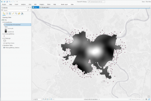
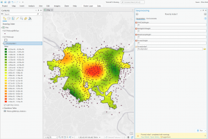
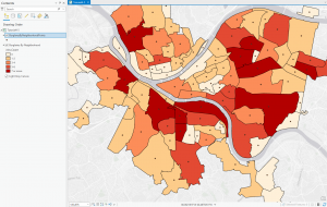
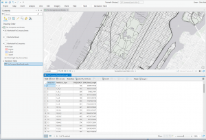
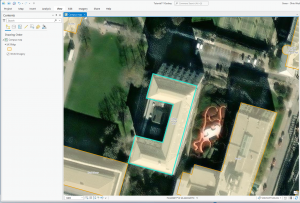
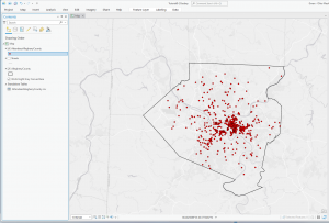
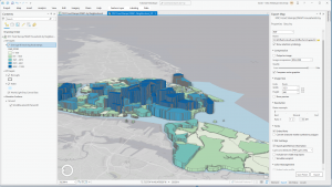
The second application I decided to do was Mapping Change. I began by downloading the Subdivision file from the Delaware County Ohio GIS Data Hub. Then, in the GIS program, I opened the following layers on my map: Parcel, Street Centerline, Hydrology, and Subdivision. First, I opened the attribution table for the Subdivision layer and located the column with the dates of the subdivision’s establishment; these dates range from 18080311 (3/11/1808) to 20240917 (9/17/2024). The next step was to separate these establishment dates into new layers to highlight the changes in urban development within Delaware County. I did this within the Subdivision attribution table with the tool Select by Attributes; within this popup, I created the query “Date is greater than or equal to 18080311 and Date is less than or equal to 18501231” (this example ranges from 3/11/1808 to 12/31/1850). The query highlights all subdivision establishments within 1808-1850, which in turn selects all of the subdivisions established during that time period on the map. Then, I right-clicked on the Subdivision layer, and then under selection, I clicked Create a new layer from selection, which made a new layer in the contents column, which I then renamed to 1808-1850 and selected an appropriate color for. I repeated that process for the dates 1851-1900, 1901-1930, 1931-1960, 1961-1990, 1991-2010, and 2011-2024. The following colors match each of the date ranges on the map: red (1808-1850), orange (1851-1900), yellow (1901-1930), green (1931-1960), blue (1961-1990), purple (1991-2010), pink (2011-2024). I also included a close-up of downtown Delaware because I think the changes in the establishment have been more noticeable throughout the decades (also, it’s cool!).
Map of Establishment:
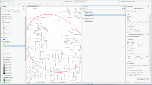
Downtown: