Plunkett Week 4

Chapter 1: It was a slow start for me as I was getting used to where all of the buttons were. I had trouble with clearing the attribute table because it kept telling me the clear button was at the top and it ended up being at the bottom. It’s fun to mess around with the maps.

Chapter 2:
This one once again started smoothly but I can’t for the life of me figure out where the dialog launcher is. I also had to separately add the files for neighborhoods on 2-4 because it kept saying there were no properties.

Chapter 3:
This one took a while because uploading the maps online took almost 10 minutes each. I’m now running into an issue with loading the second map, it keeps disappearing while uploading which makes me have to re-do the steps. I’ll come back to the online uploads.

Plunkett Week 3

Chapter 4: 

  • This chapter goes into detail about why you should map density and how to map it. Density mapping is used specifically when looking for patterns rather than individual features. There are two ways of mapping density, by defined area and by density surface. Using a defined area allows you to create a dot map, which means each dot represents a specified number of features. The density surface is created in GIS as a raster layer, which means each cell in the layer gets a density value that varies depending on what you are measuring. The use of color is also brought in again, when a part of the map has a higher density typically the color becomes darker to signify the amount. As someone who is not the best at math, I think learning how to calculate the correct density sizes seems to be important. The steps to this are to first convert density units to cell units, then divide by the number of cells, and then take the square root to get the cell size. Another important factor while mapping is your search radius. Having a large search radius generalizes the patterns of the density surface. You also need to specify your units, square meters can be used for something small but using it to track larger areas would not work. As we learned in previous chapters different classes need to be identified as they all have unique density values. Such as quantile having each class have the same number of cells. At the end of creating your density map know that the patterns you see depend on how the density surface was created. One cause of this was discussed earlier, which was having different search radiuses. 

Chapter 5:

  • This chapter is about mapping what is inside. It took me a little bit of reading to fully understand what this meant. Mapping what is inside means what is inside an area, so that if something occurs they can tell how close or if it is inside that area. Such as if someone was speeding in a school zone, they would suffer a harsher penalty. There are different methods for creating a boundary, and it depends on what you want to find. Some of the options to highlight are a service area, a buffer, a natural boundary, manually drawn territory, a floodplain, etc… You choose the barrier which also includes choosing if something that is partially in the barrier is included or not. Once the barrier is created you need a way of figuring out what is inside the barrier. You have to ask yourself what it is good for and what you need. To use this map you create a report in GIS of the selected features. Overlaying areas allows you to find the discrete areas and summarize them. 

  • Discrete:  These are unique, identifiable features. You can list or count them. They are either locations, such as student addresses, crimes, or eagle nests. They can also be linear features. 
  • Continuous: Represents seamless geographic phenomena. It can include spatially continuous classes such as vegetation or elevation range. 
  • Continuous Values: Numeric values that vary continuously across a surface. They can be measures of temperature, elevation, or precipitation.
  • Count: Total number of features inside and area. 
  • Frequency: The number of features with a given value is displayed as a table. 
  • Raster Method: Combining raster layers allows GIS to compare each cell on the layer with categories. It then calculates the areal extent and presents the results in a table. The areal extent causes this method to be the most efficient. 


Chapter 6: 

  • This chapter goes into detail about mapping what is nearby, which is mapping within a set distance or travel range of a feature. It seems similar to mapping what is inside but mapping what is nearby lets you find out what is happening within a set distance of a feature. To find out what is nearby you can measure distance or cost over a network, or measure cost over a surface. Just like in the last chapter with creating a set boundary, you also have to determine what is considered nearby. I wouldn’t have thought to think about whether you are measuring over a flat plane or the curvature of the earth. I almost forgot that it can change the distance. There are three ways of measuring what is nearby, straight line distance, distance or cost over network, and cost over a surface. After choosing which way works, the next step is to create a buffer that can see what’s within the distance of the source. Sometimes I forget that a lot of this process is gathering and separating data and not yet creating a map. In this case, once you need to make a map you can choose to present what is inside the buffer or what is on both sides. There are other ways to make a map as well such as point-to-point distance, displaying what is near a source feature, color-coded, a spider diagram, and many more. The rest of the chapter is repetitive in its form, it guides you through a measuring form, what GIS does, and how to map it. 

  • Rings: Useful for finding out how the total amount increases as the distance increases
  • Buffer: defines a boundary, multiple can be created at the same time
  • Bands: Useful if you want to compare distance to other characteristics


Plunkett Week 2

Chapter 1:

  • GIS has been growing enormously and the use of it is also increasing. It started as a database but now has many more applications. The first step of GIS is examining geographical patterns and the relationship between their features. This can be done by making a map of these patterns. The next step is to formulate a question to better understand what information you need, the more specific the better. You still may not have all the information you need after this which is why choosing the correct method for your analysis is important. Then comes the GIS to process the data. Finally, the last step is to display the results as a table, map, graph, etc.. Being able to see your processed data is important as it allows for patterns to be noticed more easily than looking at raw data. 
  • There are a couple of different features in GIS that affect the analysis process. 
    • Discrete Features: When there are discrete locations or lines the actual location can be pinpointed. 
  • Continuous Phenomena: Two examples of this are temperature and precipitation. Continuous phenomena can determine a value at any given location. 
  • Interpolation: A process in which GIS assigns values to the area between the points, using the data points. 
  • Summarized Data: Data representing the counts or density of individual features within area boundaries. 
  • Map Projections: Translates locations on the globe onto the flat surface of your map. The map projections distort the features being displayed on the map and this can be a concern if you are mapping larger areas. 
  • Categories: A process that lets you organize your data by grouping similar things. 
  • Ranks: This puts features in order from high to low and is used when direct measurements are difficult or there is a combination of factors. 
  • Counts and Amounts: Shows you the total numbers, and the number of features on a map. 
  • Ratios: Show you the relationship between two quantities. These are created by dividing one quantity by another for each feature. This is used to even out the difference between large and small areas. 


Chapter 2:

  • This chapter is set up similarly to the first chapter in which it explains the step-by-step details about figuring out what to map and how to use it. It also focuses solely on what is on the map and the presentation of it. To properly use a map one must figure out what map is appropriate for the issue addressed. You have to think about from the perspective of someone who knows nothing about the data, what would they need to see on the map to properly interpret the data. Just like in the last chapter with making categories, these features that were categorized need to have their code of identification. Codes can indicate the major type and subtype of each feature. 
  • Originally I had no idea how to start making these maps but I understand a bit better that each process is step by step and not all at once. Such as in making a single map type, you add features by drawing symbols on the map. Mapping by category can show patterns of that specific data. 
  • There seem to be a lot of different ways to present the data on the map such as mapping by category as stated before. Displaying the features by type allows you to use different categories to display different patterns instead of just using category information. However, with any feature, you do not want to display too much on a map as it can make patterns difficult to follow. To fix this problem you can always group the categories. 
  • I kept reading about symbols and wasn’t sure if it was as direct as it seems but it is. Choosing a symbol is as simple as picking one, but it can also help show the pattern of the data. Symbols usually use a combination of shape and color. 

Chapter 3:

  • The start of the chapter seems to be a small refresher to the last chapter about what you need to map. Once again it is important to remember who is going to be seeing the map, as you may be able to present the data differently depending on the person. In the past chapters there was a lot of discussion about mapping categories but mapping individual data is just as important. While it may take more effort it does create a more accurate representation of the data. 
  • Classes: Groups features with similar values by assigning them the same symbol and allows you to see features with similar values. This does change how the map looks. 
  • Natural Breaks: This is done by using classes based on natural grouping data values, separating them from highest to lowest. 
  • Quantile: Block groups with similar values are forced into adjacent classes. The block groups at the high end are put into one class. 
  • Equal interval: The difference between high and low is the same for every class. In this example, it allows for the blocks with the highest median income to be identified. 
  • Standard deviation: In this case, the classes are based on how much their values vary from the mean.
  • Natural Breaks: Values within a class are likely to be similar and values between classes are different. Due to the natural break finding groupings and patterns inherent in the data. 
  • There are multiple formats to make a map such as graduated symbols, graduated colors, charts, contours, and 3D perspective views. Understanding which features you are using is important to making the map. If I were to have discrete locations or lines I would use graduated symbols to show value ranges,  charts to show both categories and quantities, or a 3D view to show relative magnitude. The chart starting on 154 will probably be useful later down the course. 

Plunkett Week 1

Hello! My name is Gabrielle Plunkett and I am a senior biology major. A fun fact about me is that I have a cat named Finn who lives in my dorm with me.

I had never heard of GIS before coming to college, and if I did I didn’t recognize what it was. It interests me that they refer to GIS as a “scientific approach” due to the many different ways it can be used. It reminds me of when I took my animal behavior class and we discussed how there is no definition for the word behavior. It seems within this article people also define GIS in a myriad of ways. The term “black box” seems very fitting for GIS as many seem unsure about the legitimacy of these programs. However, as they gain more knowledge and the systems become better established people stop questioning the legitimacy. Since I didn’t know anything about GIS I also didn’t know there were different types. GISystems seem to be an identity of GIS while GIScience seems to be the theory that underlies the GISystems while still being its own identity. GIS seems to primarily focus on the system and hardware as a whole. To me, GIS seems to be taking a simple question and then asking it in multiple ways while forming digital entities, models, graphs, etc. so that it can be visualized. It also seems that every step of GIS has been disagreed upon such as the definition of spatial objects. I’ve read about John Snow’s mapping of Cholera before but never realized his map was a form of GIS. Seeing how GIS started from paper and pencil to the development of visualization to now is incredible. It does not surprise me that GIS quickly became widespread. Seeing a visual image of data is easier than just numbers for me, as I am more of a visual learner. I’m hoping I learn more about the different ways to use GIS and eventually get a better understanding of what exactly it does by doing it.


GIS and Crows

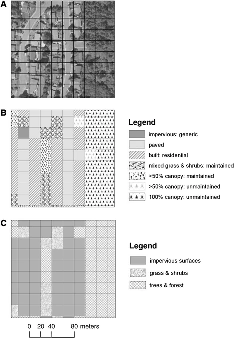
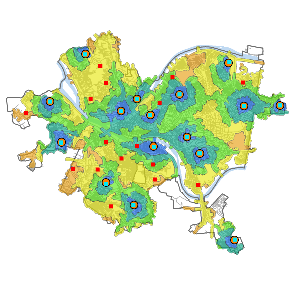
I’ve noticed a lot of crows on campus so I decided to see what I could find involving GIS. One use of GIS is the tracking of the type of land cover of American Crows. This figure shows the use of ArcGIS in creating grids to signify the different land cover/land use classifications of the study sites. The article studied the fine-scale characteristics of developed landscapes that may help explain the growth of crow populations in urbanizing areas.

Source: American Crows in an urbanizing landscape

In another article studying the dispersal rate of Juvenile American Crows, researchers used a program called RAMAS GIS to simulate the population growth of the crows and then put it into a model to visualize it. They used it to model two populations “urban” and “non urban”. This interested me because I have most likely looked at a simulated population model and didn’t realize it was done using GIS. There was no show model or figure for this section.

Source: Dispersal by Juvenile American CrowsÂ