Mulloy Week 5

Chapter 4

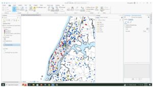
4-1 — This tutorial taught how to add new data to a project and make it readable by the program.

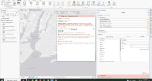
4-2 — I had an error with this tutorial. The book says to type “!GEOID10!” in the section where you calculate field for GEOIDNum, but in actually “!GEOID!” without the “10” worked perfectly fine, and gave me the ID without the leading zeros. Additionally, there was another error where they asked me to create 3 text fields through the attributes table which is not where you add fields.

4-3 — Much of this tutorial felt repetitive, as I believe we already learned (or at least it was very straightforward) how to select a range, and then only view selected items in the attribute table. Learning SQL was helpful, though.

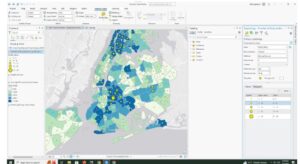
4-4 — 4-4 Was about how to use Spatial Join to aggregate data.

4-5 — I simply could not get this one working, the tool would not run and I was unable to figure out why.

4-6 — I had accidentally broken the data value once when I wrote the inputs/outputs wrong, as the book did not disclose which was the proper logic. I managed to fix it later, though.

Chapter 5

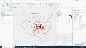
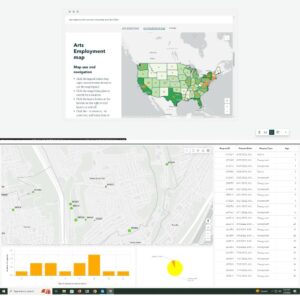
5-1 — I’m a really big nerd for Map projections so this tutorial I found really interesting. It was fun to play with the different world maps.

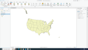
5-2 — This chapter was the same as the previous, more or less, but for the U.S. instead of the world.

5-3 — I felt pretty confused over the purpose of this tutorial. I understand that it was to change the Coordinate systems the map used, but it had a bunch of extra information or things it wanted me to do that felt completely arbitrary or irrelevant.

5-4 — This was a confusing and conflicting Chapter. I couldn’t find the “Display XY Data” option they were talking about. Then, they said to delete the Libraries Table, but there were later steps that required the Libraries Table.

5-5 — Completing this section requires waiting 40 minutes for a 1.4 Gigabyte download.

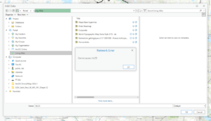
5-6 — I received an error message when trying to access NLCD that said “Network Error: Cannot Access NLCD”

Chapter 6

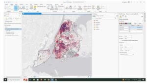
6-1 — This tutorial was incredibly confusing, and I was barely able to figure out what it wanted for the final part of it. My only question is what does normalization do? The final “Your Turn” asked for symbolizing with graduated colors using the field Sum_TOT_POP and normalizing it with Sum_SQ_MI.

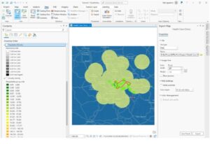
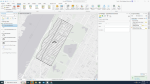
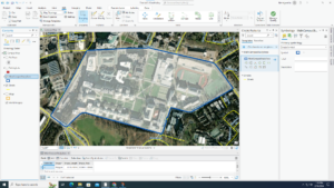
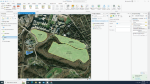
6-2 — This taught how to select certain features within an area, then how to clip them to fit entirely within it.

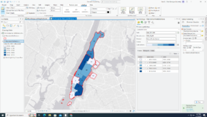
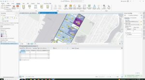
6-3 — I encountered an error at the end in which I was unable to merge the NYC Waterfront Parks into one layer. There was not much information on the error message so I was unsure how to fix it.

6-4 — This showed how to use the append tool to merge data.

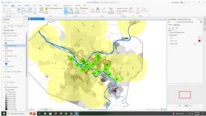
6-5 — This section showed how to merge data from an area feature to streets. It seems useful to be able to know what streets are in what division.

6-6 — This was more about merging and summarizing data from tables.

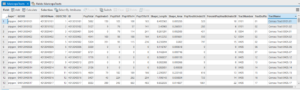
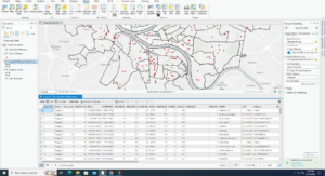
6-7 — When told to do the summary statistics for the total number of disabled people per Fire zone, I was able to figure out which was the correct Input, case field, and statistic field to input to get the proper summary statistics without looking back at the book.

Chapter 7

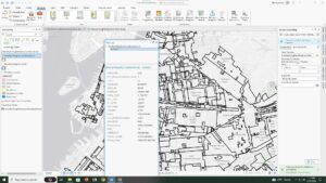
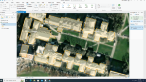
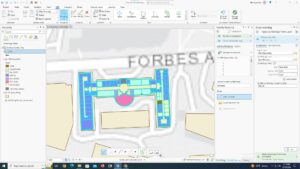
7-1 — This quick section covered how to edit polygons on maps. It’s nice to finally learn how to edit features after 7 chapters of tables and computing

7-2 — Learning to create the features for the feature class finally was also nice.

7-3 — Having smoothing done by an algorithm seems to be helpful so I wouldn’t have to worry myself about making it perfectly smooth.

7-4 — The transform tool was slightly hard as I could not find the exact vertex of the layer I was transforming.

Chapter 8

8-1 — I wish that more often the book would tell us exactly what each part of each tool does and why it’s needed. It can be confusing just filling out these tools without it. This chapter’s introduction was very helpful in understanding the tools, though. I feel like I was really understanding what the tools did and how they worked rather than just confused clicking.

8-2 — This section I feel the same way, although this was slightly more confusing, as none of the fields were explained fully for the create locator tool. I think that maybe a table or chart that fully explains each tool we use would be helpful.

Mulloy Week 4

Chapter 1

1-1 — I do not have any questions or comments on this chapter overall. I am very confident in my computer abilities and knowledge, so learning this program has been very easy for me, as much knowledge has transferred over.

1-2 — This section was very simple and mostly just covered how to navigate the  programs menus and maps.

1-3 — This tutorial was about learning how to use the attribute tables and the summary statistics tool to get statistical information from the map.

1-4 — This section was all about learning how to label things and add or change symbols for features. I could not get the 3d Map to open.

Chapter 2

2-1 — This taught how to assign different colors to different feature classes.

2-2 — This taught how to label features and change the label properties. It also teaches how to manage pop ups when selecting a feature.

2-3 — I found the part regarding setting each symbol to a different shape and color tedious from previous sections, however knowing how to separate features based on other classifications is very useful. 

2-4 — For this one, I ended up running into a problem where the source data was not set for the “Neighborhoods” layer, and I had to manually set it. Luckily, it was pretty easy to find it, because the file paths were all named logically.

2-5 — This was a very short section on a very simple concept that expanded off previous ones, just using symbols to explain

2-6 — Learning how to import settings from a different layer and apply the same parameters to another layer is incredibly useful for comparing the two layers.

2-7 — This section showed how to use density dot maps, which is the other density map we learned of in the previous book.

2-8 — This taught how to adjust which features/labels can be seen from different zoom levels. This is very useful to prevent clutter, however I wish other virtual maps allowed me to change these min/max of visibility. I often find myself unable to determine what area of a map I’m looking at when zoomed too far in. 

Chapter 3

3-1 — It’s strange, I feel, that map layouts were introduced at the very beginning and are not mentioned again until this point.

3-2 — Using WebGIS was a nice change of pace. I feel this is far simpler to navigate than Desktop, but it also feels more limited.

3-3 — I quite enjoyed being able to learn how to display my data in a meaningful and organized way, even if they did just tell me to copy and paste everything.

3-4 — This final section of this chapter was about how to create and assign data to graphs, charts and dashboards. It was quite interesting and at this point of the class it feels like we’re getting to the point where this information can really be applied to the real world and used in meaningful ways.

Mulloy Week 3

Chapter 4.


This chapter covers mapping density and the process of deciding how to do so. The primary use of density mapping is to determine patterns and groups, rather than analyze individual data points. Density is mapped by finding the amount of something within a consistent unit of space. It could be features or feature values, which will often present different results and patterns. 

There’s a few different methods to mapping density.

One of the ways of mapping density is mapping by defined areas. Typically, you could map features on a surface using dots, where each dot represents 1 feature. In certain scenarios, however, this can become too cluttered to discern some important patterns. Instead, the dots could be defined by certain areas (legal borders, zip codes, etc.) and then randomly redistributed throughout their area, which gives a good sense of which areas are more densely packed with this feature. This can also be done by adding each feature in an area and assigning ranges of number of features to a colour, then give each area their respective colour based on this range. 

Another way is density surface maps. This is a method using raster cells instead of other defined areas like what would be with vector boundaries. Density surface takes each raster and measures how many features fall within a certain radius of that raster, then assign a value (and typically colour) to it based on the amount. That radius is called the “Search Radius.” Often, the search radius is weighted so that closer points to the cell have a higher value than further ones. I’m assuming that it uses a Gaussian function for the weighting, or at least an approximation of a Gaussian function. This is inherently similar to the Kuwahara filter, which is a noise-reduction filter. It’s used to discern patterns out of impossible-to-read, noisy scannings of people’s heart muscles by dividing an image into cells and giving each cell a weighted search radius.

This chapter further expands on the ideas surrounding cell size in order to properly show patterns without generalizing to becoming choppy, while still not taking much storage space. 

I’m not entirely sure why the numbers for the class ranges are chosen for the natural breaks and quantile methods. It seems exponential, but also partly just random and I don’t fully understand the choices.


Chapter 5


 Chapter 5 is all about mapping areas. This can be used to determine where is the best place to place something, or to see what is possibly close enough to something to affect it. These can be in a radius around a point, in a radius surrounding a line, in a manually created bordered area (such as property line/zip code).

There are two main types of values to assign to features: Discrete and Continuous. Discrete are things that are unique and separated clearly by a point or border. Continuous are features that are not separated like this, but instead have a continuous path from one data point to another in all places. This is things like density or elevation maps. Knowing what features are all within a certain area, such as other areas or single points, creates a better understanding of the area and allows determining how the features may affect the area. 

When dealing with features that have a distance or area that are within an area, mappers can choose to only select features that are fully inside the area, partially inside, or just only consider the parts of the features inside the area. There are different applications for each, I would assume, such as streams in the area of dangerous chemical spill. It would be useful to map teh entirety of streams that fall at all within the area of the spill, because likely they would be affected downstream since the water may carry the contaminants. The overlay method would be very useful for legal things like property lines, since its not important to know the rest of the are, just where it overlaps. 

You are also able to find the features of features/areas within marked areas, and find values, frequencies, densities, averages, or summaries.

I feel as if the shaded areas outside the highlighted areas would be especially difficult to see, and I have a hard time discerning which is which colour.

I feel as though there would not be many uses for taking the average elevation of watersheds in a scenario like the one shown where they overlay a continuous elevation graph over watershed boundaries. There seems to be greatly varied elevation within the watershed boundaries, with lower land on one side and very high land on the other. I suppose that over a very large map that contains many many watersheds could be more useful as to generalize elevation. 


Chapter 6


This chapter covers how to find and analyze things within a certain distance or time of a location. Determining time or distance is considerably more complex when it’s regarding how something like a person or animal would actually get to that location. People can only drive on roads, and there aren’t always direct roads to a location. Additionally, stops and traffic lights could influence how long it takes to get to somewhere. Steep elevation or dense forest could influence how deer may travel across land, and direct paths may not be short or possible.

The straight line distance system seems like it works fine for many situations, especially ones where short time/distance is not immediately important.

The “buffer” for straight line distances can be placed around lines or shapes in addition to just points. Additionally, you can have multiple lengths of buffer lines for different classes of points/lines/shapes, and they can be combined where they overlap.

Earth’s curvature causes maps to become distorted at large scales, and so this is something that has to be taken into account when working with large maps and distances.

It’s also possible to determine the exact distance between two features (usually a feature and a source) within a selected range. With multiple sources, one can find whichever source is the closest to the point you want to determine, and then finding the distance to that and classifying it based on that one. The distance from the further ones will not affect it’s distance to one.

The algorithm used to determine distance across networks was considerably more simple than I thought it would be. 

Using cost layer, you can determine the cost to travel or expand to that location, for things like roads.

Mulloy Week 2

Chapter 1:

This chapter reiterates the usefulness of spatial analysis and how employing to deepen understanding of an area can allow more accurate predictions. I feel that the step-by-step process that they provide is incredibly useful, not just for GIS (or so I presume) but also for any other method of data analysis. Often, trying to figure out what information is needed and how to interpret/gather it is the most difficult part, and it can be overwhelming when examining large amounts of data without fully understanding it. This part of the chapter is something I feel I will return to. 

Interpolation is the assigning of data to points that aren’t measured between points that are measured. Since measuring tools are only so efficient, and the landscapes that people are measuring are often rather large, they can only take so many measurements. This means that space between measurement points can vary greatly. In order to fill these gaps, they typically apply a continuous connection between points, even if they’re not continuous, because it’s generally accurate enough to be accepted. If more accurate data is needed, they can do more precise measurements and simply manually edit data.

A similar issue to inaccurate measurements is cell size in the Raster model. When measuring, it has to be done in a timely manner, but also be accurate enough, which is where compromises and interpolation come into play. Cells that make up the space in GIS can vary in size, and it quickly becomes a problem of balancing storage space and time to measure/render, and being precise enough. 

The vector model is different from the raster model in that it is based on coordinate points that are linked together to make lines and polygons.

The attributes that can be assigned to points/cells are Categories, Ranks, Counts, Amounts, and Ratios. Some of these seem slightly redundant, and I’m still not quite sure what the difference between “counts” and “amounts” are.


Chapter 2:

This chapter is primarily focused on mapping and how to assign data from a conceptual viewpoint, rather than practical; as in what to do to make your maps decipherable (via data values, map type, scale, color coordination, etc.) rather than what buttons to press. It also discusses what types of map may be more useful for certain applications.

The section about the different uses about mapping expands on the week 1 readings from Schuurman, and it really reinforces how versatile GIS is as a tool, and proves that it’s more than the sum of its parts.
I find it very interesting that 7 seems to be the sweet spot of categories on a map. I can imagine that that may cause issues when considering large scale maps with lots of varied categories, because detail would have to be sacrificed. Of course, that does explain why simply having more maps of different scales or categories split into groupings would be so useful in these situations. 

It appears that there never seems to be an “ideal” way to indicate points on a map. Even if it is the best in general, there is always the issue of accessibility for people with certain vision issues. I don’t have the greatest vision, and my eyes hurt when looking at maps with small symbols, as my brain has a hard time differentiating between them. So personally, I prefer colours to indicate different types of things on maps. However, color blind people would have a significantly harder time with that and so they would need to use symbols or some other indicator.

The end of this chapter is more about deciphering and interpreting maps based on what you can determine by simply looking at it. Often you can find quite a bit, and it can be used for simple things with fine accuracy, but of course more complex maps require complex calculations.


Chapter 3:

When I saw what this chapter was about, the first thought that popped into my head was using derivatives to determine local min/max. Of course that would only work for more advanced calculations and determining exact locations rather than general ones. For getting the general min/max, there are helpful tools through gis that allow you to just look at the map to determine. While I understand the point of making maps more presentable, I think that when presenting to certain audiences, one should share the map in multiple degrees of detail. Some detail is hidden with general maps, and some detail is hard to determine with too precise maps. Additionally sharing the maps with messier data do allow show your train of thought and how you came to what conclusions you came to. I believe this is especially important because it allows second opinions on your thought process, which can reinforce your conclusions or disprove them.

The relativity of the ranks is also something that I feel needs more than just a map to understand. Providing some explanation to the map when being presented would be much needed context. 

Mapping classes is a good way to immediately mark all data that falls within a certain group on the map. This is useful for examining similarities and differences between data points with certain qualities. The remainder of this chapter discusses varying features of GIS and how to implement them, along with their uses. I noticed that based on how the classes can be made and categorized, it seems rather easy to lie or warp conclusions. When making the classes, if the data groupings are not evenly distributed, (ex. 1-100 being 1-10, 11-30, 31-90, 91-100) it can be used to seriously warp the presentation of data. People would assume without looking at a legend that it would be gradual and evenly spaced.

Mulloy Week 1

Hello! My name is Gaia Mulloy. I’m a freshman studying Environmental Science as my major. I’m from a small rural town outside Cleveland, Ohio. My sister, Eva, also went to OWU and so I already knew a bit about the town and professors. I’m a big music nerd, and I’ve always had a passion for the environment ever since I was young. Growing up a bike ride away from a state park certainly influenced my interests


Beginning this course, I had a slight bit of prior knowledge of GIS. My mother’s work involves legal zoning and she uses GIS fairly regularly at her job, so I’ve heard a bit about its potential. Initially, It didn’t occur to me it’s possible utility, especially in the environmental fields. It is incredibly fascinating how much more diverse and useful GIS is as a tool. It’s more than just a mapmaking software, it’s instead used as a way to apply information to maps for computation and analysis.

I didn’t quite understand personally how a lack of “identity” so to speak would ever be a problem. From what the chapter says, it really just seems like it’s an incredibly versatile tool that allows for putting information onto maps and conducting analysis. Another piece of software that came to mind that I think could be compared to this is Blender, which is a 3d modeling program. It’s mostly used for art (3d sculpting, animation, VFX, Motion Capture, etc.), but it has a variety of applications, such as physics simulations or video editing. The reason GIS feels so different, however, is because it’s unique and important uses, analysis and computing, are hidden behind the face of “just another mapping software.” In Blender’s case, the main use (3d modeling for artistic purposes) is the main appeal of the software and it’s fully at the front of advertising. It makes considerably more sense that because it’s best features were hidden, people tended to simply prefer handmade maps. 

There is something to be said about “visual intuition” when it comes to analyzing data. Using one’s visual intuition is obviously a step up from text, but additionally, using a program and tool that can accurately map many different factors and display them is likely considerably more useful on a digital map from something like GIS than on other types of maps. Also, having everything in one place where it’s so easily accessible and shareable seems like it was a game changer for anyone who had to work with maps.


As previously stated, my mother uses GIS at her workplace. For her job, it’s more about land ownership. She works in the sale and operation of retail real estate, so things like malls and shops. Having GIS as a tool for zoning and drawing those property lines allows her to clearly see what is and isn’t under certain people’s control. Not only this, but GIS is also a useful tool for seeing certain other information about a piece of real estate. Certain factors that apply to land may make that land more or less valuable and therefore more or less desirable. 


Here’s a web GIS data extract of Delaware county, including information such as property lines and farm lots.

https://gisdata-delco.hub.arcgis.com/apps/delaware-county-gis-data-extract/explore

Here’s a screenshot from this Data extract that shows property lines of commercial buildings on North Sandusky, which is the exact type of work my mother deals with.

A topic I studied last semester was Green Infrastructure for stormwater management. In order to decipher the locations of things like Rain Gardens or storm sewers, city planners needed to study the land and map out the locations of those items. Here is an example of green infrastructure mapped in an area of Washington DC.

https://owugis.maps.arcgis.com/apps/mapviewer/index.html?layers=b1ae7b7b110447c3b452d9cacffeed36

https://www.sciencedirect.com/science/article/pii/S187802961200309X