Steed – Week 6: Delaware Data Inventory

  • Zip Code – This data set contains all zip codes within Delaware County, Ohio…This layer was also used to populate the zip_right and zip_left attributes for Delaware County’s road centerline.
  • Recorded Document – This dataset consists of points that represent recorded documents in the Delaware County Recorder’s Plat Books, Cabinet/Slides and Instrument Records which are not represented by subdivision plats that are active. They are documents such as; vacations, subdivisions, centerline surveys, surveys, annexations, and miscellaneous documents within Delaware County, Ohio.
  • School District – This data set consists of all school districts within Delaware County, Ohio.
  • Map Sheet – This dataset consists of all map sheets within Delaware County, Ohio.
  • Farm Lot – This dataset consists of all the farmlots in both the US Military and the Virginia Military Survey Districts of Delaware County.
  • Township – This data set was created to facilitate identifying the geographic boundaries of each township within Delaware County, Ohio.
  • Street Centerline – Depicts center of pavement of public and private roads within Delaware County.
  • Annexation – This data set contains Delawre County’s annexations and conforming boundaries from 1853 to present.
  • Condo – This dataset consists of all condominium polygons within Delaware County, Ohio.
  • Subdivision – This data set consists of all subdivisions and condos recorded in the Delaware County Recorder’s office.
  • Survey – Points represent the location of the survey plat.
  • Dedicated ROW – This dataset consists of all dedicated road right of way polygons in Delaware County, Ohio.
  • Tax District – This data set consists of all tax districts within Delaware County, Ohio.
  • GPS – This dataset identifies all GPS monuments that were established in 1991 and 1997.
  • Original Township – This dataset consists of the original boundaries of the townships in Delaware County, Ohio before tax district changes affected their shapes.
  • Hydrology – This data set consists of all the major waterways within Delaware County, Ohio.
  • Precinct – Polygons that determine each voting precinct boundaries in Delaware County.
  • Parcel – This dataset consists of all Parcels within Delaware County, Ohio.
  • PLSS – This data set consists of polygons depicting the boundaries of the two public land survey districts within Delaware County, Ohio.
  • MSAG – This dataset contains the boundaries of the 28 different political jurisdictions such as townships, cities, and villages that make up Delaware County, Ohio.
  • Municipality – This dataset consists of all municipal boundaries in Delaware County, Ohio.
  • Address Point – A spatially accurate representation of all certified addresses within Delaware County, Ohio.
  • Building Outline – This dataset consists of building outlines for all structures in Delaware County, Ohio.

Steed – Week 5

Getting To Know ArcGIS by Michael Law and Amy Collins, Chapter 6: Collaborative mapping

Notes and Comments

  • The idea that a group of users can work together to gather and record information–also known as crowdsourcing.

Exercise Notes and Screenshots

  • An organization is a shared online workplace that is tied to your software license.
  • Using domains helps maintain data integrity and does not allow other values to be entered during data collection.
  • The data type determines what kind of data that the field can store; the alias can be used to refer to the attribute field by a different name; and the domain determines which existing domain the field can use.
  • A tree inventory map allows urban forest managers to identify areas in which tree conditions can be poor and so prioritize maintenance.

Getting To Know ArcGIS by Michael Law and Amy Collins, Chapter 7: Geoenabling your project

Notes and Comments

  • You can create features from information that describes or names a location—typically an address—through a process called geocoding.
  • An address table—a list of addresses for features that you want to map and that are stored as a database table or a text file.
  • Reference data—commonly from a streets layer, on which the addresses can be located.
  • An address locator—a file that contains the reference data and various geocoding rules and settings.
  • You can use overlay analysis tools to identify and visualize how potential retail site locations may serve customers in the neighborhood.

Exercise Notes and Screenshots

  • When you geocode the table of retail locations, you will use the reference data to create an address locator to create point features that represent the locations of the addresses (also known as locator styles).
  • When you geocode an address, the address location is interpolated from the range of addresses found on a given segment.
  • A locator determines other settings for geocoding, including what comprises a matched address, search parameters, and tolerance for spelling errors.
  • Rematch Addresses pane allows you to review which addresses are unmatched or insufficiently matched.
  • Buffers are polygons that are created around a feature at specified distances.
  • The Clip tool extracts features using other features as a “cookie cutter” or trim boundary.

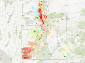
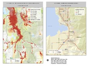
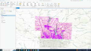
Getting To Know ArcGIS by Michael Law and Amy Collins, Chapter 8: Analyzing spatial and temporal patterns

Notes and Comments

  • Crime mapping analysts can use GIS to identify spatial patterns to gain a better understanding of the role of location, proximity, and opportunity, while providing key decision-makers with information to put crime prevention solutions in place.
  • Temporal data is data that has a time attribute.

Exercise Notes and Screenshots

  • A kernel density calculates the density of features in an area around those features and is one of the most common techniques in crime mapping.
  • The Optimized Hot Spot Analysis tool is used to find statistically significant hot spots and cold spots of robberies.
  • Creating a space-time cube can help you aggregate the robbery points, and visualizing it will help you understand how the robbery data is distributed over a geographic area.
  • A persistent hot spot is a location that has been statistically significant hot spot for 100 percent of the time-step intervals with no discernible trend indicating an increase or decrease in the intensity of clustering over time.
  • An intensifying hot spot is a location that has been a statistically significant hot spot for 90 percent of the time-step intervals.
  • A new hot spot is a location that is a statistically significant hot spot for the final time step and has never been a statistically significant hot spot before.
  • The Calculate button ensures that the full time extent—start time and end time—is specified.

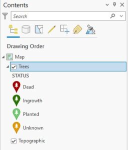
Getting To Know ArcGIS by Michael Law and Amy Collins, Chapter 9: Defining suitability

 Notes and Comments

  • A raster is composed of a grid of cells, instead of discrete x,y coordinates, that define geographic entities. The cells contain values that are used to record and define geographic phenomena on the surface of the earth.
  • A surface, which is made up of raster cells, can be discrete data, which means that it shows distinct and discernible regions on a map, such as soil types, or it can be continuous data, which means that there are smooth transitions between variations in the range of data.
  • Map algebra—a language that combines GIS layers—is fundamental to raster analysis.
  • NoData means that no values were recorded for that cell.

Exercise Notes and Screenshots

  • Aspect is used to determine which direction each part of the ground primarily faces—north, south, east, west, or in between.
  • A hillshade is a surface layer that depicts shadows to model the effect of an illumination source (usually the sun) over the terrain of the land.
  • Azimuth is the direction of the sun, expressed in positive degrees from 0 to 360, measured clockwise from north.
  • Altitude is the angle of the sun above the horizon.
  • No portion of the property is in complete shadow.
  • Four of the planting sites contain mostly low-slope (less than 14 percent) topology.
  • Two of the potential planting sites include at least some land that faces south, southeast, or southwest.
  • None of the potential planting sites are in shadow at 2:00 pm in mid-September.
  • The location closest to Paris Valley Rd is a planting site that meets the slope and aspect criteria and also has decent sun exposure at 4:30 pm.

Getting To Know ArcGIS by Michael Law and Amy Collins, Chapter 10: Presenting your project

Notes and Comments

  • In a layout, you can arrange common elements, including the map, map labels, a title, legend, scale bar, north arrow, captions, and additional graphics.
  • A good map not only provides facts but also persuades opinion. You will want to think about the context of the data and frame the results to match the geographic area of the phenomena.

Exercise Notes and Screenshots

  • There are around 18 areas that are fixed wireless technology.
  • Labels are based on one or more feature attributes and placed near or on a feature.
  • Dynamic labeling is when ArcGIS Pro places labels for all features in a layer with a single click based on predetermined labeling rules.
  • When you use the Maplex Label Engine, you have access to a new set of label placement properties that allow you to control how labels are oriented, formatted, and palce in feature-dense areas, and how conflicts between labels can be resolved.
  • Label classes are used to specify detailed aspects of how labels are positioned and symbolized.
  • A map layout includes map frames and other elements, such as scale, legend, north arrow, and more.
  • ArcGIS Pro has rulers, guides, and a grid to help you arrange map elements on a page.
  • Map frames are containers for maps in your page layout. They can contain any map in your project, including 3D scenes.
  • A legend will help your map readers understand the meaning of your map.
  • A scale bar is a dynamic element that provides an indication of the size of features and distances on the map.
  • A north arrow is a dynamic element that indicates the orientation of the map.

Utah County Broadband Map

Steed – Week 4

Getting To Know ArcGIS by Michael Law and Amy Collins

Chapter 1: Introducing GIS

Notes and Comments

  • A GIS is composed of five interacting parts that include hardware, software, data, procedures, and people.
  • Spatial data—…information that represents real-world locations and the shapes of geographic features and the relationships between them—involves using coordinates and a suitable map projection to reference this data to the earth (e.g., the location of a hospital).
  • Attribute data—information about spatial data (e.g., information about the hospital).
  • Dynamic and interactive maps on the internet, known simply as web maps, are ideal for allowing many users to access and quickly locate features and visualize data.
  • The open data movement provides agencies and the public with authoritative data and enables all levels of government to develop new tools and applications.
  • Point, line, and polygon data is also called vector data.
  • Features of the same type—such as trees, roadways, or buildings—are grouped together and displayed as layers on a map.
  • You can record and collect measured values for any location on the earth’s surface to form a digital surface, also known as a raster.
  • ArcGIS Pro uses ArcGIS Online basemaps, which provides a backdrop or frame of reference as you add your own layers.

Exercise Notes and Screenshots

  • Pay attention to the names of each subject—some of them are very similar.

Getting To Know ArcGIS by Michael Law and Amy Collins

Chapter 2: A first look at ArcGIS Pro

Notes and Comments

  • It offers 2D and 3D visualization and analysis within an intuitive, easily navigable interface

Exercise Notes and Screenshots

  • Using a project template (.aptx) is usually the quickest way to start a project. Templates are shareable project packages, including the specific basemaps, connections, datasets, toolboxes, or add-ins that are most helpful for your project.
  • The countries with the highest PM concentrations are Uruguay, Angola, Sudan, Chad, Niger, Mali, Iraq, Egypt, Pakistan, and Bangladesh.
  • If the content pane is missing, I utilize the search bar to return it.
  • The city with the largest population is Shanghai, China.
  • Symbology refers to the way GIS features are displayed on a map.
  • Single symbol—one symbol is used for all features in a layer.
  • Unique values—used for categorical data, different symbols represent various attributes.
  • Graduated colors—used for quantitative data, different colors represent different value ranges.
  • Graduated symbols—used for quantitative data, symbols increase in size with increased values.
  • The height of the tallest building is 339.8 meters.
  • Extrusion is the process of stretching flat 2D features vertically so that they appear three-dimensional.

Getting To Know ArcGIS by Michael Law and Amy Collins

Chapter 3: Exploring geospatial relationships 

Notes and Comments

  • The power of GIS extends far beyond exploring digital maps. You can combine datasets, enrich them with new attributes, derive statistics from them, and obtain new information based on their relationships.

Exercise Notes and Screenshots

  • The field name that indicates the state within which the county features are located is “STATE_NAME.” In Wayne, Ohio there is 10,575 people between the ages of 22 and 29 years.
  • Definition queries are helpful when you want to work with a subset of data in a map while maintaining the source data.
  • Attribute query—a request for features in a table that meet user-defined criteria.
  • Using an attribute join operation, you can append the spreadsheet table (the join table) to your existing attribute table (the input table), provided you have a common attribute field in each table—for instance, a feature name or numerical identifier.
  • I cannot find the years of data that are represented in the table.
  • There are various classification methods:
    • Manual interval classification, equal interval classification, defined interval classification, quantile classification, natural breaks (jenks) classification, geometric interval classification, and standard deviation classification.
  • I was not able to verify a correlation between income and 2010 obesity. I believe I messed up with importing symbology from 2009 to 2010.
  • The percentage of households that had income of less than $15,000 per year is 17.7%.
  • There are 13,115 food deserts in Knox County.
  • A spatial join allows you to define a spatial relationship between two layers (a target layer and a join layer) and combine their attributes in a new output layer.

Getting To Know ArcGIS by Michael Law and Amy Collins

Chapter 4: Creating and editing spatial data

Notes and Comments

  • A shapefile is a simple, stand-alone data format. It stores geometry and attribute data for one set of features.
  • A geodatabase is a storage container, in which sets of features are grouped into feature classes. The geodatabase can also store rasters and special geodatabase elements that facilitate capabilities that are not available with other data formats.

Exercise Notes and Screenshots

  • A coordinate system defines features’ positions on the earth’s surface.
  • A geographic coordinate system uses latitude and longitude to define the locations of points on the surface of a sphere or spheroid.
  • A projected coordinate system uses a mathematical equation (the map projection) to transform latitude and longitude coordinates into Cartesian or planar coordinates for display on a flat map.
  • ArcGIS employs on-the-fly projection, which means that it applies the projected coordinate system of the first layer added to all subsequent layers.
  • Metadata is textual information about the dataset.
  • An attribute domain is a set of valid values, or a numerical range, to which attributes in each field must be limited.
  • Snapping allows you to accurately connect features, such as waterlines and values, without impossibly precise sketching.
  • There are four vertices on SW 19th
  • The Shape_Area value of the original water pressure zone split in half.

Getting To Know ArcGIS by Michael Law and Amy Collins

Chapter 5: Facilitating workflows

Notes and Comments

  • A task item might capture an entire workflow or one piece of a more complex solution.
  • Modelbuilder is a geoprocessing environment that allows you to easily link one tool to another and run a set of operations one after another with the click of a button.

Exercise Notes and Screenshots

  • Tasks are helpful to standardize business operations and promote best practices for a repeatable workflow.
  • Yes, I can name the types of conflict events that are recorded in this dataset.
  • A definition query limits the display of features to features that meet user-defined criteria.
  • According to ACLED statistics, 14,211 fatalities resulted from conflicts against South Sudanese civilians between 2010 and 2018.
  • A model allows you to string multiple geoprocessing tools together and run them automatically with the click of button.
  • There were 71 fatalities that resulted from conflicts classified as violence against civilians in Rwanda from 2010 to 2018.
  • There were 41 events classified as riots/protests that occurred in Rwanda between 2010 and 2018. As a result of these events, there was 12 fatalities.
  • Python is a programming language that, in the GIS context, is used to script geoprocessing workflows and build custom geoprocessing tools.
  • The two geoprocessing tools that are combined in this script are Select and Summary Statistics.
  • There were 26,323 fatalities that resulted from conflicts classified as violence against civilians in Nigeria from 2010 to 2018.

Steed – Week 3

Chapter 5

This chapter explains how and why GIS users analyze data inside an area, and specifies the advantages and disadvantages to using various mapping methods. First, Mitchell examines why people map different areas. He states that people map “to monitor what’s occurring inside it, or to compare several areas based on what’s inside each.” For example, a police officer would be interested in analyzing how many people on parole are still in their specified areas; if a person is outside of their specified region, then a warrant may be issued. Next, the author emphasizes the importance of determining what information is necessary when attempting to map out a problem. The following questions are ones he deems critical: are you mapping a single or multiple areas?; are the features continuous or discrete?; do you need a list, count, or summary?; and do you need to see the features completely or partially inside the area? Then, Mitchell analyzes three different mapping methods: (1) drawing areas and features, (2) selecting features inside an area, and (3) overlaying areas and features. He provides short synopses for what each method is good for, what you need to utilize the method, and how GIS visualize these methods. Finally, the author goes into further detail about each method and provides tips and trips to better assemble and analyze maps.

Overall, I found this to chapter to be helpful in providing tips into better defining map data so as not to confuse observers, but also in creating better analyses for the user. Although I did find this reading to be very redundant with the majority of points being made multiple times throughout. I will be utilizing this chapter in particular to troubleshoot if I run into any issues analyzing data.

Chapter 6

This chapter explains the significance of mapping the distance around an area and specifies three manners in which the process can be done. First, the author states why people map near specified areas and examines various questions that he finds to be important in configuring how to better define problems. Then, he states the three types of mapping processes utilized to map nearby: (1) straight-line distance, (2) distance or cost over a network, and (3) cost over a surface. Before defining each individually, Mitchell compares each type with one another and clarifies which mapping method is best for different situations. Next, he begins to describe the straight-line distance method, which he says is when “you specify the source feature and the distance, and the GIS finds the area or the surrounding features within the distance.” For example, you might have a toxic waste spill at a nuclear plant and need to know how many houses or businesses are within a 10-mile radius of the nuclear plant to properly evacuate the region. In addition, Mitchell examines measuring distance or cost over a network. This is when “you specify the source locations and a distance or travel cost along with each linear feature, and the GIS finds which segments of the network are within the distance or cost.” Furthermore, Mitchell defines the final mapping method, calculating cost over a geographic surface. This is when “you specify the location of the source features and a travel cost, and the GIS creates a new layer showing the travel cost from each source feature.” For example, you may have a river that has been commonly used as a dumping ground for animal waste by a local farmer, and the river sits on an uneven surface over a large stretch of land. You may need to use GIS to calculate the cost distance of river runoff to help better prepare for cleanup.

Chapter 7

This chapter primarily explains the importance of mapping change and provides the necessary logistical tools to create an easily digestible map utilizing different data. First, the author examines the various types of change that can be defined through geographics. He says, you can either map the change in location, which “helps you see how features behave so you can predict where they’ll move,” or the change in character or magnitude, which “shows you how conditions in a given place have changed.” For example, one mountain may shift a few inches a year due to plate tectonics, so scientists may be interested in plotting this information in GIS. Then, Mitchell defines the various methods of mapping change including time series, tracking maps, and measuring change. He states that time series are “good for showing changes in boundaries, values for discrete areas, or surfaces.” In other words, good for locations that are constant, or never move. Tracking maps are “good for showing movement in discrete locations, linear features, or area boundaries, which is like time series, but can include features for several dates and times. Finally, he explains measuring change shows “the amount, percentage, or rate of change in a place.” For example, you may measure change within a small village following a mudslide or a tornado to understand the full impacts of the natural disaster event.

Steed – Week 2

Chapter 1

This chapter introduced readers to GIS analysis, the manners in which it can be applied, and the technical terms used to describe its functions. First, the author provided a clear definition of GIS analysis, and then described the five ways in which geographic data should be analyzed: (1) frame the question, (2) understand your data, (3) choose a method, (4) process the data, and (5) look at the results. Next, Mitchell distinguishes the various feature types, which includes discrete, continuous, and summarized features. These are important because they determine how to move forward with the given data (e.g., if we know our boundaries are discrete, then we know exactly where to pull our data points). Then, the author describes how each geographic feature can be modeled—through either vector or raster models. In addition, Mitchell defines map projections and coordinate systems, and explains how the shape of our globe impacts their applications. Finally, this chapter describes different attributes that characterizes data (e.g., categories, ranks, ratios, etc.).

Overall, I think this chapter was critical in understanding some of the jargon that has been used in the past here at Ohio Wesleyan that I have neglected to do more research about. Although the information in this chapter is definitely basic, I think by starting out with this advice with accompanying examples, I will find it easier to understand the ArcGIS application.

Chapter 2

This chapter explains the importance of mapping and discloses strategies that can be utilized to best represent data through map design. First, the author specifies that mapping can be used to analyze where action needs to occur in a geographic space, to explore the causation of (an) event(s), or to search an area for a specific criterion. Then, Mitchell mentions the necessary steps to prepare data for mapping. He stated that users need to ensure that geographic coordinates and category values (if needed) are assigned to each feature. If not, Mitchell indicates that there a variety of issues that could occur. Next, Mitchell articulates how GIS works in creating a map for both single and categorical features that are prescribed by the users. In addition, the author provides tips for users to make their map as clear as possible to audiences. Finally, Mitchell discusses how to analyze geographic maps to look for patterns. He clarifies that pattern formation is one of the critical pieces of creating a map, so it is important that these steps are followed successfully.

As suspected, this chapter added to what we just learned from the first chapter. For example, Mitchell consistently reverberates terms such as “continuous” and “raster,” which were just defined in the first chapter. Additionally, this section gave great guidance to avoid mistakes when creating maps. For example, he said “if you’re showing several categories on a single map, you’ll want to display no more than seven categories,” and also, “if the pattern are complex or the features are close together, creating a separate map for each category can make patterns within a particular category—and even across categories—easier to see.” Not only will these tips allow me to avoid making unnecessary mistakes, but also it creates a better understanding of why there are specific tasks that users need to make.

Chapter 3

This chapter focused on mapping intervals of values and explained which methods of mapping are necessary based on the type of feature. First, the author examined the importance of graphing maps with varying quantities and reverberated some of the information that was discussed in chapters 1 and 2 (specifically, discrete, continuous, and summarized features). Next, Mitchell defined the various quantities like counts and amounts, ratios and ranks. Then, he begins to explain how these quantities can be divided into classes either manually or through the use of classification schemes. The four classification schemes he describes are natural breaks (jenks), quantile, equal interval, and standard deviation. Each of these class separation tools allow for geographers to better understand given data sets, but they must be used in the right manner. For example, natural breaks are good for mapping uneven data sets, but quantiles are not (they are known for comparing areas that are roughly the same size). Furthermore, Mitchell explains how to deal with outliers in data sets and defines the differences between various map types for understanding discrete, continuous, or summarized areas. Finally, the author describes how users should be able to visualize patterns in their maps, and how to make it clearer for their audiences.

Although this reading bares some similarities between chapters 1 and 2, the author was able to provide guidance for why and how classes should be assembled for a given data set. In addition, it was able to differentiate between different map types, which is useful for when I apply this knowledge to the ArcGIS application. I am curious how the author will be able to build from this to describe map densities in the next chapter without reverberating the same information.

Chapter 4

This chapter describes the importance of density maps and explains how to create the two distinct types: (1) by defined area and (2) by density surface. First, as the previous chapters, he reverberates some of the primary information for why you should have an objective in mind when creating maps of any kinds. However, he describes that for density maps, they are “useful when mapping areas…which vary greatly in size.” Then, the author describes in greater detail the two distinct types of density maps. He says, map density by area when “you have data already summarized by area, or lines or points you can summarize by area.” On the other hand, Mitchell states to create a density surface when “you have individual locations, sample points, or lines.” Then, he goes into broader detail about each type with how each are calculated, displayed, and finally analyzed.

Honestly, I found this section to be a little redundant, but I understand its importance. Without a firm understanding of density maps, there’s a lot of data that cannot be properly analyzed. In addition, this sort of mapping is commonly what I see when I go to various databases. It is fairly easy to interpret, and from the sounds of it, pretty easy to map on your own—if you know some basic math.

Graham Steed – Week 1

Hello everyone!

My name is Graham Steed. Yes, that baby is me (I still wonder what made me so happy; maybe grass, trees, and sustainability, but most likely my mom). Anyways, as I was saying, I am a 2023 senior majoring in Environmental Studies. I am from Marion, Ohio, and I currently live in the Service Engagement and Leadership (SEAL) SLU. I am excited to take this class because I think ArcGIS is an important application that has so many real world uses, so why not learn more about it.

In regards to Nadine Schuurman’s GIS: A Short Introduction, Chapter 1, I found this reading to be both informative and interesting. Although I had previously heard of the debate between GISystems and GIScience, I now understand why making a decision is quite confusing. Personally, I find the theoretical aspects of spatial divisions found in GIScience to be the most fascinating because this is something that historically has been neglected, even in the early days of GISystems. Additionally, in my opinion, I believe GIScience attempts to clarify what the author says is “fuzzy” phenomena, which we have a hard time demarcating, if at all. 

Also, Schuurman discusses the technical history of GIS. What I found to be the most intriguing portion of this section was the author’s description of Ian McHarg’s methods for analyzing a particular space. To me, it is interesting that we still utilize McHarg’s “layers” approach in a digital environment. Furthermore, I was surprised that McHarg was able to get the results he was looking for by just using paper shaped into different forms. 

Finally, Schuurman explained the different uses among different organizations, such as municipalities, governments, and companies. I think it is awesome that you can map and analyze concrete data like waterways, public transportation systems, bicycle paths, public buildings, et cetera, but also abstract data like religion, income, and race. It is also extremely neat how geographers can utilize GIS data to predict future events like natural disasters.

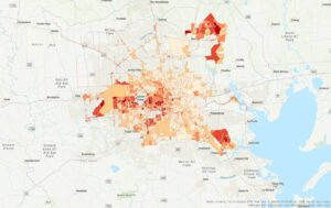
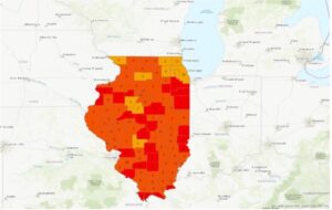
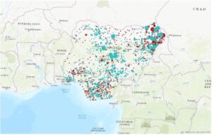
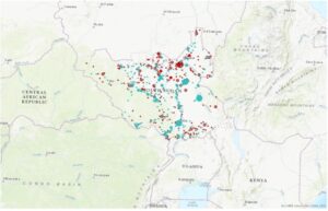
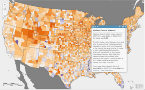
In looking into GIS applications, I researched two topics of interest: food safety and income inequality. I found out that GIS can be used to plot human epidemiology and public health, agriculture, plant and animal health, and environmental factors that can determine overall food quality and safety in a given space, which helps companies and health professionals better protect consumers. In addition, I discovered that you can utilize GIS to plot income levels, which assists a wide range of researchers in answering questions in public health, economics, and government.

Sources:

https://hub.arcgis.com/maps/UrbanObservatory::income-inequality-in-u-s-counties/about

https://www.proquest.com/docview/2741249913?pq-origsite=summon